Notable observations and news items from the Web, with no processing and little in the way of comment. Make of them what you will.
Leading up to this September’s extremes
Firefighters flying over a controlled burn to fight wildfires in Canada’s Quebec Province. Photograph: Genevieve Poirier/Societe De Protection Des Forets/AFP/Getty Images (from the article)
From June to August 2023, a series of extreme weather events exacerbated by climate breakdown caused death and destruction across the globe.
As the world sweltered through the hottest three month spell in human history this summer, extreme weather disasters took more than 18,000 lives, drove at least 150,000 people from their homes, affected hundreds of millions of others and caused billions of dollars of damage.
That is a conservative tally from the most widely covered disasters between early June and early September, which have been compiled in the timeline below as a reminder of how tough this period has been and what might lie ahead.
How much are these extremes costing society. For an idea see the following graphic from Scientific American’s blog. Note: this graphic applies only to the US,
https://www.theguardian.com/environment/2023/aug/28/crazy-off-the-charts-records-has-humanity-finally-broken-the-climate Warning: Data is provided for this article by climate scientists who suffer from the reticence causing academic and institutional scientists to downplay any overly ‘dramatic’ warnings in order to avoid alarming departmental colleagues, administrators, or governments influencing hiring, promotion, financial support for research, etc. Google “scientific reticence” and you will find lots of evidence on how it works.
The current extremely low sea ice will have a range of impacts. Changed ocean stratification and circulation will alter basal melting beneath ice shelves48. Greater coastal exposure will increase coastal erosion and reduce ice-shelf stability49. Changes in dense shelf water production will alter bottom water formation and deep ocean ventilation50. Sea ice changes will also have contrasting influences on Adélie and emperor penguin colonies51,52, and substantially alter human activities along the Antarctic coastline.
Anthropogenic greenhouse gas emissions have been attributed as the primary cause of Southern Ocean warming, and here we suggest a potential link to a regime shift in Antarctic sea ice. While for many years, Antarctic sea ice increased despite increasing global temperatures6, it appears that we may now be seeing the inevitable decline, long projected by climate models53. The far-reaching implications of Antarctic sea ice loss highlight the urgent need to reduce greenhouse gas emissions.
Off the previous chart, again…. In 12 days another ~500,000 hectares have burned! Will the burning stop for winter? What does this portend for Australia’s upcoming El Nino summer?
The record for the 23rd blew the Canadian system’s off the chart! The following chart from Copernicus, the EU’s equivalent of NASA, that operates the satellites, suggests the data from the 23d is probably a real record of what the satellites actually recorded. In most years the wildfires would have been more-or-less through for the year. Yet 23 Sept shows BY FAR the largest number of hotspots recorded for the year so far, previous highs being 9269 for June 22 and 9692 for July 13.
For the latest Natural Resources Canada tabulation, see https://cwfis.cfs.nrcan.gc.ca/maps/fm3?type=arpt. Note 1: the current version of the total burned area chart can be seen by scrolling down to the bottom of the table accessed by this link.
Note 2: the following Guardian chart was PUBLISHED on 22 Sept.
Note: warmer winter temperatures allowed mountain pine beetle populations to grow explosively through this region due to additional reproduction of adult beetles that were normally killed off by hard freezing winters. I did several Facebook posts in 2016 and 2018 on the increasing fire hazard this would create until the dead biomass was removed. This year’s extreme temperatures facilitated this!
The Canadian 🔥 season is not yet done but I have a few URGENT questions we must address. 1. How many of these fires will burn underground overwinter and emerge as spring zombie fires? 2. How much extra permafrost will thaw because of this year’s severe burning? #ClimateCrisispic.twitter.com/Ih0ilRHQ6Q
[Note that 2020- Siberian wildfires plus this years’ wildfires in the Canadian Arctic Zone probably produced massive increases in permafrost GHG emissions beyond what was happening during the years included in this survey.]
Map of northern permafrost extent (data from Obu et al. 2021) overlain with the spatial extent of the permafrost domain included (BAWLD-RECCAP2 regions). The spatial extent of the permafrost region de ned in this study as an overlap of permafrost extent and the Boreal Arctic Wetlands and Lakes Dataset (BAWLD, Olefeldt et al. 2021a,bScheme of annual atmospheric GHGs exchange (CO2, CH4, and N2O) for the ve terrestrial land cover classes (Boreal Forests, Non-permafrost Wetlands, Dry Tundra, Tundra Wetlands and Permafrost Bogs); inland water classes (Rivers and Lakes). Annual lateral fluxes from coastal erosion and riverine fluxes are also reported in Tg C yr-1 and Tg N yr-1. Symbols for fluxes indicate high (x>Q3), medium (Q1<x<Q3), and low (<Q1) fluxes, in comparison the quartile (Q). Note that the magnitudes across three di erent GHG fluxes within each land cover class cannot be compared with each other.
ClimateReanalyzer
Stationary anomaly, somewhat hotter on 23rd than 22nd
https://www.theguardian.com/environment/2023/sep/11/us-record-billion-dollar-climate-disastersNote, as the frequency, extent, and ferocity of climate disasters continue to increase with accelerating global warming, newer disasters will overlap and add to destruction from previous disasters where there has not been enough time to complete repair and remediation leading to the accelerating accumulated climate damage — until society no longer has the resources to continue repairing and replacing what has already been repaired and replaced. At this point social collapse is inevitable…… We must stop and reverse the process of global warming that is causing this or face near-term extinction.
11 September 2023 – Coming out of winter — not a good look for the rest of the year in Australia!
In February 2023, Antarctic sea ice set a record minimum; there have now been three record-breaking low sea ice summers in seven years. Following the summer minimum, circumpolar Antarctic sea ice coverage remained exceptionally low during the autumn and winter advance, leading to the largest negative areal extent anomalies observed over the satellite era. Here, we show the confluence of Southern Ocean subsurface warming and record minima and suggest that ocean warming has played a role in pushing Antarctic sea ice into a new low-extent state. In addition, this new state exhibits different seasonal persistence characteristics, suggesting that the underlying processes controlling Antarctic sea ice coverage may have altered. [my emphasis]
a Antarctic monthly sea ice extent (SIE) anomaly time series from the National Snow and Ice Data Center over the satellite period, November 1978 to June 2023, in millions of square kilometres. Sea ice extent anomalies are calculated relative to the 1979–2022 climatology. Two change points are detected, separating the time series into three periods: November 1978 to August 2007 (grey), September 2007 to August 2016 (blue), and September 2016 to June 2023 (orange). The means of each period are shown by the horizontal lines and are statistically distinguishable. b Antarctic monthly SIE anomaly time series expressed as a percentage of the monthly climatology over 1979–2022. Periods are coloured as in (a). Record minima months occurring since 2016 are noted in (a, b). c Southern Ocean 50–65°S temperature anomaly time series from Argo over January 2004 to May 2023, in degrees Celsius. Ocean temperature anomalies are calculated relative to the 2004-2022 climatology. Dashed vertical lines show the sea ice extent change points. Stippling indicates values outside ± 1 standard deviation, where the standard deviation is calculated independently at each depth level to account for the change in magnitude of the variability with depth. Warm anomalies shown in orange and red are evident below 100 m from 2015, and at the surface from late 2016.Antarctic five-day sea ice extent anomalies in millions of square kilometres for each year from the National Snow and Ice Data Center. Sea ice extent anomalies are calculated relative to the 1979–2022 climatology. Anomalies are coloured by period as in Fig. 1: November 1978 to August 2007 (grey), September 2007 to August 2016 (blue), and September 2016 to June 2023 (orange). January to June 2023 is shown in bold orange, with the largest negative areal extent anomaly of the satellite era observed during June 2023.
Implications
The current extremely low [Antarctic] sea ice will have a range of impacts. Changed ocean stratification and circulation will alter basal melting beneath ice shelves48. Greater coastal exposure will increase coastal erosion and reduce ice-shelf stability49. Changes in dense shelf water production will alter bottom water formation and deep ocean ventilation50. Sea ice changes will also have contrasting influences on Adélie and emperor penguin colonies51,52, and substantially alter human activities along the Antarctic coastline.
Anthropogenic greenhouse gas emissions have been attributed as the primary cause of Southern Ocean warming, and here we suggest a potential link to a regime shift in Antarctic sea ice. While for many years, Antarctic sea ice increased despite increasing global temperatures, it appears that we may now be seeing the inevitable decline, long projected by climate models. The far-reaching implications of Antarctic sea ice loss highlight the urgent need to reduce greenhouse gas emissions. [my emphasis]
Key facts from CDR (Center for Disaster Recovery):
As of Sept. 15, the Libyan Red Crescent said the death toll had reached 11,300 people in Derna alone. Officials expect this figure to continue to rise, possibly as high as 20,000. About 170 people were also killed in other parts of eastern Libya, including in Susa, Marj, Bayda and Um Razaz. More than 7,000 people were injured and at least 10,100 people are still reported to be missing. Because of the lack of telecommunications, some may be displaced and unable to reach family, but due to the large-scale destruction, it is hard to confirm these figures.
According to Floodlist, Libya’s National Center of Meteorology reported, “in a 24 hour period to Sept. 10, a staggering 414.1 mm [16.2 inches] of rain was recorded in Bayda, while 240 mm [9.5 inches] of rain fell in Marawah in the District of Jabal al Akhdar, and 170 mm [6.7] fell in Al Abraq in the Derna District.”
I used publicly available satellite imagery to try assess the damage attributed largely due to the failure of two dams. My conclusion is that the dams were no more than momentary and relatively insignificant barriers to to the flow of an inconceivably large volume of water. The following satellite images from Google Earth, and Sentinel Hub’s EO Browser clearly demonstrate the power of our planet’s increasingly extreme weather events driven by global warming. As the oceans and atmosphere warm, the atmosphere is able to transport increasingly stupendous volumes of water (in the form of water vapor) over the land to be dropped when the air cools for any reason.
The following image is what appears to be the center of the city of Derna (pop ~100,000) immediately before Storm Daniel dropped part of its load of water in the watershed of Wadi Derna. The very dry stream bed of Wadi Derna crosses the center of the image. If you have access to Google Earth, you can zoom in to see shadows of the few individual people out in the mid-day sun.
Zooming in, note the large building on the NE side of the Wadi 3 blocks downstream from the bridge on the lower left corner of the picture. It is a high-rise, where the tallest part is 9 stories above the ground floor, and the rest five. I determined the number of floor by counting the sun shades visible on the downstream side of the building. This is one of the few structures left in this part of town that can be identified in the next image.
Immediately after it looked like this:
Note the conspicuous high-rise (10 stories) easily marked by its long shadow in this image. The image below images this building from the down-stream side. The image here is relatively low resolution, but the three lowest floors (facing AWAY from the flood) have clearly been gutted by the flood. The bridge referred to in the previous picture has vanished leaving only two supports (aligned with the stream flow) to show where it was. Rows of 4-6 story buildings (and even some 8 story buildings just off the left edge of this image) extending 3-4 and even more rows back from the Wadi have totally vanished or are only memorialized by a bit of concrete slab or trace of a foundation wall.
The next two pictures zoom in on the area between the vanished bridge in the above images and the next bridge upstream (just off the edge of the above).
The three buildings to the left of the Wadi at the bottom of the image were respectively 7, 4, and 7 stories high
The next two pictures show the site of the lower dam – 250 meters upstream from the inland edge of the city.
Note: the dam has no spillway. Overflow protection is provided by the flared drain pipe (circular structure) in the lower left of the picture. Using Google Earth’s measuring tool, the diameter of the drain as approximately 6m. On the upstream side the surface of the reed bed is ~24 m above sea level, and the level of the road over the top is 45 m, giving the dam height of 21 m. On the downstream side the base of the dam is at 26 m, with the outlet for the overflow drain at approx 22 m. The length of the dam across the top is ~115 m, across the bottom (at reed level) is 50 m; thickness at the bottom is ~74 m, 8.5 m at the roadway.
The next Google Earth image is of the upper dam (12.5 km upstream from the lower dam) from immediately before Storm David’s rain. There is no high resolution image available from after the flood.
The drain tube (right side upstream) seems to be 7m in diameter. The dam is ~10 m high and 270 m long. 143 m thick at the base and 6.5 m thick at the top.
The last composite graphic gives an impression of the amount of water held behind both dams in the days immediately prior to Storm David. All are sourced via Sentinel Hub’s EO Browser and all are at the same scale – close to the maximum resolution available. The left four images are of the upper dam and its lake, while those on the right are of the lower dam and its lake. The upper three images of each dam use the Normalized Difference Moisture Index NDMI – that basically highlights any moisture in the otherwise barren landscape. The bottom picture is the same view as the one immediately above, except that it displays “true colors”. On the left in the top picture, on 10/01/2023 there was some water backed up behind the dam, perhaps 2 m deep at the dam wall given that most of the upstream face is still dry. The second picture, on 02/09/2023 shortly before Storm Daniel shows essentially zero moisture behind the dam, except there is a tiny blue streak in the bottom of the bright yellow area that is too small to be resolved at the magnification shown here. The blue areas below the dam are well watered orchards and fields – not standing water. The dam is visible in both of the above pictures. The third picture, from 12/09/2023 immediately after Storm Daniel shows the Wadi Derna has been scraped clean of any sign of a dam or the well watered agricultural area below the dam save the blue area off to the side. Inspection of the area just downstream from the pictures here in the before and after show the complete obliteration of farms and vegetation together with the road to a height of 20+ meters above the bottom of the wadi. A little further upstream – a bit closer to the dam, the landscape has been scraped up to a height of 38 m! above the wadi bottom, where the width of the wadi is approximately 200 m across. The height of this point is ~215 m above sea level (at least 10 m higher than the top of the dam!).
A similar story can be constructed for the pictures of the lower dam in the right column. The dams were minor inconveniences to the flow of the total volume of the storm water.
The Wadi Derna drains a large and relatively barren plateau with some of the weirdest landforms I have seen, and could possibly be organized so it receives large volumes of water from a number of subsidiary drainages at the same time. Or, more likely, the insanely hot Mediterranean air was supersaturated with water, and the storm dynamics led to rapid cooling that squeezed all of the water out over a very short period of time….. And the barren plateau lacked soil and vegetation to slow the flow of the water once it hit the ground, and simply demonstrated what can happen when the Earth System has too much energy to dissipate all at once in the form of climate catastrophes.
Consequently….
Our planet is progressively becoming uninhabitable!
Not yet getting back to anything as cool as last year’s near record highs after more than 3 months! – https://climatereanalyzer.org/clim/t2_daily/?dm_id=world3+ months and the anomaly is still trending ever more extreme as the sub-solar point moves towards the Southern Hemisphere!Global Average Sea Surface Temperature still above previous years ALL TIME RECORD HIGH TEMPERATURE with trend line still widening the gap. 90% of excess solar heat is first absorbed into the oceans to heat the globe as a whole. – https://climatereanalyzer.org/clim/sst_daily/Southern Hemisphere anomaly also in record extreme territory and rising rapidly. Antarctic rising and ~1 day from record daily high.Sept. 13 and Antarctic sea ice already beginning to melt after 4+ months of record low freezing rate, to create a global average record low amounts of sea ice. At the southern summer low to come will there be ANY sea ice left around Antarctica? What does this mean for ice shelves and glacier fronts exposed to warm pounding waves and tides? – https://nsidc.org/arcticseaicenews/charctic-interactive-sea-ice-graph/Sept. 19 and the ice is rapidly melting into ever more extreme low sea ice for the date.Sept 19 and rapid Antarctic melting keeps global coverage more than 4 σ below any previous low for the date. Not good news for southern summer! https://seaice.visuals.earth/ Record high temperatures & reduced temperatures between polar and ‘temperate’ zones lead to crazy, weak and chaotic jet streams; in turn allowing stalled extreme heat domes, droughts and wildfires; lethally moist air masses, biblical flooding, and catastrophic storms. OUR GOVERNMENTS ARE STILL PROMOTING AND SUBSIDIZING FOSSIL FUEL BURNING!
It’s truly astonishing how hot the North Atlantic was this summer. 2.3F above normal (+1.3C) and about 1F or .5C above records. It may not sound like much but it’s tremendous – This is for a huge area from the equator to the southern tip of Greenland and from Florida to the UK. https://t.co/M6Wapdbo5jpic.twitter.com/D2mj0iKBRy
Leon Simons [Mission: To understand & protect the home planet. Innovator, climate researcher, social entrepreneur. Board member Club of Rome NL], who works outside the ‘reticence’ imposed by the usual academic and institutional employers considers the significance of recent reports on the Earth’s energy imbalance. Note: Simons is a coauthor on at least two peer reviewed scientific reports in this area.
Simons puts the previous graphs in a geological context based on Shackleton et al’s reconstruction of variations of Earth’s energy balance determined from measurements of Oxygen isotope ratios in sediment cores from the seabeds.
The thread from https://twitter.com/LeonSimons8/status/1698413266421096893 explains in some detail how the following graph was inferred and extrapolated from the above. At first I found it difficult to make sense of this graph until I grasped that the vertical line defining the right-hand side of the graph was data, comparing the imbalance observed directly over the last 50 years, with the variation recorded over the last 150,000[!] years, not the border….
Simons was one of the coauthors of the above paper.
ERA5 September 2023 monthly data are out.
I'm still struggling to comprehend how a single year can jump so much compared to previous years.
Just by adding the latest data point, the linear warming trend since 1979 increased by 10%. pic.twitter.com/AnNAbyUQwY
Note that the following X-Tweet is limited to the United States – based on a Scientific American article. The rest of the world is suffering at least as much! Total costs are adjusted for inflation. It isn’t clear whether this also applies to the individual “billion dollar” events in the graph below.
Given the rapidly growing accumulation of excess heat in Earth’s oceans, if we cannot stop and reverse global warming within the next few years the inevitable result will be ecological and social collapses, within a few decades, and likely global extinction of most complex organisms — including humans within a century or so….
We must act before it is too late!
Featured Image
Based on an image by Leon Simons, https://twitter.com/LeonSimons8/status/1698410404693594417 depicting the urgent existential problem facing humanity today: If we cannot reverse the heating spike forming the right-hand border of the graph and force it below the neutral line forming the graph’s X axis within a few years, most complex life on Earth will be extinct in a century or so.
Views expressed in this post are those of its author(s), not necessarily all Vote Climate One members.
What’s this article about, and why is the date important?
As I write this, the average climate for our WHOLE PLANET is changing so freaking fast we can see visibly measurable changes in the averages from one day to the next!
The sudden speed up of changes in several climate indicators at the same time suggests that we may be crossing a critical tipping point in the complex interactions of important temperature related feedbacks controlling the behavior of Earth’s Climate System, as shown in the Featured Image. The speed-up is highlighted by the fact that the average air temperature 2 meters above the surface of our planet is at an all time record (and especially in the satellite era beginning in 1979). These changes will affect the whole 8,000,000,000+ humans and alive today along with all other life on the planet. The charts and maps presented here graphically illustrate measurements of important climate variables up to the last 1 to 4 days.
Fig. 1. ClimateReanalyzer’s Time Series plotting of Earth’s global average temperature at 2 meters above the surface from the NCEP Climate Forecast System (CFS) version 2 (April 2011 – present) and CFS Reanalysis (January 1979 – March 2011). CFS/CFSR is a numerical climate/weather modeling framework that ingests surface, radiosonde, and satellite observations to estimate the state of the atmosphere at hourly time resolution onward from 1 January 1979. The horizontal gridcell resolution is 0.5°x0.5° (~ 55km at 45°N). The time series chart displays area-weighted means for the selected domain. For example, if World is selected, then each daily temperature value on the chart represents the average of all gridcells 90°S–90°N, 0–360°E and accounts for the convergence of longitudes at the poles.
Again, every day since July 3 has been hotter than any maximum temperature recorded for any prior year back to 1979 when these records were compiled.
@EliotJacobson on Twitter shows this data a bit more legibly. The first record high was on 3 July, and daily average temperatures have remained in annual record high regions for a total of 12 ! continuous days through 14 July. The record is now 21 days!
Fig. 2. Progression of global temperatures higher than all time record temperatures back to 1979. ref. Eliot Jacobson.
The time gap between the instants of measurement depicted in the plots and charts and when they were printed are due to time delays between:
automatically recording millions of readings from hundreds of thousands of networked physical sensors and more millions of readings from remote sensors on a plethora of artificial satellites whizzing around our revolving planet several times a day (“Intensity of observation”, below, illustrates just how comprehensive the sensor network is);
accumulating and assembling the recorded data over the world-wide communications network;
proofing, processing and tabulating the received data on the world’s largest supercomputers; reanalyzing and plotting the observations in the form of charts and graphs comprehensible to humans;
publishing and publishing these outputs onto the public web, where they are accessible to anyone with a computer and the knowledge to find and understand the representations.
Based on the most recent measurements, the ongoing climate changes are accelerating in directions and speeds that will inevitably be lethal to the human and many other species within another century, more or less, if the changes are not stopped and reversed. These changes are a direct consequence of an unplanned experiment that humans began around 1½ centuries ago to burn geologically significant quantities of fossil carbon (e.g., coal, oil, ‘natural’ gas) into usable energy and greenhouse gases trapping an ever growing proportion of the total solar energy striking Planet Earth.
However, some of the combustion energy released by burning fossil carbon has also fueled an exponential growth of knowledge and technology able to produce the I am showing here. These plots provide the evidence our experiment is changing our global climate system to a state that will have existentially catastrophic consequences for Earth’s complex forms of life. This Hellish state is known as “Hothouse Earth“.
This fact that we now have the tools to actually see the evidence of our likely doom gives me some hope that our still exponentially improving technology may also provide us with the ability to stop further damage caused by our rogue experiment and repair enough of the damage already caused, to allow our species to continue evolving into the foreseeable future.
This raises the unavoidable and fraught question: Do we humans have the political will and capability to marshal and mobilize our technologies to engineer solutions that will allow us to avoid the abyss? This is the single most important issue facing the world today. If we don’t solve it, no other issue matters because — before long — no one will be left to worry about it.
Problematically, the world’s governments are dominated by puppets of the fossil fuel industry and related interests. They are doing as much as they can to PREVENT, DELAY, or MINIMIZE any actions that might hamper fossil fuel’s greed and short term interests for the world to burn yet more fuel. Hoping that we humans can solve this single, most important issue, VoteClimateOne is working to revolutionize our governments by replacing or changing parliamentary puppets to prioritize actions to solve the climate crisis first. Also, I am writing articles such as this to demonstrate and explain why this revolution is so urgent and necessary.
To demonstrate just how rapidly we are currently moving down the road to doom in what will be Earth’s Hothouse Hell, this article will be updated at least once a week until there is evidence of a downward trend to safer readings. We are certainly not seeing them yet!
Measuring progress towards existential catastrophe on Hothouse Earth
The world’s polar regions are critical. Ice and snow covering land and ocean reflects around 90% of the solar energy striking it. As temperature rises, more of the frozen water melts, allowing the exposed earth and water to absorb a much greater proportion of the solar energy during 24 hour-long polar polar daylight (open ocean absorbs ~94% of the energy striking it) , causing polar and global temperatures to rise in a potentially accelerating feedback cycle. In the animated graphic below, this process is clearly visible since the mid 1930s. This particular cycle won’t be broken until the ice is essentially all melted. By then there are several other feedbacks that will likely be in full swing.
Fig. 3. Zonal-mean (averaged over longitude) temperature anomalies for each year from 1900 to 2022. The x-axis is latitude (not scaled by distance), and the y-axis is the temperature anomaly. Data is from Berkeley Earth Surface Temperatures (BEST; http://berkeleyearth.org/data/) using a reference period of 1951-1980. (Zachary Labe 2023. Climate Indicators.
Ocean measurements are critical
Because most humans live on continental land masses, immersed in the atmosphere, most climatologists are primarily concerned with what goes on in the atmosphere. However, because water covers some 70% of our planet’s surface and because of water’s physical properties, around 90% of the excess solar energy striking Earth is absorbed in the World Ocean. Heat is then transported around the planet in currents and is available to be released to drive climate. See belowfor explanations of how the major heat engines driving Earth’s Climate System interact and work.
Fig. 4. Growing heat content held by our warming Ocean Current to Feb. 2023 (NOAA data)
Because these climate ‘engines’ are complex dynamical systems with many interacting components, where the interactions are often non-linear and sometimes even chaotic (in a mathematical sense their behavior is inherently unpredictable to any statistically define degree. Positive feedbacks in such systems can be potentially destructive because they lead to exponentially growing changes that lead to system breakdown (because infinity is impossible in the real world). Mathematical modeling of the interactions of small sets of variables can provide an appreciation of how such breakdowns may occur. Systems engineering as practiced in large defence engineering projects is based around a MilStd known as Failure Modes Effects and Criticality Analysis (FMECA) to identify such kinds of failure modes in order to engineer system solutions mitigate or totally avoid circumstances where they might arise.
The charts and maps below show how some measures of the behavior of Global Climate System have been behaving over the last few months and days. I consider these to be critical because they are likely to be evolved in the kinds of positive feedbacks that can grow exponentially to cause systems failure or collapse.
A definition
Many of the charts represent values of particular variables averaged over the surface of the whole Earth (or some specified region) at a specified point or interval of time. Most maps use colors to indicate the value of a specified variable at a specified point or averaged over an interval of time. In most such cases these measures are presented in the form of “anomalies”. An anomaly is the difference between the particular measurement and the long-term ‘baseline’ average for that measure on that day or interval of the year. For example, the graph immediately below uses a 30 year average (from 1971-2000) for its baseline average. Anomaly plots are particularly useful to highlight changes taking place over time.
Critical Variables
Global Sea-Surface Temperature
The global sea surface temperature anomaly broke into all-time record for the day of the year around 15 March, and by the end of March it was an all time record high since 1981, 0.1 °C above the previous record set on 6 March 2015. This value is so extreme, that along with other variables noted below it suggests that the average rate of global warming observed over the last few decades may be shifting into a new regime where the rate of ocean-surface warming is skyrocketing. As at 29 June it is still 0.2 °C above the previous record for that date – with an uptick after 4 days of downward trend).
Fig. 5a. Time series visualizations of daily mean Sea Surface Temperature (SST) up to 23 July. Data from NOAA Optimum Interpolation SST (OISST) version 2.1. OISST is a 0.25°x0.25° gridded dataset that provides estimates of temperature based on a blend of satellite, ship, and buoy observations. The datset spans 1 January 1982 to present with a 1 to 2-day lag from the current day. Data are preliminary for about two weeks until a finalized product is posted by NOAA. This status is identified on the maps by “[preliminary]” appearing in the title, and applies to the time series as well. SST anomalies, which are included in the OISST dataset, are based on 1971–2000 climatology. The time series chart displays area-weighted means for the selected domain. For example, if World 60S-60N is selected, then each daily SST value on the chart represents the average of all ocean gridcells between 60°S and 60°N across all longitudes, and accounts for the convergence of longitudes at the poles. Hide or display individual time series by clicking the year below the chart; Hide All and Show All buttons are at the chart lower right. The map can be switched between SST and SST anomaly by clicking the toggle button at the map top-left. A sea ice mask is applied to the SST and anomaly maps for gridcells where ice concentration is >= 50%
Fig. 5b. Sea Surface Temperature Anomalies. Significant positive heat anomalies exist in normal sinking zones for cooled salty water.Fig. 5c. Sea Surface Temperatures. ClimateReanalyzer’s SST current SST data can be accessed here.
The North Atlantic’s fever is still has a fever is still growing on 13 July. Warmer than usual water flooding up around southern Greenland right up to the edge of the melting sea-ice, with what looks like cold fresh meltwater flowing out of Baffin Bay along the west side.
Note that the ocean surface temperature is 5 °C right up to the edge of the sea ice, with warmer water than that intruding nearly as far as the ice front in Baffin Bay. The cooler (purple shaded) water flowing down close to the Canadian shoreline has been pushed back into Baffin Bay (between Greenland and Canada. There is no sign in either of the SST maps of ‘cool spots’ which are thought to be the sources of the ‘salty cold water’ forming the deep water branches of the thermohaline circulation in the North Atlantic. In fact, the ocean in these areas seems to be 10-15 °C. Northern Hemisphere ice extents are low for the date but not yet near record lows, unlike the South!
Fig. 6a.Record Sea Surface temperature in North Atlantic for July 23, only 0.1 °C short of the previous all-time record, set more than a month later last year.Fig 6b.Sea Surface Temperature distribution in North Atlantic for 23 July 2023.
Global Sea Ice
Antarctic Sea ice
Around the same time the global average sea-surface temperature began to skyrocket, the rate of sea-ice formation around Antarctica slowed — as would be expected if the surrounding ocean was becoming progressively warmer than has ever before been the case for this time of the year.
Fig. 7a. Time series showing he full annual cycle of the melting and freezing of sea ice around Antarctica from Jan 1979 up to 23 July. Seaice.visuals.Earth.
Fig 7b. Time series showing daily anomalies in the extent of sea ice around Antarctica from Jan 1979 up to 23 July highlighting the substantial slowing of freezing. Note differences in scale to 5a. The deviation is 7.12σ. Dark green shading = 3 sigma, light green = 5 sigma.
Sea ice extent anomaly is strongest in the Weddell and Bellingshausen Sea region. With the Indian Ocean region also showing what looks like the beginning of a strong deviation. The illustration is from the article from the Australian Antarctic Program Partnership that discusses the significance of the anomaly.
Fig. 8. Monthly anomalies in Antarctic sea-ice concentration and sea-surface temperatures for June 2023, showing more negative (i.e., reduced ice freezing) than positive anomalies. Note deep red is -70%, and lack of sea ice in Bellingshausen Sea (west of Antarctic Peninsula). Even though Antarctica is in mid-freeze season, Bellingshausen Sea is almost at summer sea-ice levels. (Source: interactive chart accessed at nilas.org). see also Polar View.
Sea ice extent anomaly is strongest in the Weddell Sea (area above the Antarctic Peninsula) and Bellingshausen Sea region (indicated by the arrow above). With the Indian Ocean region also showing what looks like the beginning of a strong deviation. See especially the article from the Australian Antarctic Program Partnership that discusses the significance of the anomaly.
Fig. 9.Color-coded animation displaying the last 2 weeks of the daily sea ice concentrations. Sea ice concentration is the percent areal coverage of ice within the data element (grid cell) in the Southern Hemisphere. These images use data from the AMSR-E/AMSR2 Unified Level-3 12.5 km product. The different shades of gray over land indicate the land elevation with the lightest gray being the highest elevation.
This graphic from NASA Earth Science’s Current State of Sea Ice Cover shows the slow rate of ice formation around Antarctica. The almost complete absence of ice in the Bellingshausen Sea is remarkable. It is only now in the last few days that it is beginning to ice over. There is also significant open water within the extent of the sea ice.
Nature. (2017). Garabato et al. 9 Feb (2017). Vigorous lateral export of the meltwater outflow from beneath an Antarctic ice shelf. 10.1038/nature20825. Free PDF
Nature 29 Mar (2023). Qian Li, et al.. Abyssal ocean overturning slowdown and warming driven by Antarctic meltwater. 10.1038/s41586-023-05762-w [paywalled!]
Nature Climate Change, 2 June (2023). Zhou et al. Slowdown of Antarctic Bottom Water export driven by climatic wind and sea-ice changes. https://doi.org/10.1038/s41558-023-01695-4.
So far, melting of the Arctic sea ice has not been particularly exceptional. With regard to sea-ice at both poles, it is also important to consider thickness and volume. Ice that is only a meter or two thick is accumulated over winter when there is no solar heating (sun largely or completely below the horizon) is normally only a year old. Solid ice reflects most of the solar energy heating it. However, the thinner the ice is, the faster it can melt as it begins to heat under the summer sun and possibly even rain(!), to say nothing of warm currents from the tropics. Around the North Pole, all of the bluish and purple ice shown in the map here can disappear fairly quickly as summer continues to leave open ocean to absorb most of the solar energy striking it that will delay freezing in the following winter.
Fig. 11. Thickness of Arctic Sea Ice for the month of July 2023. This is an animated reanalysis and forecast system developed by the US Naval Research Labs, based on the global database. It is one of several oceanographic data plotting visualizations for the Arctic (see System information). Presumably in the light lavender areas the remaining ice could disappear in a few days of warm temperatures. See also Danish Arctic Research Institution’s Polar Portal for current info on the northern polar region.
Arctic sea ice beginning to thin and break up as far as the North Pole. Shades of blue within the ice cap show regions where less than 100 percent of the quadrangle are covered by ice. (Either due to exposed ocean water or puddles of rain/melt-water on top of the ice). In either case this is bad news for reflectivity of the ice cap.
Fig. 12. Color-coded animation displaying the last 2 weeks from June 25 of the daily sea ice concentrations in the Northern Hemisphere. These images use data from the AMSR-E/AMSR2 Unified Level-3 12.5 km product. The different shades of gray over land indicate the land elevation with the lightest gray being the highest elevation. From Current State of Sea Ice Cover
Atmosphere and land
Jet streams
Fig. 13a. Jet streams in the Southern Hemisphere.
Fig. 13b. Jet streams in the Northern Hemisphere
Fig. 13c. Global distribution of jet streams.
Jet streams are the atmospheric equivalents to major ocean currents that influence all of the other weather systems on the planet to keep them moving latitudinally around the planet. They are driven by temperature differences between the tropical and polar regions of the Earth and Coreolus effects as winds blow towards or away from the poles. Where the temperature differs strongly between poles and equator the jet streams are well organized with high winds. As temperature differences decrease so do the wind speeds, and the streams begin to slowly meander until they may become quite chaotic. Winds less than 60 kt are not considered to be jet streams. At present there has been very little change in the pattern that existed a week and a half ago (as shown in Fig 8b) there are virtually NO jet streams at all in the Northern Hemisphere, and the winds that do exist are completely chaotic — a highly unusual situation. This leaves major heat domes basically motionless, facilitating the buildup and maintenance of record high temperatures.
Fig. 14. The taiga biome is found throughout the high northern latitudes, between the tundra and the temperate forest, from about 50°N to 70°N, but with considerable regional variation. (Wikipedia).
Some of the greatest impacts of the disrupted jet stream system are seen over the boreal/taiga forest zones of North America and Eurasia. Arctic tundra and much of the taiga is underlain by carbon rich peat and peaty permafrost soils that are thought to contain at least 2x more carbon than the current amount of carbon in our atmosphere. Depending on circumstances, significant amounts of that carbon can be released in the form of methane, that has more than 80x the greenhouse potential of CO2 over the first 20 years of emission (20x over 100 years). Aside from greenhouse gases emitted by the burning forests and soils, significant amounts of the black carbon ‘ash’ will settle on Arctic snow and ice – speeding their melting when exposed to sunlight. Collectively, at least over the first few years following wildfire, the burning will provide yet another powerful positive feedback to speed snow and ice melting. Over a longer term, re-vegetation will sequester some atmospheric CO2, but only if the forest is not burned again.
Fig. 15.By the end of June Canadian wildfires mainly in boreal forests have burned more area before the fire season is half over than in the previous record for a full year in 1989. Phys Org (30 June 2023). As at 24 July 11,582,531 ha have burned. The graph here, sourced from Natural Resources Canada gives the status as at 15 July. This is literally ‘off the chart’, and represents about 1.1% of Canada’s total land area.
If the burning releases more greenhouse emissions than can readily be recaptured by re-vegetating forests. These emissions may more than replace any emissions humans cut — providing positive feedback to drive global temperatures still higher. This is one of several crucial tipping points associated with stopping the thermohaline circulation.
Intensity of observation
A hint to how little you can trust claims of reality denying trolls, puppets, and the like, is provided by the number monitoring points that physically monitor the atmosphere at those locations around the surface of the planet we live on used PER DAY.
Atmospheric monitoring
The European Centre for Medium-Range Weather Forecasts (ECMWF) for the charts plotted on 6 July 2023 as shown below are based on measurements from 92,702 locations. Note 1: this map does not NOT include ocean monitoring points. Note 2: The DATA COLLECTED EVERY DAY by this web of sensors is available to, used, and interpreted by several different national and institutional climate monitoring centers. In other words, the conclusions are cross checked between different centers many times over. The charts above depict scientific facts, not hunches and personal opinions. For more detail on how the accuracy of the observations is controlled see ECMWF’s Monitoring of the observing system.
Fig. 19. The type and location of 92,702 separate observations used on 6 July 2023 between 3:00 and 9:00 PM for 6 hourly data coverage used by the ECMWF data assimilation system (4DVAR). Each plot shows the available data for a family of observations. The current day’s chart can be downloaded here. SYNOP refers to encoded information collected and transmitted every 6 hours by more than 7600 manned and unmanned meteorological stations and more than 2500 mobile stations around the world and is used for weather forecasting and climatic statistics. SHIP METAR is a format for reporting weather information. A METAR weather report is predominantly used by aircraft pilots, and by meteorologists, who use aggregated METAR information to assist in weather forecasting.
Oceanographic monitoring
Argo
Argo floats profiles physical properties of the surrounding water, minimally ocean temperature, salinity, pressure (i.e., depth). Each float operates on a 10 day cycle, spending most of the cycle ‘resting’ at an intermediate depth. On the 10th day it sinks to a specified depth and begins recording inputs from its sensors as it floats up to the surface. The standard float sinks to a depth of 2 km (2,000 m) and records all the way up to the surface, where it then determines its GPS position to within a few meters and messages a passing relay satellite with its location and profile data before sinking to its resting depth waiting for the next profile position. As shown on the world map here, for June 2023, shows the locations of 3849 profiles received over the month. Of these ~1,400 recorded the profile from 2 km deep in the ocean to the surface. Some floats are designed to sink to the bottom and thus record a profile for the full depth of the ocean. A few include several additional sensors to levels for things like acidity, oxygen, nitrate, light level, and some more I don’t recognize. The Argo system is really quite amazing.
Some even have ice sensors allowing them to operate even in ice-covered waters by warning if they might be fatally damaged by striking ice overhead. For these, if they sense ice, they’ll record the profile in memory, and drop back and rest until the next cycle (which may again prevent surfacing). These interrupted cycles will keep repeating until the float can safely surface — in which case all of the aborted profiles will be messaged to the satellite relay along with the current one (better late than never!)
Fig. 20. Argo floats operational in June 2023. For the latest data see Ocean Ops dashboard
And then there is a plethora of other ocean sensor systems. The full gamut of them shown next. The various different types are named in the legend. Collectively, on 26 June 2023, the ocean sensing system measuring in-situ variables includes 7973 ‘platforms’ (including the different kinds of Argo Floats) and results from 104 ‘cruises’ of ships ranging from specialized oceanographic vessels to fishing boats. Some of these non-Argo systems also record partial or complete (i.e., to the bottom) profiles.
Almost all of the data collected from the range of sensors is freely accessible via the public World Wide Web.
Fig. 21. Location of ocean sensor platforms.
Satellite remote sensing systems
As if the plethora of physical systems for directly measuring weather and climate is not enough. There is now a cloud of satellite-based remote sensing systems buzzing around our planet, making literally millions of observations every day of critical weather and climate variables. NASA EarthData’s What is remote sensing? gives a high level overview of some of the capabilities of these systems. You can be assured that the measurements made by the earth-based and space-based sensing systems are carefully cross calibrated to ensure the various systems are all working together towards a common view of the actual physical reality.
Major heat engine domains of the Earth System
Dynamic changes in the Universe through time are driven by spontaneous flows and transformations of energy from ‘sources’ at high potential to entropy and ‘sinks’ at lower potentials (e.g., water flowing down a hill). This flux can be used to drive other processes through a system of coupled interactions forming a thermodynamic system or heat engine. As governed by the universal physical Laws of Thermodynamics (especially the Second Law), as long as there is a potential difference between source and sink, the flux of energy between them will continue to spontaneously flow through the system/heat engine as long as long as the system’s net entropy production remains positive.
The ‘Earth System’ includes all the shell-like layered components of the planet from the edge of outer space to its center. The three main ones concerning us here from inside out are the geosphere, hydrosphere, and atmosphere. The biosphere formed in the interface between atmosphere and geosphere (on the planetary scale) is a microscopically thin turbulent layer of carbonaceous macromolecules and water combined with other elements and molecules exhibiting the properties of life. We humans form part of that biosphere.
The heat engines described here circulate masses of matter that transport heat energy from place to place within the Earth System.
Geosphere
The geosphere comprises Planet Earth’s, solid (‘rocky’) components. The geosphere’s heat engine is based on the geologically slow process of plate tectonics that drives continental drift.
Fig. 22. Geological heat engine at work. Mantle convection may be the main driver behind plate tectonics. Image via University of Sydney.
The plate tectonics engine is driven by the slow radioactive decay of unstable isotopes of elements such as potassium, uranium and thorium remaining from the formation of Earth some 4.5 billion years ago.
Enough heat has and is being generated by this decay to melt the planet’s core and heat and expand the overlying mantle rocks enough to make them less dense and plastic enough for them to form convection cells like you see in a pan of nearly boiling water. Hotter and less dense rocks float up towards Earth’s harder crust and spread out (carrying surface crust and even lighter continental rocks, i.e., ‘plates’) to become cool enough for gravitational force to pull the solidified plates back towards the molten core in subduction zones that also form oceanic trenches.
Heat transported from radioactive decay is released into the hydrosphere and atmosphere from conduction through the crust + hot springs and geysers; by molten basalt lava coming to the surface in oceanic and terrestrial spreading (‘rift zones’); and volcanoes associated with localized ‘hot spots of rising magma or with the rift zones. Lavas associated with the latter type of volcanoes are formed of lighter, lower melting point rocks forming a scum on top of the denser crustal rocks of the drifting plates.
Hydrosphere
Earth’s hydrosphere is the thin film of water between the geosphere and atmosphere forming the salty Ocean covering around 70% of the planetary surface along with lakes and streams of generally nearly salt-free water serving as feeding tendrils draining water condensed from the land. The hydrosphere also includes a solid component of ice and a gaseous component of vapor. These components have very different properties compared to water and each other.
The liquid component of the hydrospheric heat engine absorbs solar energy in the form of heat warming volumes of water, in the form of latent heat of fusion (i.e., melting of ice) absorbing about 80 cal/gm of ice melted, and latent of vaporization (i.e., turning liquid water into an atmospheric gas) absorbing about 540 cal/gm of water vaporized (6.75 times as much energy as required to melt the gm of ice). The heat absorbed becomes ‘latent’ in that the energy transforms the state from liquid to solid or from liquid to gas without changing the measurable or feel-able (i.e., ‘sensible’) temperature of the mass. When the water vapor condenses or the water freezes, of course the latent energies are released in the form of sensible heat.
Basically, the hydrospheric heat engine is driven by the absorption of excess amounts solar radiation (the source) in equatorial, tropical, and subtropical regions of the planet that is mainly carried by ocean currents towards the polar and sub-polar regions where the an excess of heat energy released from water and freezing ice is carried away from the planet in the form of long-wave infrared radiation to the cold sink of outer space. Many different local, regional, and global ocean currents are involved in moving energy around the planetary sphere. Proportionately, a small amount of geothermal heat energy is absorbed from the geospheric heat engine by water, and larger amounts of heat are exchanged with the atmospheric heat engine(s) in a variety of ways.
Water has some very peculiar properties that play very important roles in the climate system and biospheric systems, especially around the freezing point. Most materials contract and become denser as they cool. This is also true for pure water, down to a temperature of 4 °C when it begins to expand and become less dense until it begins to freeze. Ice at 0°C is even lighter such that it easily floats. This is because water molecules are shaped like boomerangs with the oxygen atom at the apex and the two hydrogen atoms sticking out at angles. When they are warmer they jitter around in a relatively random way, such that warming makes the molecules jitter faster and further, while as they cool the jitter slows and they come closer such that a given number of molecules take up less space. As the jitter slows further at and below 4 °C, molecules tend to spread out some to form a quasi crystalline structure approaching that of ice where they are more or less locked into that structure, where the solid water is significantly lighter than the liquid. The presence of dissolved salts and minerals depresses the freezing temperature. As as ice freezes, crystallization of the water also tends to concentrate and expel dissolved minerals and gases in extra-cold plumes of particularly dense and very cold salty water (i.e., brine) — cold enough that tubes of ice may form from the less salty water around the brine.
Water is also a god solvent, able to carry substantial amounts of gases, (e.g., oxygen, CO2, methane – CH4), salts, carbonates, nitrates, sulfates, metal ions, etc). The ocean carries a lot of salt – enough to play an important role in the ocean circulation system. Oxygen and CO2 play essential roles in living systems, CO2 and carbonates play important roles in interactions between water, the Geosphere and the atmosphere. CO2 and methane in the atmosphere, along with water vapor, are the most important greenhouse gases, etc…..
Fig. 23. A summary of the path of the thermohaline circulation. Blue paths represent deep-water currents, while red paths represent surface currents. This map shows the pattern of thermohaline circulation also known as “meridional overturning circulation”. This collection of currents is responsible for the large-scale exchange of water masses in the ocean, including providing oxygen to the deep ocean. The entire circulation pattern takes ~2000 year. Wikipedia
The principal current system driving ocean heat transport is known as the ‘thermohaline circulation‘. Basically, seawater is warmed in the equatorial, tropical and subtropical regions of the world. It also increases in density due to the evaporation of water vapor into the atmosphere. However, parcels of water are kept hot enough that thermal expansion more than compensates for the densification from becoming saltier. However, as currents carry the hot, salty surface water further towards the poles, the water begins to cool until the warm salty water carrying a full load of oxygen becomes dense enough around 4 °C to sink through layers of still warmish but less salty water, carrying a full load of oxygen down to the bottom of the ocean. The salt in this descending water is diluted by mixing with relatively fresh ice water from terrestrial runoffs, melting glacial and sea ice, etc sourced from zones even closer to the poles than where the dense salty water normally sinks.
The main source of power that drives the thermohaline circulation heat engine is the conversion gravitational potential energy in the sinking masses of water as they sink to the ocean floor this sinking helps to pull surface waters into the ‘sinkhole’. Further assists to the circulation are provided by prevailing atmospheric winds pushing surface waters away from continental shores, pulling up cold, deoxygenated, CO2 and mineral rich deep waters to the surface where they fertilize the blooms of micro-algae that add more oxygen and feed the whole food chains of larger organisms in the oceans.
Atmosphere
Fig. 24. (top)Plan and (bottom) cross-section schematic view representations of the general circulation of the atmosphere. Three main circulations exist between the equator and poles due to solar heating and Earth’s rotation: 1) Hadley cell – Low-latitude air moves toward the equator. Due to solar heating, air near the equator rises vertically and moves poleward in the upper atmosphere. 2) Ferrel cell – A midlatitude mean atmospheric circulation cell. In this cell, the air flows poleward and eastward near the surface and equatorward and westward at higher levels. 3) Polar cell – Air rises, diverges, and travels toward the poles. Once over the poles, the air sinks, forming the polar highs. At the surface, air diverges outward from the polar highs. Surface winds in the polar cell are easterly (polar easterlies). A high pressure band is located at about 30° N/S latitude, leading to dry/hot weather due to descending air motion (subtropical dry zones are indicated in orange in the schematic views). Expanding tropics (indicted by orange arrows) are associated with a poleward shift of the subtropical dry zones. A low pressure band is found at 50°–60° N/S, with rainy and stormy weather in relation to the polar jet stream bands of strong westerly wind in the upper levels of the atmosphere. From Wikipedia Hadley Cell.
The atmosphere includes the gaseous components of Earth’s global heat engine. The transport and transfer of heat energy and the Coriolis effect are the major drivers. The major sources of heat are direct conduction of sensible heat across the atmosphere : ocean/land interface, the conversion of latent heat into sensible heat through the evaporation and condensation of water vapor (mainly from the oceans), and direct solar heating (note: because the atmosphere is largely transparent to most radiation, most solar energy is not captured by the atmosphere itself.)
The diagram here shows how the transport of heat from the Earth’s surface to the top of the atmosphere where it radiates away as infrared to the heat sink of outer space organizes the wind systems into three major cycles. Note that the moisture laden warm air cools as it rises and releases a lot more energy as the water vapor condenses into rain or hail to keep the rising air warmer for longer.
Biosphere
The Biosphere (“Life”) – the totality of the living components of the planetary sphere, generally residing in the interface between the Atmophere and the Geosphere/Hydrosphere, where living things are characterized by their capacity to self-organize, self-regulate, and self-reproduce their properties of life through time.
Fig. 25. The biosphere of living things (NASA’s Goddard Space Flight Center, via Wikipedia). False colors are used to show seasonal changes in the concentration of chlorophyll over the annual cycle. On land, vegetation appears on a scale from brown (low to zero vegetation) to dark green (lots of vegetation); at the ocean surface, phytoplankton are indicated on a scale from purple (low) to yellow (high) and red (highest). This visualization was created with data from satellites including SeaWiFS, and instruments including the NASA/NOAA Visible Infrared Imaging Radiometer Suite and the Moderate Resolution Imaging Spectroradiometer.
The biosphere’s “Engine of Life” is predominantly driven by the complexly catalyzed formation of high energy chemical bonds from the capture of solar radiant or activation energy from redox reactions to combine oxygen and carbon to produce high energy carbohydrates (i.e., captured by chlorophyll in photosynthesis) used or ‘burned’ to fuel all kinds of metabolic activities and processes in living things. Living components of the Earth System have and depend for their continued survival and reproduction on their capacity to catalyze all kinds of energy transformations within and between the other Earth Systems. Over time the Engine of Life has profoundly affected the other planetary spheres. A tiny fraction of energy is captured in abyssal depths and deep in the earth through the process of chemosynthesis
Over evolutionary time the emergence and evolution Life has affected major global transformations involving many aspects of Earth’s other subsystems. Evolutionary processes are complexly dynamic and many of them include many potentially powerful positive feedbacks able to drive changes at exponential rates. All life can evolve genetically to live under a wide variety of environmental conditions over multi generational time scales due to natural selection at the genetic level.
A few species and humans in particular, can evolve culturally at intra-generational timescales to drive changes at exponentially explosive rates to the extent that WE are literally threatening all complex life on the planet with global mass extinction – quite possibly within two or three of our own generations!
Interpersonal competition to gain ever more personal power from the burning of globally significant quantities of fossil carbon in less than a century that was accumulated in the geosphere over millions of years by life processes has destabilized Earth’s Climate System. TODAY, we seem to be in the midst of flipping the global climate system from the Glacial-Interglacial Cycle most life has adapted genetically to live under, to the Hothouse Earth regime that very few organisms will be able to survive in without hundreds or thousands of generations or more of genetic adaptation. SEE FEATURED IMAGE!
Views expressed in this post are those of its author(s), not necessarily all Vote Climate One members.
What’s this article about, and why is the date in the title important?
As I write this, the average climate for our WHOLE PLANET is changing so freaking fast we can see visibly measurable changes in the averages from one day to the next!
The sudden speed up of changes in several climate indicators at the same time suggests that we may be crossing a critical tipping point in the complex interactions of important temperature related feedbacks controlling the behavior of Earth’s Climate System, as shown in the Featured Image. The speed-up is highlighted by the fact that the average air temperature 2 meters above the surface of our planet is at an all time record (and especially in the satellite era beginning in 1979). These changes will affect the whole 8,000,000,000+ humans and alive today along with all other life on the planet. The charts and maps presented here graphically illustrate measurements of important climate variables up to the last 1 to 4 days.
Fig. 1. ClimateReanalyzer’s Time Series plotting of Earth’s global average temperature at 2 meters above the surface from the NCEP Climate Forecast System (CFS) version 2 (April 2011 – present) and CFS Reanalysis (January 1979 – March 2011). CFS/CFSR is a numerical climate/weather modeling framework that ingests surface, radiosonde, and satellite observations to estimate the state of the atmosphere at hourly time resolution onward from 1 January 1979. The horizontal gridcell resolution is 0.5°x0.5° (~ 55km at 45°N). The time series chart displays area-weighted means for the selected domain. For example, if World is selected, then each daily temperature value on the chart represents the average of all gridcells 90°S–90°N, 0–360°E and accounts for the convergence of longitudes at the poles. Hide or display individual time series by clicking the year below the chart
The time gap between the instants of measurement depicted in the plots and charts and when they were printed are due to time delays between:
automatically recording millions of readings from hundreds of thousands of networked physical sensors and more millions of readings from remote sensors on a plethora of artificial satellites whizzing around our revolving planet several times a day (“Intensity of observation”, below, illustrates just how comprehensive the sensor network is);
accumulating and assembling the recorded data over the world-wide communications network;
proofing, processing and tabulating the received data on the world’s largest supercomputers; reanalyzing and plotting the observations in the form of charts and graphs comprehensible to humans;
publishing and publishing these outputs onto the public web, where they are accessible to anyone with a computer and the knowledge to find and understand the representations.
Based on the most recent measurements, the ongoing climate changes are accelerating in directions and speeds that will inevitably be lethal to the human and many other species within another century, more or less, if the changes are not stopped and reversed. These changes are a direct consequence of an unplanned experiment that humans began around 1½ centuries ago to burn geologically significant quantities of fossil carbon (e.g., coal, oil, ‘natural’ gas) into usable energy and greenhouse gases trapping an ever growing proportion of the total solar energy striking Planet Earth.
However, some of the combustion energy released by burning fossil carbon has also fueled an exponential growth of knowledge and technology able to produce the I am showing here. These plots provide the evidence our experiment is changing our global climate system to a state that will have existentially catastrophic consequences for Earth’s complex forms of life. This Hellish state is known as “Hothouse Earth“.
This fact that we now have the tools to actually see the evidence of our likely doom gives me some hope that our still exponentially improving technology may also provide us with the ability to stop further damage caused by our rogue experiment and repair enough of the damage already caused, to allow our species to continue evolving into the foreseeable future.
This raises the unavoidable and fraught question: Do we humans have the political will and capability to marshal and mobilize our technologies to engineer solutions that will allow us to avoid the abyss? This is the single most important issue facing the world today. If we don’t solve it, no other issue matters because — before long — no one will be left to worry about it.
Problematically, the world’s governments are dominated by puppets of the fossil fuel industry and related interests. They are doing as much as they can to PREVENT, DELAY, or MINIMIZE any actions that might hamper fossil fuel’s greed and short term interests for the world to burn yet more fuel. Hoping that we humans can solve this single, most important issue, VoteClimateOne is working to revolutionize our governments by replacing or changing parliamentary puppets to prioritize actions to solve the climate crisis first. Also, I am writing articles such as this to demonstrate and explain why this revolution is so urgent and necessary.
To demonstrate just how rapidly we are currently moving down the road to doom in what will be Earth’s Hothouse Hell, this article will be updated at least once a week until there is evidence of a downward trend to safer readings.
Measuring progress towards existential catastrophe on Hothouse Earth
Ocean measurements are critical
Because most humans live on continental land masses, immersed in the atmosphere, most climatologists are primarily concerned with what goes on in the atmosphere. However, because water covers some 70% of our planet’s surface and because of water’s physical properties, around 90% of the excess solar energy striking Earth is absorbed in the World Ocean. Heat is then transported around the planet in currents and is available to be released to drive climate. See belowfor explanations of how the major heat engines driving Earth’s Climate System interact and work.
Fig. 2. Growing heat content held by our warming Ocean Current to Feb. 2023 (NOAA data)
Because these climate ‘engines’ are complex dynamical systems with many interacting components, where the interactions are often non-linear and sometimes even chaotic (in a mathematical sense their behavior is inherently unpredictable to any statistically define degree. Positive feedbacks in such systems can be potentially destructive because they lead to exponentially growing changes that lead to system breakdown (because infinity is impossible in the real world). Mathematical modeling of the interactions of small sets of variables can provide an appreciation of how such breakdowns may occur. Systems engineering as practiced in large defence engineering projects is based around a MilStd known as Failure Modes Effects and Criticality Analysis (FMECA) to identify such kinds of failure modes in order to engineer system solutions mitigate or totally avoid circumstances where they might arise.
The charts and maps below show how some measures of the behavior of Global Climate System have been behaving over the last few months and days. I consider these to be critical because they are likely to be evolved in the kinds of positive feedbacks that can grow exponentially to cause systems failure or collapse.
A definition
Many of the charts represent values of particular variables averaged over the surface of the whole Earth (or some specified region) at a specified point or interval of time. Most maps use colors to indicate the value of a specified variable at a specified point or averaged over an interval of time. In most such cases these measures are presented in the form of “anomalies”. An anomaly is the difference between the particular measurement and the long-term ‘baseline’ average for that measure on that day or interval of the year. For example, the graph immediately below uses a 30 year average (from 1971-2000) for its baseline average. Anomaly plots are particularly useful to highlight changes taking place over time.
Critical variables
Global sea-surface temperature
The global sea surface temperature anomaly broke into all-time record for the day of the year around 15 March, and by the end of March it was an all time record high since 1981, 0.1 °C above the previous record set on 6 March 2015. This value is so extreme, that along with other variables noted below it suggests that the average rate of global warming observed over the last few decades may be shifting into a new regime where the rate of ocean-surface warming is skyrocketing. As at 29 June it is still 0.2 °C above the previous record for that date – with an uptick after 4 days of downward trend).
Fig. 3a. This chart provides time series visualizations of daily mean Sea Surface Temperature (SST) up to 4 July from NOAA Optimum Interpolation SST (OISST) version 2.1. OISST is a 0.25°x0.25° gridded dataset that provides estimates of temperature based on a blend of satellite, ship, and buoy observations. The datset spans 1 January 1982 to present with a 1 to 2-day lag from the current day. Data are preliminary for about two weeks until a finalized product is posted by NOAA. This status is identified on the maps by “[preliminary]” appearing in the title, and applies to the time series as well. SST anomalies, which are included in the OISST dataset, are based on 1971–2000 climatology. The time series chart displays area-weighted means for the selected domain. For example, if World 60S-60N is selected, then each daily SST value on the chart represents the average of all ocean gridcells between 60°S and 60°N across all longitudes, and accounts for the convergence of longitudes at the poles. Hide or display individual time series by clicking the year below the chart; Hide All and Show All buttons are at the chart lower right. The map can be switched between SST and SST anomaly by clicking the toggle button at the map top-left. A sea ice mask is applied to the SST and anomaly maps for gridcells where ice concentration is >= 50%
Fig. 3b. Sea Surface Temperature AnomaliesFig. 3c. Sea Surface Temperatures. ClimateReanalyzer’s SST current SST data can be accessed here.
The North Atlantic still has a fever on 4 July. Warmer than usual water flooding up around southern Greenland right up to the edge of the melting sea-ice, with what looks like cold fresh meltwater flowing out of Baffin Bay along the west side.
Note that the ocean surface temperature is 5 °C right up to the edge of the sea ice, with warmer water than that intruding nearly as far as the ice front in Baffin Bay. Cooler water may be flowing out close to the Canadian shoreline. There is no sign in either of the SST maps of ‘cool spots’ which are thought to be the sources of the ‘salty cold water’ forming the deep water branches of the thermohaline circulation in the North Atlantic. In fact, the ocean in these areas seems to be 10-15 °C. Northern Hemisphere ice extents are low for the date but not yet near record lows, unlike the South!
Fig. 4a. Record Sea Surface temperature in North Atlantic for Jul 4.Fig 4b. Sea Surface Temperature distribution in North Atlantic.
Sea ice
Around the same time the global average sea-surface temperature began to skyrocket, the rate of sea-ice formation around Antarctica slowed — as would be expected if the surrounding ocean was becoming progressively warmer than has ever before been the case for this time of the year.
Fig. 5a. Time series showing he full annual cycle of the melting and freezing of sea ice around Antarctica from Jan 1979 up to 3 July. Seaice.visuals.Earth.
Fig 5b. Time series showing daily anomalies in the extent of sea ice around Antarctica from Jan 1979 up to 3 July highlighting the substantial slowing of freezing. Note differences in scale to 5a.
Sea ice extent anomaly is strongest in the Weddell and Bellingshausen Sea region. With the Indian Ocean region also showing what looks like the beginning of a strong deviation. The illustration is from the article from the Australian Antarctic Program Partnership that discusses the significance of the anomaly.
Fig. 6. Monthly anomalies in Antarctic sea-ice concentration for early June 2023, showing more negative than positive anomalies. Note colour bar (deep red is -70%), and lack of sea ice in Bellingshausen Sea (arrowed). Even though Antarctica is in mid-freeze season, Bellingshausen Sea is almost at summer sea-ice levels. (Source: nilas.org). see also Polar View.
Sea ice extent anomaly is strongest in the Weddell Sea (area above the Antarctic Peninsula) and Bellingshausen Sea region (indicated by the arrow above). With the Indian Ocean region also showing what looks like the beginning of a strong deviation. See especially the article from the Australian Antarctic Program Partnership that discusses the significance of the anomaly.
Fig. 7. Color-coded animation displaying the last 2 weeks of the daily sea ice concentrations Sea ice concentration is the percent areal coverage of ice within the data element (grid cell) in the Southern Hemisphere. These images use data from the AMSR-E/AMSR2 Unified Level-3 12.5 km product. The different shades of gray over land indicate the land elevation with the lightest gray being the highest elevation.
This graphic from NASA Earth Science’s Current State of Sea Ice Cover shows the slow rate of ice formation around Antarctica. The almost complete absence of ice in the Bellingshausen Sea is remarkable. There is also significant open water within the extent of the sea ice.
Nature. (2017). Garabato et al. 9 Feb (2017). Vigorous lateral export of the meltwater outflow from beneath an Antarctic ice shelf. 10.1038/nature20825. Free PDF
Nature 29 Mar (2023). Qian Li, et al.. Abyssal ocean overturning slowdown and warming driven by Antarctic meltwater. 10.1038/s41586-023-05762-w [paywalled!]
Nature Climate Change, 2 June (2023). Zhou et al. Slowdown of Antarctic Bottom Water export driven by climatic wind and sea-ice changes. https://doi.org/10.1038/s41558-023-01695-4.
Is all this part of an early warning that a tipping point is being approached…. Or is it the real thing?
So far, melting of the Arctic sea ice has not been particularly exceptional. With regard to sea-ice at both poles, it is also important to consider thickness and volume. Ice that is only a meter or two thick is accumulated in the winter when there is no solar heating (sun largely or completely below the horizon) is normally only a year old. Solid ice reflects most of the solar energy heating it. However, the thinner the ice is, the faster it can melt as it begins to heat under the summer sun and possibly even rain(!), to say nothing of warm currents from the tropics. Around the North Pole, all of the bluish and purple ice shown in the map here can disappear fairly quickly as summer continues to leave open ocean to absorb most of the solar energy striking it that will delay freezing in the following winter. (Danish Arctic Research Institution’s Polar Portal).
Fig. 9. Thickness of Arctic Sea Ice on 5 July 2023. Note the Danish Polar Portal provides an animated time series of changes from 1 Jan 2004.
Jet streams
Fig. 10a. Jet streams in the Southern Hemisphere.
Fig. 10b. Jet streams in the Northern Hemisphere
Fig. 10c. Global distribution of jet streams.
Jet streams are the atmospheric equivalents to major ocean currents that influence all of the other weather systems on the planet to keep them moving latitudinally around the planet. They are driven by temperature differences between the tropical and polar regions of the Earth and Coreolus effects as winds blow towards or away from the poles. Where the temperature differs strongly between poles and equator the jet streams are well organized with high winds. As temperature differences decrease so do the wind speeds, and the streams begin to slowly meander until they may become quite chaotic. Winds less than 60 kt are not considered to be jet streams. At present (as shown in Fig 8b, there are virtually NO jet streams at all in the Northern Hemisphere, and the winds that do exist are completely chaotic — a highly unusual situation. This leaves major heat domes and cold patches basically motionless, facilitating the buildup of record temperatures.
Fig. 11. The taiga is found throughout the high northern latitudes, between the tundra and the temperate forest, from about 50°N to 70°N, but with considerable regional variation. (Wikipedia).
Some of the greatest impacts of the disrupted jet stream system are seen over the boreal/taiga forest zones of North America and Eurasia. Arctic tundra and much of the taiga is underlain by carbon rich peat and peaty permafrost soils that are thought to contain at least 2x more carbon than the current amount of carbon in our atmosphere. Depending on circumstances, significant amounts of that carbon can be released in the form of methane, that has more than 80x the greenhouse potential of CO2 over the first 20 years of emission (20x over 100 years).
Fig. 12.By the end of June Canadian wildfires mainly in boreal forests have burned more area before the fire season is half over than in the previous record for a full year in 1989. Phys Org (30 June 2023). As at 6 July 8.782,952 have burned (Canadian Interagency Forest Fire Centre).
If the burning releases more greenhouse emissions than can readily be recaptured by re-vegetating forests. These emissions may more than replace any emissions humans cut — providing positive feedback to drive global temperatures still higher. This is one of several crucial tipping points associated with stopping the thermohaline circulation.
Intensity of observation
A hint to how little you can trust claims of reality denying trolls, puppets, and the like, is provided by the number monitoring points that physically monitor the atmosphere at those locations around the surface of the planet we live on used PER DAY.
Atmospheric monitoring
The European Centre for Medium-Range Weather Forecasts (ECMWF) for the charts plotted on 6 July 2023 as shown below are based on measurements from 92,702 locations. Note 1: this map does not NOT include ocean monitoring points. Note 2: The DATA COLLECTED EVERY DAY by this web of sensors is available to, used, and interpreted by several different national and institutional climate monitoring centers. In other words, the conclusions are cross checked between different centers many times over. The charts above depict scientific facts, not hunches and personal opinions. For more detail on how the accuracy of the observations is controlled see ECMWF’s Monitoring of the observing system.
Fig. 13. This chart maps the type and location of 92,702 separate observations used on 6 July 2023 between 3:00 and 9:00 PM for 6 hourly data coverage used by the ECMWF data assimilation system (4DVAR). Each plot shows the available data for a family of observations. The current day’s chart can be downloaded here. SYNOP refers to encoded information collected and transmitted every 6 hours by more than 7600 manned and unmanned meteorological stations and more than 2500 mobile stations around the world and is used for weather forecasting and climatic statistics. SHIP METAR is a format for reporting weather information. A METAR weather report is predominantly used by aircraft pilots, and by meteorologists, who use aggregated METAR information to assist in weather forecasting.
Oceanographic monitoring
Argo
Argo floats profiles physical properties of the surrounding water, minimally ocean temperature, salinity, pressure (i.e., depth). Each float operates on a 10 day cycle, spending most of the cycle ‘resting’ at an intermediate depth. On the 10th day it sinks to a specified depth and begins recording inputs from its sensors as it floats up to the surface. The standard float sinks to a depth of 2 km (2,000 m) and records all the way up to the surface, where it then determines its GPS position to within a few meters and messages a passing relay satellite with its location and profile data before sinking to its resting depth waiting for the next profile position. As shown on the world map here, for June 2023, shows the locations of 3849 profiles received over the month. Of these ~1,400 recorded the profile from 2 km deep in the ocean to the surface. Some floats are designed to sink to the bottom and thus record a profile for the full depth of the ocean. A few include several additional sensors to levels for things like acidity, oxygen, nitrate, light level, and some more I don’t recognize. The Argo system is really quite amazing.
Some even have ice sensors allowing them to operate even in ice-covered waters by warning if they might be fatally damaged by striking ice overhead. For these, if they sense ice, they’ll record the profile in memory, and drop back and rest until the next cycle (which may again prevent surfacing). These interrupted cycles will keep repeating until the float can safely surface — in which case all of the aborted profiles will be messaged to the satellite relay along with the current one (better late than never!)
And then there is a plethora of other ocean sensor systems. The full gamut of them shown next. The various different types are named in the legend. Collectively, on 26 June 2023, the ocean sensing system measuring in-situ variables includes 7973 ‘platforms’ (including the different kinds of Argo Floats) and results from 104 ‘cruises’ of ships ranging from specialized oceanographic vessels to fishing boats. Some of these non-Argo systems also record partial or complete (i.e., to the bottom) profiles.
Almost all of the data collected from the range of sensors is freely accessible via the public World Wide Web.
Fig. 15.
Satellite remote sensing systems
As if the plethora of physical systems for directly measuring weather and climate is not enough. There is now a cloud of satellite-based remote sensing systems buzzing around our planet, making literally millions of observations every day of critical weather and climate variables. NASA EarthData’s What is remote sensing? gives a high level overview of some of the capabilities of these systems. You can be assured that the measurements made by the earth-based and space-based sensing systems are carefully cross calibrated to ensure the various systems are all working together towards a common view of the actual physical reality.
Major heat engine domains of the Earth System
Dynamic changes in the Universe through time are driven by spontaneous flows and transformations of energy from ‘sources’ at high potential to entropy and ‘sinks’ at lower potentials (e.g., water flowing down a hill). This flux can be used to drive other processes through a system of coupled interactions forming a thermodynamic system or heat engine. As governed by the universal physical Laws of Thermodynamics (especially the Second Law), as long as there is a potential difference between source and sink, the flux of energy between them will continue to spontaneously flow through the system/heat engine as long as long as the system’s net entropy production remains positive.
The ‘Earth System’ includes all the shell-like layered components of the planet from the edge of outer space to its center. The three main ones concerning us here from inside out are the geosphere, hydrosphere, and atmosphere. The biosphere formed in the interface between atmosphere and geosphere (on the planetary scale) is a microscopically thin turbulent layer of carbonaceous macromolecules and water combined with other elements and molecules exhibiting the properties of life. We humans form part of that biosphere.
The heat engines described here circulate masses of matter that transport heat energy from place to place within the Earth System.
Geosphere
The geosphere comprises Planet Earth’s, solid (‘rocky’) components. The geosphere’s heat engine is based on the geologically slow process of plate tectonics that drives continental drift.
Fig. 16. Geological heat engine at work. Mantle convection may be the main driver behind plate tectonics. Image via University of Sydney.
The plate tectonics engine is driven by the slow radioactive decay of unstable isotopes of elements such as potassium, uranium and thorium remaining from the formation of Earth some 4.5 billion years ago.
Enough heat has and is being generated by this decay to melt the planet’s core and heat and expand the overlying mantle rocks enough to make them less dense and plastic enough for them to form convection cells like you see in a pan of nearly boiling water. Hotter and less dense rocks float up towards Earth’s harder crust and spread out (carrying surface crust and even lighter continental rocks, i.e., ‘plates’) to become cool enough for gravitational force to pull the solidified plates back towards the molten core in subduction zones that also form oceanic trenches.
Heat transported from radioactive decay is released into the hydrosphere and atmosphere from conduction through the crust + hot springs and geysers; by molten basalt lava coming to the surface in oceanic and terrestrial spreading (‘rift zones’); and volcanoes associated with localized ‘hot spots of rising magma or with the rift zones. Lavas associated with the latter type of volcanoes are formed of lighter, lower melting point rocks forming a scum on top of the denser crustal rocks of the drifting plates.
Hydrosphere
Earth’s hydrosphere is the thin film of water between the geosphere and atmosphere forming the salty Ocean covering around 70% of the planetary surface along with lakes and streams of generally nearly salt-free water serving as feeding tendrils draining water condensed from the land. The hydrosphere also includes a solid component of ice and a gaseous component of vapor. These components have very different properties compared to water and each other.
The liquid component of the hydrospheric heat engine absorbs solar energy in the form of heat warming volumes of water, in the form of latent heat of fusion (i.e., melting of ice) absorbing about 80 cal/gm of ice melted, and latent of vaporization (i.e., turning liquid water into an atmospheric gas) absorbing about 540 cal/gm of water vaporized (6.75 times as much energy as required to melt the gm of ice). The heat absorbed becomes ‘latent’ in that the energy transforms the state from liquid to solid or from liquid to gas without changing the measurable or feel-able (i.e., ‘sensible’) temperature of the mass. When the water vapor condenses or the water freezes, of course the latent energies are released in the form of sensible heat.
Basically, the hydrospheric heat engine is driven by the absorption of excess amounts solar radiation (the source) in equatorial, tropical, and subtropical regions of the planet that is mainly carried by ocean currents towards the polar and sub-polar regions where the an excess of heat energy released from water and freezing ice is carried away from the planet in the form of long-wave infrared radiation to the cold sink of outer space. Many different local, regional, and global ocean currents are involved in moving energy around the planetary sphere. Proportionately, a small amount of geothermal heat energy is absorbed from the geospheric heat engine by water, and larger amounts of heat are exchanged with the atmospheric heat engine(s) in a variety of ways.
Water has some very peculiar properties that play very important roles in the climate system and biospheric systems, especially around the freezing point. Most materials contract and become denser as they cool. This is also true for pure water, down to a temperature of 4 °C when it begins to expand and become less dense until it begins to freeze. Ice at 0°C is even lighter such that it easily floats. This is because water molecules are shaped like boomerangs with the oxygen atom at the apex and the two hydrogen atoms sticking out at angles. When they are warmer they jitter around in a relatively random way, such that warming makes the molecules jitter faster and further, while as they cool the jitter slows and they come closer such that a given number of molecules take up less space. As the jitter slows further at and below 4 °C, molecules tend to spread out some to form a quasi crystalline structure approaching that of ice where they are more or less locked into that structure, where the solid water is significantly lighter than the liquid. The presence of dissolved salts and minerals depresses the freezing temperature. As as ice freezes, crystallization of the water also tends to concentrate and expel dissolved minerals and gases in extra-cold plumes of particularly dense and very cold salty water (i.e., brine) — cold enough that tubes of ice may form from the less salty water around the brine.
Water is also a god solvent, able to carry substantial amounts of gases, (e.g., oxygen, CO2, methane – CH4), salts, carbonates, nitrates, sulfates, metal ions, etc). The ocean carries a lot of salt – enough to play an important role in the ocean circulation system. Oxygen and CO2 play essential roles in living systems, CO2 and carbonates play important roles in interactions between water, the Geosphere and the atmosphere. CO2 and methane in the atmosphere, along with water vapor, are the most important greenhouse gases, etc…..
Fig. 17. A summary of the path of the thermohaline circulation. Blue paths represent deep-water currents, while red paths represent surface currents. This map shows the pattern of thermohaline circulation also known as “meridional overturning circulation”. This collection of currents is responsible for the large-scale exchange of water masses in the ocean, including providing oxygen to the deep ocean. The entire circulation pattern takes ~2000 year. Wikipedia
The principal current system driving ocean heat transport is known as the ‘thermohaline circulation‘. Basically, seawater is warmed in the equatorial, tropical and subtropical regions of the world. It also increases in density due to the evaporation of water vapor into the atmosphere. However, parcels of water are kept hot enough that thermal expansion more than compensates for the densification from becoming saltier. However, as currents carry the hot, salty surface water further towards the poles, the water begins to cool until the warm salty water carrying a full load of oxygen becomes dense enough around 4 °C to sink through layers of still warmish but less salty water, carrying a full load of oxygen down to the bottom of the ocean. The salt in this descending water is diluted by mixing with relatively fresh ice water from terrestrial runoffs, melting glacial and sea ice, etc sourced from zones even closer to the poles than where the dense salty water normally sinks.
The main source of power that drives the thermohaline circulation heat engine is the conversion gravitational potential energy in the sinking masses of water as they sink to the ocean floor this sinking helps to pull surface waters into the ‘sinkhole’. Further assists to the circulation are provided by prevailing atmospheric winds pushing surface waters away from continental shores, pulling up cold, deoxygenated, CO2 and mineral rich deep waters to the surface where they fertilize the blooms of micro-algae that add more oxygen and feed the whole food chains of larger organisms in the oceans.
Atmosphere
Fig. 18. (top)Plan and (bottom) cross-section schematic view representations of the general circulation of the atmosphere. Three main circulations exist between the equator and poles due to solar heating and Earth’s rotation: 1) Hadley cell – Low-latitude air moves toward the equator. Due to solar heating, air near the equator rises vertically and moves poleward in the upper atmosphere. 2) Ferrel cell – A midlatitude mean atmospheric circulation cell. In this cell, the air flows poleward and eastward near the surface and equatorward and westward at higher levels. 3) Polar cell – Air rises, diverges, and travels toward the poles. Once over the poles, the air sinks, forming the polar highs. At the surface, air diverges outward from the polar highs. Surface winds in the polar cell are easterly (polar easterlies). A high pressure band is located at about 30° N/S latitude, leading to dry/hot weather due to descending air motion (subtropical dry zones are indicated in orange in the schematic views). Expanding tropics (indicted by orange arrows) are associated with a poleward shift of the subtropical dry zones. A low pressure band is found at 50°–60° N/S, with rainy and stormy weather in relation to the polar jet stream bands of strong westerly wind in the upper levels of the atmosphere. From Wikipedia Hadley Cell.
The atmosphere includes the gaseous components of Earth’s global heat engine. The transport and transfer of heat energy and the Coriolis effect are the major drivers. The major sources of heat are direct conduction of sensible heat across the atmosphere : ocean/land interface, the conversion of latent heat into sensible heat through the evaporation and condensation of water vapor (mainly from the oceans), and direct solar heating (note: because the atmosphere is largely transparent to most radiation, most solar energy is not captured by the atmosphere itself.)
The diagram here shows how the transport of heat from the Earth’s surface to the top of the atmosphere where it radiates away as infrared to the heat sink of outer space organizes the wind systems into three major cycles. Note that the moisture laden warm air cools as it rises and releases a lot more energy as the water vapor condenses into rain or hail to keep the rising air warmer for longer.
Biosphere
The Biosphere (“Life”) – the totality of the living components of the planetary sphere, generally residing in the interface between the Atmophere and the Geosphere/Hydrosphere, where living things are characterized by their capacity to self-organize, self-regulate, and self-reproduce their properties of life through time.
The “Engine of Life” is predominantly driven by the complexly catalyzed formation of high energy chemical bonds from the capture of solar radiant or activation energy from redox reactions to combine oxygen and carbon to produce high energy carbohydrates used or ‘burned’ to fuel all kinds of metabolic activities and processes in living things. Living components of the Earth System have and depend for their continued survival and reproduction on their capacity to catalyze all kinds of energy transformations within and between the other Earth Systems. Over time the Engine of Life has profoundly affected the other planetary spheres.
Over evolutionary time the emergence and evolution Life has affected major global transformations involving many aspects of Earth’s other subsystems. Evolutionary processes are complexly dynamic and many of them include many potentially powerful positive feedbacks able to drive changes at exponential rates. All life can evolve genetically to live under a wide variety of environmental conditions over multi generational time scales due to natural selection at the genetic level.
A few species and humans in particular, can evolve culturally at intra-generational timescales to drive changes at exponentially explosive rates to the extent that WE are literally threatening all complex life on the planet with global mass extinction – quite possibly within two or three of our own generations!
Interpersonal competition to gain ever more personal power from the burning of globally significant quantities of fossil carbon in less than a century that was accumulated in the geosphere over millions of years by life processes has destabilized Earth’s Climate System. TODAY, we seem to be in the midst of flipping the global climate system from the Glacial-Interglacial Cycle most life has adapted genetically to live under, to the Hothouse Earth regime that very few organisms will be able to survive in without hundreds or thousands of generations or more of genetic adaptation. SEE FEATURED IMAGE!
Views expressed in this post are those of its author(s), not necessarily all Vote Climate One members.
International group of climatologists launch a set of annually updated climate indicators to track human induced global warming through time.
This decade is absolutely critical for climate action if we are to avoid climate catastrophe. However, up to now we have lacked a standardized set of measures of the level of human-induced warming for tracking our progress over times as short as a year.
So far, the gold standard against which progress can be measured has been the IPCC’s cycle of Assessment Reports (e.g., the latest being AR6, completed this year). These have been published on cycle times of 6 to 7 years.
A team of 50 authors from major climate science institutes and universities around the world under lead author, Piers Maxwell Forster of the Priestly Centre University of Leeds, have set out to publish annually updated reliable global climate indicators in the public domain. This is based on the assessment methods used in the IPCC Sixth Assessment Report (AR6) Working Group One (WGI) report, to update the monitoring datasets and to produce updated estimates for key climate indicators. These include emissions, greenhouse gas concentrations, radiative forcing, surface temperature changes, the Earth’s energy imbalance, warming attributed to human activities, the remaining carbon budget and estimates of global temperature extremes. As these measurements are traceable and consistent with IPCC report methods, they can be trusted by all parties involved in UNFCCC negotiations and help convey wider understanding of the latest knowledge of the climate system and its direction of travel.
Although still unreviewed, this work certainly provides the most up to date data on our progress towards reversing global warming while that might still be possible.
The news is bad. Although there are a few improvements in isolation, nothing we have done through the end of 2022 has been enough to perceptibly the rate of global warming.
Piers Maxwell Forster, et al. – 02/05/2023, Earth System Science Data
Abstract. Intergovernmental Panel on Climate Change (IPCC) assessments are the trusted source of scientific evidence for climate negotiations taking place under the United Nations Framework Convention on Climate Change (UNFCCC), including the first global stocktake under the Paris Agreement that will conclude at COP28 in December 2023. Evidence-based decision making needs to be informed by up-to-date and timely information on key indicators of the state of the climate system and of the human influence on the global climate system. However, successive IPCC reports are published at intervals of 5–10 years, creating potential for an information gap between report cycles.
We base this update on the assessment methods used in the IPCC Sixth Assessment Report (AR6) Working Group One (WGI) report, updating the monitoring datasets and to produce updated estimates for key climate indicators including emissions, greenhouse gas concentrations, radiative forcing, surface temperature changes, the Earth’s energy imbalance, warming attributed to human activities, the remaining carbon budget and estimates of global temperature extremes. The purpose of this effort, grounded in an open data, open science approach, is to make annually updated reliable global climate indicators available in the public domain (https://doi.org/10.5281/zenodo.7883758, Smith et al., 2023). As they are traceable and consistent with IPCC report methods, they can be trusted by all parties involved in UNFCCC negotiations and help convey wider understanding of the latest knowledge of the climate system and its direction of travel.
The indicators show that human induced warming reached 1.14 [0.9 to 1.4] °C over the 2013–2022 period and 1.26 [1.0 to 1.6] °C in 2022. Human induced warming is increasing at an unprecedented rate of over 0.2 °C per decade. This high rate of warming is caused by a combination of greenhouse gas emissions being at an all-time high of 57 ± 5.6 GtCO2e over the last decade, as well as reductions in the strength of aerosol cooling. Despite this, there are signs that emission levels are starting to stabilise, and we can hope that a continued series of these annual updates might track a real-world change of direction for the climate over this critical decade.
The first set of observations shows that most human carbon emissions have not slowed, although, although the slowing economy over COVID have somewhat slowed overall growth (although this appears to have resumed in 2022). The only area where have actually significantly slowed emissions is for regulated fluorinated gases (F-gas).
Figure 1: Annual global anthropogenic greenhouse gas emissions by source, 1970-2021. Refer to Sect. 2.1 for a list of datasets. Starred datasets (*) indicate the sources used to compile global total greenhouse gas emissions in panel a. CO2 equivalent emissions in panels a and f are calculated using GWPs with a 100-year time horizon from the AR6 WGI Chapter 7 (Forster et al., 2021). F-gas emissions in panel a comprise only UNFCCC F-gas emissions (see Sect. 2.1 for a list of species). Not shown in panels d and e are biomass combustion emissions from GFED (Van Der Werf 2017), which are included in the aggregate estimate in panel a.
The next set of figures shows how effective the various gases in greenhouse layer in the atmosphere are at capturing solar radiation (i.e., “effective radiation forcing”). In 2a right facing bars represent a net positive forcing of higher temperatures, while the left facing bars represent the reflection of extra energy away from Earth. 2b shows a fairly abrupt increase in the forcing between 1960 and 1970, presumably due to the increasing annual rates of greenhouse gas emissions. Note: if the Earth is to have any chance to begin cooling the anthropogenic forcing (grey) needs to trend down, not to continue rising higher as it does here!
Figure 2: Effective radiative forcing from 1750-2022. (a) 1750-2022 change in ERF, showing best estimates (bars) and 5-95% uncertainty ranges (lines) from major anthropogenic components to ERF, total anthropogenic ERF, and solar 610 forcing.
Figure 2: Effective radiative forcing from 1750-2022. (b) Time evolution of ERF from 1750 to 2022. Best estimates from major anthropogenic categories are shown along with solar and volcanic forcing (thin coloured lines), total (thin black line) and anthropogenic total (thick black line). 5-95% uncertainty in the anthropogenic forcing is shown in shaded grey. Note solar forcing in 2022 is a single-year estimate.
Because Earth currently suffers an imbalance between the solar energy it receives and what it radiates away to outer space as heat energy, the difference between energy received and energy radiated is stored as heat by raising the temperature of various components of planet’s mass (i.e., as the heat inventory). Figure 3a shows that the vast bulk is being stored at different water levels in the ocean, with virtually all of the remained represented by melted ice and the surface layer of soil. Again, if we are to even begin to reduce the rate of global warming, the graph of energy change must be changed to a down slope rather than the continuously rising one show here.
Figure 3b compares the IPCC’s estimates with the somewhat higher estimates presented in this paper.
Conclusion
There is absolutely no good news in the vast array of evidence assembled into these few graphs (assuming the work stands up to peer review, which it almost certainly will). Nothing humans have done to date has had a visible impact on the ominous trends into the climate crisis of the 6th global mass extinction in a ‘Hothouse Earth’ that will simply be too hot for many keystone species to survive physiologically. Beginning with Steffen et al’s, “Trajectories of the Earth System in the Anthropocene” and “Tripping down the road to Earth’s Hothouse Hell and Global Mass Extinction“, a series of articles in Climate Sentinel News explains that falling into the hothouse hell will be as easy as falling off a cliff.
As noted herein above, if we are to get off that road to Hell before it is too steep for that to be possible, we basically have to turn the graphs shown above upside down, so the trends are back towards where they were in the first half of the last century. We won’t be able to do this as long as our governments continue protecting and subsidizing the fossil fuel industries that are still making things worse from one year to the next. Basically our governments will have to work together and mobilize a global war against the climate emergency. Individually, as is the case in global war, we’ll probably have to accept rationing of critical or polluting resources and some curtailment of our usual freedoms to make things worse….
It will be hard, but consider this: It took us more about 100 years from beginning in 1927 with 2 bn people and steampunk technology to accidentally warm the planet to its present state. Starting now, with 2023’s highly advanced and incredibly more powerful technologies and scientific knowledge, we should be able cool the planet back to a sustainable temperature.
The first step has to be fixing our political systems so they work for all humans rather than working to make a few vested special interests become insanely wealthy and powerful individuals at the expense of the planetary biosphere.
Featured Image:
Summary from the Copernicus ESDD article bringing reported values from IPCC AR6 report up to date at the end of 2022. The causal chain from emissions to resulting warming of the climate system. Emissions of GHG have 1190 increased rapidly over recent decades (panel a). These emissions have led to increases in the atmospheric concentrations of several GHGs including the three major well-mixed GHGs (panel b). The global surface temperature (shown as annual anomalies from an 1850–1900 baseline) has increased by around 1.15°C since 1850–1900 (panel c). The human-induced warming estimate is a close match to the observed warming (panel d). Whiskers show 5% to 95% ranges. Figure is modified from AR6 SYR (Figure 2.1, Lee et al., 2023).
Views expressed in this post are those of its author(s), not necessarily all Vote Climate One members.
A compendium of graphs plots key indicators of our changing climate. Unless trends are reversed today’s lethal extremes will be ‘lethal ‘new normals’.
Climate scientist Zach Labe shows us in a collection of simple graphs from his WordPress page how many of Planet Earth’s vital signs have been changing over recent decades. He plots the best available data, and lets the plots tell the story without adding his redundant commentary.
However, If you want, you can still follow links that explains how the data was collected and analyzed. Click on Climate Visualizations at the top of the screen to open a pull-down menu, and then on FAQ and my methods at the bottom of that menu.
Plotting the reality
Four critical variables (the three critical greenhouse gases and global average temperature) show us how our changing climate is progressing.
The collection of graphs shows completely unambiguously that ever more heat energy is being loaded into our planetary climate system to make it hotter and more humid — where heat and humidity are the drivers for all kinds of extreme weather events.
If you look at the most recent years of Rising Temperature (beginning with 2020) you might think temperatures have stopped rising. However, this is almost certainly dangerously wrong. We have just finished an unusual three successive periods of La Niña conditions that result in below average global temperatures. GIven the generally increasing rate of temperature rise, the next El Niño periods are likely to be substantially hotter than the last ones (2014-2019) when Australia suffered the record-breaking bushfires of our Black Summer that even burned temperate rainforests that survived previous fires for many hundreds of years.
What do the graphs tell us?
In the past VoteClimateOne’s Climate Sentinel News has posted many articles attesting to the increasing frequency, extent and ferocity of extreme weather and the increasing chaos and costs these cause.
As the energy in the climate system continues to rise, catastrophes will increasingly overlap such that more damage and chaos will be caused by following events before recovery from earlier ones is complete. We are already seeing examples of this in NSW’s Northern Rivers and southwestern areas. At some point (in the not distant future — if global warming is not reversed) the still growing social and physical costs will lead to social and physical collapse of society.
Can you do something to change the picture?
At this point both major political parties in the NSW government are still defending and even subsidizing the fossil fuel industry’s (coal and gas) continuing increasing emissions of greenhouse gases.
It is time for you to help elect a government able to act effectively against the climate emergency by ensuring neither party has a majority to do things without people’s support. Hard-right members in either party who will do deals with anyone to stay in power to enforce their religiofascist dogmas tend to ignore even stark objective realities such as the climate crisis shown by Earth’s vital sighs. Such people need to be replaced by electing teals, other community-oriented independents and Greens who accept the reality of the climate emergency and are willing to prioritize acting on it.
My Climate Sentinel News article, Is Premier Perrettet a far-right puppet, or the puppet master?, documents and explains how the kind of ultra dogmatic hard-right politicians got into power that most need to be replaced by parliamentarians who will represent and work for the voters’ benefits. As the now deceased Lyenko Urbanchich, ex MLC David Clarke, federal Senator Alex Hawke, the Tudehope family and the Perrottet family have shown on the far right of the NSW Liberal Party, if your faction can fill key positions in party and factional organizations with collaborators who can organize cadres of ‘storm troops’, it is easy to put whoever the faction ‘leader(s)’ may want into Parliament. The party’s ‘safest’ seats are taken over by using the cadres to subvert preselections by branch stacking and simple thuggery or by bypassing preselection entirely with direct appointments (as has been demonstrated many times over the 40 years of history covered in my article).
Here I focused on the Liberal hard-right. But it should be recognized that Labor also has had and probably still has a very similar hard-right. This was made most evident in the impact Bob Santamaria had on the Labor Party in the 1950’s that led to it a near-lethal split to form the Democratic Labor Party. I have not had the time to adequately research the NSW Labor Party, but its leader, Chris Minns shares many characteristics with Dominic Perrottet, and has even backed and defended him over the treatment of climate protester Violet Coco. Like the Liberals, Labor also safe seats giving factions many opportunities to subvert real democracy. To me this is more than enough reason for VoteClimateOne to advise voters in such seats not to vote for factional puppets in hopes of making the seat marginal. Even if you don’t get rid of the puppet this time, you may be given a real opportunity in the next election to preselect someone actually representing you (rather than someone dogma) in the next election.
How to vote?
We won’t suggest who you should vote for. However we try to show you in our NSW voting guides where we think each candidate in your electorate stands relative to action on the climate emergency and whether we think there are reasons a particular candidate might be considered to be a puppet or less trustworthy on issues than others in the electorate. These recommendations won’t be complete or final until we have had a chance to work our way through those on the ballots provided by the Electoral Commission.
Featured image
Featured image from Dettre, M., (18/08/2022). Lismore City News, Questions over NSW flood victims’ buyback / More than a thousand people lost homes in the NSW Northern Rivers floods. (Darren England/AAP PHOTOS).
Health Minister Minster Mark Butler says ongoing trauma can manifest in increased rates of anxiety, post-traumatic stress and domestic and family violence: “Mental health is one of the government’s highest priorities and I recognise that these flooding events have been hugely traumatic for many people,” he said…. For some of these communities, this has been their fourth flood in 18 months.”
Views expressed in this post are those of its author(s), not necessarily all Vote Climate One members.

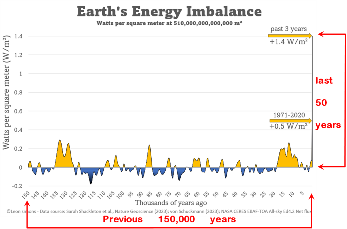
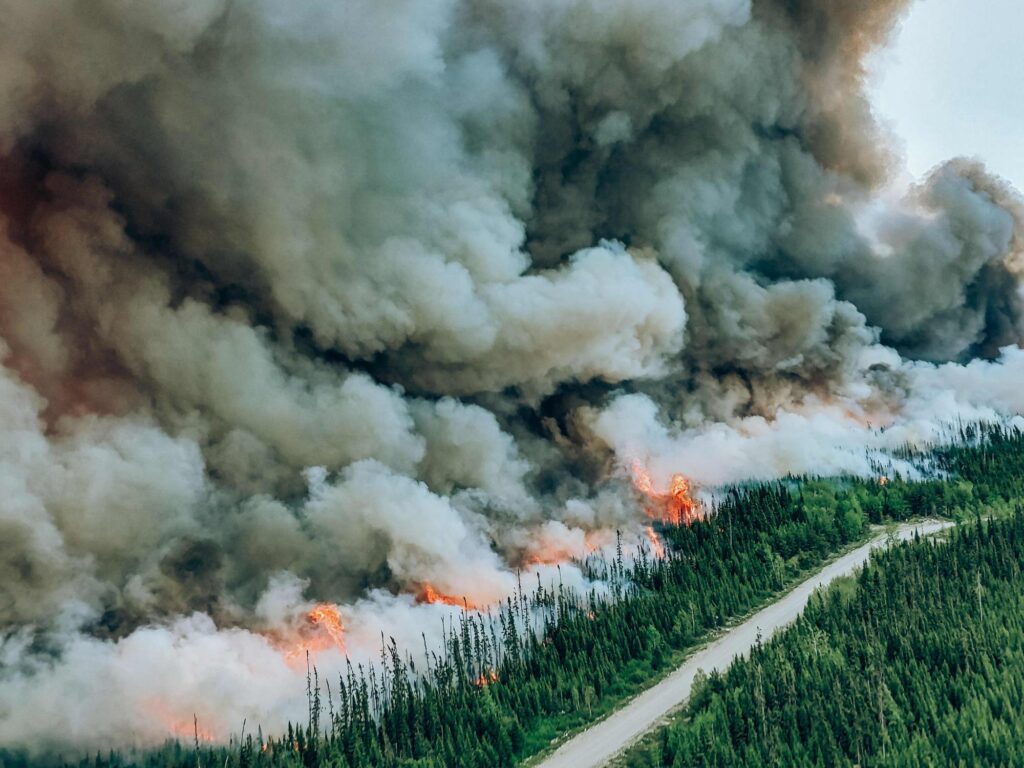
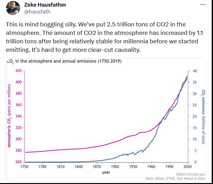
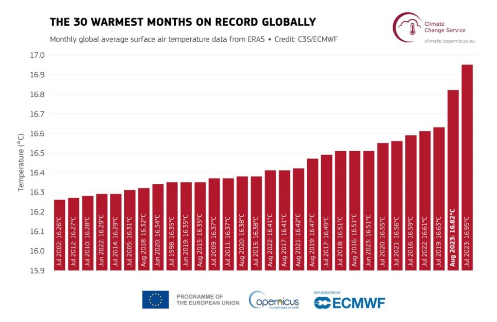
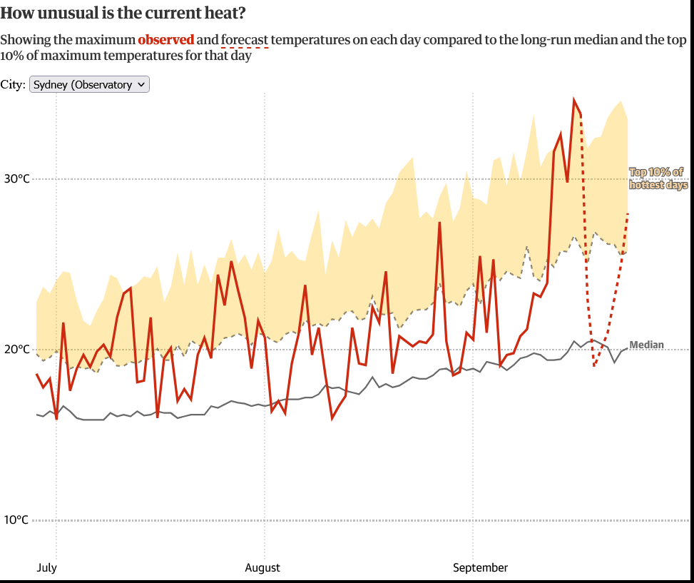
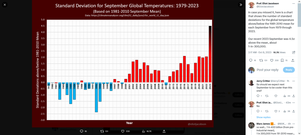
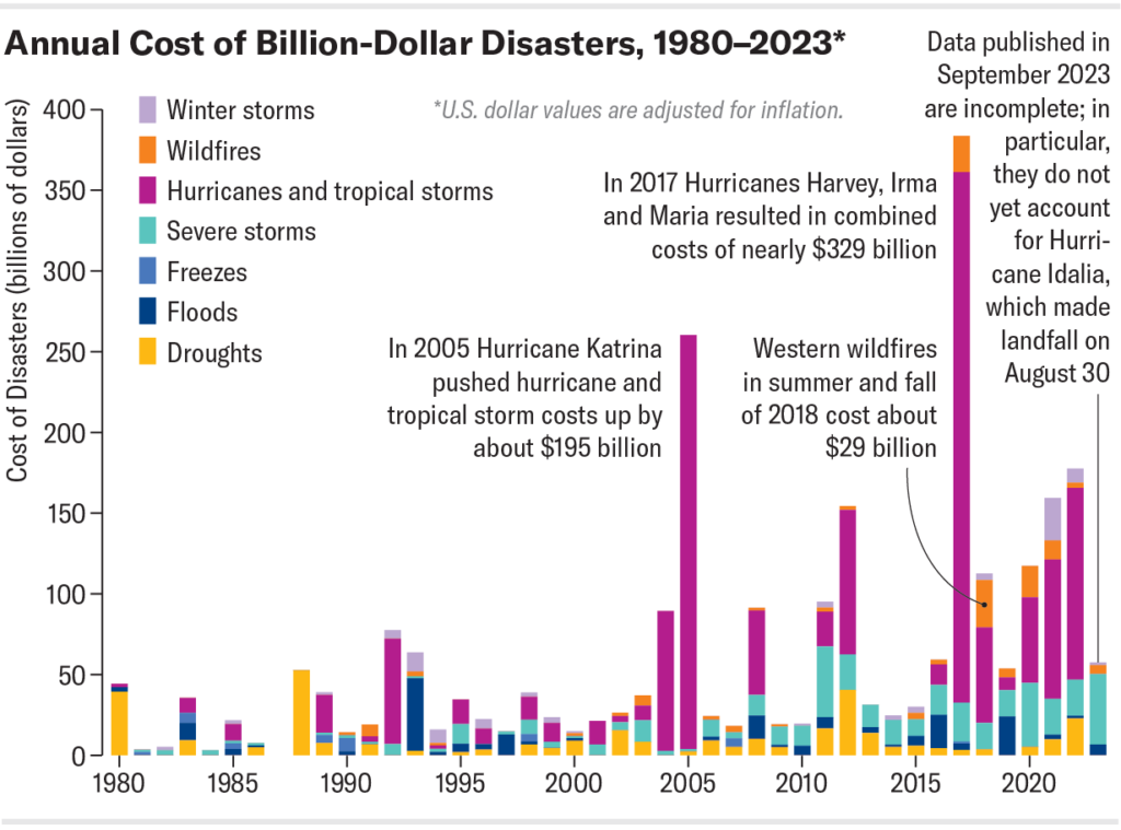

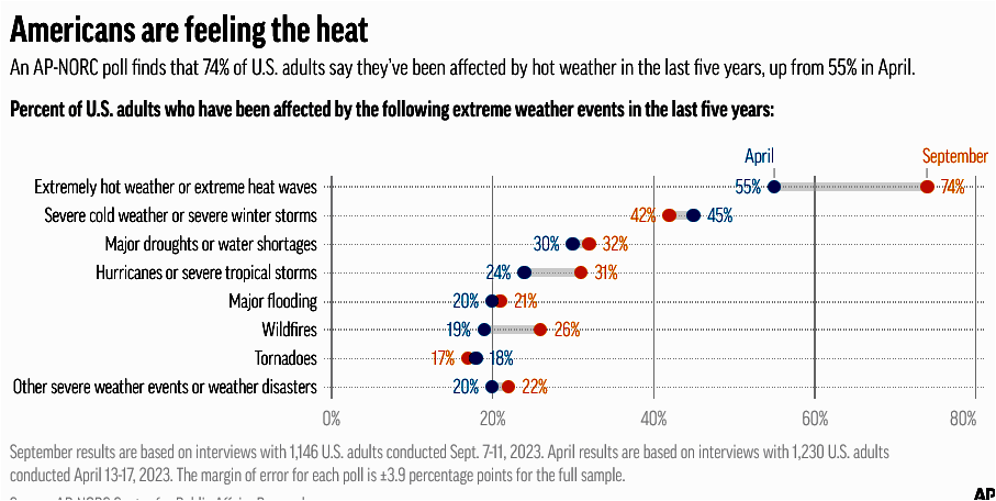
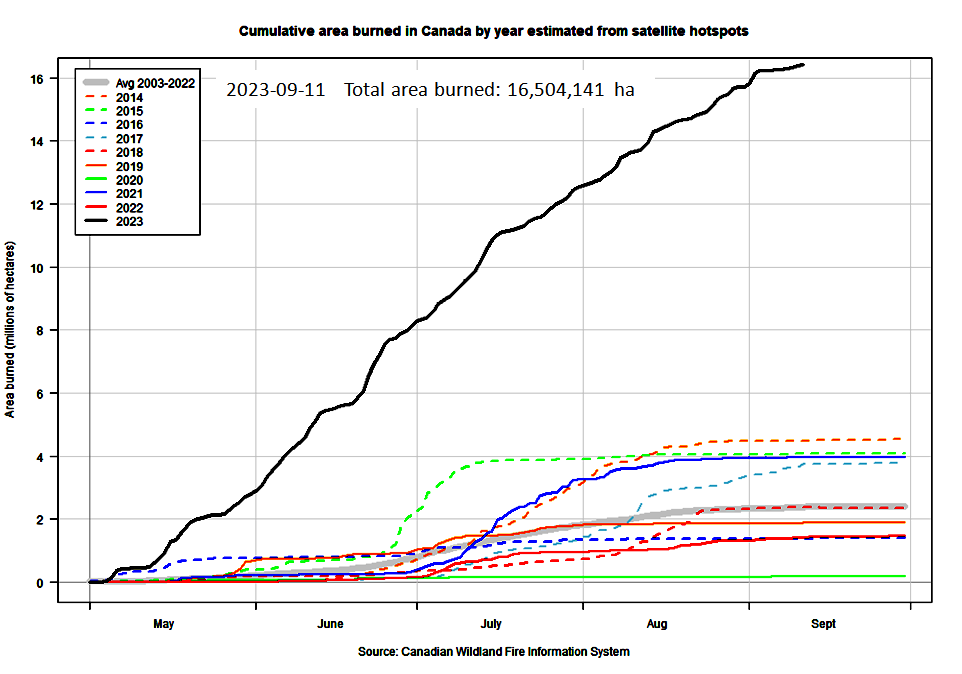
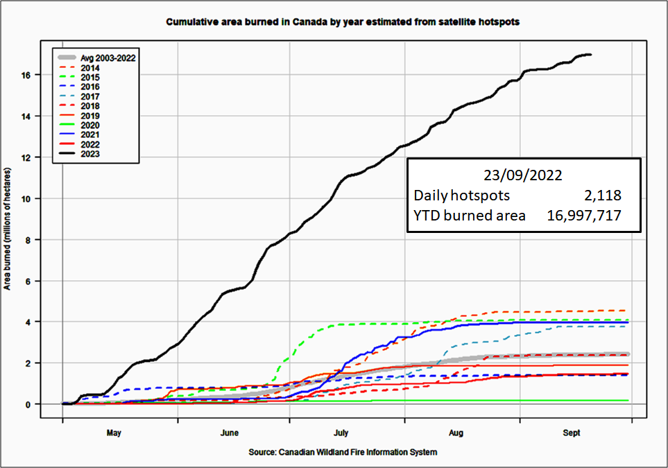
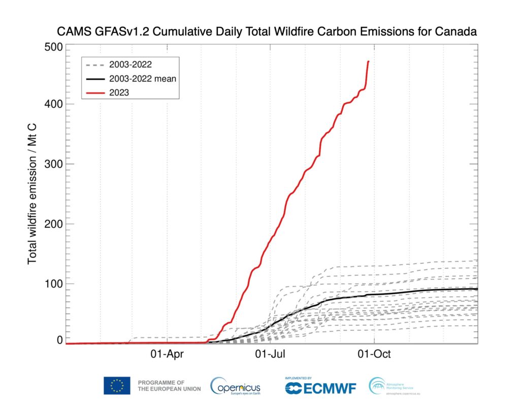
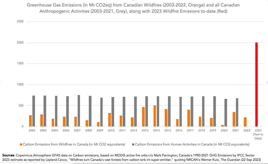
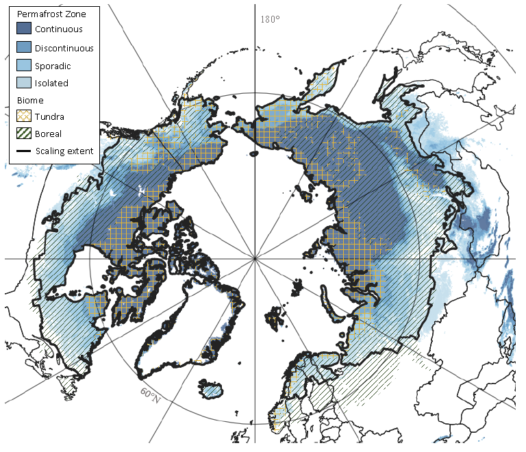
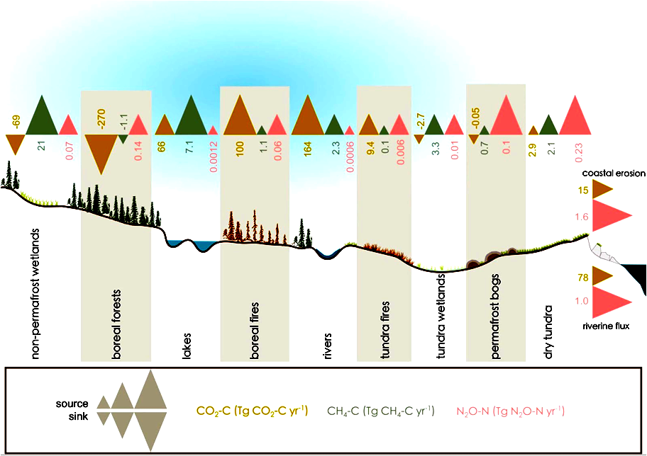
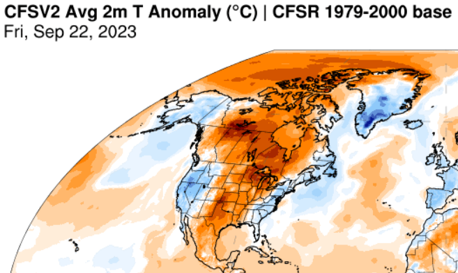
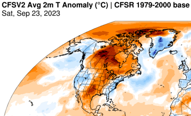
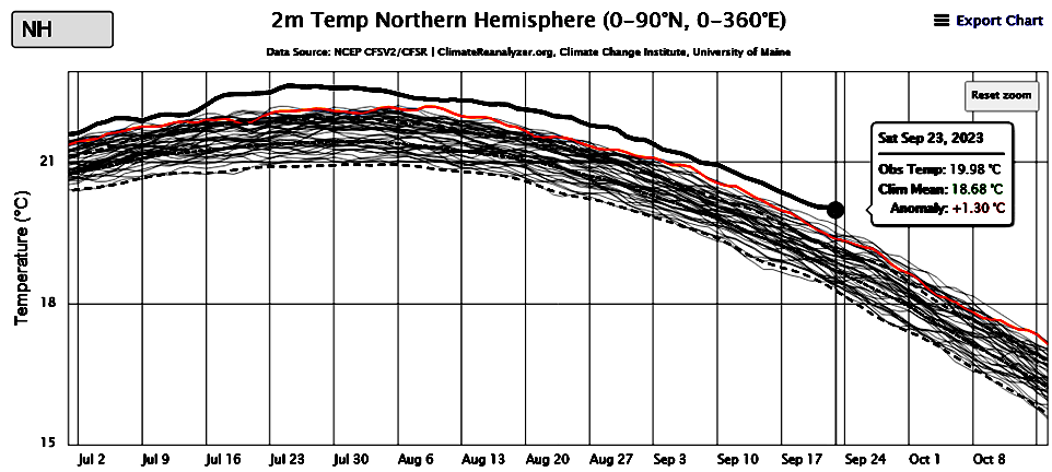
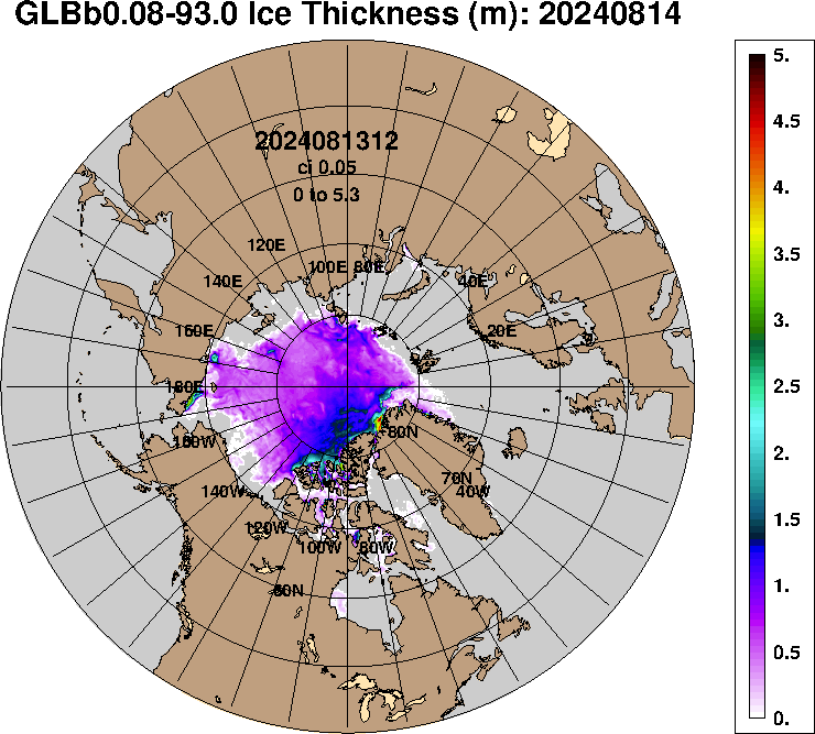
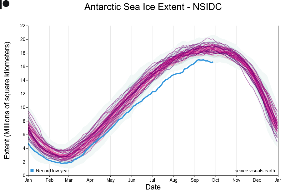
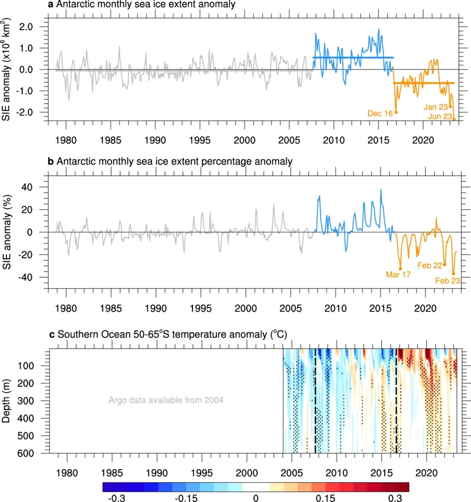
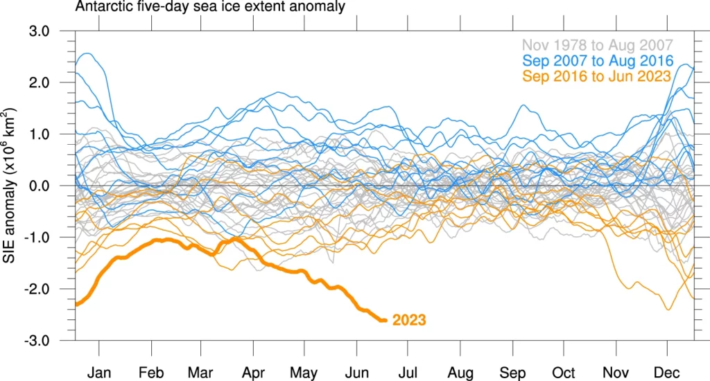
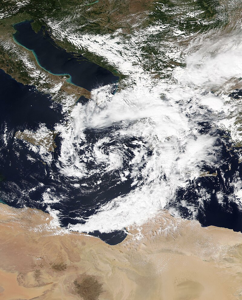
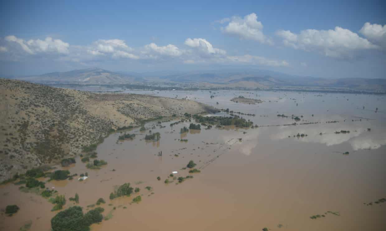
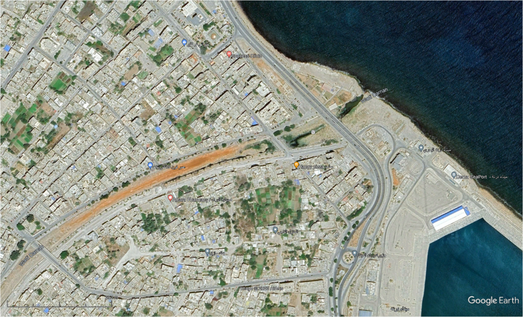
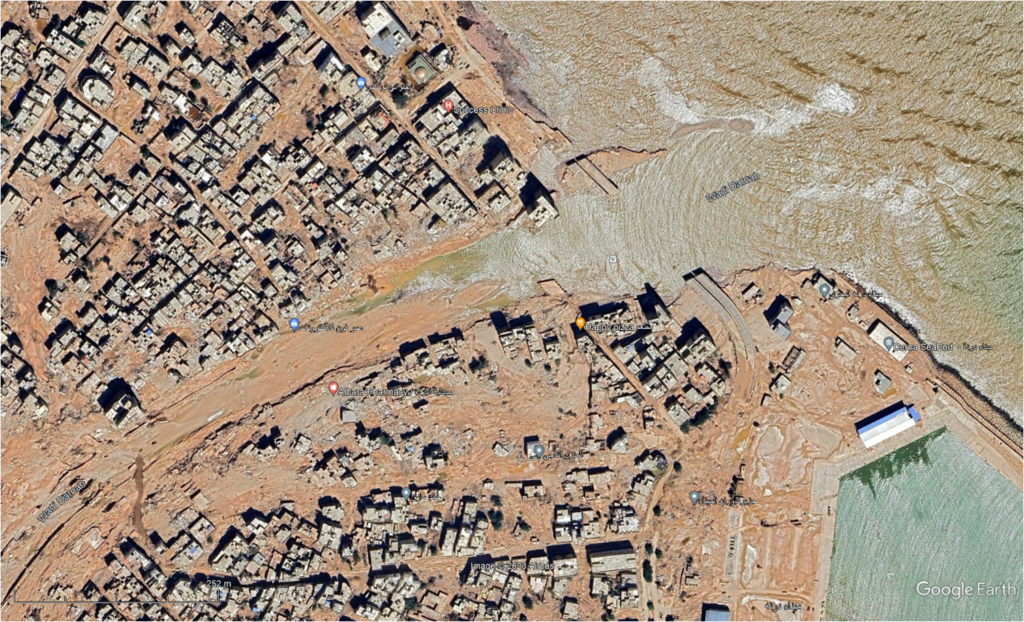
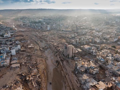
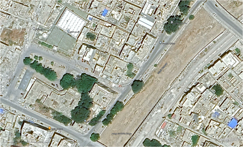
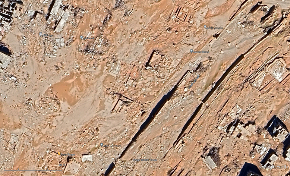
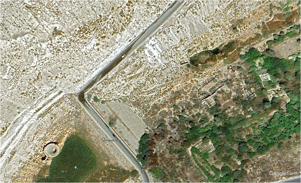
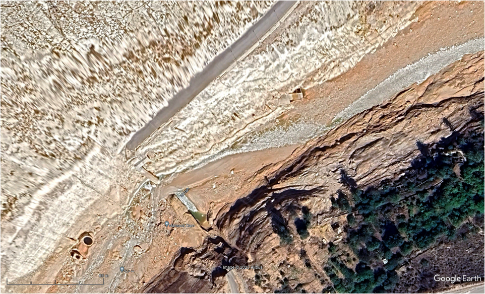
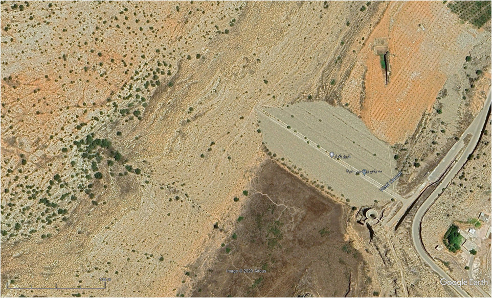
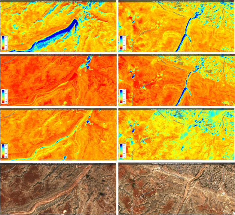
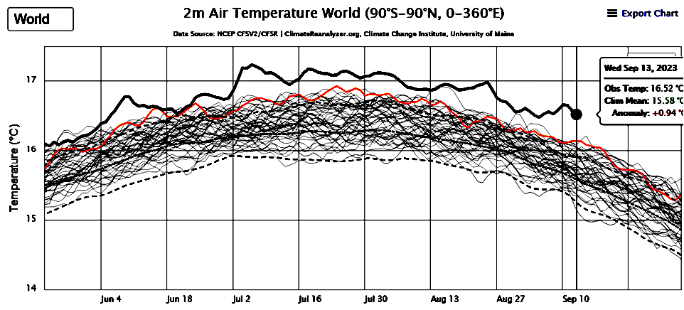
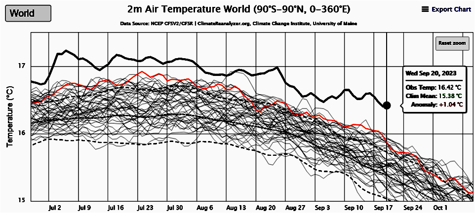
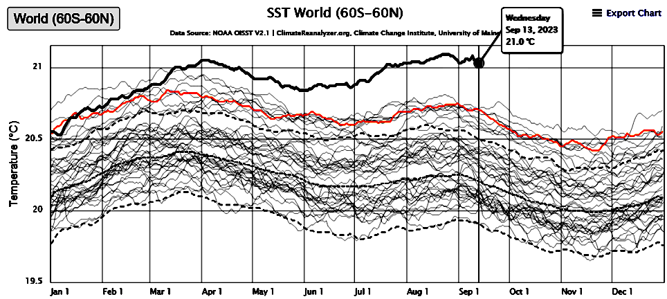
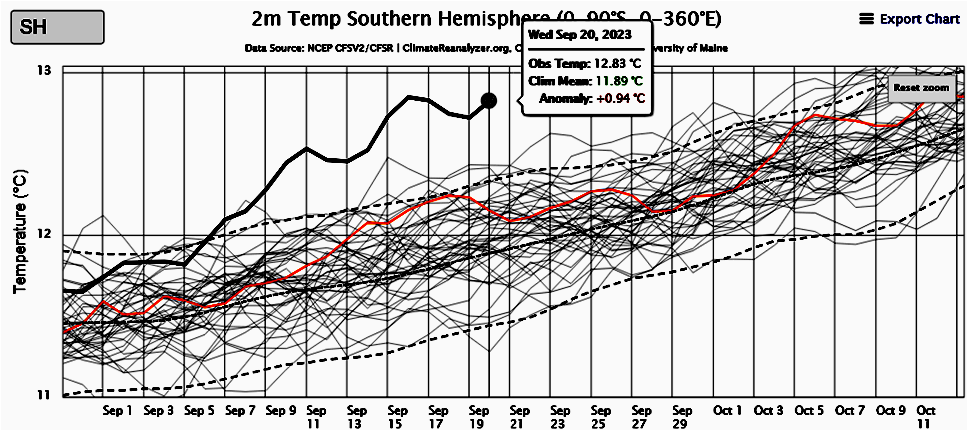
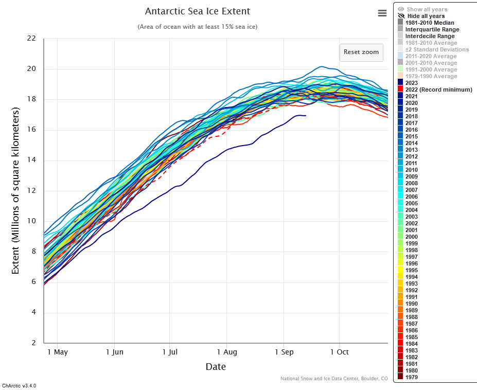
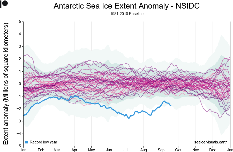
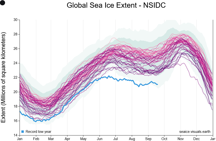
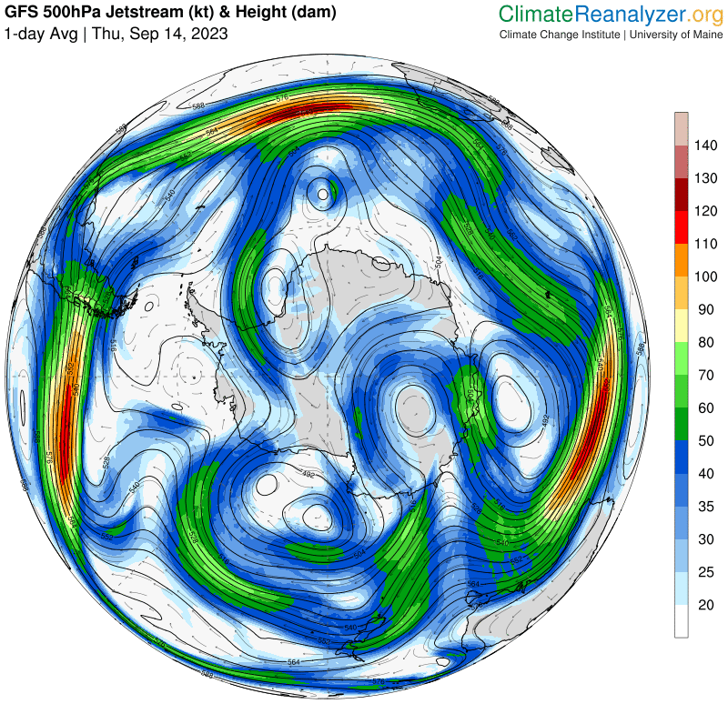
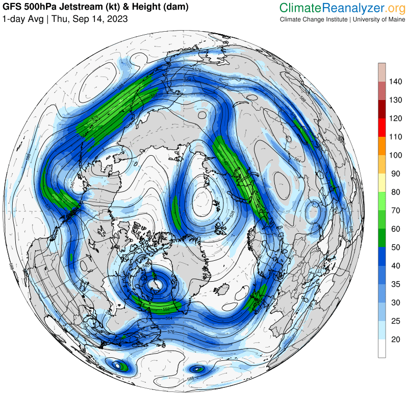
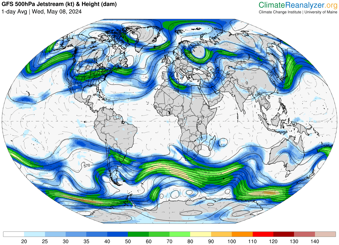
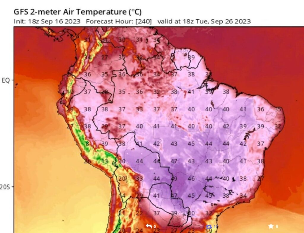
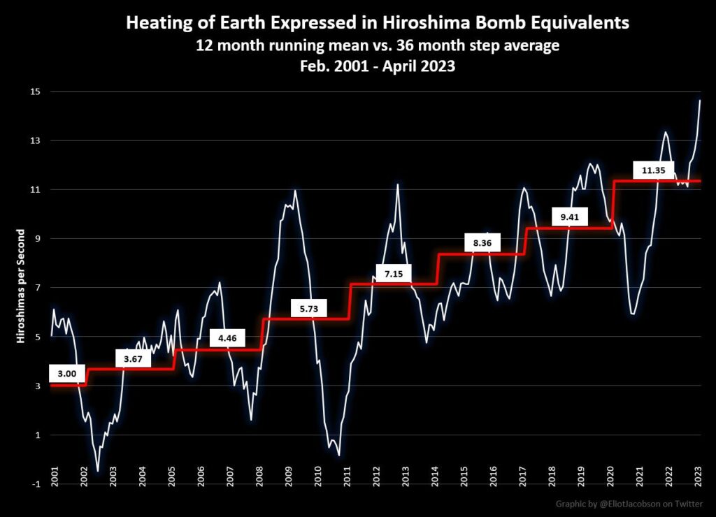
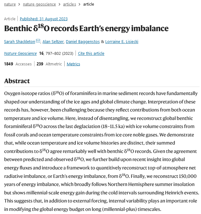
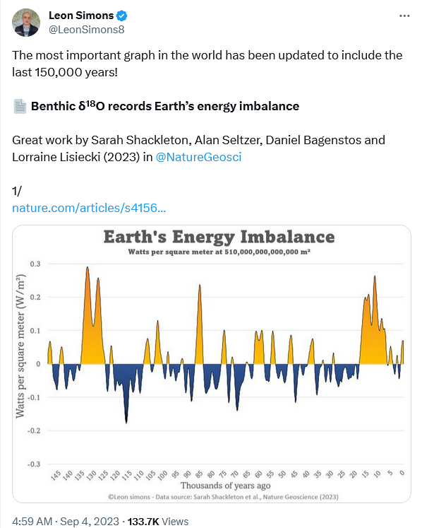
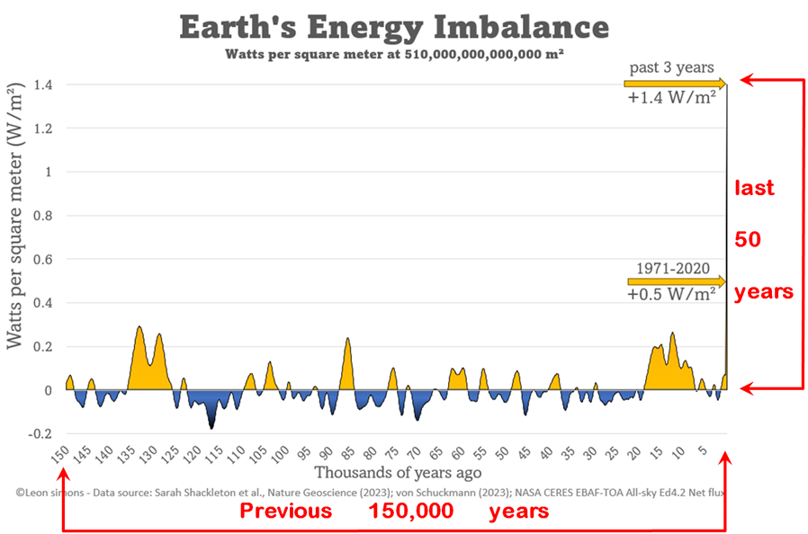
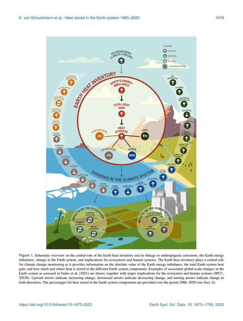
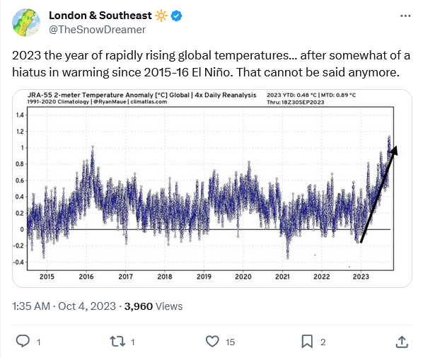
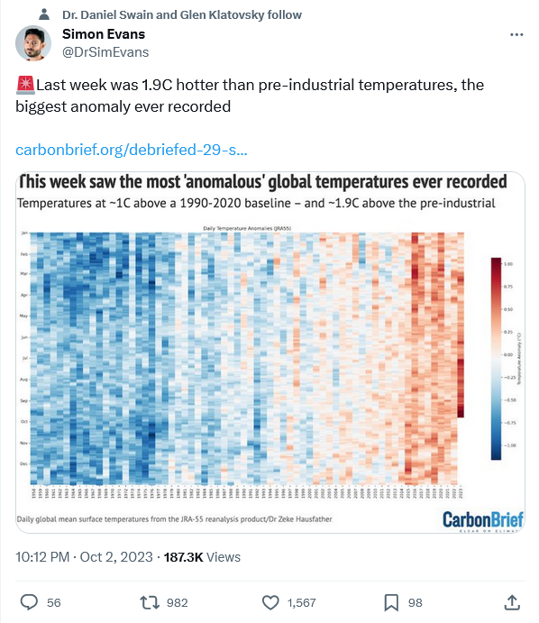
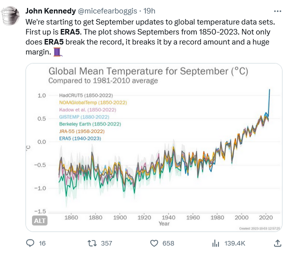
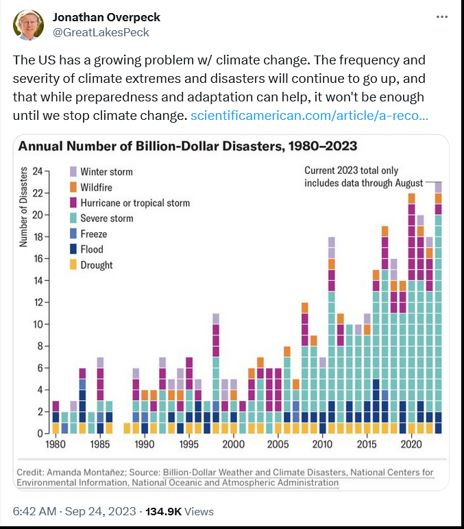
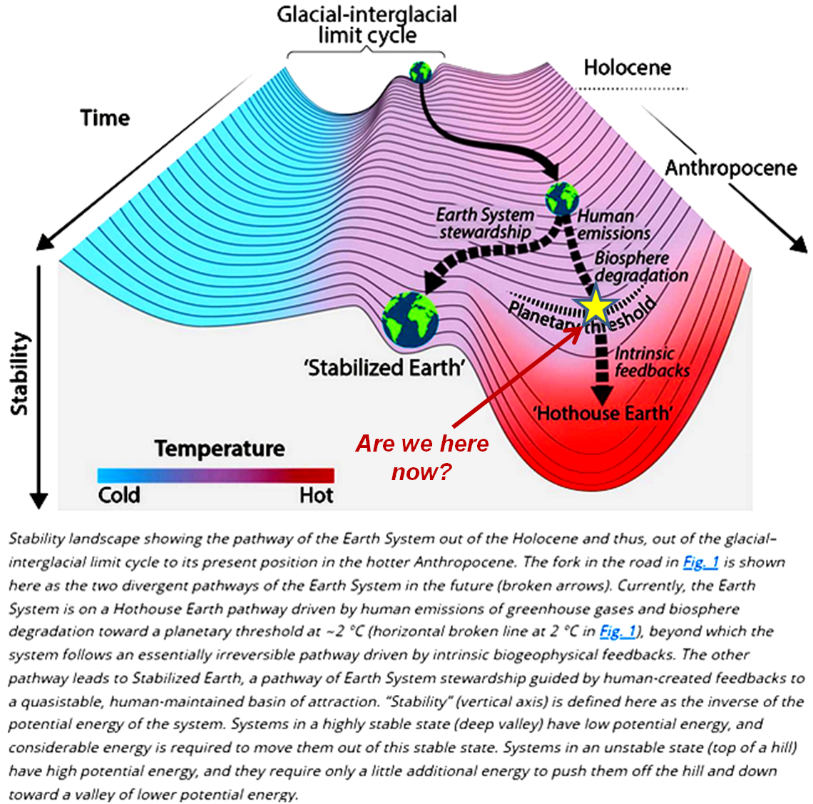

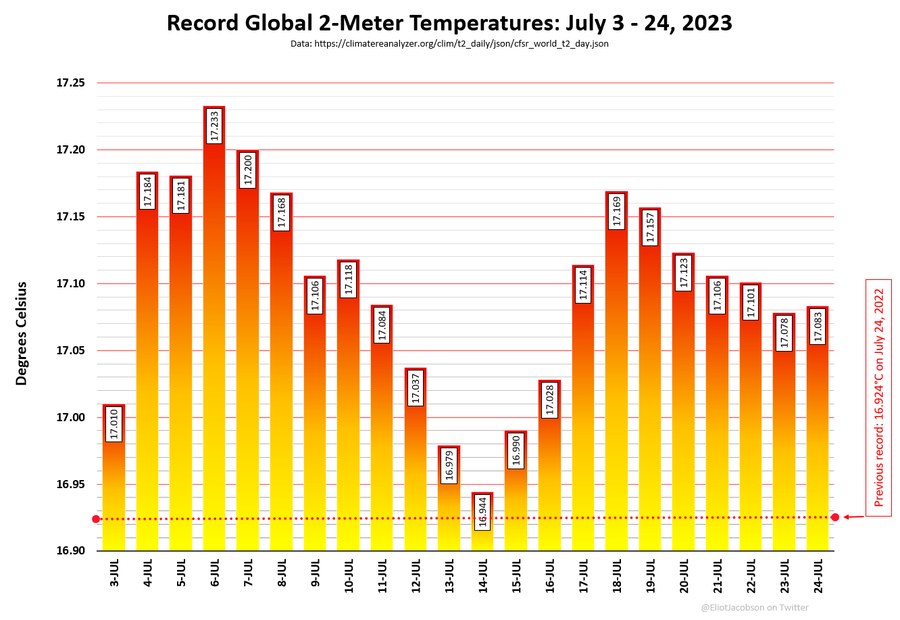

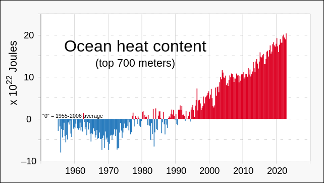
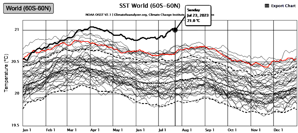


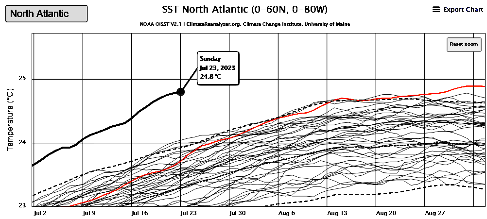

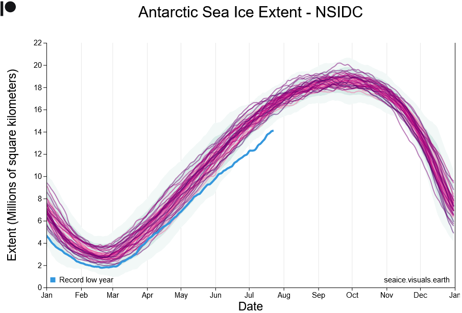
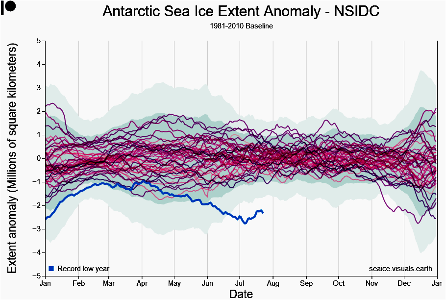
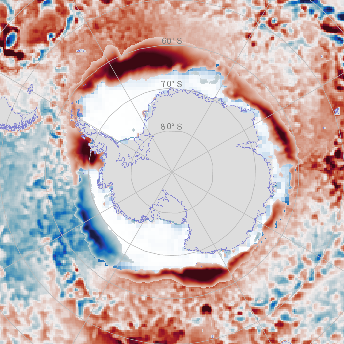

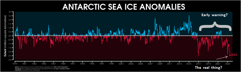

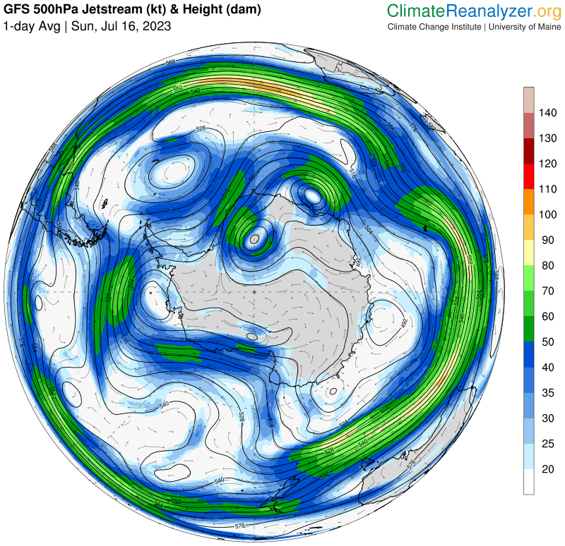
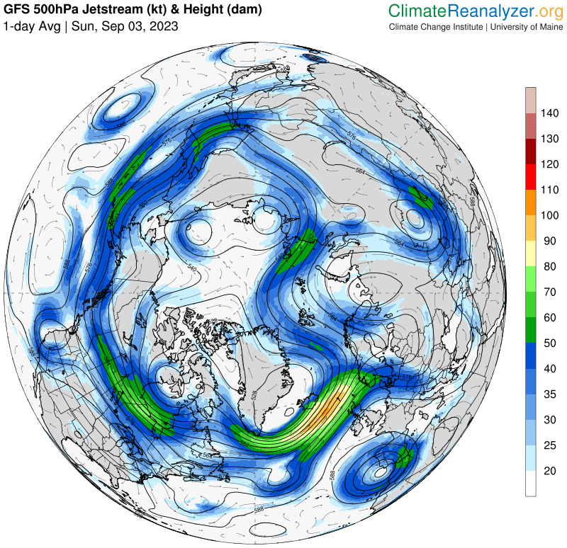
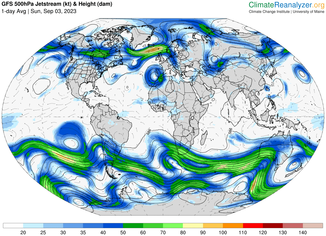
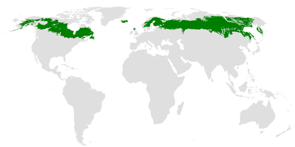
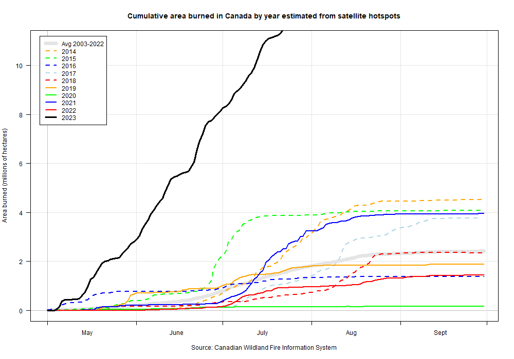
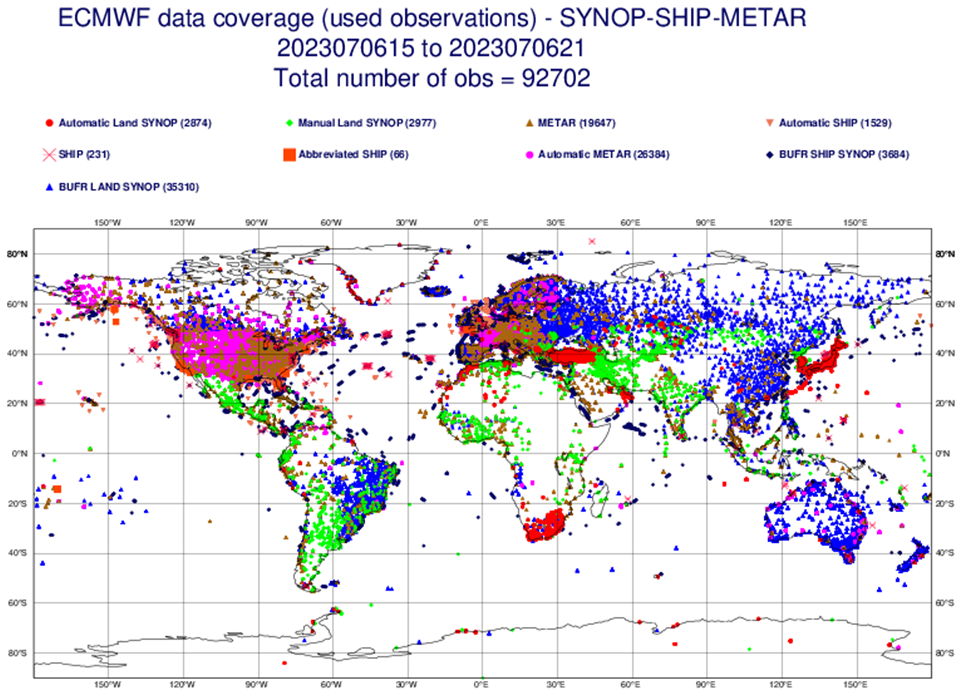
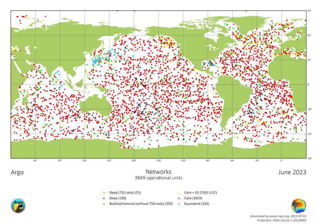
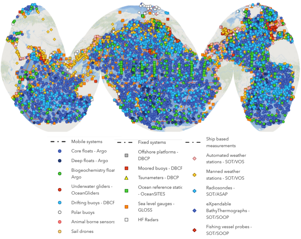
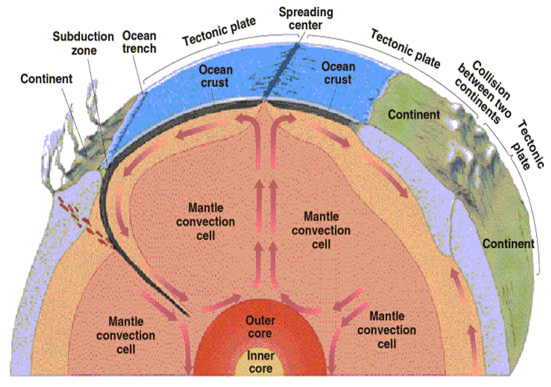

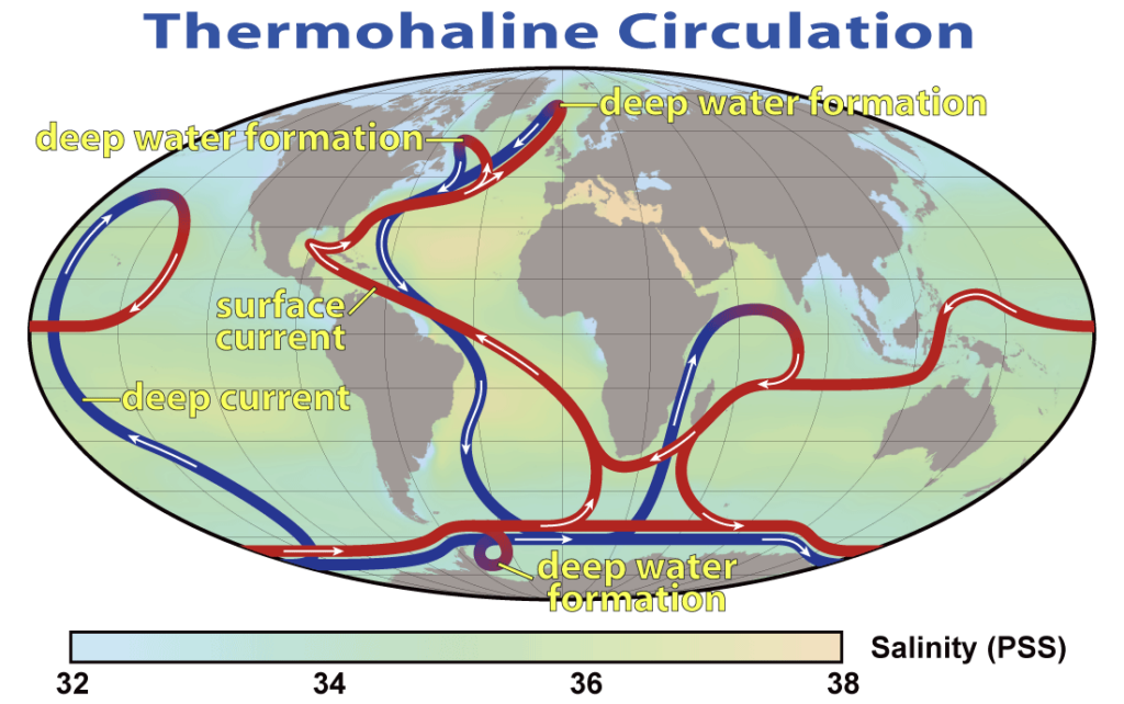
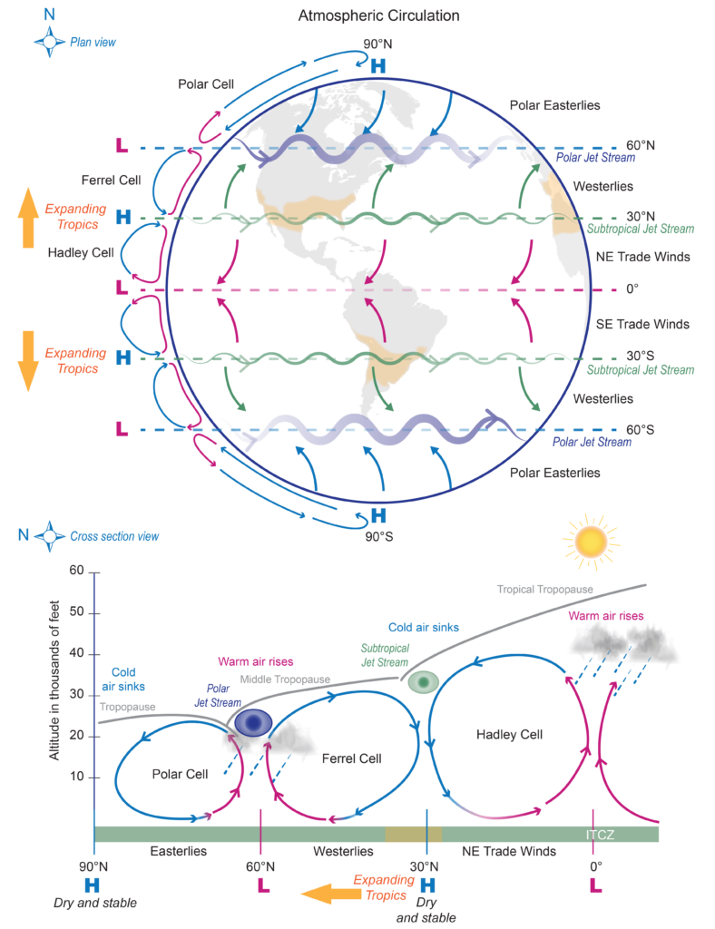
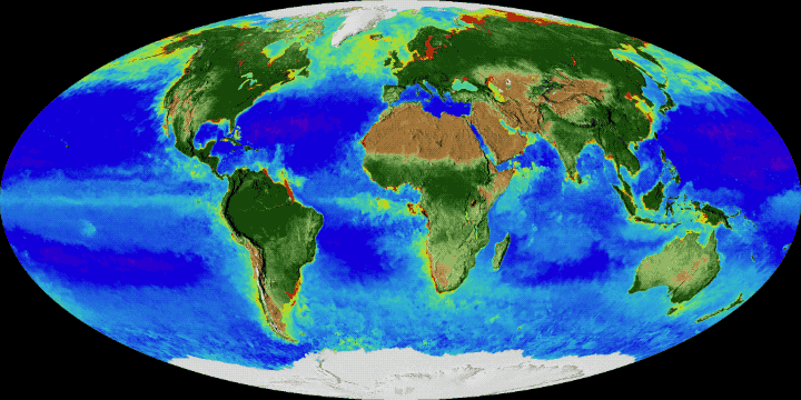
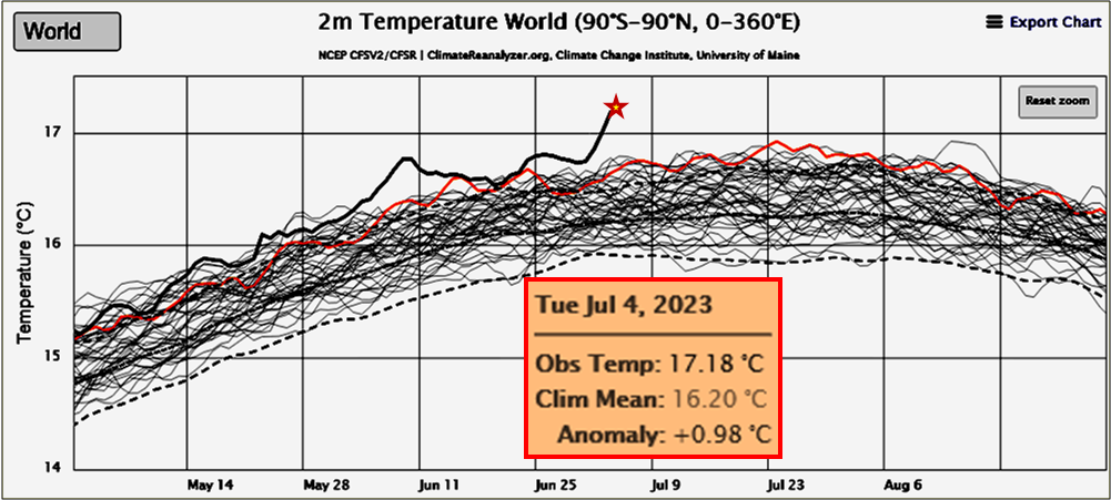
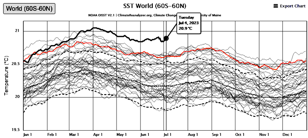
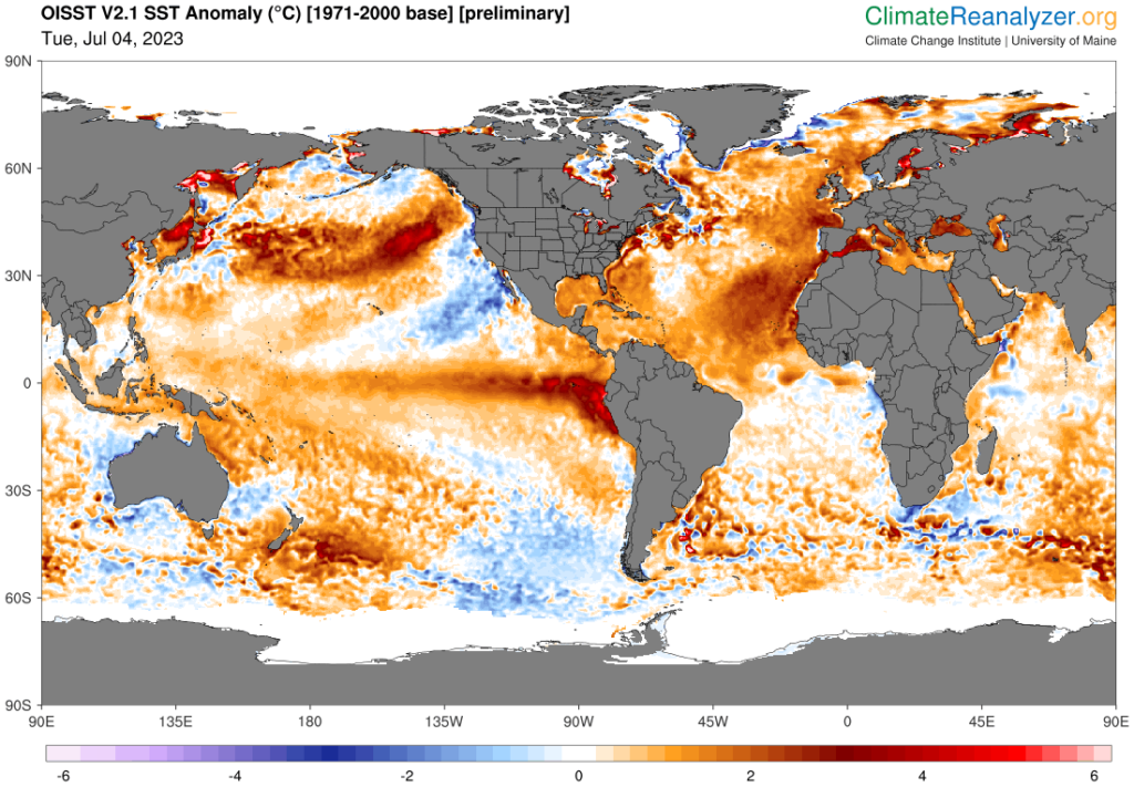
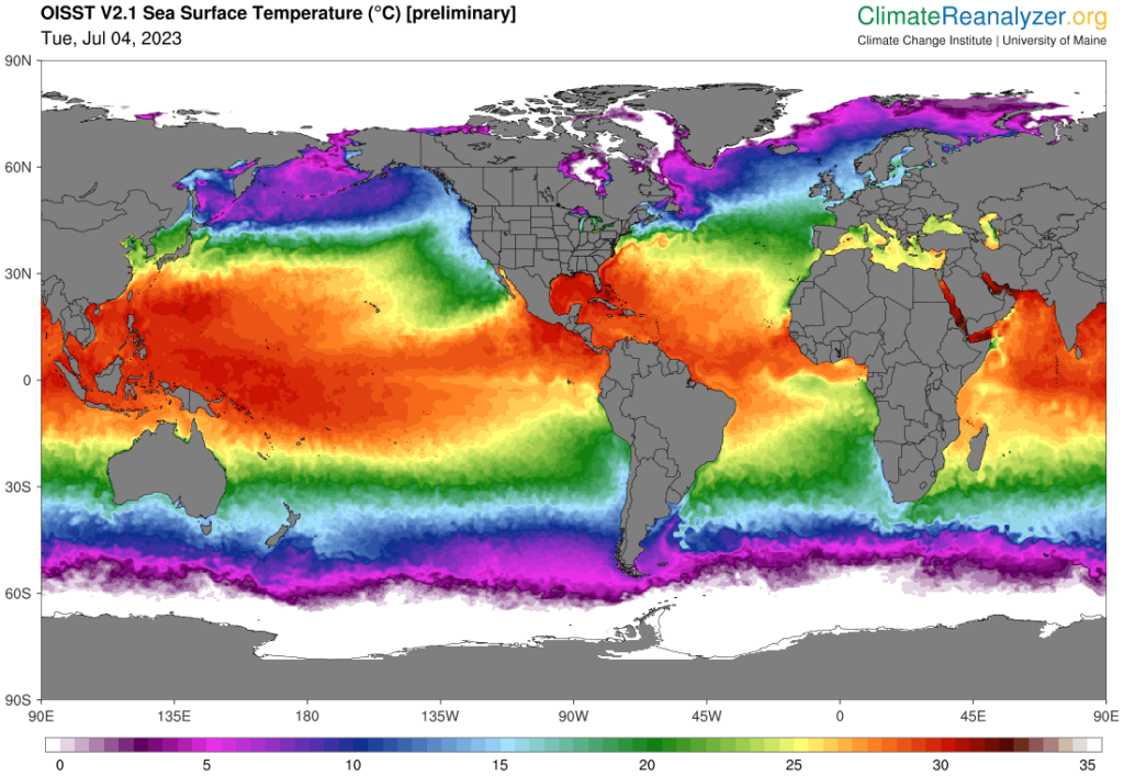

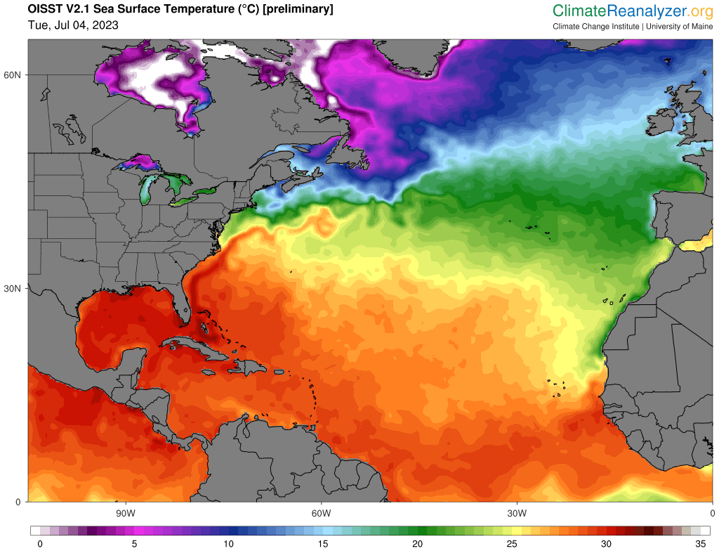
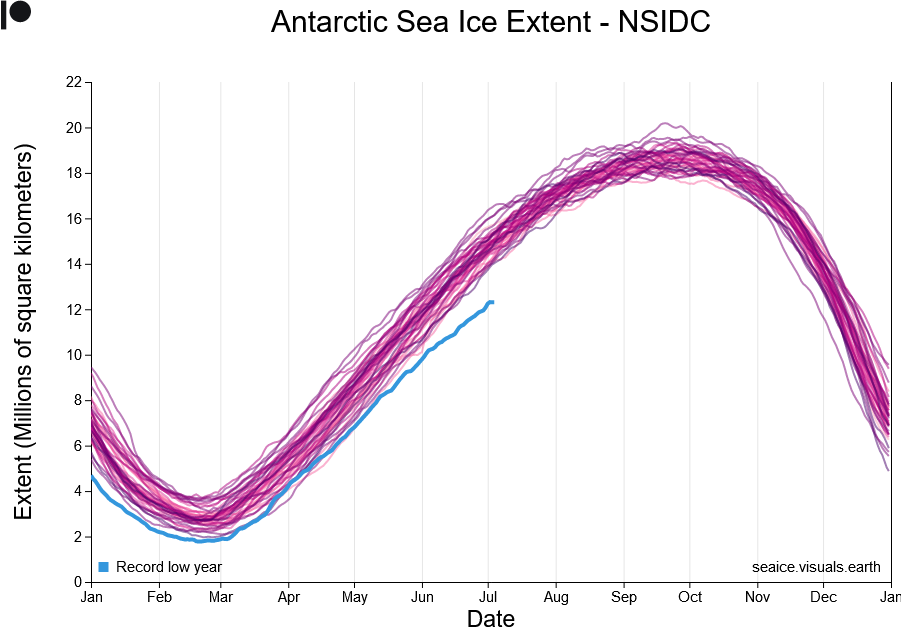
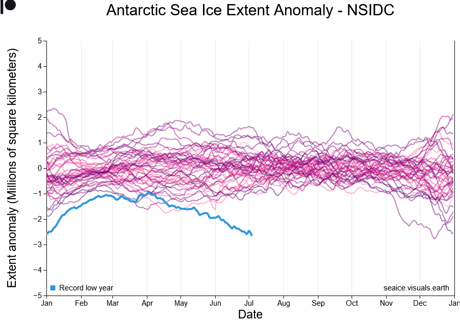
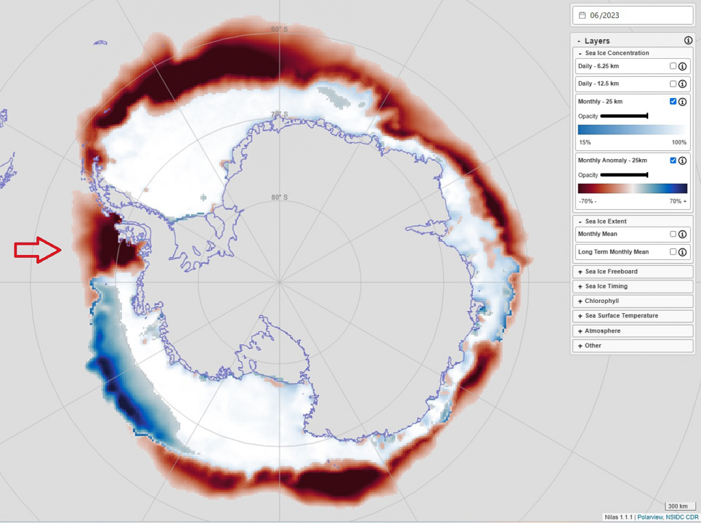
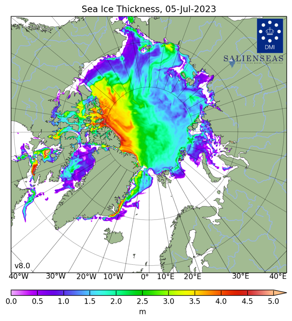
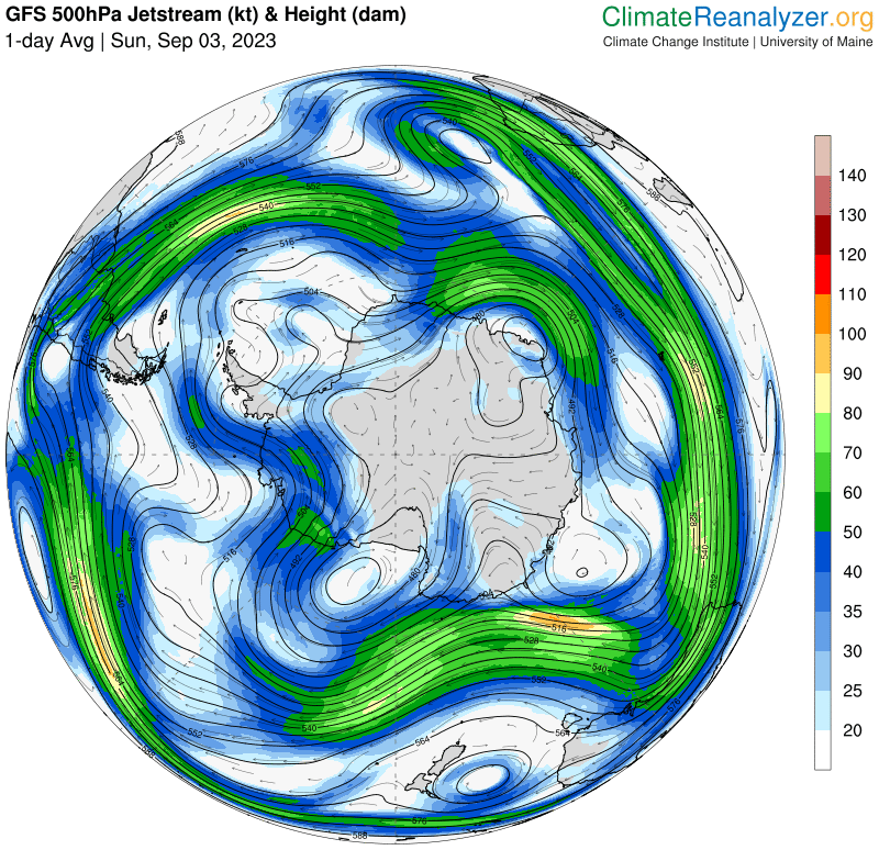
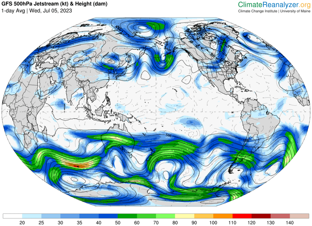
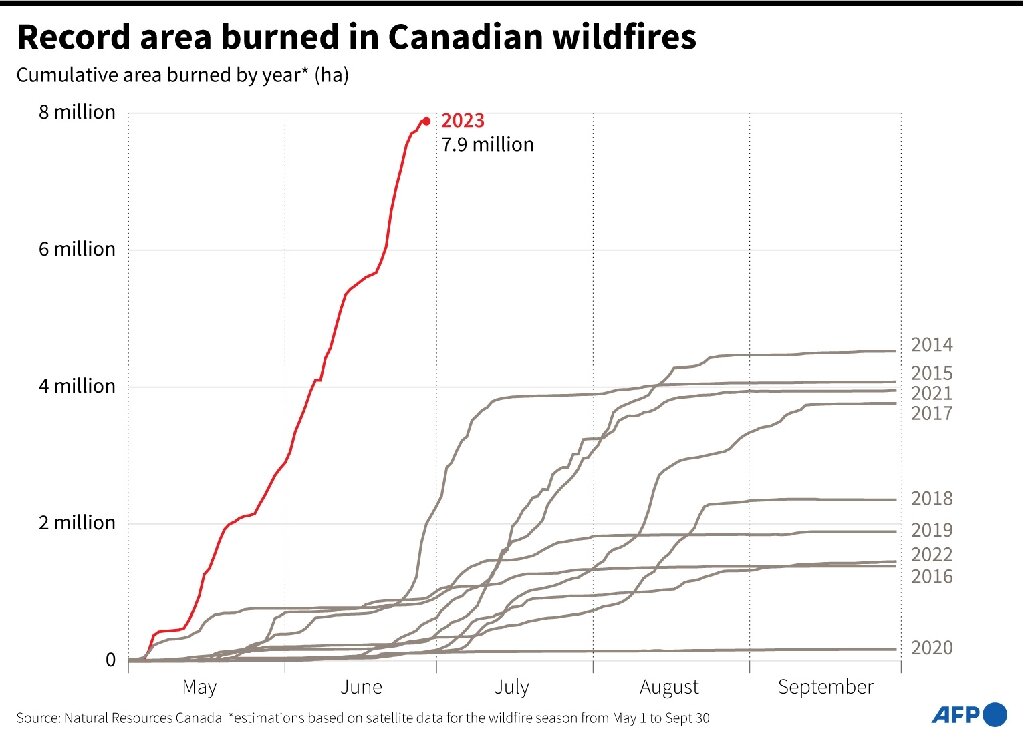
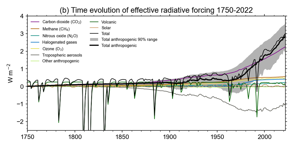
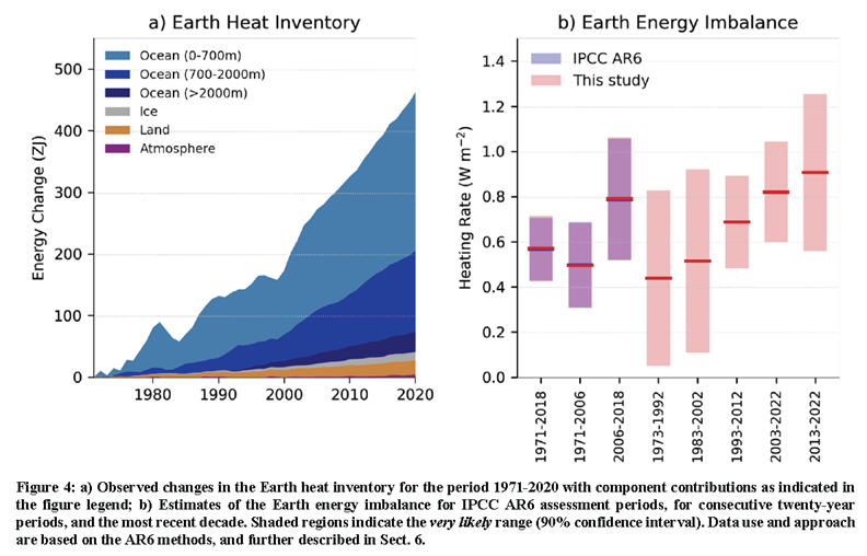
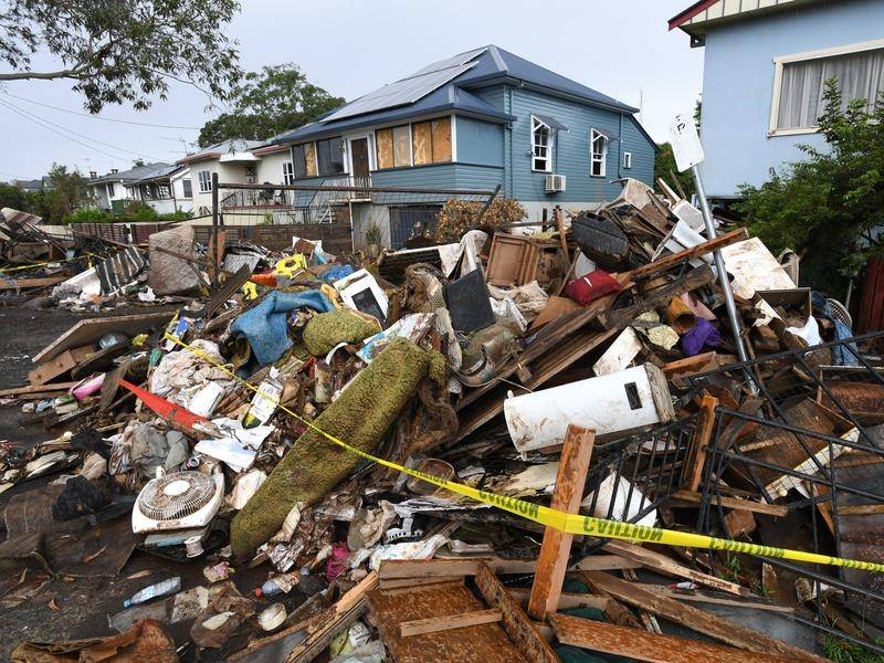
