If we don’t reverse the climate system’s growing energy imbalance it will soon drive us over the lethal fall into global mass extinction
ALL the global climate indicators are at or near all-time records so extreme that by September last year staid climate professionals have called the readings “gobsmackingly bananas.” — a phrase that is now in common usage in the climate science community. To some, the readings spell doom is nigh. But, here, i’m with the Guardian’s Fiona Katsaukas and her friend in the green shirt.
These gobsmacking records bear witness that Earth’s climate system has shifted into a new kind of rapidly evolving climate regime that is not encompassed or anticipated by existing climate forecasting models (at least not before 2050…). Every month since September has set new, still more extreme records.ALL the global climate indicators are at or near all-time records so extreme that by September last year staid climate professionals have called the readings “gobsmackingly bananas.” — a phrase that is now in common usage in the climate science community. These records bear witness that Earth’s climate system has shifted into a new kind of rapidly evolving climate regime that is not encompassed or anticipated by existing climate forecasting models (at least not before 2050…). Every month since September has set new, still more extreme records.
In 1985, the renowned planetary systems scientist and cosmologist (also one of the best communicators of hard science to the public the world has known), Karl Sagan addressed the U.S. Senate Environment and Public Works Subcommittee on Hazardous Wastes and Toxic Substances hearing on the greenhouse effect to explain the then scientific understanding of global warming. The 17 minute video on YouTube of his speech is extracted here by C-SPAN. C-SPAN also has the full 2 hour, 24 min video of the hearing. I mention this to triply underline the fact that the science of global warming and its consequences was already clearly understood four decades ago. The only fault in Sagan’s exposition is that the predicted dire consequences are happening sooner than he anticipated. This is still a common problem in climate science today where most climatologists trained in maths or physics still fail to appreciate the importance of fundamental non-linearity and chaos of complex dynamical systems like climate. The existential emergency Sagan predicted for the latter half of the 21st Century has already started now.
Because the [greenhouse] effects occupy more than a human generation there is a tendency to say that they are not our problem. Of course, then nobody’s problem, not on my tour of duty, not on my term of office… It’s something for the next century. Let the next century worry about it. But the problem is that the greenhouse effect is one of them which have long time constants. If you don’t worry about it now, it’s too late later on; and so in this issue, as in so many other issues, we are passing on extremely grave problems for our children when the time to solve the problems if they can be solved at all is now.
Carl Sagan, 1985, transcribed from C-SPAN video [2:30-3:15]
Today’s screams heard now from continually breaking climate records are the realities anticipated 39 years ago in this address;
In my “Feb. 2024 climate extremes” report (published March 12) I review the records as they were being broken in the February peak of the global climate cycle. I am currently trying to finish an update on the first anniversary of setting continuous daily record high global sea surface temperatures. detailing the piling up energy flows through the climate system (as described by Sagan) from the time solar energy is absorbed in the climate system and is eventually emitted back to space in the form of infrared emissions leaving the Earth. I have posted the current state of the first part, “Considering the first anniversary of a new climate regime — Accelerating down the road to extinction in Earth’s Hothouse Hell?” in the Google Docs format (that everyone should be able to read). Completing this is difficult because many indicators are literally breaking records faster than I can write about them. The most important of these regularly breaking records is the daily average sea surface temperature (SST), which is the first place excess solar energy piles up in the climate system. On 9 May SST is still more than 0.1 °C above 2023’s 9 May record – the 423 day of continuous daily records. The graph below focuses mainly on the part of the years where this year’s record is on top of last year’s. Note that Sagan also predicted rapidly rising sea levels. Today’s Washington Post describes how the southeastern US is currently being affected by this rise (probably because hot water is being backed up in the slowing Gulf Stream).
However, so people can see the evidence that is driving us here in @VoteClimateOne to do what we can to fight the emergency, I have also been posting to X-Twitter, and I include a couple of samples here:
If not this year, the next 1 or 2 years will see Kim Stanley Robinson's million-death heat wave: The Ministry for the Future (https://t.co/6ifnrqiIzP). If we ignore this emergency and fail to totally mobilize to reverse Earth's energy imbalance before society collapses, we'll… https://t.co/4eKQiB9Egypic.twitter.com/TBAblGHNtf
Copernicus offers no good news. Their news is amplified by a small sample from other sources. Global mass extinction (including us) is virtually certain unless we reverse the energy imbalance. However, given that humans created the climate crisis with 19th-century tech, we should… https://t.co/GxBU3LXd67pic.twitter.com/u9xdLI8iHI
As ever increasing numbers of climate scientists and aware commentators are crying out that it is time to sound the emergency alarms and urgently mobilize to fight the global emergency while there is still some chance that with our far greater knowledge and more powerful science than Sagan knew about (he suggested that by now it would be too late to stop the inevitable catastrophic end), it might still be possible for us reverse the solar energy imbalance that is rapidly driving our planet’s temperatures towards runaway feedbacks that will ensure global mass extinction is truly under way before the end of the 21st Century.
Another new fact in today’s in box hit me in the face. The record high rate of increase in CO₂ causing a majority the backup of the solar energy that is cooking us is still ACCELERATING UPWARDS at a record high RATE OF ACCELERATION. To me this suggests that runaway warming driven by positive feedbacks with temperature has well and truly started. ‘Natural’ emissions are already coming out of the ground, permafrost, wetlands, forests, and oceans faster than we are reducing fossil fuel emissions.
I’m like the girl in the green shirt in Katsaukas’s cartoon. I think it is well and truly time to sound all the emergency alarms and start total global mobilization to fight the crisis. My knowledge and experience tell me that if enough of us are willing to accept the reality of the danger and work together as a disciplined emergency force, we have sufficient knowledge and technological prowess to turn off the road to extinction and find some way to sustain at least some of the living world we know today.
Born in 1939, I’m old enough to remember living in a blacked out house in Los Angeles, and then the successful ending of WWII in 1945 little more than 4 years after America mobilized and joined the war at the end of 1941. At least in 1941-42 Americans managed the kind of mobilization we need today. I think we might still be able to defeat the runaway warming enemy if we start soon enough and fight hard enough to find a place in a still sustainable biosphere. On the other hand, I’m as close to certain that if continue to avoid looking at the grim and (for some) terrifying reality in hopes of continuing with business as usual, we will be burning up in the midst of the worst global mass extinction (i.e., even worse than the End Permian extinction ~ 250 million years ago).
As well as learning about global mass extinction when I learned to read from my father’s university textbooks in geology and paleontology, I grew up in navy towns started university as a pre-engineering student before changing my major to zoology and earning my PhD in evolutionary biology as well as teaching a variety of genetic, organismic, systems and population biology courses. I also worked professionally as a radiation ecologist and for the last 17 years before ‘retiring’ I designed a variety of documentation and knowledge management systems for Australia’s then largest defense engineering company. There, my systems helped ensure the on-time, on-budget completion of the ~7 billion $AU ANZAC Ship Project. (This is one of the very few large defense projects in world history that did not end up years overdue and billions of dollars of cost overruns, thanks in good part to systems I designed specifically to solve the kinds of management and engineering change issues that defeat most large defense projects). Finally in retirement I have spent some 15 years researching and writing on the coevolution of humans and our technologies prior to deciding that doing what I could to address the climate crisis was far more important than finishing a book for a society doing nothing to save itself from extinction.
In @VoteClimateOne.org we have thought a lot about what we can do to help the mobilization. It is clear that most governments in the world today are being run by fools, useful idiots, or puppets owned and led by already insanely rich fossil fuel and other special interests will do or say almost anything to gather more wealth. Political party discipline means that a majority government can be controlled by a handful of ‘strong’ party members and functionaries in leadership roles. For example, in Australia, the supposedly ‘climate friendly’ Labor majority government has just demonstrated its fealty to its puppet masters over effective climate action.
@VoteClimateOne.org has a two-pronged approach to try to change governments into supporters and even leaders of the climate emergency mobilization effort.
Given how urgent the need for action is, we hope to convince the puppets and other blockers that climate action is far more important and urgent than whatever benefits they gain from catering to the desires of their patrons and masters. However, this will take a massive effort – much more than just supplying truthful information that is easily ignored or actively denied. Minds might be changed if enough people piled on each and every recalcitrant parliamentarian – but this would take the concerted action of a large number of climate and environment action groups that has to this point not been forthcoming.
The other prong in the spear, is to actually replace enough of the recalcitrant parliamentarians with progressive community representatives or small party members who truly understand and accept the crisis and the need for action; and who are willing to put in the effort to get elected — to prevent either major party from forming a majority government. Not only will there be more sensible and effective parliamentarians, but any party forming government will have to listen to and compromise with genuine community representatives to do anything, even if this requires them to mobilize an effective climate action.
Our home page, ACT NOW, and TRAFFIC LIGHT VOTING explain how this all works, and provides examples of how we have addressed past elections. Hopefully all voters will have the chance to see and think about what these pages have to offer, and inform their voting decisions with the climate crisis in mind. As elections approach, CLIMATE SENTINEL NEWS will be providing frequent updates on the state of the climate and relevant political news.
Our grandchildren tell us all to “vote climate one” so they can have a happy future rather than the descent into Earth’s hothouse hell (like Sagan and most climate scientists until the last few months, the authors of the referenced paper have overestimated just how much time we have left for effective action).
WE MUST BEGIN ACTION NOW!
Views expressed in this post are those of its author(s), not necessarily all Vote Climate One members.
2023 set new planetary extremes as our activities force global temperatures ever higher on the way to mass extinction. 2024 looks even worse! Soon humans will no longer be able to survive in the climate we are forging.
My featured image of the state of Earth’s oceans up to February 1 is already dated (see below). The world’s sea surface temperature is still rising and setting new records every day since 14 March last year and is within 4 days of overlapping last years’ unbroken sequence of record days.ClimateReanalyzer – updated daily – shows global average Sea Surface Temperatures for every day since Sept 1, 1981. (This web page also provides links to details on the methodologies used to compute these values.)
The implications of these observations is truly alarming when placed in the context of Earth’s climate system. Emergency mobilization of global action is required if we are to have any hope of avoiding the existential consequences of runaway warming that may have actually started. This level of action will require many individual sacrifices that governments and people prefer not to think about and will be reluctant to make. However, history shows (e.g., mobilization for WWII)1 that humans can and will unite and act if the reality of the threat is accepted and taken seriously.
What follows is no hoax! It is how universal physical laws work in the real world of our planet. Ignore the evidence at your peril, or accept reality and work to survive the impending apocalypse foretold. As will be explained, my featured image announces the existential threat all humanity faces from global warming – currently being largely ignored by politicians, press, and citizens.
March 13, 2024, when this year’s continuous all-time record heating builds on top of last year’s continuous-all time record heating, should be taken as our “Pearl Harbor Day“.
Figure 1. Daily Sea Surface Temperature as at 23 Feb. 2024, (from ClimateReanalyzer). Kuhlbrodt et al. A glimpse into the future: The 2023 ocean temperature and sea-ice extremes in the context of longer-term climate change. Bull. Amer. Met. Soc. (17 Jan 2024) says the following about this data: “The extraordinary magnitude of the joint SST and sea-ice extent extrema in 2023 calls for a community effort to quickly identify their drivers. This is urgently required for updating impact assessments of extreme weather on ecosystems and climate services, but also for ensuring that climate and Earth System models are fit for purpose in predicting the magnitude and frequency of extremes. As a starting point for analysing these drivers, we posit in this Essay that strong multiannual and decadal trends in Atlantic ocean temperature and salinity might contribute to these extrema through rapid warming of the ocean’s top layer, and that they could point to large-scale oceanic circulation changes.”
Hot oceans drive many potentially catastrophic changes to planetary climate.
Earth’s accelerating energy imbalance
Earth oceans are warming at a geologically prodigious rate that we can clearly see major changes in a human lifetime (Figure 1). This is because oceans are being flooded with excess energy much faster than they can lose it. The rising temperature has dire consequences. However, before presenting the consequences of ocean warming, we should understand what is causing the warming.
The average surface temperature of our planet (i.e., the biosphere) is determined by balance between the amount of (heat) energy it receives from all sources versus the amount of energy it loses to outer space as radiant heat.
The vast amount of energy received by the biosphere comes directly from the Sun, as “radiant energy“, mainly in the form of visible light. This varies only slightly over time, due to astronomical factors. There are also two very minor internal sources (“internal energy“) left over from Earth’s formation billions of years ago that I mention for completeness: (1) the decay of radioactive elements in the Earth’s body and (2) the residue heat from the conversion of gravitational potential energy into heat as our planet formed by condensation of small part of the solar nebula that also gave birth to the Sun. This internal energy, brought to the surface from below by conduction and volcanic activity, accounts for only about 0.03% of the total energy warming the surface.
Given that vacuums cannot conduct heat, and that gravity stops particles from carrying away energy (i.e., convection), the only way Earth can lose heat is by radiation. All objects warmer than absolute zero, including Earth, lose heat by “black-body” radiation. Objects close to absolute zero lose energy via microwave radiation. As the object’s temperature rises heat energy is able to escape at shorter (more energetic) wavelengths – with a growing percentage of energy at these shorter wavelengths. E.g., hot iron may be ‘red hot’; molten iron is literally ‘white hot’. The hottest stars actually radiate most of their energy at the blue end of the spectrum. Under normal circumstances surface temperature fluctuates up and down until there is a balance between the amount of radiant energy received by the surface and the amount energy radiated away.
At Planet Earth’s temperature, most heat is lost as relatively short wavelength infrared radiation, because ‘greenhouse gases‘ block some of the longer wavelengths (Wikipedia’s articles do a good job of explaining the physical laws and processes governing Earth’s energy budget). With no greenhouse gases in the atmosphere, the average temperature of Earth’s surface would be about −18 °C, rather than the present average around 15 °C. As explained, for a given mix and concentration of greenhouse gases Earth’s average temperature will rise or fall until the same amount of energy (mainly in the form of infrared) is radiated to outer space as is received from the Sun (mainly in the form of visible light).
However, Figure 2 shows that is not the case today. Our planet is suffering from what is an extraordinarily rapidly growing energy imbalance that vastly exceeds anything that can be reconstructed from the last 150,000 year geological record of the planet. Currently, 93% of the excess energy is being stored by heating the Ocean. According to Trenberth and Cheng (2022),
About 93% of the extra heat from [Earth’s Energy Imbalance] ends up in the ocean as increasing ocean heat content (OHC). In 2022, the global OHC was the highest on record (Cheng et al 2022) and the global warming signal in OHC is large compared with the natural variability, unlike [Global Mean Surface Temperature], so that trends in OHC can be detected in four years….]
Figure 3 below, shows that this imbalance is rapidly growing in the 21st Century, the latest reading (mid 2023) is around 5 times what it was in 2001. This imbalance is what is driving the rapid growth of sea-surface temperatures shown in Figure 1.
Figure 3a. Earth’s net radiation balance for February 2024 as measured by NASA’s CERES project. Some of the Sunlight that reaches Earth is reflected back to space by bright surfaces like clouds or ice. The rest is absorbed by the atmosphere, oceans, and land. This absorbed light is converted to heat, which the surface and atmosphere emit back to space. “Net radiation” is the total amount of absorbed sunlight and heat energy that does not escape from the top of the Earth’s atmosphere back into space. Specifically, net radiation is the sum total of shortwave and longwave electromagnetic energy, at wavelengths ranging from 0.3 to 100 micrometers, that remains in the Earth system. The net radiation is the energy that is available to influence the climate. On a global scale, the net radiation must be zero or else the planet’s overall temperature must rise or fall. These false-color maps show the net radiation (in Watts per square meter) that was contained in the Earth system for the given time period. Regions of positive net radiation have an energy surplus, and areas of negative net radiation have an energy deficit. The maps illustrate the fundamental imbalance between net radiation surpluses at the equator, where sunlight is direct year-round, and net radiation deficits at high latitudes, where direct sunlight is seasonal. This imbalance is the fundamental force that drives atmospheric and oceanic circulation patterns. (https://neo.gsfc.nasa.gov/view.php?datasetId=CERES_NETFLUX_M)
Figure 3b. Rapidly accelerating growth in Earths Energy Imbalance during the 21st Century. @Leon Simons
The only thing that will forestall that flood of excess energy into the oceans making them even hotter is to reverse the imbalance by radically reducing the concentration of greenhouse gases in the atmosphere allowing more heat to escape AND by reflecting more of the incident energy back to space before it is absorbed into the oceans.
Regarding reflection, Leon Simmons2 and others have shown that a reflective smog of sulfate aerosols produced by worldwide shipping burning dirty, sulfur-rich diesel fuel slowed ocean warming by a significant amount. This source of sulfur emissions largely stopped when the International Maritime Organization shipping regulations increasingly restricted sulfate emissions (see Hansen, Sato, Simons et al., 2023. Global warming in the pipeline. Oxford Open Climate Change). This unplanned experiment and the Mt Pinatubo eruption in 1991 demonstrated that sulfate aerosols could measurably reduce the amount of solar heat absorbed by Earth. However, given that the aerosol particles basically consist of concentrated sulfuric acid that eventually falls into the living biosphere to acidify land and ocean, sulfate aerosol production will probably cause more problems than the additional heating allowed by clean air. IPCC climate modeling grossly under represents the energy imbalance (Schmidt et al., 2023. CERESMIP: a climate modeling protocol to investigate recent trends in the Earth’s Energy Imbalance. Frontiers in climate; see also Leon Simons X-Twitter thread).
Ocean currents distribute excess heat from hottest areas to the rest of the planet. Far more heat energy enters the air via convection and increased humidity carrying latent heat in vaporized water from the oceans than is absorbed directly from Solar radiation. Heated land also contributes energy to the atmosphere via evaporation and convection.
Figure 4. European Centre for Medium-Range Weather Forecasts(ECMWF) plot of global average temperatures at 2m above the ground from 1940 to date. The ECMWF reanalysis project ERA5 is a meteorological reanalysis project carried out by the European Centre for Medium-Range Weather Forecasts (ECMWF). ERA5 has recently been released by ECMWF as part of Copernicus Climate Change Services. This product has higher spatial resolution (31 km) and covers the period from 1979 to present. Extension up to 1940 became available in 2023. – Wikipedia.Figure 5. Grant Foster’s Adjusted Global Temperature Data removes the known effects of natural astronomical and geophysical effects on global average temperatures to show residual variations from other causes such as the impact of greenhouse gas emissions on the global energy imbalance. Compare the strong upward acceleration beginning in 2001 observed in this graph, with the similar upward acceleration in preceding graph (Figure 3) of Earth’s Energy Imbalance.
Figure 6a. On 18 February, the air temperature in Perth, Western Australia was so far beyond the kinds of record highs that can be expected from random variation around some “normal’ value for the time of the year that it was unimaginable — until it was recorded.
And then it was much hotter further up the Western Australian coast from Perth! See Sophie McNeil – https://twitter.com/Sophiemcneill/status/1759174092597715078: 10 °C hotter in Canarvon and Shark Bay Airport; and based on satellite measurements, probably at least 14 °C hotter on the flatland inland of Shark Bay where there are no ground-based weather stations to record the measure. Closer to the boiling point of water than the freezing point! and well above temperatures where unprotected humans could survive. WeatherZone Businesshighlights these observations on their Instagram account.
Figure 6b. WeatherZone’s map, with Australian Bureau of Meteorology data Carnarvon Airport and Shark Bay Airport for 10 days as an inset. Given that the BOM’s reported dates for the official data apply to the preceding 24 hours, the actual peak temperatures would have occurred around 1 PM on the 17th of February.
This heating of the oceans (Figure 1) and atmosphere (Figures 4 and 5) caused by the energy imbalance is already causing a range of catastrophic extreme weather events around the world. However, before exploring these further we should first consider what causes the energy imbalance.
Global warming is caused by increasing concentrations of greenhouse gases emitted by and as a consequence of human activities.
Until the accelerating trends illustrated in the following graphs can be reversed to the point that the “increase” graphs extend into negative territory and the “concentration” curves begin to curve downward to show decreasing concentrations, physical laws determine that forcing of the energy imbalance (Figure 3) will continue to grow ever more lethal for the biosphere. The main forcing factor is the still accelerating rising concentration of infra-red blocking greenhouse gases.
Figure 7. Continuously growing concentrations of major greenhouse gas as a 10 February 2023 are amplified by increasing rates of growth. See https://gml.noaa.gov/ccgg/trends/. Excepting only 3 years of the methane record, every year the concentration of each of the greenhouse gases has been hotter than the previous year, and generally by a larger amount than the previous years.
The record for direct CO2 measurements, a carbon dioxide concentration of 426.5 parts per million (ppm), was observed on Friday Feb. 3 2024 when the wind over Mauna Loa shifted to more northerly. This brought air in from North American and East Asian industrial areas thousands of miles upwind.
Figure 8.The Keeling Curve is a daily record of global atmospheric carbon dioxide concentration maintained by Scripps Institution of Oceanography at UC San Diego – https://keelingcurve.ucsd.edu/. Note: “On Saturday, Feb. 3, the daily Keeling Curve record was broken when instruments at Mauna Loa detected a carbon dioxide concentration of 426.5 parts per million (ppm). It was the first time in the modern record a daily reading had exceeded 425 ppm, though the annual peak does not typically take place until May. Since then, several daily readings have surpassed 425 ppm. The reading was also an increase of more than 4 ppm from the previous day’s. Scripps CO2 Program Director Ralph Keeling said that a shift in weather patterns played a role. “We attribute the large increase in CO2 that occurred from Feb. 2 to Feb. 3 to a strong wind shift, as a new weather system moved in,” Keeling said. “Before this weather shift, the Mauna Loa Observatory was receiving air that had blown in from lower latitudes. After the shift, the air was coming from northern latitudes, where CO2 is normally higher this time of year. An upwards shift in CO2 was therefore to be expected.”- https://keelingcurve.ucsd.edu/2024/02/10/on-this-weeks-record-high-co2-readings-at-mauna-loa/. See also: https://twitter.com/MarkTrewick1/status/1757096995653579202
These measurements are made in many locations around the world as indicated on the following world map.
Figure 9. Locations where greenhouse gases are measured on a regular basis to track changes through time. Solid symbols are currently active measurement programs. Open symbols designate locations used in the past. – https://gml.noaa.gov/ccgg/about.html
Wherever in the world these trends are measured, the increasing concentrations of principal greenhouse gases show similar patterns. For example:
Figure 10. Recent growth in CO2 from pole to pole – https://gml.noaa.gov/ccgg/trends/gl_trend.html The figure shows daily averaged CO2 from four GML Atmospheric Baseline observatories; Barrow, Alaska (in blue), Mauna Loa, Hawaii (in red), American Samoa (in green), and South Pole, Antarctica (in yellow). The thick black lines represent the average of the smoothed seasonal curves and the smoothed, de-seasonalized curves for each of the records. These lines are a very good estimate of the global average levels of CO2. Details about how the smoothed seasonal cycle and trend are calculated from the daily data are available here.
The four locations in Figure 10 show relative decreases going from north to south. A majority of emissions are made in the Northern Hemisphere and a majority of the net draw-down into the biosphere occurs in the oceans of the Southern Hemisphere.
Figure 11.● Blue Curve: CO2 rate of change based on Mauna Loa Record. ● Black Curve: CO2 rate of change based on the Antarctic ice core record from Law Dome before 1958 (Macfarling Meure, C. et al., 2006: Law Dome CO2, CH4 and N2O ice core records extended to 2000 years BP. Geophysical Research Letters, 33.) and a seasonally detrended arithmetic average of monthly air measurements from Mauna Loa and the South Pole from the Scripps CO2 program after and including 1958. The records were combined without adjustment. Ice core data are rejected after 1958 which overlap direct measurements. The ice core data are interpolated to monthly resolution using a spline with a stiffness of 0.8. The curve is smoothed to suppress short-term interannual variability, for example, due to El Nino events. ● Red Curve: Fossil fuel CO2 emissions. Mauna Loa and South Pole data from Scripps CO2 Program.
The way in which this excess heat is distributed around our planet has profound implications for the planetary biosphere and human survival in it as expressed in the inevitable weather and climate extremes as the world warms beyond our physiological limits of adaptation.
Ocean circulation is the major engine distributing excess heat around the planet.
We know a great deal about the dynamics of ocean heating and the distribution of heat through the international Argo Float program (see Fig. 12 for a link describing the Argo program). In addition to the direct physical measurements by Argo Floats, sea surface temperatures are also based on scans of the whole of the Earth’s surface by numerous satellites launched by several different countries.3
Figure 12. The global distribution of active floats in the Argo array. The program started around 2001. In Jan 2024 there were 3879 floats. Although the USA operated the majority, 23 other nations also provided and operated floats, making it a truly international endeavor. – https://argo.ucsd.edu/about/ explains what the floats can do and how the data they produce is processed.
Wikipedia’s Ocean Heat Content article explains how the ocean redistributes its heat content around the planet.
Figure 13. Ocean heat content (OHC) is the energy absorbed and stored by oceans. To calculate the ocean heat content, it is necessary to measure ocean temperature at many different locations and depths. Vast amounts are stored in the ocean depths that may continue driving extreme events for several to many years even if we achieve surface cooling.
Heat absorbed in the ocean is circulated around the planet by ocean currents, where much of it is transferred over time to the atmosphere by direct contact.
Figure 14. Leon Simons’s chart of rising global average temperatures (as measured in the air 2 m above the ground). Note: 1940 is the oldest year shown on this chart. Note that Copernicus.EU, the Earth observation component of the European Union’s Space program, offers information services that draw from satellite Earth Observation and in-situ (non-space) data. Their just released just released Climate Pulse app provides easy user access to surface air and sea surface temperature variations (charts of daily variation in absolute value or anomaly – similar to the above – by year and global maps of these variations by date, month, or year).
AMOC under threat
Earth’s ocean currents are critical in distributing and regulating heat over the entire planet. These currents are largely driven by temperature differences between polar and tropical waters. Although the Atlantic Ocean is smaller than the Pacific, the Atlantic circulation is probably the most important because it is the primary connection between the Arctic Ocean and the tropical regions. (The shallow Bering Strait between NE Asia and Alaska completely blocks the exchange of deep waters between the Pacific and the Arctic Ocean). Wikipedia explains in detail:
The Atlantic meridional overturning circulation (AMOC) is a system of surface-level and deep currents in the Atlantic Ocean which are driven both by changes in the atmospheric weather and thermohaline changes in temperature and salinity. These currents collectively make up one half of the global thermohaline circulation that encompasses the flow of major ocean currents. The other half is the Southern Ocean overturning circulation, and both play highly important roles in the climate system.…
Also, the most extreme oceanic heating has taken place in the North Atlantic (where shipping traffic has been the most concentrated and where there has been the greatest reduction in sulfate emissions).
Hot water in the North Atlantic does two things:
It warms the surface waters in the Arctic.
Excess heat in the ocean and in the air heated by the ocean speeds the melting of glaciers to dilute the salinity of the ocean at their feet (and raise sea levels).
Both factors work together to reduce the density of the northern waters to the point that they are no longer able to sink below relatively dense mid-level waters to form the Atlantic Deep Water flowing back to the tropics, leaving the warm currents (e.g., the Gulf Stream) bringing heat up from the south no place to go, stopping the flow. Paradoxically, this blockage would probably allow NE North America and NW Europe to become extremely cold over winter.
Leon Simons’s thread below explains:
🌎📉🌍 I did some basic energy and water calculations on the scary AMOC study (1) that's making headlines, so you don't have to.
It's quite simple, so please don't let the orders of magnitude scare you off.
Figure 15. Follow Leon Simons’ Show more thread for a detailed summary of how these conclusions were reached, and discussion of consequences.
Marine dieoffs and the collapse of marine ecosystems
As the oceans rapidly grow hotter, we’ll soon see the extinction of keystone coral species and collapses of ecosystems they support. Not only will we lose many species but their rotting remains will emit greenhouse gases such as CO2 and poisonous hydrogen sulfide gas…. The additional CO2 emissions will add to positive feedback increasing the energy imbalance –> global heating –> sea surface temperature.
In Australia and elsewhere, other than coral bleaching and death (e.g., the Guardian’s latest – Bleaching fears along 1,000km stretch of the Great Barrier Reef), we are also seeing dieoffs of mangrove, sea grass, and kelp. For several years we have known these were happening, but as the ocean continues to warm, the die-offs will take place faster and more comprehensively until the species (and the ecosystems they support) are lost entirely (i.e., become extinct).
Ice melting and sea-level rises
Warm oceans carry prodigious amounts of heat into polar zones, to substantially increase the rate of ice melting and raising polar temperatures to slow and eventually stop re-freezing. There is ample evidence for a greatly increased rate of melting.
Figure 16. Global sea-ice extent was at its lowest level for the year on 31 January (seaice.visuals.earth). This uses the same database is the US National Snow and Ice Data Center’s (NSIDC) Charctic application does, but with the addition of Global (here), Anomaly, and Deviation versions of the graph.
Antarctic sea ice extent is currently very close to its all-time low recorded last year. As of March 1, this year’s extent passed its low point as second lowest ever and has now risen to 4th lowest . In any case, at an extent of only 2 million km2 the Antarctic Ocean will not be reflecting much heat away from the planet.
Figure 17. Antarctic sea-ice extent at its lowest level for the year on 17-18 February (seaice.visuals.earth).
Warming produces melt-water that lubricates the sliding of ice into a hot ocean
Figure 18. Dawson et al., 19 Jan. 2024. Heterogeneous Basal Thermal Conditions Underpinning the Adélie-George V Coast, East Antarctica. Geophysical Research Letters. East Antarctica’s Adélie-George V Land has been relatively stable over the last few decades. However, this region contains the Wilkes Subglacial Basin, which has a downward-sloping bed inland of the grounding zone. This could make irreversible retreat possible if warming seawater off the coast enters beneath the ice sheet…. We find that areas near the outflow of the Wilkes Subglacial Basin, critical in maintaining the stability of the region, might consist of mixed frozen-bed and thawed-bed or near-thawed conditions on the scale of tens of kilometers across. This finding is important since the extent of basal thaw affects how easily ice can flow or slide over the bed. If parts of the bed are close to thawed, this could make Adélie-George V Land more sensitive to climate forcing, possibly resulting in mass loss. For media articles see also: https://news.stanford.edu/2024/02/05/stable-parts-east-antarctica-ice-may-close-melting/; California-size Antarctic ice sheet once thought stable may actually be at tipping point for collapse.
Where Antarctica is concerned, its land ice has the potential to cause major rises in global sea levels compared to what Greenland can do. In 2024, East and West Antarctica’s riskiest glaciers are still plugged by grounded ice. However, as the article referenced above (Figure 18) discusses, several of the plugs on the largest glaciers are showing signs of impending collapse.
Sea levels are rising at an accelerating rate as a consequence of melting land ice (mainly Greenland and Antarctica)
In addition to the rise in sea level due to the addition of meltwater from land ice, ocean water expands in volume as its increasing heat content increases its temperature.
Figure 19. Rising Mean Sea Level. (https://www.aviso.altimetry.fr/en/data/products/ocean-indicators-products/mean-sea-level.html) As global warming occurs, a direct reaction of the climate system is the sea level rise. This rise results from seawater expansion as a response to the temperature increase and addition of water from land-ice sheets and glaciers melting. Precise monitoring of the sea level rise is made possible using altimetry satellites that help understanding climate change and its socioeconomic consequences. The Global Mean Sea Level (GMSL) has thus become a key indicator of climate change. The reference global mean sea level (GMSL) based on data from the TopEx/Poseidon, Jason-1, Jason-2, Jason-3 and Sentinel-6MF missions from January 1993 to present, after removing the annual and semi-annual signals and applying a 6-month filter. By applying the postglacial rebound correction (-0.3 mm/yr), the rise in mean sea level has thus been estimated to 3.6 mm/year with an uncertainty of 0.3 mm/yr. Note that over the last quarter of year 2022, Sentinel-6 MF is affected by an inaccurate radiometer calibration error resulting in an overestimation of the wet tropospheric correction and therefore of the GMSL by about 5 mm (see issue #9170 of EUMETSAT User Notification Service at https://uns.eumetsat.int/ ). Analyzing the uncertainty of the altimetry observing system yields to construct an uncertainty envelop for the GMSL climate data record (shaded area in the figure above). The dashed line displayed over 1993-1998 is an estimation of the GMSL evolution after correction of the TOPEX-A instrumental drift (Cazenave WCRP 2018). It is estimated from empirical correction derived by comparing altimetry and tide-gauge sea level data (see more details in Validation). The TOPEX-A instrumental drift led to overestimate the GMSL slope during the first 6 years of the altimetry record. Accounting for this correction changes the shape of the GMSL curve, that is no more linear but quadratic, indicating that the mean sea level is accelerating during the altimetry era (1993-to present, Beckley et al. 2017, Nerem et al. 2018). Currently, this empirical correction is not applied to the AVISO GMSL dataset, wainting for the ongoing TOPEX reprocessing by CNES and NASA/JPL.
The most immediate dangers from ice melting are in the Arctic Ocean
Figure 21. Winter maximums of Arctic sea ice extents from 1980 to 2024 (Charctic Interactive Sea Ice Graph). Note that February 2024’s extents closely tracks the extents recorded for the same days as 2012 (red dashed line), when the record low summer extent was reached that still holds today.
The reflection of a significant percentage of solar energy over many days of 24 hour summer sunlight Arctic Ocean’s sea ice and Greenland’s ice cap is an important component in Earths energy balance. Similarly, Greenland’s potential contribution to total sea level rise is limited by its small size compared to Antarctica. However, over the near term, Greenland’s proximity to the rapidly warming North Atlantic Ocean and an Arctic Ocean likely to be ice-free and also rapidly warming in the next few years puts the entire Greenland ice cap at risk for rapid melting. What happens in the Arctic over the next few years will profoundly affect the entire world.
Changes in the in the reflectivity (“albedo”) of the Arctic can have a profound effect on Earth’s planetary weather system. Sam Carana’s article started in 2012, Albedo, latent heat, insolation and more, explains the roles and feedbacks between ice melting, insolation, and temperature and explores the potential consequences of these changes.
The following images provide the evidence to bring the story up to February this year. They drive home the message that we are probably on the cusp of a critical tipping point to a new climate regime governed by an ice-free and rapidly warming Arctic Ocean that governs climate for most of Planet Earth.
Figure 22. Charctic sea ice concentration from the US National Snow and Ice Data Center, Sea Ice News. Near the midwinter peak in early March of Arctic freezing (29 Feb 2024) 10-20% open water extends up from the North Atlantic near to and past the North Pole!.
Figure 23. Estimated Arctic sea ice thickness for 1 Mar. 2024. US Naval Research Laboratory HYCOM Consortium for Data-Assimilative Ocean Modeling – GOFS 3.1 Real-time 1/12° Global HYCOM+CICE Nowcast/Forecast System. Close to the winter maximum extent, except for a tiny sliver of thicker ice piled up close on the northernmost areas of the Canadian Archipelago and Greenland. The thickest sea ice anywhere on the Arctic ocean is < 2.6 m. Over half the coverage is < 1.5 m. In the early 1980’s large areas of the Ocean north of Canada and Alaska were covered by 4 to even 5 m thick ice.
Figure 24. Albedo sea ice surface types and associated feedbacks in Earths energy imbalance. The albedo for different surface conditions on the sea ice range widely, from roughly 85 per cent of radiation reflected for snow-covered ice to 7 per cent for open water. These two surfaces cover the range from the largest to the smallest albedo on earth. Melting snow, bare ice and ponded ice lie within this range. There is a general decrease in the albedo of the ice cover during the melt season as the snow-covered ice is replaced by a mix of melting snow, bare ice, and ponded ice. As the melt season progresses, the bare ice albedo remains fairly stable, but the pond albedo decreases. During summer the ice cover retreats, exposing more of the ocean, and the albedo of the remaining ice decreases as the snow cover melts and melt ponds form and evolve. These processes combine to form the ice–albedo feedback mechanism. Year: 2016.From collection:Global Outlook for Ice and Snow: Albedo of sea-ice surface types – https://www.grida.no/resources/5219; Feedbacks associated with albedo changes – https://www.grida.no/resources/5261. Cartographer: Hugo Ahlenius, UNEP/GRID-Arendal.
Arctic temperatures are already rising at a rate 2-4 times faster than for the Earth as a whole (referred to as Arctic amplification. This reduces the difference between subtropical-temperate zones and polar regions that drives jet streams. With less energy to work with the jet streams slow and begin to wander chaotically that in turn enables the development of lethally extreme heatwaves or cold outbreaks in sub-polar and temperate zones that can remain stationary for days or even a week or more.
With some fluctuations, for the last several decades the extent of Arctic sea ice has been declining to annual minimums in the 2020s to around half the area the ice covered in the early 1980s. With much less apparent impact up to now, the thickness of winter ice has also been diminishing significantly, to the point that within a very few years the extent of midsummer ice will show a catastrophic drop to virtually nothing as its thickness drops to zero, as several national technologies have shown in the following thickness maps.
Given geopolitical conditions around the margins of the Arctic Ocean, the US Navy is particularly concerned with ice conditions in relationship submarine and surface ship navigation. The CICE Nowcast system developed by the US Navy Research Labs, was only operational beginning in 2015, but even beginning from then, a year before the minimum ice extent yet was recorded in 2016, today’s ice thickness is conspicuously less than ~ a decade ago.
Figure 25. Sea ice thickness for Feb 19 for 2015 and 2024 compared. (Source details as per Fig 23.). In 2015 (the earliest year available in this system, there is still a significant area of ice greater than 3.5 m thick. In 2024 this thick ice is reduced to a practically invisible sliver against the Canadian Archipelago and Greenland.
The next series of graphics are from European sources – mainly from the Danish Meteorological Institute’s Polar Portal. Greenland and the Faeroe Islands are autonomous territories of Denmark, so their waters are territorial waters of Denmark – which accounts for Denmark’s longtime concern with navigability and sea ice conditions in the Arctic and North Atlantic.
Figure 26. Sea ice thickness for Feb 1 for 2012 and 2024 compared. Summer 2012 still holds the record for lowest Arctic Sea Ice extent. !n 2012 near the winter maximum there were still extensive areas of the ocean covered by 3 m thick ice although the volume was at a record low for the date. It was still at or near the record low at peak thickness on May 1. However, approaching the midwinter peak in 2024 these areas of ice were reduced, but not quite to the extreme indicated on the US CICE maps (Fig 21). As at 21 Feb, 2024 sea ice thickness is at a new record low, ~ 2000 Km2 lower than the 2012 record for this date in the series. On 3 March the deviation below the previous record is even larger.
Some of the clearest and most intelligible data outputs of sea-ice changes are produced by University of Bremen’s research group on “Remote Sensing of Polar Regions“. Several of their programs connect directly with the EU’s Copernicus programs in climate science. Compare the observations below with US and Danish systems and are explicitly validated against direct physical measurements from buoys and ice-breaking ships and sensors placed directly on the ice floes.
Figure 27. AMSR2 sea ice concentration. Monitoring of changes on a daily basis. The image here for 20 Feb 2024, (MODIS-AMSR2, 1 km). “Since October 2019, we have been producing sea-ice concentration at 1 km grid resolution retrieved jointly from MODIS and ASI-AMSR2 data. The data are available operationally between October 1st and May 31st. No retrieval is performed in Summer.” The color palette used clearly identifies the different sea ice concentration values. Here you can very clearly see how much open water there is within the extent bounds of the ice cap. E.g., in the northern midwinter, the red areas indicate where there is between 10 and 15 % open water.extending from the extremities of the North Atlantic more than halfway across the ice cap passing in close proximity to the North Pole.Figure 28. Left. Concentration of multi-year ice on 10 Feb 2024. This is a product of the Multiyear Ice Concentration and Ice Type project. Clearly most of the Arctic sea ice is less than a year old!. Some of new ice formed this year could get squashed together to make thicker multi-year. But it is likely that most will melt over summer to make a ‘blue’ ocean. Right. Product of the Thin Ice Thickness project. Analytical tools have been developed to estimate the thickness of thin skins of ice down to centimeter accuracy. This map from 21 Feb 2024 indicates that a large expanse of the Arctic Ocean close to the North Pole is covered by a thin skin of ice less than 10 cm thick. This would account for the fact that it is easily broken up enough to expose patches of open ocean indicated by the concentration maps. (Note: interpretation of the area of thinnest ice close to the pole is partially confused by radio frequency interference – visible here as dark grey and lighter color spotting rather than blue pixels. However, using the data browser, the large ‘blue’ area of thin ice traces back over several days earlier to patches not confused by the interference.)
The conclusion to be drawn from the body of remote sensing observations (backed up by on the ice measurements from oceanographic cruises such as the icebreaker Polarstern‘s voyages in the MOSAiC program) is that much of the ice sheet covering most the Arctic Ocean over summer, is presently so thin and broken in winter that it is teetering on the brink of dispersal and complete melting over summer, possibly as early as this year or the next. Replacing the reflective ice with close to totally absorptive blue ocean as shown in areas currently lacking multi-year ice (Figure 24, left) will substantially increase Earth’s energy imbalance. Surrounded by warm water and rising temperatures, any remaining multi-year ice will also soon melt. Depending on how fast summer’s 24 hour solar heating warms the surface waters well above the freezing point, the Arctic Ocean may soon remain ice-free over winter as well…..
One more set of ice observations seems relevant to support the perilous state of Earth’s cryosphere.
Figure 29. North America’s Great Lakes practically ice free – a record low for what is normally when ice is at its maximum extent.
Polar ice and its feedback into polar and global air temperatures
The Danes’ long-term concerns about Arctic ice and weather has provided another set of charts that is particularly informative about the interactions between air temperature and sea ice that is likely to impact on future climate conditions (Figures 30 and 31).
Figure 30. Daily mean air temperatures over the Arctic Ocean (i.e., above 80° N) – https://ocean.dmi.dk/arctic/meant80n.uk.php. Note: the link here gives yearly records going back to 1958. Average autumn, winter and spring temperatures begin deviating significantly from the 1958-2002 baseline between 1995 and 2000. This is illustrated more clearly by the plots of the seasonal and annual anomalies shown in Figure 27, below.Figure 31 Seasonal and annual anomalies of the >80° N mean air temperatures (https://ocean.dmi.dk/arctic/meant80n_anomaly.uk.php).
Figures 30 and 31 illustrate an important phenomenon that will reveal itself as a step change in temperatures over the Arctic Ocean – possibly as soon as this year’s northern summer. Spring, autumn, and annual temperature anomalies began rising above the 1958-2002 baseline temperature around 1995. By 2015 they were between 2 and 4 °C above the baseline. The winter anomaly was between 4 and 8° higher than the baseline: offering clear examples of arctic amplification.
Seemingly paradoxically, the summer anomalies have continued to track the baseline anomaly quite closely through the entire measurement period. Actually, this just represents the physical fact that melting a given amount of ice absorbs as much energy as it would take to heat the same amount of liquid water to 80 °C ! Thus, almost any amount of excess summer heat over an extent of sea ice will be absorbed in the process of melting surface ice ice rather than significantly raising surface or air temperatures, whereas in other seasons with ambient temperatures considerably below zero degrees, excess heat directly warms the ice, bringing it from the deep freeze closer to the melting point. Once the ice is gone, summer surface air and water temperatures will rise considerably.
As long as at least a thin layer of sea ice remains frozen through summer it will continue doing its job of reflecting a lot of excess solar energy back to outer space. However, once a substantial fraction of that ice cover has melted, all hell will break loose! Excess energy that went into melting ice without changing its temperature will heat up cold water fast. An open Arctic Ocean under 24-hour a day solar heating will absorb several to many times as much energy that could be delivered through the ice, to say nothing of the fact that the air temperature over the open ocean may end up being many degrees hotter because it is no longer being cooled by melting ice.
For example, over the last few years weather stations on or near the Arctic Ocean coastline in Siberia and Alaska have recorded temperatures above 30°. With no ice cover, nothing would stop those temperatures extending out over the ocean adding to the heat. Ending the sunny season with sea surface temperatures of 10 – 20° could well prevent ice from forming over winter….. A radical change between one year and the next that would undoubtedly cause a ‘regime shift‘ in the behavior of Earth’s climate system. Removal of the sharp temperature difference between polar and sub-polar air masses will probably cause the polar jet stream system to collapse – at least over summer – leading to lethally extreme and long-lasting weather events such as heat domes beyond anything seen to date.
Time for a break before it gets worse…
Cartoonists sometimes have the knack of expressing human foibles. Their few words about cliimate hoaxes may provide a bit of a break before the last bit of climate reality reality that we humans are the only thing left with the capacity to resolve.
Figure 32 a couple of cartoons illustrating some of the difficulties in accepting physical reality. My guess is that pictures on the left are from last year’s movie, “Don’t Look Up” – only here we are talking of a few decades or years – where immediate action might actually minimize the collapse, while in the movie it was a matter of days….
The universal laws of nature and evolution are what they are irrespective of human desires and intents
Most of these laws relate to the interactions of heat energy and pressure on gases, their mutual solubilities (i.e., the degree to which they can mix together), changes of state from gas ⇌ liquid ⇌ solid, and their spectroscopic properties (i.e., relatively easily measurable details of how they absorb and emit different wavelengths of radiant energy as a function of temperature and pressures. These differ considerably among the important gases that generate weather (water vapor, CO2, methane). These three gases also are heavily involved in very different ways in various aspects of the metabolisms of living systems. Physical interactions of the gases were already well understood in the early 20th Century and their biological behaviors by the 1960s and 1970s. What they do in all possible circumstances is purely a function of the fundamental laws of physics and chemistry that are totally independent of any human beliefs, fears, and desires. In other words, we have to live (or die) with whatever laws of nature that the Universe provides.
This includes extreme weather that is mostly driven by energy released or consumed by water as it changes in temperature (the energy here is called ‘sensible heat‘ because we can actually feel the temperature changing) or changes its state from solid (ice), to liquid (water), to gas (water vapor). The changes between ice and liquid water, and liquid water and water vapor consume large amounts of energy, but do not change the temperature. In this case the energy being transferred is called ‘latent energy‘.
Either kind of energy will change the density/pressure of the liquid or gas transferring the energy, or conversely externally pressure changes will affect the energy content of the parcel of molecules being affected by the pressure. Wikipedia’s article on ‘Weather’ explains how these laws work to generate weather. The basic message I am trying to communicate here is that the more energy applied to parcel of atmosphere, the more extreme its weather will be….
Figure 33. Simple laws have major consequences! A useful rule of thumb is that the maximum absolute humidity doubles for every 11 °C increase in temperature. Thus, the relative humidity will drop by a factor of 2 for each 11 °C increase in temperature, assuming conservation of absolute moisture. For example, in the range of normal temperatures, air at 20 °C and 50% relative humidity will become saturated if cooled to 10 °C, its dew point, and 5 °C air at 80% relative humidity warmed to 20 °C will have a relative humidity of only 29% and feel dry (and have much more capacity to induce drought by drawing water out of crops and agricultural soils.
Some cases of extreme weather ramped up by increasing heat trapped by greenhouse gases
Figure 34. Some extreme examples of NB4 (‘never before” seen) climate events. (1) Canada has a large proportion of the world’s subarctic/Boreal forests including a large area on carbon rich peaty soils on permafrost. For 20 years Canada has had a powerful satellite system for objectively tracking thee extent of wildfires. Record high temperatures and drought led to burning over 4x more area than than any of the past 20 years. The 2023 fires are estimated to have emitted 2.5 x times as much greenhouse gases as all sectors of the Canadian economy together. Some of the fires are still burning today in the peat soils and are already beginning to surface for the 2024 fire season (see also). (2) on Sept. 10-11, 2023, a few days after dumping more than a meter of water on the north-eastern agricultural area of Greece, Storm Daniel dumped enough water on the Cyrenaican area of Libya to erase a major part of the high-rise center of the city of Derna, along with around 13,000 of the city’s inhabitants. (See Derna is our 9/11 for climate action for my initial survey of the event). I am still documenting details of the flooding from the comprehensive satellite, press, and social media imagery available, but it is clear from dateable geological evidence that this is the most extreme flood event along this area of coast since the Eemian period of the Last Interglacial ~120,000 years ago. (3) Mexico’s major Pacific Coast resort city of Acapulco was comprehensively smashed by Cat 5 hurricane Otis. According to the US National Hurricane Center, Otis was the strongest hurricane in the Eastern Pacific to make landfall in the satellite era, and the second most rapidly intensifying hurricane in the recent era (US NOAA – National Environmental Satellite, Data, and Information Service; unbelievable videos). (4) Chile’s heatwaves and firestorms in early February are unprecedented and have killed more than 100 people.
Conclusion
The observations above point to the conclusion that we have already entered a new climate regime of positive feedbacks that are forcing Earth’s Climate System into the Hothouse Earth mode and a 6th global mass extinction event at least comparable to what caused the End Permian global mass extinction – only very much faster
Figure 35. Once extinct, that is the end point for that species – for all time. Hints of its past existence will be left in its remains and impacts (for better or worse) on the Universe. Humans will leave behind the consequences of the greatest mass extinction event so far in Earth’s history.
Dynamical physical processes driven by positive feedbacks tend to grow exponentially until the process runs out of fuel or the system they are part of breaks. Humanity’s experiment to turn a significant percentage of Planet Earth’s fossil carbon (accumulated in the geosphere over hundreds of millions of years) into greenhouse gases in the atmosphere in a little more than a century is completely unprecedented in Earth’s history.
If humans cannot quickly reverse the feedbacks in global warming processes documented in this essay that have been triggered by our burning of a significant fraction of Earths fossil carbon driven, we’ll soon be extinct along with most other large, complex organisms currently inhabiting our single planet.
Bill McGuire, professor emeritus of geophysical & climate hazards at University College London and author of “Hothouse Earth: An Inhabitant’s Guide”, acknowledges this:
If the fracturing of our once stable climate doesn’t terrify you, then you don’t fully understand it. The reality is that, as far as we know, and in the natural course of events, our world has never — in its entire history — heated up as rapidly as it is doing now. Nor have greenhouse gas levels in the atmosphere ever seen such a precipitous hike.
Think about that for a moment. We’re experiencing, in our lifetimes, a heating episode that is probably unique in the last 4.6 billion years.
…[T]his is a problem — a big one. After all, we can’t act effectively to tackle a crisis if we don’t know its full depth and extent.
…
What’s happening to our world scares the hell out of me, but if I shout the brutal, unvarnished truth from the rooftops, will this really galvanize you and others into fighting for the planet and your children’s futures? Or will it leave you frozen like a rabbit in headlights, convinced that all is lost? It is an absolutely critical question. With politicians and corporations unable or unwilling to take action rapidly enough to stymie emissions as the science demands, all we as climate scientists are left with is to seek to rouse the public to try and force through — via the ballot box and consumer choices — the enormous changes required to curb global heating.
Most people find it difficult to think about the possible near-term end of our green living biosphere as we know it and extinction of the human species that depends on this biosphere for its survival. Many prefer to deny the reality of this possibility and continue with business as usual in the blind hope that nothing will change, than take it seriously and try to do something to avoid the extinction that we are still driving towards.
True, no individual action on its own can stop the planetary climate system from doing whatever it is going to do. But, the collective action of millions or even billions of humans mobilized and working together to use the best of our knowledge and technologies may still be able to alter this fatal path enough to reach some kind of sustainable future.
What gives me hope that we can solve the crisis…
is that even thoughtless greedy humans, starting ~200 years ago, had the demonstrated capacity to turn the planetary climate system onto its currently lethal trajectory.
The unplanned planetary geoengineering project to strengthen Earth’s greenhouse layer was driven by greedy men competing for power. It was begun by men wielding picks and shovels to mine fossil carbon, build canals, roads and rail, and men with poles and horses pulling wagons and barge loads of fossil carbon to fuel 18th Century steam powered technology. Much of the energy released from the carbon along with greenhouse gases was used by men to build increasingly sophisticated and powerful technology to dig up and burn ever more carbon faster and faster to fuel even more GHG emissions that are still increasing today.
Unlike our great, great, … grandparents, today’s instantly networked humans (women included!) have virtually instant Web access to the exponentially growing and collected knowledge of our history and increasingly powerful technologies and sciences. Is it not plausible that we now have the capacity to use the essentially unlimited resources of solar energy to reduce, remove, and repair enough of our past damage to Earth’s climate to find a way off the road to Hothouse Hell to a sustainable future?
As is blindingly obvious from the range of current measurements reported here of many different aspects of our global climate system it is clear average temperatures have risen so high and so much extra heat energy (both sensible and latent) has already been absorbed into the system that several temperature-related feedbacks have been pushed past thresholds where Earth’s natural processes will continue to force temperatures and GHG concentrations higher even if human GHG emissions stopped today.
Figure 36. A reminder of what dooms us if we cannot reverse this process.
As long as Earth’s energy imbalance continues to rise, global temperatures will also continue to rise as our planet tries to balance the books by radiating more energy at higher temperatures. Many animal species (including humans) and plants are already living close to the maximum temperatures their physiologies can survive. Local extinctions of populations are already happening every day – and when the last populations of a species dies off they can no longer (ever!) provide ecosystem services many other species cannot live without who could survive the ambient temperature. People can air-condition their living spaces, but they cannot survive the collapse of the agricultural ecosystem that provides the food we must eat in order to live.
Greedy stupid humans accidentally geoengineered the freeway to Earth’s Hothouse Hell and the Sixth Global Mass Extinction with the Industrial Revolution
This gives me a real hope that today’s wiser and more conscientious humans can geoengineer a greener road to a sustainable future.
Beginning very slowly in the mid 1700s, machine power began to replace human and animal muscle power for doing work to make and move things around in the environment. This began when it was discovered that the heat energy given off by combustion could be used to boil water to create steam in a pressure-tight container where the excess energy in the hot steam could be converted to mechanical work by driving a system of pistons, gears and connectors. In principal the steam engines could be fueled by burning wood, but the ancient forests were soon consumed by land clearing and agriculture. Coal was found to provide more energy per kilo than wood, but this had to be dug out of the ground and transported to where the power was needed.
Steam engines were first used to increase the rate of mining by allowing deeper areas to be mined. Gradually they replaced virtually every other source of mechanical power beyond the very limited areas that could be driven by falling water. Competition between nations and individuals for power in the broadest sense led to the positive feedbacks between the still rampant greed for power and the burning of fossil carbon in a wide variety of heat engines that is still increasing the rates of greenhouse gas emissions driving Earth’s Energy Imbalance to lethally high levels.
Human’s blind greed, starting with picks, shovels, and steam punk technology change ad whole planet’s life-giving atmosphere into a life-stifling heat blanket in less than 200 years. This fact screams out that with enough will, wisdom, foresight, and work that humans with our 21st Century knowledge of science, a vast array of technologies, and networking capabilities should be able to put the excess atmospheric carbon back into the ground. Although it may just still be possible for us to do this, it will not be easy. Greed and and the Second Law of Thermodynamics guarantee that. At the very least, it will involve a global mobilization on the scale of what Americans achieved in 1941 to win the Second World War (WWII). Two articles give small hints of what this actually involved: Social and economic changes – Encyclopedia.com, World War II Mobilization 1939-1943; and The Scientific and Technological Advances of World War II. (Note: the mobilization affected so many aspects of society, was so pervasive, and so rapid that I have been unable to find any single document that does justice to the revolutionary changes enacted by an initially divisive, isolationist, and hedonistic society not unlike Trumpist America is today.)
However, more than most people now alive, I am old enough to remember the end of WWII and the atom bombing of Hiroshima and Nagasaki. Thanks to the diverse threads in my lifetime of learning, I have come to understand that as a child I had first hand experience with the incredible total mobilization beginning in December 1939 and almost totally complete by the end of 1941; that won the War by 1945 through largely united social action informed by vast advances science and engineering. By 1941 the Axis powers (Germany, Japan and tag-along Italy) had controlled the whole of Europe between Great Britain and Moscow, virtually all of the Mediterranean border lands, the whole of East Asia save the western reaches of China and most of the Western Pacific save Australia and New Zealand. Within a little more than four more years, led by America, Germany and Japan were reduced to smoking rubble and unconditional surrenders. Within a few more years, the whole theater of war outside of Russian control was restored to functionality and even some degree of prosperity by the Marshal Plan for Europe and similar aid in Asia, initially under General Douglass MacArthur who had been Supreme Commander in the Pacific and oversaw the post-war occupation of Japan.
The brutal, unvarnished truth is that if record breaking climate trends established over the last year continue to accelerate as they have over this last year there’s a high likelihood that most species of large complex organisms, including humans, will be extinct before the end of the current 21st Century.
Most academic scientists, especially those reporting via the Intergovernmental Panel on Climate Change (IPCC) find it close to impossible to deal with the reality included within the socially and politically unacceptable term, ‘extinction’. Thus, to get the ‘brutal, unvarnished truth’ about what the facts the measurements of climate change are telling us that you need to know in order to prioritize your actions, you need to consider what retired curmudgeons like me have to say. Of course, you should also investigate whether they have qualifications that would give you reason to have the qualifications to actually understand what they are saying.
Nevertheless, the facts reported above show that we are already well started down the road to extinction and are rapidly running out of time when physics will transcend any conceivable actions humans might take to stop that progress. This was already apparent in 2022, even from the hyper-conservative IPCC’s publications, when UN Secretary General Antonio Guterres warned world leaders at COP 27 summit that nations must cooperate or face “collective suicide” from climate change because:
We are on a highway to Climate Hell – with our foot still on the accelerator!
The facts presented in this article show that in the ~16 months since COP27 the climate situation is far, far worse than almost anyone anticipated then. Yet, so far Guterres’s often repeated warnings that we were already accelerating towards “collective suicide” in [Earth’s] “Climate Hell” have been almost totally ignored by virtually all of the world’s nations, national medias, and most people.
Around the world virtually all nations and states are still practically owned by the self-interests who have the financial power to elect their puppets and useful idiots who work to protect the interests to national and state governments. Even in supposedly representative democracies like Australia, the USA, Great Britain, etc., they only need to control a few key representatives in parties forming majority governments…. Party discipline gives them control of the majority party, and thus government.
We must change the politics that has allowed this to happen and will prevent effective action that may for a small while yet allow humanity to climb back up over the cliff before we are cooked in the caldera of Hothouse Hell
Figure 37. Our dilemma – the greatest danger to the biosphere and human survival is ourselves, and we keep voting for the puppets of the axe and shovel wielding special interests.
To have any hope at all to organize and implement the kind of total mobilization that will be required to marshal the people, science, technology, and logistics to deal with the global emergency we must first revolutionize our governments to cut their allegiances with the industries that are killing us, either by changing the minds of our present representatives, or by replacing the puppets and useful idiots with progressive community independents who will act for the citizens who elect them by promoting, authorizing, and leading the kinds of actions required to address the emergency.
Vote Climate One along with Climate Rescue Accord and a number of other volunteer organizations have been formed to address the critical political issues, by identifying, promoting, advising, and electing suitable progressive and climate oriented candidates to our parliaments and governments who can be trusted to focus governments on mobilizing emergency actions to address the current existential emergency.
Footnotes:
America’s mobilization for WWII shows what humans can do in an emergency situation if they work together. I was born in 1939 and am old enough to actually remember the war’s ending: My father worked in the defence industry. We lived on a boat in the Port of Los Angeles close to the 2nd largest builder of Liberty Ships in the USA, and then in San Diego Harbor directly opposite North Island Naval Air Station and home port of the Pacific Fleet’s aircraft carriers. In my postgraduate career I worked for 15 months for the Atomic Energy Corporation; and for the last 17½ years prior to retirement I was a knowledge management systems analyst and designer in logistics support engineering for Tenix Defence (at the time, Australia’s largest defence engineering project manager). I have also read a lot of history, so I know a bit about what was mobilized and how it was done. Until Dec 7 1941 when Japan bombed Pearl Harbor, Americans were isolationist deniers of the reality of Axis aggression (not unlike Trumpist ‘MAGA’). By 8 May 1945 Germany had been expunged and on 6 Aug. 1945 the atomic bombing of Hiroshima (and then Nagasaki a few days later) overwhelmed Japan. In 1941 nuclear fission was a wacky idea proposed by some academics. In 4 years nuclear science was developed, the Manhattan Project was conceived, several different kinds of production infrastructure (Hanford, Oak Ridge Facility, Savanna River)(a bit after the War), Los Alamos, etc…) were designed and built, atom bombs were designed, built, tested, and used. In the area of engineering and logistics, an average of 5 highly capable destroyers were built each month for 32 months and an average of 3 Liberty Ships every 2 days between 1941 and 1945. were able to be assembled and launched each week. The United Nations was formed, etc.. Equally prodigious challenges were met in many other areas that completely changed world history. Yes, conscription, coercion, rationing, etc. was required – but the global challenge was met and the common danger vanquished…. Today, we have massively more knowledge and prowess than we did in the early 1940’s. Humans can do remarkable things if people and governments unite and work together to fight the common danger. There is no greater danger than the near term extinction of our entire species and most of the rest of Earth’s biosphere! ↩︎
Leon Simons makes a good case that the abrupt rise in the imbalance is at least partially due to the sharp reduction of sulfur emissions from worldwide shipping. The smog emitted along with CO2 by the burning of especially sulfurous diesel bunker fuel in the voyages of hundreds of thousands of ships per year almost certainly reflected a portion of the incoming solar energy back to space before it had a chance to be absorbed into the ocean – especially in the highly trafficked North Atlantic. See https://twitter.com/LeonSimons8/status/1668612887949217792. Stopping the sulfur emissions would certainly allow more solar energy to impinge on the ocean. Nevertheless it is still likely that the bulk of the rising temperature is due to the the increase in absorbed energy caused by the also rapidly increasing concentrations of greenhouse gases. ↩︎
Few people who don’t actually work with satellite remote sensing technologies or work with their data products since the early 1980s have any idea how comprehensively weather, oceanographic and climatological variables are measured over space and time. Hundreds of operational satellites in polar orbits and dozens in geostationary orbits collect and send tens of millions of individual observations every day to government and private supercomputer centers on the ground for cross checking, validation and processing. Such centers are operated by the USA, EU, Russia, Japan, China, Australia, along with several university and commercial centers in the USA and EU — all competing to provide their customers with the most accurate information possible. In fact, so much information is available that in a couple hours of searching I have been unable to find any single reference to site here that comes close to providing a reasonable overview of the complete scope and depth of the available remote sensing data from satellites. ↩︎
Views expressed in this post are those of its author(s), not necessarily all Vote Climate One members.
On Saturday the Sea Surface Temperature (SST) was less than 0.1 °C below last year’s record set in August. Traditionally the global peak temperature for the year is reached in March. This year will probably be well and truly off this chart, yet humans are still burning fossil fuels at an increasing rate driving us ever faster towards global mass extinction in runaway warming as polar permafrosts and retreating ice-sheets release vast stores of soil carbon as methane and CO2.
Note that about 90% of the excess solar energy absorbed by our planet goes into the upper layers of the oceans before being redistributed via increased atmospheric humidity and heat to fuel increasingly extreme and lethal climates and weather events.
The only hope our species has to stop this apocalypse is to reverse greenhouse emissions (stop new emissions and ‘draw down’ and sequester some of the existing excess) and reflect more solar energy away from Planet Earth.
Isn’t it time we made our governments work towards this rather than increasing the obscene profits of their mates and patrons in the fossil fuel industries?
If you want more evidence in favor of this choice, please read my past posts on Climate Sentinel News. As well as using your vote effectively, Vote Climate One suggests a number of things you can do between elections to pressurize your governments to work with you (rather than against) to solve the climate emergency.
Notable observations and news items from the Web, with no processing and little in the way of comment. Make of them what you will.
Leading up to this September’s extremes
Firefighters flying over a controlled burn to fight wildfires in Canada’s Quebec Province. Photograph: Genevieve Poirier/Societe De Protection Des Forets/AFP/Getty Images (from the article)
From June to August 2023, a series of extreme weather events exacerbated by climate breakdown caused death and destruction across the globe.
As the world sweltered through the hottest three month spell in human history this summer, extreme weather disasters took more than 18,000 lives, drove at least 150,000 people from their homes, affected hundreds of millions of others and caused billions of dollars of damage.
That is a conservative tally from the most widely covered disasters between early June and early September, which have been compiled in the timeline below as a reminder of how tough this period has been and what might lie ahead.
How much are these extremes costing society. For an idea see the following graphic from Scientific American’s blog. Note: this graphic applies only to the US,
https://www.theguardian.com/environment/2023/aug/28/crazy-off-the-charts-records-has-humanity-finally-broken-the-climate Warning: Data is provided for this article by climate scientists who suffer from the reticence causing academic and institutional scientists to downplay any overly ‘dramatic’ warnings in order to avoid alarming departmental colleagues, administrators, or governments influencing hiring, promotion, financial support for research, etc. Google “scientific reticence” and you will find lots of evidence on how it works.
The current extremely low sea ice will have a range of impacts. Changed ocean stratification and circulation will alter basal melting beneath ice shelves48. Greater coastal exposure will increase coastal erosion and reduce ice-shelf stability49. Changes in dense shelf water production will alter bottom water formation and deep ocean ventilation50. Sea ice changes will also have contrasting influences on Adélie and emperor penguin colonies51,52, and substantially alter human activities along the Antarctic coastline.
Anthropogenic greenhouse gas emissions have been attributed as the primary cause of Southern Ocean warming, and here we suggest a potential link to a regime shift in Antarctic sea ice. While for many years, Antarctic sea ice increased despite increasing global temperatures6, it appears that we may now be seeing the inevitable decline, long projected by climate models53. The far-reaching implications of Antarctic sea ice loss highlight the urgent need to reduce greenhouse gas emissions.
Off the previous chart, again…. In 12 days another ~500,000 hectares have burned! Will the burning stop for winter? What does this portend for Australia’s upcoming El Nino summer?
The record for the 23rd blew the Canadian system’s off the chart! The following chart from Copernicus, the EU’s equivalent of NASA, that operates the satellites, suggests the data from the 23d is probably a real record of what the satellites actually recorded. In most years the wildfires would have been more-or-less through for the year. Yet 23 Sept shows BY FAR the largest number of hotspots recorded for the year so far, previous highs being 9269 for June 22 and 9692 for July 13.
For the latest Natural Resources Canada tabulation, see https://cwfis.cfs.nrcan.gc.ca/maps/fm3?type=arpt. Note 1: the current version of the total burned area chart can be seen by scrolling down to the bottom of the table accessed by this link.
Note 2: the following Guardian chart was PUBLISHED on 22 Sept.
Note: warmer winter temperatures allowed mountain pine beetle populations to grow explosively through this region due to additional reproduction of adult beetles that were normally killed off by hard freezing winters. I did several Facebook posts in 2016 and 2018 on the increasing fire hazard this would create until the dead biomass was removed. This year’s extreme temperatures facilitated this!
The Canadian 🔥 season is not yet done but I have a few URGENT questions we must address. 1. How many of these fires will burn underground overwinter and emerge as spring zombie fires? 2. How much extra permafrost will thaw because of this year’s severe burning? #ClimateCrisispic.twitter.com/Ih0ilRHQ6Q
[Note that 2020- Siberian wildfires plus this years’ wildfires in the Canadian Arctic Zone probably produced massive increases in permafrost GHG emissions beyond what was happening during the years included in this survey.]
Map of northern permafrost extent (data from Obu et al. 2021) overlain with the spatial extent of the permafrost domain included (BAWLD-RECCAP2 regions). The spatial extent of the permafrost region de ned in this study as an overlap of permafrost extent and the Boreal Arctic Wetlands and Lakes Dataset (BAWLD, Olefeldt et al. 2021a,bScheme of annual atmospheric GHGs exchange (CO2, CH4, and N2O) for the ve terrestrial land cover classes (Boreal Forests, Non-permafrost Wetlands, Dry Tundra, Tundra Wetlands and Permafrost Bogs); inland water classes (Rivers and Lakes). Annual lateral fluxes from coastal erosion and riverine fluxes are also reported in Tg C yr-1 and Tg N yr-1. Symbols for fluxes indicate high (x>Q3), medium (Q1<x<Q3), and low (<Q1) fluxes, in comparison the quartile (Q). Note that the magnitudes across three di erent GHG fluxes within each land cover class cannot be compared with each other.
ClimateReanalyzer
Stationary anomaly, somewhat hotter on 23rd than 22nd
https://www.theguardian.com/environment/2023/sep/11/us-record-billion-dollar-climate-disastersNote, as the frequency, extent, and ferocity of climate disasters continue to increase with accelerating global warming, newer disasters will overlap and add to destruction from previous disasters where there has not been enough time to complete repair and remediation leading to the accelerating accumulated climate damage — until society no longer has the resources to continue repairing and replacing what has already been repaired and replaced. At this point social collapse is inevitable…… We must stop and reverse the process of global warming that is causing this or face near-term extinction.
11 September 2023 – Coming out of winter — not a good look for the rest of the year in Australia!
In February 2023, Antarctic sea ice set a record minimum; there have now been three record-breaking low sea ice summers in seven years. Following the summer minimum, circumpolar Antarctic sea ice coverage remained exceptionally low during the autumn and winter advance, leading to the largest negative areal extent anomalies observed over the satellite era. Here, we show the confluence of Southern Ocean subsurface warming and record minima and suggest that ocean warming has played a role in pushing Antarctic sea ice into a new low-extent state. In addition, this new state exhibits different seasonal persistence characteristics, suggesting that the underlying processes controlling Antarctic sea ice coverage may have altered. [my emphasis]
a Antarctic monthly sea ice extent (SIE) anomaly time series from the National Snow and Ice Data Center over the satellite period, November 1978 to June 2023, in millions of square kilometres. Sea ice extent anomalies are calculated relative to the 1979–2022 climatology. Two change points are detected, separating the time series into three periods: November 1978 to August 2007 (grey), September 2007 to August 2016 (blue), and September 2016 to June 2023 (orange). The means of each period are shown by the horizontal lines and are statistically distinguishable. b Antarctic monthly SIE anomaly time series expressed as a percentage of the monthly climatology over 1979–2022. Periods are coloured as in (a). Record minima months occurring since 2016 are noted in (a, b). c Southern Ocean 50–65°S temperature anomaly time series from Argo over January 2004 to May 2023, in degrees Celsius. Ocean temperature anomalies are calculated relative to the 2004-2022 climatology. Dashed vertical lines show the sea ice extent change points. Stippling indicates values outside ± 1 standard deviation, where the standard deviation is calculated independently at each depth level to account for the change in magnitude of the variability with depth. Warm anomalies shown in orange and red are evident below 100 m from 2015, and at the surface from late 2016.Antarctic five-day sea ice extent anomalies in millions of square kilometres for each year from the National Snow and Ice Data Center. Sea ice extent anomalies are calculated relative to the 1979–2022 climatology. Anomalies are coloured by period as in Fig. 1: November 1978 to August 2007 (grey), September 2007 to August 2016 (blue), and September 2016 to June 2023 (orange). January to June 2023 is shown in bold orange, with the largest negative areal extent anomaly of the satellite era observed during June 2023.
Implications
The current extremely low [Antarctic] sea ice will have a range of impacts. Changed ocean stratification and circulation will alter basal melting beneath ice shelves48. Greater coastal exposure will increase coastal erosion and reduce ice-shelf stability49. Changes in dense shelf water production will alter bottom water formation and deep ocean ventilation50. Sea ice changes will also have contrasting influences on Adélie and emperor penguin colonies51,52, and substantially alter human activities along the Antarctic coastline.
Anthropogenic greenhouse gas emissions have been attributed as the primary cause of Southern Ocean warming, and here we suggest a potential link to a regime shift in Antarctic sea ice. While for many years, Antarctic sea ice increased despite increasing global temperatures, it appears that we may now be seeing the inevitable decline, long projected by climate models. The far-reaching implications of Antarctic sea ice loss highlight the urgent need to reduce greenhouse gas emissions. [my emphasis]
Key facts from CDR (Center for Disaster Recovery):
As of Sept. 15, the Libyan Red Crescent said the death toll had reached 11,300 people in Derna alone. Officials expect this figure to continue to rise, possibly as high as 20,000. About 170 people were also killed in other parts of eastern Libya, including in Susa, Marj, Bayda and Um Razaz. More than 7,000 people were injured and at least 10,100 people are still reported to be missing. Because of the lack of telecommunications, some may be displaced and unable to reach family, but due to the large-scale destruction, it is hard to confirm these figures.
According to Floodlist, Libya’s National Center of Meteorology reported, “in a 24 hour period to Sept. 10, a staggering 414.1 mm [16.2 inches] of rain was recorded in Bayda, while 240 mm [9.5 inches] of rain fell in Marawah in the District of Jabal al Akhdar, and 170 mm [6.7] fell in Al Abraq in the Derna District.”
I used publicly available satellite imagery to try assess the damage attributed largely due to the failure of two dams. My conclusion is that the dams were no more than momentary and relatively insignificant barriers to to the flow of an inconceivably large volume of water. The following satellite images from Google Earth, and Sentinel Hub’s EO Browser clearly demonstrate the power of our planet’s increasingly extreme weather events driven by global warming. As the oceans and atmosphere warm, the atmosphere is able to transport increasingly stupendous volumes of water (in the form of water vapor) over the land to be dropped when the air cools for any reason.
The following image is what appears to be the center of the city of Derna (pop ~100,000) immediately before Storm Daniel dropped part of its load of water in the watershed of Wadi Derna. The very dry stream bed of Wadi Derna crosses the center of the image. If you have access to Google Earth, you can zoom in to see shadows of the few individual people out in the mid-day sun.
Zooming in, note the large building on the NE side of the Wadi 3 blocks downstream from the bridge on the lower left corner of the picture. It is a high-rise, where the tallest part is 9 stories above the ground floor, and the rest five. I determined the number of floor by counting the sun shades visible on the downstream side of the building. This is one of the few structures left in this part of town that can be identified in the next image.
Immediately after it looked like this:
Note the conspicuous high-rise (10 stories) easily marked by its long shadow in this image. The image below images this building from the down-stream side. The image here is relatively low resolution, but the three lowest floors (facing AWAY from the flood) have clearly been gutted by the flood. The bridge referred to in the previous picture has vanished leaving only two supports (aligned with the stream flow) to show where it was. Rows of 4-6 story buildings (and even some 8 story buildings just off the left edge of this image) extending 3-4 and even more rows back from the Wadi have totally vanished or are only memorialized by a bit of concrete slab or trace of a foundation wall.
The next two pictures zoom in on the area between the vanished bridge in the above images and the next bridge upstream (just off the edge of the above).
The three buildings to the left of the Wadi at the bottom of the image were respectively 7, 4, and 7 stories high
The next two pictures show the site of the lower dam – 250 meters upstream from the inland edge of the city.
Note: the dam has no spillway. Overflow protection is provided by the flared drain pipe (circular structure) in the lower left of the picture. Using Google Earth’s measuring tool, the diameter of the drain as approximately 6m. On the upstream side the surface of the reed bed is ~24 m above sea level, and the level of the road over the top is 45 m, giving the dam height of 21 m. On the downstream side the base of the dam is at 26 m, with the outlet for the overflow drain at approx 22 m. The length of the dam across the top is ~115 m, across the bottom (at reed level) is 50 m; thickness at the bottom is ~74 m, 8.5 m at the roadway.
The next Google Earth image is of the upper dam (12.5 km upstream from the lower dam) from immediately before Storm David’s rain. There is no high resolution image available from after the flood.
The drain tube (right side upstream) seems to be 7m in diameter. The dam is ~10 m high and 270 m long. 143 m thick at the base and 6.5 m thick at the top.
The last composite graphic gives an impression of the amount of water held behind both dams in the days immediately prior to Storm David. All are sourced via Sentinel Hub’s EO Browser and all are at the same scale – close to the maximum resolution available. The left four images are of the upper dam and its lake, while those on the right are of the lower dam and its lake. The upper three images of each dam use the Normalized Difference Moisture Index NDMI – that basically highlights any moisture in the otherwise barren landscape. The bottom picture is the same view as the one immediately above, except that it displays “true colors”. On the left in the top picture, on 10/01/2023 there was some water backed up behind the dam, perhaps 2 m deep at the dam wall given that most of the upstream face is still dry. The second picture, on 02/09/2023 shortly before Storm Daniel shows essentially zero moisture behind the dam, except there is a tiny blue streak in the bottom of the bright yellow area that is too small to be resolved at the magnification shown here. The blue areas below the dam are well watered orchards and fields – not standing water. The dam is visible in both of the above pictures. The third picture, from 12/09/2023 immediately after Storm Daniel shows the Wadi Derna has been scraped clean of any sign of a dam or the well watered agricultural area below the dam save the blue area off to the side. Inspection of the area just downstream from the pictures here in the before and after show the complete obliteration of farms and vegetation together with the road to a height of 20+ meters above the bottom of the wadi. A little further upstream – a bit closer to the dam, the landscape has been scraped up to a height of 38 m! above the wadi bottom, where the width of the wadi is approximately 200 m across. The height of this point is ~215 m above sea level (at least 10 m higher than the top of the dam!).
A similar story can be constructed for the pictures of the lower dam in the right column. The dams were minor inconveniences to the flow of the total volume of the storm water.
The Wadi Derna drains a large and relatively barren plateau with some of the weirdest landforms I have seen, and could possibly be organized so it receives large volumes of water from a number of subsidiary drainages at the same time. Or, more likely, the insanely hot Mediterranean air was supersaturated with water, and the storm dynamics led to rapid cooling that squeezed all of the water out over a very short period of time….. And the barren plateau lacked soil and vegetation to slow the flow of the water once it hit the ground, and simply demonstrated what can happen when the Earth System has too much energy to dissipate all at once in the form of climate catastrophes.
Consequently….
Our planet is progressively becoming uninhabitable!
Not yet getting back to anything as cool as last year’s near record highs after more than 3 months! – https://climatereanalyzer.org/clim/t2_daily/?dm_id=world3+ months and the anomaly is still trending ever more extreme as the sub-solar point moves towards the Southern Hemisphere!Global Average Sea Surface Temperature still above previous years ALL TIME RECORD HIGH TEMPERATURE with trend line still widening the gap. 90% of excess solar heat is first absorbed into the oceans to heat the globe as a whole. – https://climatereanalyzer.org/clim/sst_daily/Southern Hemisphere anomaly also in record extreme territory and rising rapidly. Antarctic rising and ~1 day from record daily high.Sept. 13 and Antarctic sea ice already beginning to melt after 4+ months of record low freezing rate, to create a global average record low amounts of sea ice. At the southern summer low to come will there be ANY sea ice left around Antarctica? What does this mean for ice shelves and glacier fronts exposed to warm pounding waves and tides? – https://nsidc.org/arcticseaicenews/charctic-interactive-sea-ice-graph/Sept. 19 and the ice is rapidly melting into ever more extreme low sea ice for the date.Sept 19 and rapid Antarctic melting keeps global coverage more than 4 σ below any previous low for the date. Not good news for southern summer! https://seaice.visuals.earth/ Record high temperatures & reduced temperatures between polar and ‘temperate’ zones lead to crazy, weak and chaotic jet streams; in turn allowing stalled extreme heat domes, droughts and wildfires; lethally moist air masses, biblical flooding, and catastrophic storms. OUR GOVERNMENTS ARE STILL PROMOTING AND SUBSIDIZING FOSSIL FUEL BURNING!
It’s truly astonishing how hot the North Atlantic was this summer. 2.3F above normal (+1.3C) and about 1F or .5C above records. It may not sound like much but it’s tremendous – This is for a huge area from the equator to the southern tip of Greenland and from Florida to the UK. https://t.co/M6Wapdbo5jpic.twitter.com/D2mj0iKBRy
Leon Simons [Mission: To understand & protect the home planet. Innovator, climate researcher, social entrepreneur. Board member Club of Rome NL], who works outside the ‘reticence’ imposed by the usual academic and institutional employers considers the significance of recent reports on the Earth’s energy imbalance. Note: Simons is a coauthor on at least two peer reviewed scientific reports in this area.
Simons puts the previous graphs in a geological context based on Shackleton et al’s reconstruction of variations of Earth’s energy balance determined from measurements of Oxygen isotope ratios in sediment cores from the seabeds.
The thread from https://twitter.com/LeonSimons8/status/1698413266421096893 explains in some detail how the following graph was inferred and extrapolated from the above. At first I found it difficult to make sense of this graph until I grasped that the vertical line defining the right-hand side of the graph was data, comparing the imbalance observed directly over the last 50 years, with the variation recorded over the last 150,000[!] years, not the border….
Simons was one of the coauthors of the above paper.
ERA5 September 2023 monthly data are out.
I'm still struggling to comprehend how a single year can jump so much compared to previous years.
Just by adding the latest data point, the linear warming trend since 1979 increased by 10%. pic.twitter.com/AnNAbyUQwY
Note that the following X-Tweet is limited to the United States – based on a Scientific American article. The rest of the world is suffering at least as much! Total costs are adjusted for inflation. It isn’t clear whether this also applies to the individual “billion dollar” events in the graph below.
Given the rapidly growing accumulation of excess heat in Earth’s oceans, if we cannot stop and reverse global warming within the next few years the inevitable result will be ecological and social collapses, within a few decades, and likely global extinction of most complex organisms — including humans within a century or so….
We must act before it is too late!
Featured Image
Based on an image by Leon Simons, https://twitter.com/LeonSimons8/status/1698410404693594417 depicting the urgent existential problem facing humanity today: If we cannot reverse the heating spike forming the right-hand border of the graph and force it below the neutral line forming the graph’s X axis within a few years, most complex life on Earth will be extinct in a century or so.
Views expressed in this post are those of its author(s), not necessarily all Vote Climate One members.
What’s this article about, and why is the date important?
As I write this, the average climate for our WHOLE PLANET is changing so freaking fast we can see visibly measurable changes in the averages from one day to the next!
The sudden speed up of changes in several climate indicators at the same time suggests that we may be crossing a critical tipping point in the complex interactions of important temperature related feedbacks controlling the behavior of Earth’s Climate System, as shown in the Featured Image. The speed-up is highlighted by the fact that the average air temperature 2 meters above the surface of our planet is at an all time record (and especially in the satellite era beginning in 1979). These changes will affect the whole 8,000,000,000+ humans and alive today along with all other life on the planet. The charts and maps presented here graphically illustrate measurements of important climate variables up to the last 1 to 4 days.
Fig. 1. ClimateReanalyzer’s Time Series plotting of Earth’s global average temperature at 2 meters above the surface from the NCEP Climate Forecast System (CFS) version 2 (April 2011 – present) and CFS Reanalysis (January 1979 – March 2011). CFS/CFSR is a numerical climate/weather modeling framework that ingests surface, radiosonde, and satellite observations to estimate the state of the atmosphere at hourly time resolution onward from 1 January 1979. The horizontal gridcell resolution is 0.5°x0.5° (~ 55km at 45°N). The time series chart displays area-weighted means for the selected domain. For example, if World is selected, then each daily temperature value on the chart represents the average of all gridcells 90°S–90°N, 0–360°E and accounts for the convergence of longitudes at the poles.
Again, every day since July 3 has been hotter than any maximum temperature recorded for any prior year back to 1979 when these records were compiled.
@EliotJacobson on Twitter shows this data a bit more legibly. The first record high was on 3 July, and daily average temperatures have remained in annual record high regions for a total of 12 ! continuous days through 14 July. The record is now 21 days!
Fig. 2. Progression of global temperatures higher than all time record temperatures back to 1979. ref. Eliot Jacobson.
The time gap between the instants of measurement depicted in the plots and charts and when they were printed are due to time delays between:
automatically recording millions of readings from hundreds of thousands of networked physical sensors and more millions of readings from remote sensors on a plethora of artificial satellites whizzing around our revolving planet several times a day (“Intensity of observation”, below, illustrates just how comprehensive the sensor network is);
accumulating and assembling the recorded data over the world-wide communications network;
proofing, processing and tabulating the received data on the world’s largest supercomputers; reanalyzing and plotting the observations in the form of charts and graphs comprehensible to humans;
publishing and publishing these outputs onto the public web, where they are accessible to anyone with a computer and the knowledge to find and understand the representations.
Based on the most recent measurements, the ongoing climate changes are accelerating in directions and speeds that will inevitably be lethal to the human and many other species within another century, more or less, if the changes are not stopped and reversed. These changes are a direct consequence of an unplanned experiment that humans began around 1½ centuries ago to burn geologically significant quantities of fossil carbon (e.g., coal, oil, ‘natural’ gas) into usable energy and greenhouse gases trapping an ever growing proportion of the total solar energy striking Planet Earth.
However, some of the combustion energy released by burning fossil carbon has also fueled an exponential growth of knowledge and technology able to produce the I am showing here. These plots provide the evidence our experiment is changing our global climate system to a state that will have existentially catastrophic consequences for Earth’s complex forms of life. This Hellish state is known as “Hothouse Earth“.
This fact that we now have the tools to actually see the evidence of our likely doom gives me some hope that our still exponentially improving technology may also provide us with the ability to stop further damage caused by our rogue experiment and repair enough of the damage already caused, to allow our species to continue evolving into the foreseeable future.
This raises the unavoidable and fraught question: Do we humans have the political will and capability to marshal and mobilize our technologies to engineer solutions that will allow us to avoid the abyss? This is the single most important issue facing the world today. If we don’t solve it, no other issue matters because — before long — no one will be left to worry about it.
Problematically, the world’s governments are dominated by puppets of the fossil fuel industry and related interests. They are doing as much as they can to PREVENT, DELAY, or MINIMIZE any actions that might hamper fossil fuel’s greed and short term interests for the world to burn yet more fuel. Hoping that we humans can solve this single, most important issue, VoteClimateOne is working to revolutionize our governments by replacing or changing parliamentary puppets to prioritize actions to solve the climate crisis first. Also, I am writing articles such as this to demonstrate and explain why this revolution is so urgent and necessary.
To demonstrate just how rapidly we are currently moving down the road to doom in what will be Earth’s Hothouse Hell, this article will be updated at least once a week until there is evidence of a downward trend to safer readings. We are certainly not seeing them yet!
Measuring progress towards existential catastrophe on Hothouse Earth
The world’s polar regions are critical. Ice and snow covering land and ocean reflects around 90% of the solar energy striking it. As temperature rises, more of the frozen water melts, allowing the exposed earth and water to absorb a much greater proportion of the solar energy during 24 hour-long polar polar daylight (open ocean absorbs ~94% of the energy striking it) , causing polar and global temperatures to rise in a potentially accelerating feedback cycle. In the animated graphic below, this process is clearly visible since the mid 1930s. This particular cycle won’t be broken until the ice is essentially all melted. By then there are several other feedbacks that will likely be in full swing.
Fig. 3. Zonal-mean (averaged over longitude) temperature anomalies for each year from 1900 to 2022. The x-axis is latitude (not scaled by distance), and the y-axis is the temperature anomaly. Data is from Berkeley Earth Surface Temperatures (BEST; http://berkeleyearth.org/data/) using a reference period of 1951-1980. (Zachary Labe 2023. Climate Indicators.
Ocean measurements are critical
Because most humans live on continental land masses, immersed in the atmosphere, most climatologists are primarily concerned with what goes on in the atmosphere. However, because water covers some 70% of our planet’s surface and because of water’s physical properties, around 90% of the excess solar energy striking Earth is absorbed in the World Ocean. Heat is then transported around the planet in currents and is available to be released to drive climate. See belowfor explanations of how the major heat engines driving Earth’s Climate System interact and work.
Fig. 4. Growing heat content held by our warming Ocean Current to Feb. 2023 (NOAA data)
Because these climate ‘engines’ are complex dynamical systems with many interacting components, where the interactions are often non-linear and sometimes even chaotic (in a mathematical sense their behavior is inherently unpredictable to any statistically define degree. Positive feedbacks in such systems can be potentially destructive because they lead to exponentially growing changes that lead to system breakdown (because infinity is impossible in the real world). Mathematical modeling of the interactions of small sets of variables can provide an appreciation of how such breakdowns may occur. Systems engineering as practiced in large defence engineering projects is based around a MilStd known as Failure Modes Effects and Criticality Analysis (FMECA) to identify such kinds of failure modes in order to engineer system solutions mitigate or totally avoid circumstances where they might arise.
The charts and maps below show how some measures of the behavior of Global Climate System have been behaving over the last few months and days. I consider these to be critical because they are likely to be evolved in the kinds of positive feedbacks that can grow exponentially to cause systems failure or collapse.
A definition
Many of the charts represent values of particular variables averaged over the surface of the whole Earth (or some specified region) at a specified point or interval of time. Most maps use colors to indicate the value of a specified variable at a specified point or averaged over an interval of time. In most such cases these measures are presented in the form of “anomalies”. An anomaly is the difference between the particular measurement and the long-term ‘baseline’ average for that measure on that day or interval of the year. For example, the graph immediately below uses a 30 year average (from 1971-2000) for its baseline average. Anomaly plots are particularly useful to highlight changes taking place over time.
Critical Variables
Global Sea-Surface Temperature
The global sea surface temperature anomaly broke into all-time record for the day of the year around 15 March, and by the end of March it was an all time record high since 1981, 0.1 °C above the previous record set on 6 March 2015. This value is so extreme, that along with other variables noted below it suggests that the average rate of global warming observed over the last few decades may be shifting into a new regime where the rate of ocean-surface warming is skyrocketing. As at 29 June it is still 0.2 °C above the previous record for that date – with an uptick after 4 days of downward trend).
Fig. 5a. Time series visualizations of daily mean Sea Surface Temperature (SST) up to 23 July. Data from NOAA Optimum Interpolation SST (OISST) version 2.1. OISST is a 0.25°x0.25° gridded dataset that provides estimates of temperature based on a blend of satellite, ship, and buoy observations. The datset spans 1 January 1982 to present with a 1 to 2-day lag from the current day. Data are preliminary for about two weeks until a finalized product is posted by NOAA. This status is identified on the maps by “[preliminary]” appearing in the title, and applies to the time series as well. SST anomalies, which are included in the OISST dataset, are based on 1971–2000 climatology. The time series chart displays area-weighted means for the selected domain. For example, if World 60S-60N is selected, then each daily SST value on the chart represents the average of all ocean gridcells between 60°S and 60°N across all longitudes, and accounts for the convergence of longitudes at the poles. Hide or display individual time series by clicking the year below the chart; Hide All and Show All buttons are at the chart lower right. The map can be switched between SST and SST anomaly by clicking the toggle button at the map top-left. A sea ice mask is applied to the SST and anomaly maps for gridcells where ice concentration is >= 50%
Fig. 5b. Sea Surface Temperature Anomalies. Significant positive heat anomalies exist in normal sinking zones for cooled salty water.Fig. 5c. Sea Surface Temperatures. ClimateReanalyzer’s SST current SST data can be accessed here.
The North Atlantic’s fever is still has a fever is still growing on 13 July. Warmer than usual water flooding up around southern Greenland right up to the edge of the melting sea-ice, with what looks like cold fresh meltwater flowing out of Baffin Bay along the west side.
Note that the ocean surface temperature is 5 °C right up to the edge of the sea ice, with warmer water than that intruding nearly as far as the ice front in Baffin Bay. The cooler (purple shaded) water flowing down close to the Canadian shoreline has been pushed back into Baffin Bay (between Greenland and Canada. There is no sign in either of the SST maps of ‘cool spots’ which are thought to be the sources of the ‘salty cold water’ forming the deep water branches of the thermohaline circulation in the North Atlantic. In fact, the ocean in these areas seems to be 10-15 °C. Northern Hemisphere ice extents are low for the date but not yet near record lows, unlike the South!
Fig. 6a.Record Sea Surface temperature in North Atlantic for July 23, only 0.1 °C short of the previous all-time record, set more than a month later last year.Fig 6b.Sea Surface Temperature distribution in North Atlantic for 23 July 2023.
Global Sea Ice
Antarctic Sea ice
Around the same time the global average sea-surface temperature began to skyrocket, the rate of sea-ice formation around Antarctica slowed — as would be expected if the surrounding ocean was becoming progressively warmer than has ever before been the case for this time of the year.
Fig. 7a. Time series showing he full annual cycle of the melting and freezing of sea ice around Antarctica from Jan 1979 up to 23 July. Seaice.visuals.Earth.
Fig 7b. Time series showing daily anomalies in the extent of sea ice around Antarctica from Jan 1979 up to 23 July highlighting the substantial slowing of freezing. Note differences in scale to 5a. The deviation is 7.12σ. Dark green shading = 3 sigma, light green = 5 sigma.
Sea ice extent anomaly is strongest in the Weddell and Bellingshausen Sea region. With the Indian Ocean region also showing what looks like the beginning of a strong deviation. The illustration is from the article from the Australian Antarctic Program Partnership that discusses the significance of the anomaly.
Fig. 8. Monthly anomalies in Antarctic sea-ice concentration and sea-surface temperatures for June 2023, showing more negative (i.e., reduced ice freezing) than positive anomalies. Note deep red is -70%, and lack of sea ice in Bellingshausen Sea (west of Antarctic Peninsula). Even though Antarctica is in mid-freeze season, Bellingshausen Sea is almost at summer sea-ice levels. (Source: interactive chart accessed at nilas.org). see also Polar View.
Sea ice extent anomaly is strongest in the Weddell Sea (area above the Antarctic Peninsula) and Bellingshausen Sea region (indicated by the arrow above). With the Indian Ocean region also showing what looks like the beginning of a strong deviation. See especially the article from the Australian Antarctic Program Partnership that discusses the significance of the anomaly.
Fig. 9.Color-coded animation displaying the last 2 weeks of the daily sea ice concentrations. Sea ice concentration is the percent areal coverage of ice within the data element (grid cell) in the Southern Hemisphere. These images use data from the AMSR-E/AMSR2 Unified Level-3 12.5 km product. The different shades of gray over land indicate the land elevation with the lightest gray being the highest elevation.
This graphic from NASA Earth Science’s Current State of Sea Ice Cover shows the slow rate of ice formation around Antarctica. The almost complete absence of ice in the Bellingshausen Sea is remarkable. It is only now in the last few days that it is beginning to ice over. There is also significant open water within the extent of the sea ice.
Nature. (2017). Garabato et al. 9 Feb (2017). Vigorous lateral export of the meltwater outflow from beneath an Antarctic ice shelf. 10.1038/nature20825. Free PDF
Nature 29 Mar (2023). Qian Li, et al.. Abyssal ocean overturning slowdown and warming driven by Antarctic meltwater. 10.1038/s41586-023-05762-w [paywalled!]
Nature Climate Change, 2 June (2023). Zhou et al. Slowdown of Antarctic Bottom Water export driven by climatic wind and sea-ice changes. https://doi.org/10.1038/s41558-023-01695-4.
So far, melting of the Arctic sea ice has not been particularly exceptional. With regard to sea-ice at both poles, it is also important to consider thickness and volume. Ice that is only a meter or two thick is accumulated over winter when there is no solar heating (sun largely or completely below the horizon) is normally only a year old. Solid ice reflects most of the solar energy heating it. However, the thinner the ice is, the faster it can melt as it begins to heat under the summer sun and possibly even rain(!), to say nothing of warm currents from the tropics. Around the North Pole, all of the bluish and purple ice shown in the map here can disappear fairly quickly as summer continues to leave open ocean to absorb most of the solar energy striking it that will delay freezing in the following winter.
Fig. 11. Thickness of Arctic Sea Ice for the month of July 2023. This is an animated reanalysis and forecast system developed by the US Naval Research Labs, based on the global database. It is one of several oceanographic data plotting visualizations for the Arctic (see System information). Presumably in the light lavender areas the remaining ice could disappear in a few days of warm temperatures. See also Danish Arctic Research Institution’s Polar Portal for current info on the northern polar region.
Arctic sea ice beginning to thin and break up as far as the North Pole. Shades of blue within the ice cap show regions where less than 100 percent of the quadrangle are covered by ice. (Either due to exposed ocean water or puddles of rain/melt-water on top of the ice). In either case this is bad news for reflectivity of the ice cap.
Fig. 12. Color-coded animation displaying the last 2 weeks from June 25 of the daily sea ice concentrations in the Northern Hemisphere. These images use data from the AMSR-E/AMSR2 Unified Level-3 12.5 km product. The different shades of gray over land indicate the land elevation with the lightest gray being the highest elevation. From Current State of Sea Ice Cover
Atmosphere and land
Jet streams
Fig. 13a. Jet streams in the Southern Hemisphere.
Fig. 13b. Jet streams in the Northern Hemisphere
Fig. 13c. Global distribution of jet streams.
Jet streams are the atmospheric equivalents to major ocean currents that influence all of the other weather systems on the planet to keep them moving latitudinally around the planet. They are driven by temperature differences between the tropical and polar regions of the Earth and Coreolus effects as winds blow towards or away from the poles. Where the temperature differs strongly between poles and equator the jet streams are well organized with high winds. As temperature differences decrease so do the wind speeds, and the streams begin to slowly meander until they may become quite chaotic. Winds less than 60 kt are not considered to be jet streams. At present there has been very little change in the pattern that existed a week and a half ago (as shown in Fig 8b) there are virtually NO jet streams at all in the Northern Hemisphere, and the winds that do exist are completely chaotic — a highly unusual situation. This leaves major heat domes basically motionless, facilitating the buildup and maintenance of record high temperatures.
Fig. 14. The taiga biome is found throughout the high northern latitudes, between the tundra and the temperate forest, from about 50°N to 70°N, but with considerable regional variation. (Wikipedia).
Some of the greatest impacts of the disrupted jet stream system are seen over the boreal/taiga forest zones of North America and Eurasia. Arctic tundra and much of the taiga is underlain by carbon rich peat and peaty permafrost soils that are thought to contain at least 2x more carbon than the current amount of carbon in our atmosphere. Depending on circumstances, significant amounts of that carbon can be released in the form of methane, that has more than 80x the greenhouse potential of CO2 over the first 20 years of emission (20x over 100 years). Aside from greenhouse gases emitted by the burning forests and soils, significant amounts of the black carbon ‘ash’ will settle on Arctic snow and ice – speeding their melting when exposed to sunlight. Collectively, at least over the first few years following wildfire, the burning will provide yet another powerful positive feedback to speed snow and ice melting. Over a longer term, re-vegetation will sequester some atmospheric CO2, but only if the forest is not burned again.
Fig. 15.By the end of June Canadian wildfires mainly in boreal forests have burned more area before the fire season is half over than in the previous record for a full year in 1989. Phys Org (30 June 2023). As at 24 July 11,582,531 ha have burned. The graph here, sourced from Natural Resources Canada gives the status as at 15 July. This is literally ‘off the chart’, and represents about 1.1% of Canada’s total land area.
If the burning releases more greenhouse emissions than can readily be recaptured by re-vegetating forests. These emissions may more than replace any emissions humans cut — providing positive feedback to drive global temperatures still higher. This is one of several crucial tipping points associated with stopping the thermohaline circulation.
Intensity of observation
A hint to how little you can trust claims of reality denying trolls, puppets, and the like, is provided by the number monitoring points that physically monitor the atmosphere at those locations around the surface of the planet we live on used PER DAY.
Atmospheric monitoring
The European Centre for Medium-Range Weather Forecasts (ECMWF) for the charts plotted on 6 July 2023 as shown below are based on measurements from 92,702 locations. Note 1: this map does not NOT include ocean monitoring points. Note 2: The DATA COLLECTED EVERY DAY by this web of sensors is available to, used, and interpreted by several different national and institutional climate monitoring centers. In other words, the conclusions are cross checked between different centers many times over. The charts above depict scientific facts, not hunches and personal opinions. For more detail on how the accuracy of the observations is controlled see ECMWF’s Monitoring of the observing system.
Fig. 19. The type and location of 92,702 separate observations used on 6 July 2023 between 3:00 and 9:00 PM for 6 hourly data coverage used by the ECMWF data assimilation system (4DVAR). Each plot shows the available data for a family of observations. The current day’s chart can be downloaded here. SYNOP refers to encoded information collected and transmitted every 6 hours by more than 7600 manned and unmanned meteorological stations and more than 2500 mobile stations around the world and is used for weather forecasting and climatic statistics. SHIP METAR is a format for reporting weather information. A METAR weather report is predominantly used by aircraft pilots, and by meteorologists, who use aggregated METAR information to assist in weather forecasting.
Oceanographic monitoring
Argo
Argo floats profiles physical properties of the surrounding water, minimally ocean temperature, salinity, pressure (i.e., depth). Each float operates on a 10 day cycle, spending most of the cycle ‘resting’ at an intermediate depth. On the 10th day it sinks to a specified depth and begins recording inputs from its sensors as it floats up to the surface. The standard float sinks to a depth of 2 km (2,000 m) and records all the way up to the surface, where it then determines its GPS position to within a few meters and messages a passing relay satellite with its location and profile data before sinking to its resting depth waiting for the next profile position. As shown on the world map here, for June 2023, shows the locations of 3849 profiles received over the month. Of these ~1,400 recorded the profile from 2 km deep in the ocean to the surface. Some floats are designed to sink to the bottom and thus record a profile for the full depth of the ocean. A few include several additional sensors to levels for things like acidity, oxygen, nitrate, light level, and some more I don’t recognize. The Argo system is really quite amazing.
Some even have ice sensors allowing them to operate even in ice-covered waters by warning if they might be fatally damaged by striking ice overhead. For these, if they sense ice, they’ll record the profile in memory, and drop back and rest until the next cycle (which may again prevent surfacing). These interrupted cycles will keep repeating until the float can safely surface — in which case all of the aborted profiles will be messaged to the satellite relay along with the current one (better late than never!)
Fig. 20. Argo floats operational in June 2023. For the latest data see Ocean Ops dashboard
And then there is a plethora of other ocean sensor systems. The full gamut of them shown next. The various different types are named in the legend. Collectively, on 26 June 2023, the ocean sensing system measuring in-situ variables includes 7973 ‘platforms’ (including the different kinds of Argo Floats) and results from 104 ‘cruises’ of ships ranging from specialized oceanographic vessels to fishing boats. Some of these non-Argo systems also record partial or complete (i.e., to the bottom) profiles.
Almost all of the data collected from the range of sensors is freely accessible via the public World Wide Web.
Fig. 21. Location of ocean sensor platforms.
Satellite remote sensing systems
As if the plethora of physical systems for directly measuring weather and climate is not enough. There is now a cloud of satellite-based remote sensing systems buzzing around our planet, making literally millions of observations every day of critical weather and climate variables. NASA EarthData’s What is remote sensing? gives a high level overview of some of the capabilities of these systems. You can be assured that the measurements made by the earth-based and space-based sensing systems are carefully cross calibrated to ensure the various systems are all working together towards a common view of the actual physical reality.
Major heat engine domains of the Earth System
Dynamic changes in the Universe through time are driven by spontaneous flows and transformations of energy from ‘sources’ at high potential to entropy and ‘sinks’ at lower potentials (e.g., water flowing down a hill). This flux can be used to drive other processes through a system of coupled interactions forming a thermodynamic system or heat engine. As governed by the universal physical Laws of Thermodynamics (especially the Second Law), as long as there is a potential difference between source and sink, the flux of energy between them will continue to spontaneously flow through the system/heat engine as long as long as the system’s net entropy production remains positive.
The ‘Earth System’ includes all the shell-like layered components of the planet from the edge of outer space to its center. The three main ones concerning us here from inside out are the geosphere, hydrosphere, and atmosphere. The biosphere formed in the interface between atmosphere and geosphere (on the planetary scale) is a microscopically thin turbulent layer of carbonaceous macromolecules and water combined with other elements and molecules exhibiting the properties of life. We humans form part of that biosphere.
The heat engines described here circulate masses of matter that transport heat energy from place to place within the Earth System.
Geosphere
The geosphere comprises Planet Earth’s, solid (‘rocky’) components. The geosphere’s heat engine is based on the geologically slow process of plate tectonics that drives continental drift.
Fig. 22. Geological heat engine at work. Mantle convection may be the main driver behind plate tectonics. Image via University of Sydney.
The plate tectonics engine is driven by the slow radioactive decay of unstable isotopes of elements such as potassium, uranium and thorium remaining from the formation of Earth some 4.5 billion years ago.
Enough heat has and is being generated by this decay to melt the planet’s core and heat and expand the overlying mantle rocks enough to make them less dense and plastic enough for them to form convection cells like you see in a pan of nearly boiling water. Hotter and less dense rocks float up towards Earth’s harder crust and spread out (carrying surface crust and even lighter continental rocks, i.e., ‘plates’) to become cool enough for gravitational force to pull the solidified plates back towards the molten core in subduction zones that also form oceanic trenches.
Heat transported from radioactive decay is released into the hydrosphere and atmosphere from conduction through the crust + hot springs and geysers; by molten basalt lava coming to the surface in oceanic and terrestrial spreading (‘rift zones’); and volcanoes associated with localized ‘hot spots of rising magma or with the rift zones. Lavas associated with the latter type of volcanoes are formed of lighter, lower melting point rocks forming a scum on top of the denser crustal rocks of the drifting plates.
Hydrosphere
Earth’s hydrosphere is the thin film of water between the geosphere and atmosphere forming the salty Ocean covering around 70% of the planetary surface along with lakes and streams of generally nearly salt-free water serving as feeding tendrils draining water condensed from the land. The hydrosphere also includes a solid component of ice and a gaseous component of vapor. These components have very different properties compared to water and each other.
The liquid component of the hydrospheric heat engine absorbs solar energy in the form of heat warming volumes of water, in the form of latent heat of fusion (i.e., melting of ice) absorbing about 80 cal/gm of ice melted, and latent of vaporization (i.e., turning liquid water into an atmospheric gas) absorbing about 540 cal/gm of water vaporized (6.75 times as much energy as required to melt the gm of ice). The heat absorbed becomes ‘latent’ in that the energy transforms the state from liquid to solid or from liquid to gas without changing the measurable or feel-able (i.e., ‘sensible’) temperature of the mass. When the water vapor condenses or the water freezes, of course the latent energies are released in the form of sensible heat.
Basically, the hydrospheric heat engine is driven by the absorption of excess amounts solar radiation (the source) in equatorial, tropical, and subtropical regions of the planet that is mainly carried by ocean currents towards the polar and sub-polar regions where the an excess of heat energy released from water and freezing ice is carried away from the planet in the form of long-wave infrared radiation to the cold sink of outer space. Many different local, regional, and global ocean currents are involved in moving energy around the planetary sphere. Proportionately, a small amount of geothermal heat energy is absorbed from the geospheric heat engine by water, and larger amounts of heat are exchanged with the atmospheric heat engine(s) in a variety of ways.
Water has some very peculiar properties that play very important roles in the climate system and biospheric systems, especially around the freezing point. Most materials contract and become denser as they cool. This is also true for pure water, down to a temperature of 4 °C when it begins to expand and become less dense until it begins to freeze. Ice at 0°C is even lighter such that it easily floats. This is because water molecules are shaped like boomerangs with the oxygen atom at the apex and the two hydrogen atoms sticking out at angles. When they are warmer they jitter around in a relatively random way, such that warming makes the molecules jitter faster and further, while as they cool the jitter slows and they come closer such that a given number of molecules take up less space. As the jitter slows further at and below 4 °C, molecules tend to spread out some to form a quasi crystalline structure approaching that of ice where they are more or less locked into that structure, where the solid water is significantly lighter than the liquid. The presence of dissolved salts and minerals depresses the freezing temperature. As as ice freezes, crystallization of the water also tends to concentrate and expel dissolved minerals and gases in extra-cold plumes of particularly dense and very cold salty water (i.e., brine) — cold enough that tubes of ice may form from the less salty water around the brine.
Water is also a god solvent, able to carry substantial amounts of gases, (e.g., oxygen, CO2, methane – CH4), salts, carbonates, nitrates, sulfates, metal ions, etc). The ocean carries a lot of salt – enough to play an important role in the ocean circulation system. Oxygen and CO2 play essential roles in living systems, CO2 and carbonates play important roles in interactions between water, the Geosphere and the atmosphere. CO2 and methane in the atmosphere, along with water vapor, are the most important greenhouse gases, etc…..
Fig. 23. A summary of the path of the thermohaline circulation. Blue paths represent deep-water currents, while red paths represent surface currents. This map shows the pattern of thermohaline circulation also known as “meridional overturning circulation”. This collection of currents is responsible for the large-scale exchange of water masses in the ocean, including providing oxygen to the deep ocean. The entire circulation pattern takes ~2000 year. Wikipedia
The principal current system driving ocean heat transport is known as the ‘thermohaline circulation‘. Basically, seawater is warmed in the equatorial, tropical and subtropical regions of the world. It also increases in density due to the evaporation of water vapor into the atmosphere. However, parcels of water are kept hot enough that thermal expansion more than compensates for the densification from becoming saltier. However, as currents carry the hot, salty surface water further towards the poles, the water begins to cool until the warm salty water carrying a full load of oxygen becomes dense enough around 4 °C to sink through layers of still warmish but less salty water, carrying a full load of oxygen down to the bottom of the ocean. The salt in this descending water is diluted by mixing with relatively fresh ice water from terrestrial runoffs, melting glacial and sea ice, etc sourced from zones even closer to the poles than where the dense salty water normally sinks.
The main source of power that drives the thermohaline circulation heat engine is the conversion gravitational potential energy in the sinking masses of water as they sink to the ocean floor this sinking helps to pull surface waters into the ‘sinkhole’. Further assists to the circulation are provided by prevailing atmospheric winds pushing surface waters away from continental shores, pulling up cold, deoxygenated, CO2 and mineral rich deep waters to the surface where they fertilize the blooms of micro-algae that add more oxygen and feed the whole food chains of larger organisms in the oceans.
Atmosphere
Fig. 24. (top)Plan and (bottom) cross-section schematic view representations of the general circulation of the atmosphere. Three main circulations exist between the equator and poles due to solar heating and Earth’s rotation: 1) Hadley cell – Low-latitude air moves toward the equator. Due to solar heating, air near the equator rises vertically and moves poleward in the upper atmosphere. 2) Ferrel cell – A midlatitude mean atmospheric circulation cell. In this cell, the air flows poleward and eastward near the surface and equatorward and westward at higher levels. 3) Polar cell – Air rises, diverges, and travels toward the poles. Once over the poles, the air sinks, forming the polar highs. At the surface, air diverges outward from the polar highs. Surface winds in the polar cell are easterly (polar easterlies). A high pressure band is located at about 30° N/S latitude, leading to dry/hot weather due to descending air motion (subtropical dry zones are indicated in orange in the schematic views). Expanding tropics (indicted by orange arrows) are associated with a poleward shift of the subtropical dry zones. A low pressure band is found at 50°–60° N/S, with rainy and stormy weather in relation to the polar jet stream bands of strong westerly wind in the upper levels of the atmosphere. From Wikipedia Hadley Cell.
The atmosphere includes the gaseous components of Earth’s global heat engine. The transport and transfer of heat energy and the Coriolis effect are the major drivers. The major sources of heat are direct conduction of sensible heat across the atmosphere : ocean/land interface, the conversion of latent heat into sensible heat through the evaporation and condensation of water vapor (mainly from the oceans), and direct solar heating (note: because the atmosphere is largely transparent to most radiation, most solar energy is not captured by the atmosphere itself.)
The diagram here shows how the transport of heat from the Earth’s surface to the top of the atmosphere where it radiates away as infrared to the heat sink of outer space organizes the wind systems into three major cycles. Note that the moisture laden warm air cools as it rises and releases a lot more energy as the water vapor condenses into rain or hail to keep the rising air warmer for longer.
Biosphere
The Biosphere (“Life”) – the totality of the living components of the planetary sphere, generally residing in the interface between the Atmophere and the Geosphere/Hydrosphere, where living things are characterized by their capacity to self-organize, self-regulate, and self-reproduce their properties of life through time.
Fig. 25. The biosphere of living things (NASA’s Goddard Space Flight Center, via Wikipedia). False colors are used to show seasonal changes in the concentration of chlorophyll over the annual cycle. On land, vegetation appears on a scale from brown (low to zero vegetation) to dark green (lots of vegetation); at the ocean surface, phytoplankton are indicated on a scale from purple (low) to yellow (high) and red (highest). This visualization was created with data from satellites including SeaWiFS, and instruments including the NASA/NOAA Visible Infrared Imaging Radiometer Suite and the Moderate Resolution Imaging Spectroradiometer.
The biosphere’s “Engine of Life” is predominantly driven by the complexly catalyzed formation of high energy chemical bonds from the capture of solar radiant or activation energy from redox reactions to combine oxygen and carbon to produce high energy carbohydrates (i.e., captured by chlorophyll in photosynthesis) used or ‘burned’ to fuel all kinds of metabolic activities and processes in living things. Living components of the Earth System have and depend for their continued survival and reproduction on their capacity to catalyze all kinds of energy transformations within and between the other Earth Systems. Over time the Engine of Life has profoundly affected the other planetary spheres. A tiny fraction of energy is captured in abyssal depths and deep in the earth through the process of chemosynthesis
Over evolutionary time the emergence and evolution Life has affected major global transformations involving many aspects of Earth’s other subsystems. Evolutionary processes are complexly dynamic and many of them include many potentially powerful positive feedbacks able to drive changes at exponential rates. All life can evolve genetically to live under a wide variety of environmental conditions over multi generational time scales due to natural selection at the genetic level.
A few species and humans in particular, can evolve culturally at intra-generational timescales to drive changes at exponentially explosive rates to the extent that WE are literally threatening all complex life on the planet with global mass extinction – quite possibly within two or three of our own generations!
Interpersonal competition to gain ever more personal power from the burning of globally significant quantities of fossil carbon in less than a century that was accumulated in the geosphere over millions of years by life processes has destabilized Earth’s Climate System. TODAY, we seem to be in the midst of flipping the global climate system from the Glacial-Interglacial Cycle most life has adapted genetically to live under, to the Hothouse Earth regime that very few organisms will be able to survive in without hundreds or thousands of generations or more of genetic adaptation. SEE FEATURED IMAGE!
Views expressed in this post are those of its author(s), not necessarily all Vote Climate One members.
What’s this article about, and why is the date in the title important?
As I write this, the average climate for our WHOLE PLANET is changing so freaking fast we can see visibly measurable changes in the averages from one day to the next!
The sudden speed up of changes in several climate indicators at the same time suggests that we may be crossing a critical tipping point in the complex interactions of important temperature related feedbacks controlling the behavior of Earth’s Climate System, as shown in the Featured Image. The speed-up is highlighted by the fact that the average air temperature 2 meters above the surface of our planet is at an all time record (and especially in the satellite era beginning in 1979). These changes will affect the whole 8,000,000,000+ humans and alive today along with all other life on the planet. The charts and maps presented here graphically illustrate measurements of important climate variables up to the last 1 to 4 days.
Fig. 1. ClimateReanalyzer’s Time Series plotting of Earth’s global average temperature at 2 meters above the surface from the NCEP Climate Forecast System (CFS) version 2 (April 2011 – present) and CFS Reanalysis (January 1979 – March 2011). CFS/CFSR is a numerical climate/weather modeling framework that ingests surface, radiosonde, and satellite observations to estimate the state of the atmosphere at hourly time resolution onward from 1 January 1979. The horizontal gridcell resolution is 0.5°x0.5° (~ 55km at 45°N). The time series chart displays area-weighted means for the selected domain. For example, if World is selected, then each daily temperature value on the chart represents the average of all gridcells 90°S–90°N, 0–360°E and accounts for the convergence of longitudes at the poles. Hide or display individual time series by clicking the year below the chart
The time gap between the instants of measurement depicted in the plots and charts and when they were printed are due to time delays between:
automatically recording millions of readings from hundreds of thousands of networked physical sensors and more millions of readings from remote sensors on a plethora of artificial satellites whizzing around our revolving planet several times a day (“Intensity of observation”, below, illustrates just how comprehensive the sensor network is);
accumulating and assembling the recorded data over the world-wide communications network;
proofing, processing and tabulating the received data on the world’s largest supercomputers; reanalyzing and plotting the observations in the form of charts and graphs comprehensible to humans;
publishing and publishing these outputs onto the public web, where they are accessible to anyone with a computer and the knowledge to find and understand the representations.
Based on the most recent measurements, the ongoing climate changes are accelerating in directions and speeds that will inevitably be lethal to the human and many other species within another century, more or less, if the changes are not stopped and reversed. These changes are a direct consequence of an unplanned experiment that humans began around 1½ centuries ago to burn geologically significant quantities of fossil carbon (e.g., coal, oil, ‘natural’ gas) into usable energy and greenhouse gases trapping an ever growing proportion of the total solar energy striking Planet Earth.
However, some of the combustion energy released by burning fossil carbon has also fueled an exponential growth of knowledge and technology able to produce the I am showing here. These plots provide the evidence our experiment is changing our global climate system to a state that will have existentially catastrophic consequences for Earth’s complex forms of life. This Hellish state is known as “Hothouse Earth“.
This fact that we now have the tools to actually see the evidence of our likely doom gives me some hope that our still exponentially improving technology may also provide us with the ability to stop further damage caused by our rogue experiment and repair enough of the damage already caused, to allow our species to continue evolving into the foreseeable future.
This raises the unavoidable and fraught question: Do we humans have the political will and capability to marshal and mobilize our technologies to engineer solutions that will allow us to avoid the abyss? This is the single most important issue facing the world today. If we don’t solve it, no other issue matters because — before long — no one will be left to worry about it.
Problematically, the world’s governments are dominated by puppets of the fossil fuel industry and related interests. They are doing as much as they can to PREVENT, DELAY, or MINIMIZE any actions that might hamper fossil fuel’s greed and short term interests for the world to burn yet more fuel. Hoping that we humans can solve this single, most important issue, VoteClimateOne is working to revolutionize our governments by replacing or changing parliamentary puppets to prioritize actions to solve the climate crisis first. Also, I am writing articles such as this to demonstrate and explain why this revolution is so urgent and necessary.
To demonstrate just how rapidly we are currently moving down the road to doom in what will be Earth’s Hothouse Hell, this article will be updated at least once a week until there is evidence of a downward trend to safer readings.
Measuring progress towards existential catastrophe on Hothouse Earth
Ocean measurements are critical
Because most humans live on continental land masses, immersed in the atmosphere, most climatologists are primarily concerned with what goes on in the atmosphere. However, because water covers some 70% of our planet’s surface and because of water’s physical properties, around 90% of the excess solar energy striking Earth is absorbed in the World Ocean. Heat is then transported around the planet in currents and is available to be released to drive climate. See belowfor explanations of how the major heat engines driving Earth’s Climate System interact and work.
Fig. 2. Growing heat content held by our warming Ocean Current to Feb. 2023 (NOAA data)
Because these climate ‘engines’ are complex dynamical systems with many interacting components, where the interactions are often non-linear and sometimes even chaotic (in a mathematical sense their behavior is inherently unpredictable to any statistically define degree. Positive feedbacks in such systems can be potentially destructive because they lead to exponentially growing changes that lead to system breakdown (because infinity is impossible in the real world). Mathematical modeling of the interactions of small sets of variables can provide an appreciation of how such breakdowns may occur. Systems engineering as practiced in large defence engineering projects is based around a MilStd known as Failure Modes Effects and Criticality Analysis (FMECA) to identify such kinds of failure modes in order to engineer system solutions mitigate or totally avoid circumstances where they might arise.
The charts and maps below show how some measures of the behavior of Global Climate System have been behaving over the last few months and days. I consider these to be critical because they are likely to be evolved in the kinds of positive feedbacks that can grow exponentially to cause systems failure or collapse.
A definition
Many of the charts represent values of particular variables averaged over the surface of the whole Earth (or some specified region) at a specified point or interval of time. Most maps use colors to indicate the value of a specified variable at a specified point or averaged over an interval of time. In most such cases these measures are presented in the form of “anomalies”. An anomaly is the difference between the particular measurement and the long-term ‘baseline’ average for that measure on that day or interval of the year. For example, the graph immediately below uses a 30 year average (from 1971-2000) for its baseline average. Anomaly plots are particularly useful to highlight changes taking place over time.
Critical variables
Global sea-surface temperature
The global sea surface temperature anomaly broke into all-time record for the day of the year around 15 March, and by the end of March it was an all time record high since 1981, 0.1 °C above the previous record set on 6 March 2015. This value is so extreme, that along with other variables noted below it suggests that the average rate of global warming observed over the last few decades may be shifting into a new regime where the rate of ocean-surface warming is skyrocketing. As at 29 June it is still 0.2 °C above the previous record for that date – with an uptick after 4 days of downward trend).
Fig. 3a. This chart provides time series visualizations of daily mean Sea Surface Temperature (SST) up to 4 July from NOAA Optimum Interpolation SST (OISST) version 2.1. OISST is a 0.25°x0.25° gridded dataset that provides estimates of temperature based on a blend of satellite, ship, and buoy observations. The datset spans 1 January 1982 to present with a 1 to 2-day lag from the current day. Data are preliminary for about two weeks until a finalized product is posted by NOAA. This status is identified on the maps by “[preliminary]” appearing in the title, and applies to the time series as well. SST anomalies, which are included in the OISST dataset, are based on 1971–2000 climatology. The time series chart displays area-weighted means for the selected domain. For example, if World 60S-60N is selected, then each daily SST value on the chart represents the average of all ocean gridcells between 60°S and 60°N across all longitudes, and accounts for the convergence of longitudes at the poles. Hide or display individual time series by clicking the year below the chart; Hide All and Show All buttons are at the chart lower right. The map can be switched between SST and SST anomaly by clicking the toggle button at the map top-left. A sea ice mask is applied to the SST and anomaly maps for gridcells where ice concentration is >= 50%
Fig. 3b. Sea Surface Temperature AnomaliesFig. 3c. Sea Surface Temperatures. ClimateReanalyzer’s SST current SST data can be accessed here.
The North Atlantic still has a fever on 4 July. Warmer than usual water flooding up around southern Greenland right up to the edge of the melting sea-ice, with what looks like cold fresh meltwater flowing out of Baffin Bay along the west side.
Note that the ocean surface temperature is 5 °C right up to the edge of the sea ice, with warmer water than that intruding nearly as far as the ice front in Baffin Bay. Cooler water may be flowing out close to the Canadian shoreline. There is no sign in either of the SST maps of ‘cool spots’ which are thought to be the sources of the ‘salty cold water’ forming the deep water branches of the thermohaline circulation in the North Atlantic. In fact, the ocean in these areas seems to be 10-15 °C. Northern Hemisphere ice extents are low for the date but not yet near record lows, unlike the South!
Fig. 4a. Record Sea Surface temperature in North Atlantic for Jul 4.Fig 4b. Sea Surface Temperature distribution in North Atlantic.
Sea ice
Around the same time the global average sea-surface temperature began to skyrocket, the rate of sea-ice formation around Antarctica slowed — as would be expected if the surrounding ocean was becoming progressively warmer than has ever before been the case for this time of the year.
Fig. 5a. Time series showing he full annual cycle of the melting and freezing of sea ice around Antarctica from Jan 1979 up to 3 July. Seaice.visuals.Earth.
Fig 5b. Time series showing daily anomalies in the extent of sea ice around Antarctica from Jan 1979 up to 3 July highlighting the substantial slowing of freezing. Note differences in scale to 5a.
Sea ice extent anomaly is strongest in the Weddell and Bellingshausen Sea region. With the Indian Ocean region also showing what looks like the beginning of a strong deviation. The illustration is from the article from the Australian Antarctic Program Partnership that discusses the significance of the anomaly.
Fig. 6. Monthly anomalies in Antarctic sea-ice concentration for early June 2023, showing more negative than positive anomalies. Note colour bar (deep red is -70%), and lack of sea ice in Bellingshausen Sea (arrowed). Even though Antarctica is in mid-freeze season, Bellingshausen Sea is almost at summer sea-ice levels. (Source: nilas.org). see also Polar View.
Sea ice extent anomaly is strongest in the Weddell Sea (area above the Antarctic Peninsula) and Bellingshausen Sea region (indicated by the arrow above). With the Indian Ocean region also showing what looks like the beginning of a strong deviation. See especially the article from the Australian Antarctic Program Partnership that discusses the significance of the anomaly.
Fig. 7. Color-coded animation displaying the last 2 weeks of the daily sea ice concentrations Sea ice concentration is the percent areal coverage of ice within the data element (grid cell) in the Southern Hemisphere. These images use data from the AMSR-E/AMSR2 Unified Level-3 12.5 km product. The different shades of gray over land indicate the land elevation with the lightest gray being the highest elevation.
This graphic from NASA Earth Science’s Current State of Sea Ice Cover shows the slow rate of ice formation around Antarctica. The almost complete absence of ice in the Bellingshausen Sea is remarkable. There is also significant open water within the extent of the sea ice.
Nature. (2017). Garabato et al. 9 Feb (2017). Vigorous lateral export of the meltwater outflow from beneath an Antarctic ice shelf. 10.1038/nature20825. Free PDF
Nature 29 Mar (2023). Qian Li, et al.. Abyssal ocean overturning slowdown and warming driven by Antarctic meltwater. 10.1038/s41586-023-05762-w [paywalled!]
Nature Climate Change, 2 June (2023). Zhou et al. Slowdown of Antarctic Bottom Water export driven by climatic wind and sea-ice changes. https://doi.org/10.1038/s41558-023-01695-4.
Is all this part of an early warning that a tipping point is being approached…. Or is it the real thing?
So far, melting of the Arctic sea ice has not been particularly exceptional. With regard to sea-ice at both poles, it is also important to consider thickness and volume. Ice that is only a meter or two thick is accumulated in the winter when there is no solar heating (sun largely or completely below the horizon) is normally only a year old. Solid ice reflects most of the solar energy heating it. However, the thinner the ice is, the faster it can melt as it begins to heat under the summer sun and possibly even rain(!), to say nothing of warm currents from the tropics. Around the North Pole, all of the bluish and purple ice shown in the map here can disappear fairly quickly as summer continues to leave open ocean to absorb most of the solar energy striking it that will delay freezing in the following winter. (Danish Arctic Research Institution’s Polar Portal).
Fig. 9. Thickness of Arctic Sea Ice on 5 July 2023. Note the Danish Polar Portal provides an animated time series of changes from 1 Jan 2004.
Jet streams
Fig. 10a. Jet streams in the Southern Hemisphere.
Fig. 10b. Jet streams in the Northern Hemisphere
Fig. 10c. Global distribution of jet streams.
Jet streams are the atmospheric equivalents to major ocean currents that influence all of the other weather systems on the planet to keep them moving latitudinally around the planet. They are driven by temperature differences between the tropical and polar regions of the Earth and Coreolus effects as winds blow towards or away from the poles. Where the temperature differs strongly between poles and equator the jet streams are well organized with high winds. As temperature differences decrease so do the wind speeds, and the streams begin to slowly meander until they may become quite chaotic. Winds less than 60 kt are not considered to be jet streams. At present (as shown in Fig 8b, there are virtually NO jet streams at all in the Northern Hemisphere, and the winds that do exist are completely chaotic — a highly unusual situation. This leaves major heat domes and cold patches basically motionless, facilitating the buildup of record temperatures.
Fig. 11. The taiga is found throughout the high northern latitudes, between the tundra and the temperate forest, from about 50°N to 70°N, but with considerable regional variation. (Wikipedia).
Some of the greatest impacts of the disrupted jet stream system are seen over the boreal/taiga forest zones of North America and Eurasia. Arctic tundra and much of the taiga is underlain by carbon rich peat and peaty permafrost soils that are thought to contain at least 2x more carbon than the current amount of carbon in our atmosphere. Depending on circumstances, significant amounts of that carbon can be released in the form of methane, that has more than 80x the greenhouse potential of CO2 over the first 20 years of emission (20x over 100 years).
Fig. 12.By the end of June Canadian wildfires mainly in boreal forests have burned more area before the fire season is half over than in the previous record for a full year in 1989. Phys Org (30 June 2023). As at 6 July 8.782,952 have burned (Canadian Interagency Forest Fire Centre).
If the burning releases more greenhouse emissions than can readily be recaptured by re-vegetating forests. These emissions may more than replace any emissions humans cut — providing positive feedback to drive global temperatures still higher. This is one of several crucial tipping points associated with stopping the thermohaline circulation.
Intensity of observation
A hint to how little you can trust claims of reality denying trolls, puppets, and the like, is provided by the number monitoring points that physically monitor the atmosphere at those locations around the surface of the planet we live on used PER DAY.
Atmospheric monitoring
The European Centre for Medium-Range Weather Forecasts (ECMWF) for the charts plotted on 6 July 2023 as shown below are based on measurements from 92,702 locations. Note 1: this map does not NOT include ocean monitoring points. Note 2: The DATA COLLECTED EVERY DAY by this web of sensors is available to, used, and interpreted by several different national and institutional climate monitoring centers. In other words, the conclusions are cross checked between different centers many times over. The charts above depict scientific facts, not hunches and personal opinions. For more detail on how the accuracy of the observations is controlled see ECMWF’s Monitoring of the observing system.
Fig. 13. This chart maps the type and location of 92,702 separate observations used on 6 July 2023 between 3:00 and 9:00 PM for 6 hourly data coverage used by the ECMWF data assimilation system (4DVAR). Each plot shows the available data for a family of observations. The current day’s chart can be downloaded here. SYNOP refers to encoded information collected and transmitted every 6 hours by more than 7600 manned and unmanned meteorological stations and more than 2500 mobile stations around the world and is used for weather forecasting and climatic statistics. SHIP METAR is a format for reporting weather information. A METAR weather report is predominantly used by aircraft pilots, and by meteorologists, who use aggregated METAR information to assist in weather forecasting.
Oceanographic monitoring
Argo
Argo floats profiles physical properties of the surrounding water, minimally ocean temperature, salinity, pressure (i.e., depth). Each float operates on a 10 day cycle, spending most of the cycle ‘resting’ at an intermediate depth. On the 10th day it sinks to a specified depth and begins recording inputs from its sensors as it floats up to the surface. The standard float sinks to a depth of 2 km (2,000 m) and records all the way up to the surface, where it then determines its GPS position to within a few meters and messages a passing relay satellite with its location and profile data before sinking to its resting depth waiting for the next profile position. As shown on the world map here, for June 2023, shows the locations of 3849 profiles received over the month. Of these ~1,400 recorded the profile from 2 km deep in the ocean to the surface. Some floats are designed to sink to the bottom and thus record a profile for the full depth of the ocean. A few include several additional sensors to levels for things like acidity, oxygen, nitrate, light level, and some more I don’t recognize. The Argo system is really quite amazing.
Some even have ice sensors allowing them to operate even in ice-covered waters by warning if they might be fatally damaged by striking ice overhead. For these, if they sense ice, they’ll record the profile in memory, and drop back and rest until the next cycle (which may again prevent surfacing). These interrupted cycles will keep repeating until the float can safely surface — in which case all of the aborted profiles will be messaged to the satellite relay along with the current one (better late than never!)
And then there is a plethora of other ocean sensor systems. The full gamut of them shown next. The various different types are named in the legend. Collectively, on 26 June 2023, the ocean sensing system measuring in-situ variables includes 7973 ‘platforms’ (including the different kinds of Argo Floats) and results from 104 ‘cruises’ of ships ranging from specialized oceanographic vessels to fishing boats. Some of these non-Argo systems also record partial or complete (i.e., to the bottom) profiles.
Almost all of the data collected from the range of sensors is freely accessible via the public World Wide Web.
Fig. 15.
Satellite remote sensing systems
As if the plethora of physical systems for directly measuring weather and climate is not enough. There is now a cloud of satellite-based remote sensing systems buzzing around our planet, making literally millions of observations every day of critical weather and climate variables. NASA EarthData’s What is remote sensing? gives a high level overview of some of the capabilities of these systems. You can be assured that the measurements made by the earth-based and space-based sensing systems are carefully cross calibrated to ensure the various systems are all working together towards a common view of the actual physical reality.
Major heat engine domains of the Earth System
Dynamic changes in the Universe through time are driven by spontaneous flows and transformations of energy from ‘sources’ at high potential to entropy and ‘sinks’ at lower potentials (e.g., water flowing down a hill). This flux can be used to drive other processes through a system of coupled interactions forming a thermodynamic system or heat engine. As governed by the universal physical Laws of Thermodynamics (especially the Second Law), as long as there is a potential difference between source and sink, the flux of energy between them will continue to spontaneously flow through the system/heat engine as long as long as the system’s net entropy production remains positive.
The ‘Earth System’ includes all the shell-like layered components of the planet from the edge of outer space to its center. The three main ones concerning us here from inside out are the geosphere, hydrosphere, and atmosphere. The biosphere formed in the interface between atmosphere and geosphere (on the planetary scale) is a microscopically thin turbulent layer of carbonaceous macromolecules and water combined with other elements and molecules exhibiting the properties of life. We humans form part of that biosphere.
The heat engines described here circulate masses of matter that transport heat energy from place to place within the Earth System.
Geosphere
The geosphere comprises Planet Earth’s, solid (‘rocky’) components. The geosphere’s heat engine is based on the geologically slow process of plate tectonics that drives continental drift.
Fig. 16. Geological heat engine at work. Mantle convection may be the main driver behind plate tectonics. Image via University of Sydney.
The plate tectonics engine is driven by the slow radioactive decay of unstable isotopes of elements such as potassium, uranium and thorium remaining from the formation of Earth some 4.5 billion years ago.
Enough heat has and is being generated by this decay to melt the planet’s core and heat and expand the overlying mantle rocks enough to make them less dense and plastic enough for them to form convection cells like you see in a pan of nearly boiling water. Hotter and less dense rocks float up towards Earth’s harder crust and spread out (carrying surface crust and even lighter continental rocks, i.e., ‘plates’) to become cool enough for gravitational force to pull the solidified plates back towards the molten core in subduction zones that also form oceanic trenches.
Heat transported from radioactive decay is released into the hydrosphere and atmosphere from conduction through the crust + hot springs and geysers; by molten basalt lava coming to the surface in oceanic and terrestrial spreading (‘rift zones’); and volcanoes associated with localized ‘hot spots of rising magma or with the rift zones. Lavas associated with the latter type of volcanoes are formed of lighter, lower melting point rocks forming a scum on top of the denser crustal rocks of the drifting plates.
Hydrosphere
Earth’s hydrosphere is the thin film of water between the geosphere and atmosphere forming the salty Ocean covering around 70% of the planetary surface along with lakes and streams of generally nearly salt-free water serving as feeding tendrils draining water condensed from the land. The hydrosphere also includes a solid component of ice and a gaseous component of vapor. These components have very different properties compared to water and each other.
The liquid component of the hydrospheric heat engine absorbs solar energy in the form of heat warming volumes of water, in the form of latent heat of fusion (i.e., melting of ice) absorbing about 80 cal/gm of ice melted, and latent of vaporization (i.e., turning liquid water into an atmospheric gas) absorbing about 540 cal/gm of water vaporized (6.75 times as much energy as required to melt the gm of ice). The heat absorbed becomes ‘latent’ in that the energy transforms the state from liquid to solid or from liquid to gas without changing the measurable or feel-able (i.e., ‘sensible’) temperature of the mass. When the water vapor condenses or the water freezes, of course the latent energies are released in the form of sensible heat.
Basically, the hydrospheric heat engine is driven by the absorption of excess amounts solar radiation (the source) in equatorial, tropical, and subtropical regions of the planet that is mainly carried by ocean currents towards the polar and sub-polar regions where the an excess of heat energy released from water and freezing ice is carried away from the planet in the form of long-wave infrared radiation to the cold sink of outer space. Many different local, regional, and global ocean currents are involved in moving energy around the planetary sphere. Proportionately, a small amount of geothermal heat energy is absorbed from the geospheric heat engine by water, and larger amounts of heat are exchanged with the atmospheric heat engine(s) in a variety of ways.
Water has some very peculiar properties that play very important roles in the climate system and biospheric systems, especially around the freezing point. Most materials contract and become denser as they cool. This is also true for pure water, down to a temperature of 4 °C when it begins to expand and become less dense until it begins to freeze. Ice at 0°C is even lighter such that it easily floats. This is because water molecules are shaped like boomerangs with the oxygen atom at the apex and the two hydrogen atoms sticking out at angles. When they are warmer they jitter around in a relatively random way, such that warming makes the molecules jitter faster and further, while as they cool the jitter slows and they come closer such that a given number of molecules take up less space. As the jitter slows further at and below 4 °C, molecules tend to spread out some to form a quasi crystalline structure approaching that of ice where they are more or less locked into that structure, where the solid water is significantly lighter than the liquid. The presence of dissolved salts and minerals depresses the freezing temperature. As as ice freezes, crystallization of the water also tends to concentrate and expel dissolved minerals and gases in extra-cold plumes of particularly dense and very cold salty water (i.e., brine) — cold enough that tubes of ice may form from the less salty water around the brine.
Water is also a god solvent, able to carry substantial amounts of gases, (e.g., oxygen, CO2, methane – CH4), salts, carbonates, nitrates, sulfates, metal ions, etc). The ocean carries a lot of salt – enough to play an important role in the ocean circulation system. Oxygen and CO2 play essential roles in living systems, CO2 and carbonates play important roles in interactions between water, the Geosphere and the atmosphere. CO2 and methane in the atmosphere, along with water vapor, are the most important greenhouse gases, etc…..
Fig. 17. A summary of the path of the thermohaline circulation. Blue paths represent deep-water currents, while red paths represent surface currents. This map shows the pattern of thermohaline circulation also known as “meridional overturning circulation”. This collection of currents is responsible for the large-scale exchange of water masses in the ocean, including providing oxygen to the deep ocean. The entire circulation pattern takes ~2000 year. Wikipedia
The principal current system driving ocean heat transport is known as the ‘thermohaline circulation‘. Basically, seawater is warmed in the equatorial, tropical and subtropical regions of the world. It also increases in density due to the evaporation of water vapor into the atmosphere. However, parcels of water are kept hot enough that thermal expansion more than compensates for the densification from becoming saltier. However, as currents carry the hot, salty surface water further towards the poles, the water begins to cool until the warm salty water carrying a full load of oxygen becomes dense enough around 4 °C to sink through layers of still warmish but less salty water, carrying a full load of oxygen down to the bottom of the ocean. The salt in this descending water is diluted by mixing with relatively fresh ice water from terrestrial runoffs, melting glacial and sea ice, etc sourced from zones even closer to the poles than where the dense salty water normally sinks.
The main source of power that drives the thermohaline circulation heat engine is the conversion gravitational potential energy in the sinking masses of water as they sink to the ocean floor this sinking helps to pull surface waters into the ‘sinkhole’. Further assists to the circulation are provided by prevailing atmospheric winds pushing surface waters away from continental shores, pulling up cold, deoxygenated, CO2 and mineral rich deep waters to the surface where they fertilize the blooms of micro-algae that add more oxygen and feed the whole food chains of larger organisms in the oceans.
Atmosphere
Fig. 18. (top)Plan and (bottom) cross-section schematic view representations of the general circulation of the atmosphere. Three main circulations exist between the equator and poles due to solar heating and Earth’s rotation: 1) Hadley cell – Low-latitude air moves toward the equator. Due to solar heating, air near the equator rises vertically and moves poleward in the upper atmosphere. 2) Ferrel cell – A midlatitude mean atmospheric circulation cell. In this cell, the air flows poleward and eastward near the surface and equatorward and westward at higher levels. 3) Polar cell – Air rises, diverges, and travels toward the poles. Once over the poles, the air sinks, forming the polar highs. At the surface, air diverges outward from the polar highs. Surface winds in the polar cell are easterly (polar easterlies). A high pressure band is located at about 30° N/S latitude, leading to dry/hot weather due to descending air motion (subtropical dry zones are indicated in orange in the schematic views). Expanding tropics (indicted by orange arrows) are associated with a poleward shift of the subtropical dry zones. A low pressure band is found at 50°–60° N/S, with rainy and stormy weather in relation to the polar jet stream bands of strong westerly wind in the upper levels of the atmosphere. From Wikipedia Hadley Cell.
The atmosphere includes the gaseous components of Earth’s global heat engine. The transport and transfer of heat energy and the Coriolis effect are the major drivers. The major sources of heat are direct conduction of sensible heat across the atmosphere : ocean/land interface, the conversion of latent heat into sensible heat through the evaporation and condensation of water vapor (mainly from the oceans), and direct solar heating (note: because the atmosphere is largely transparent to most radiation, most solar energy is not captured by the atmosphere itself.)
The diagram here shows how the transport of heat from the Earth’s surface to the top of the atmosphere where it radiates away as infrared to the heat sink of outer space organizes the wind systems into three major cycles. Note that the moisture laden warm air cools as it rises and releases a lot more energy as the water vapor condenses into rain or hail to keep the rising air warmer for longer.
Biosphere
The Biosphere (“Life”) – the totality of the living components of the planetary sphere, generally residing in the interface between the Atmophere and the Geosphere/Hydrosphere, where living things are characterized by their capacity to self-organize, self-regulate, and self-reproduce their properties of life through time.
The “Engine of Life” is predominantly driven by the complexly catalyzed formation of high energy chemical bonds from the capture of solar radiant or activation energy from redox reactions to combine oxygen and carbon to produce high energy carbohydrates used or ‘burned’ to fuel all kinds of metabolic activities and processes in living things. Living components of the Earth System have and depend for their continued survival and reproduction on their capacity to catalyze all kinds of energy transformations within and between the other Earth Systems. Over time the Engine of Life has profoundly affected the other planetary spheres.
Over evolutionary time the emergence and evolution Life has affected major global transformations involving many aspects of Earth’s other subsystems. Evolutionary processes are complexly dynamic and many of them include many potentially powerful positive feedbacks able to drive changes at exponential rates. All life can evolve genetically to live under a wide variety of environmental conditions over multi generational time scales due to natural selection at the genetic level.
A few species and humans in particular, can evolve culturally at intra-generational timescales to drive changes at exponentially explosive rates to the extent that WE are literally threatening all complex life on the planet with global mass extinction – quite possibly within two or three of our own generations!
Interpersonal competition to gain ever more personal power from the burning of globally significant quantities of fossil carbon in less than a century that was accumulated in the geosphere over millions of years by life processes has destabilized Earth’s Climate System. TODAY, we seem to be in the midst of flipping the global climate system from the Glacial-Interglacial Cycle most life has adapted genetically to live under, to the Hothouse Earth regime that very few organisms will be able to survive in without hundreds or thousands of generations or more of genetic adaptation. SEE FEATURED IMAGE!
Views expressed in this post are those of its author(s), not necessarily all Vote Climate One members.
Around 90% of the extra heat trapped by the greenhouse layer warms our Ocean to slow rising temperatures. We’ll pay the price.
The climate scientist, Bill McKibben reminded me of this fact in his regular newsletter, The Crucial Years, in his 18 May post, Maybe we should have called this planet ‘Ocean’. His post on ocean warming begins with an earlier version of the graphic here from ClimateReanalizer. These are updated daily, so the record here is only a day or two behind the current reality:
The page provides time series and map visualizations of daily mean Sea Surface Temperature (SST) from the NOAA Optimum Interpolation SST (OISST) dataset version 2.1. OISST is a 0.25°x0.25° gridded dataset that estimates temperatures based on a blend of satellite, ship, and buoy observations. The OISST data product includes SST anomalies based on 1971–2000 climatology from NOAA. The datset spans 1 January 1982 to present with a 1 to 2-day lag from the current day. OISST files are preliminary for about two weeks until a finalized product file is posted by NOAA. This status is identified on the maps with “[preliminary]” showing in the title, and applies to the time series as well. The time series chart displays area-weighted means of the selected domain. For example, if World 60S-60N is selected, then the SST values shown are area-wieghted means for all ocean gridcells between 60°S and 60°N across all longitudes.
Something very troubling is happening on and under the 70 percent of the planet’s surface covered by salt water. We pay far more attention to the air temperature, because we can feel it (and there’s lots to pay attention to, with record temps across Asia, Canada and the Pacific Northwest) but the truly scary numbers from this spring are showing up in the ocean.
If you look at the top chart above , you can see “anomaly” defined. [His chart was for 11 May. Mine, here, is the temperature on 19 May.]That’s the averaged surface temperature of the earth’s oceans, and beginning in mid-March it was suddenly very much hotter than we’ve measured before. In big datasets for big phenomena, change should be small—that’s how statistics work, and that’s why the rest of the graph looks like a plate of spaghetti. That big wide open gap up there between 2023 and the next hottest year (2016) is the kind of thing that freaks scientists out because they’re not quite sure what it means. Except trouble. [My emphasis]
… A little-noticed [but quite important] recent study headed by Katrina von Schuckmann found that “over the past 15 years, the Earth has accumulated almost as much heat as it did in the previous 45 years,” and that 89 percent of that heat has ended up in the seas. That would be terrifying on its own, but coming right now it’s even scarier. That’s because, after six years dipping in and out of La Nina cooling cycles, the earth seems about to enter a strong El Nino phase, with hot water in the Pacific. El Nino heat on top of already record warm oceans will equal—well, havoc, but of exactly what variety can’t be predicted.
McKibben’s second graphic (the up to date version is my “Featured Image”) shows a global plot of temperature anomalies (also compared to the same 1971-1980 baseline) for every ¼° – ¼° square of ocean surface. “Area weighting” is applied because ¼° of latitude (the width of the ‘square) becomes much narrower as either pole is approached, reducing the physical surface area encompassed by the lines on the globe.
In any event, this data doesn’t just freak me out. It suggests that the door to Earth’s Hothouse Hell is beginning to open to suck us in.
Is this data reliable enough to support action?
Where the climate record is concerned, From the beginning of the satellite era, our oceanic temperature record is very good indeed, and not just because satellite remote sensing measures virtually every square degree of most of the globe every day, but the satellites’ measurements are calibrated every day against the ‘ground truth’ measurements from many hundreds of Argo floats surfacing each day from their 9-10 days probing the ocean depths. The graphic below shows the physical locations sampled by Argo floats over the previous month. Added to these are more detailed measurements collected by fleets of oceanographic ships and a few special moored buoys that continuously record measurements from the ocean surface to the abyssal ocean bottom.
Supercomputers amalgamate the raw input data and assemble the kinds of human readable outputs that you and I can understand at a glance. Thanks to the exponential growth of measuring technologies and data processing power the accuracy and detail of our scientific understanding of climate and weather extends far beyond anything we could know in past decades.
How is all the additional heat in the warming ocean likely to affect the planet we live on?
Melting ice
As the atmosphere and oceans absorb more solar energy, some of this excess energy will inevitably be absorbed melting ice in the cooler regions of the planet where ice has existed more-or-less in an equilibrium state, e.g., in the form of glaciers, ice sheets, and sea ice. The energy drives the equilibrium states towards more water and less ice.
One very obvious measure of ice melting is the rapidly shrinking area of the Earth’s surface covered by sea ice around the N and S Poles. Since the beginning of the satellite era this has been able to be measured accurately. The Australian Antarctic Program Partnership and the ARC Australian Centre for Excellence in Antarctic Science’s 2023 Science Briefing: On Thin Ice explains what is happening around our local polar ocean
Record minimums or maximums are updated annually. Therefore, a newly-set record may not be reflected in the chart until after the annual update. View additional years by clicking the dates in the legend. Roll your cursor over the line to see daily sea ice extent values. Zoom in to any area on the chart by clicking and dragging your mouse. To see a corresponding daily sea ice concentration image, click on a line in the chart. Sea ice extent is derived from sea ice concentration. Images are not available for the average or standard deviation. When reusing Charctic images or data, please credit “National Snow and Ice Data Center.” Currently, some functions do not work in Internet Explorer. We recommend using a different browser. For more information about the data, see About Charctic data. If you have questions or problems, please contact NSIDC User Services at [email protected].
What is currently happening in the Antarctic Ocean is also freakish and worrisome!
Uh, the #Antarctic sea ice anomaly continues to grow and is really a pronounced outlier for this time of year in our satellite record… 🥴
— Australian Antarctic Program Partnership (@Ant_Partnership) May 18, 2023
Rising sea levels
Of course, all the melt water released by melting ice has to go somewhere — i.e., adding to the volume of the World Ocean. As this wasn’t enough, as water warms it also expands to raise the sea levels even more. The graph below from the EU’s Copernicus Climate Change Service, plots the rising tide of the swelling ocean since 1993 through June 2022. The US National Oceanic and Atmospheric Administration’s Climate.Gov site’s Climate Change: Global Sea Level also plots the rise, and considers its implications in more detail.
Daily change in global mean sea level, as measured by satellite altimetry, from January 1993 to June 2022 (solid line), the associated uncertainty at 90% confidence level (shading) and the trend (dashed line). The data have been adjusted for glacial isostatic adjustment and have been corrected for the TOPEX-A instrumental drift during 1993–1998. Data source: CMEMS Ocean Monitoring Indicator based on the C3S sea level product. Credit: C3S/ECMWF/CMEMS. https://climate.copernicus.eu/climate-indicators/sea-level
Help! We’re sliding down the slope to Earth’s Hothouse Hell! Sound the sirens and mobilize for WW III against global warming and the existential climate crisis!
As is usual for the UN’s climate pronouncements driven by the UN’s IPCC findings that absolutely establish the dangers we face from global warming/heating, even this klaxon warning understates and downplays the magnitude of the crisis we face.
If we fail to mobilize genuinely effective action over the next decade to stop and reverse the warming crisis, our families will have their lives shortened due to increasing climate catastrophes and we will have condemned our entire species to death in Earth’s 6th global mass extinction within a century or two. We don’t have time to take more election cycles to elect new governments. Our existing governments must wake up, smell the smoke, and immediately begin acting to put out the fire before it destroys us all. If you are in government, read Guterres’ message in mind. YOU must act now!
Planet Hurtling towards Hell of Global Heating, Secretary-General Warns Austrian World Summit, Urging Immediate Emissions Cuts, Fair Climate Funding
Following is the text of UN Secretary-General António Guterres’ video message to the seventh Austrian World Summit, in Vienna today:
I thank the Austrian Government and Arnold Schwarzenegger for this opportunity. The climate crisis can feel overwhelming. Disasters and dangers are already mounting, with the poor and marginalized suffering the most, as we hurtle towards the hell of 2.8°C of global heating by the end of the century.
But, amidst all this, I urge you to remember one vital fact: limiting the rise in global temperature to 1.5°C remains possible. That is the clear message from the Intergovernmental Panel on Climate Change (IPCC). But, it requires a quantum leap in climate action around the world.
To achieve this, I have proposed an Acceleration Agenda. This urges all Governments to hit fast-forward on their net-zero deadlines, in line with the principle of common but differentiated responsibilities and respective capabilities in the light of national circumstances. It asks leaders of developed countries to commit to reaching net zero as close as possible to 2040 — as Austria has done. And leaders in emerging economies to do so as close as possible to 2050.
The Acceleration Agenda also urges all countries to step up their climate action, now. The road map is clear: phasing out of coal by 2030 in OECD [Organisation for Economic Co-operation and Development] countries and 2040 in all others; net-zero electricity generation by 2035 in developed countries, and 2040 elsewhere; no more licensing or funding of new fossil-fuel projects; no more subsidizing fossil fuels; and no more fake offsets, which do nothing to cut greenhouse-gas emissions, but which are still being used to justify fossil-fuel expansion today.
We can only reach net zero if we make real and immediate emissions cuts. If we embrace transparency and accountability. Relying on carbon credits, shadow markets, or murky accounting means one thing: failure. That is why I have asked CEOs to present clear net-zero transition plans, in line with the credibility standard presented by my high-level expert group on net-zero pledges.
And the Acceleration Agenda urges business and Governments to work together to decarbonize vital sectors — from shipping, aviation and steel, to cement, aluminium and agriculture. This should include interim targets for each sector to pave the way to net zero by 2050.
The Acceleration Agenda also calls for climate justice, including overhauling the priorities and business models of multilateral development banks, so that trillions of dollars in private finance flow to the green economy.
Developed countries must also make good on their financial commitments to developing countries. And they must operationalize the loss and damage fund, and replenish the Green Climate Fund. I commend Austria for increasing its pledge to the Green Climate Fund by 23 per cent and urge others to deliver their fair share.
On climate, we have all the tools we need to get the job done. But, if we waste time, we will be out of time. Let’s accelerate action, now. Thank you.
Featured Image
Note that about half the surface of Earth’s Ocean is a good 2 °C hotter than the baseline average temperature for this day of the year
Views expressed in this post are those of its author(s), not necessarily all Vote Climate One members.
Smoke and Sandstorm, Seen From Space: A time-lapse image of smoke from wildfires in New Mexico and dust from a storm in Colorado illustrates the scope of Western catastrophe.
The video is mesmerizing: As three whitish-gray geysers gush eastward from the mountains of New Mexico, a sheet of brown spills down from the north like swash on a beach.
What it represents is far more destructive.
The image, a time-lapse captured by a National Oceanic and Atmospheric Administration satellite, shows two devastating events happening [at the same time] in the Western United States. The first is a wildfire outbreak in northern New Mexico that started last month and has intensified in the past two weeks, fueled by extreme drought and high winds. The second is a dust storm caused by violent winds in Colorado.
Both are examples of the sorts of natural disasters that are becoming more severe and frequent as a result of climate change.
Featured Image: A dust storm approaching Spearman. In: Monthly Weather Review, Volume 63, April 1935, p. 148. Date: 1935April 14 Location: Texas, Spearman …an excellent view of a dust storm that occurred at Spearman, Tex., on April 14, 1935. The photograph was submitted by the official in charge, Houston, Tex., and was taken by F. W. Brandt, cooperative observer at Spearman, Tex. Credit: US National Oceanic and Atmospheric Administration, National Weather Service / Public Domain / Wikipedia
Views expressed in this post are those of its author(s), not necessarily all Vote Climate One members.
As this Global Assessment Report on Disaster Risk Reduction 2022 (GAR2022) goes to print, the world finds itself in some of the darkest days in living memory. The war in Ukraine becomes more devastating every day, and COVID-19 has affected every corner of the world. The latest Intergovernmental Panel on Climate Change report warns that without immediate and deep emission reductions across all sectors, keeping global warming below the 1.5°C threshold will be impossible.
In the years since the previous GAR, the COVID-19 pandemic has shown starkly how a hazard can cascade across systems, but also how people and societies can adopt new behaviours when the problem and the needs for action are clear.
…
GAR2022 highlights country case study examples, tools and ideas for how to address systemic risk and transform how we think about risk – including addressing biases and prejudices of which we are sometimes not conscious. It also encourages action to make risk governance fit for purpose in the context of the climate emergency and an increasingly complex and interconnected world.
GAR2022 is a call to action to better understand and act to address systemic risk and to invest in building resilient communities and global systems. Whether we can achieve [this] in the coming years to 2030 is decisive in the race to reach the Sustainable Development Goal targets, for a sustainable and resilient future for all.
Why is this report important to Australian voters?
Even if you haven’t been impacted directly, evidence from a wide variety of sources surveyed and reported on Vote Climate One’s Climate Sentinel News documents the fact that increasing numbers of humans (including those of us living here in Australia) have been battered, impoverished, injured and even killed in a growing crescendo of ‘natural’ disasters and catastrophes. Many of these ‘extreme’ events are clearly associated with the accelerating warming of our planet. Clearly we need to improve our disaster risk reduction.
Not only are the disasters becoming more frequent, but they are both becoming more extensive in terms of their areas of impact and numbers of people harmed, and they are beginning to concatenate/overlap. Here, the next disaster may follow the first disaster so closely that people affected have not had time to recover fully from the first — greatly increasing their impoverishment and diminishing their hopes for a better future. The repeated floodings of northern coastal areas of NSW and areas of Queensland including Brisbane are clear examples of this.
In line with the UN IPCC’s Assessment Reports on Climate Change, the UN has published a series of Global Assessment Reports on disaster risk reduction and management. Here the focus is on identifying disaster risks and working out how to avoid/control the risks and minimizing the consequences of those that actually happen. Much of the analysis reflects the logic of a complex systems engineering analytical point of view.
Part I of the present report looks at the concept of risk in complex social systems and the roles of human actions in generating risk and what people need to learn from this.
Part II focuses on the roles of human biases and communications in creating and managing risks associated with the social systems.
Part III explores possible solutions for better understanding, managing risks, and risk mitigation strategies in the social systems exposed to the risks.
Contents of Chapter 12,
Here, Chapter 12 explores how we can transition from our existing chaotic and ineffective states of ‘ungovernance’ based on ‘beliefs’ of the day, to rational, evidence-based thinking about risky aspects of complex system in the real world. A couple of days ago, I considered in some detail the differences between believing and thinking in a major essay, Corrupt leaders, casual media, gullible believers.
How and to what extent our Government leaders come to understand and apply the ideas and concepts explored, explained, and developed in this UN Assessment Report will have a profound impact on the future qualities of life we can achieve as Australian citizens.
We Australians have a choice to make on Saturday 21st May
What kind of people do you want to be responsible for governing our country now that we are on the cusp of what will be probably the historically most crucial decisions relating to how we manage the accelerating climate crisis, along with possibly increasingly virulent pandemics (e.g., H5N1 Avian Flu potentially crossing species barriers) as ecosystems become more chaotic with warming: ● Scotty the marketing guru who is Capt Humbug for his troop of puppets and knaves peddling faith and belief in the fossil fuel industry? Or ● Independent thinkers and green parties who have publicly committed themselves to tackling the climate emergency as their first priority if elected to Parliament?
If you believe that our present COALition government will govern in your interests rather than their patrons in the fossil fuel and related industries, then go with the flow and don’t concern yourself with the likely consequences of going down their fossil fueled road towards runaway global warming. On the other hand, if you think it is better to work for a sustainable future where your children and their children can hope for a happy future, Vote Climate One can help you elect a government that will actively lead and support this effort.
We need to turn away from the the Apocalypse on the road to hothouse hell, and we won’t do this by continuing with business as usual!
It seems to have taken the clear thinking of Greta Thunberg, a 16 year-old girl who concluded school was pointless as long as humans continued their blind ‘business as usual’ rush towards extinction.
Listen to Greta’s speech live at the World Economic forum in Davos 2019. Except for her reliance on the IPCC’s overoptimistic emissions budget, everything she says is spot on that even she, as a child, can understand the alternatives and what has to happen.
In other words, wake up! smell the smoke! see the grimly frightful reality, and fight the fire that is burning up our only planet so we can give our offspring a hopeful future. This is the only issue that matters. Even the IPCC’s hyperconservative Sixth Assessment Report that looks at climate change’s global and regional impacts on ecosystems, biodiversity, and human communities makes it clear we are headed for an existential climate catastrophe if we don’t stop the warming process.
Scott Morrison and his troop of wooden-headed puppets are doing essentially nothing to organize effective action against the warming. In fact all they doing is rearranging the furniture in the burning house to be incinerated along with anything and everyone we may care about.
In Greta’s words, “even a small child can understand [this]”. People hope for their children’s futures. She doesn’t want your hopium. She wants you to rationally panic enough to wake up, pay attention to reality, and fight the fire…. so our offspring can have some hope for their future.
Let’s hope that we can stop global warming soon enough to leave them with a future where they can survive and flourish.
Following up on my comprehensive post, The Guardian succinctly explains why the 3 parts of the complete AR6 need to be considered by everyone.
The latest report said that temperatures could rise by as much as 3C, a catastrophic level. Photograph: Mario Hoppmann/AFP/Getty Images / From the article
The Intergovernmental Panel on Climate Change (IPCC), made up of the world’s leading climate scientists, has now published all three sections of its landmark comprehensive review of climate science.
…
Yet the picture could already be even worse than the IPCC has presented. The IPCC data took in research papers published from 2014 up to last year, but since then the world has experienced even more extreme weather. The IPCC reports are regarded as cautious and conservative by many scientists, and the summary for policymakers that sets out the key messages of each working group are subject to inputs from governments that some regard as watering down.

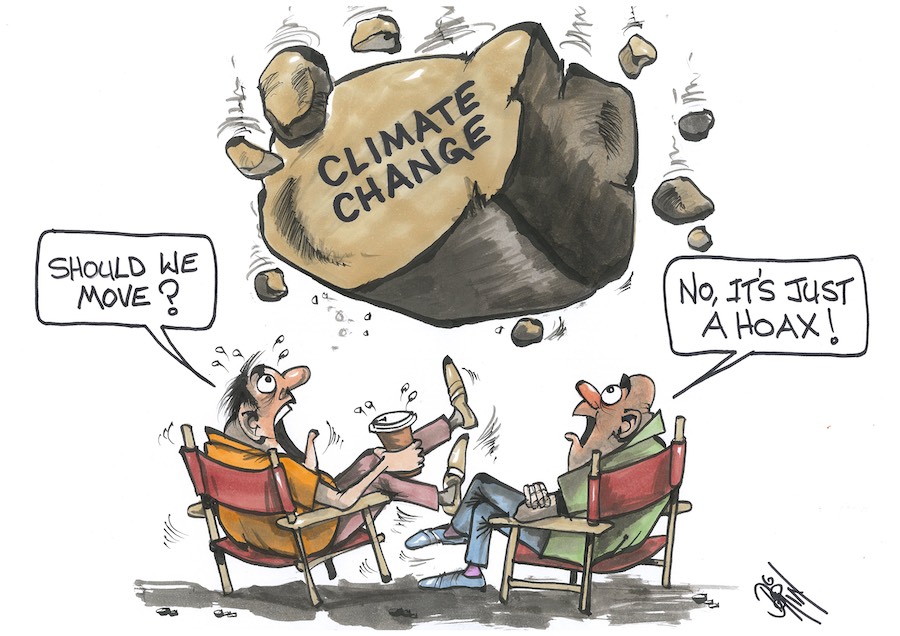
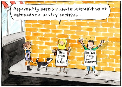

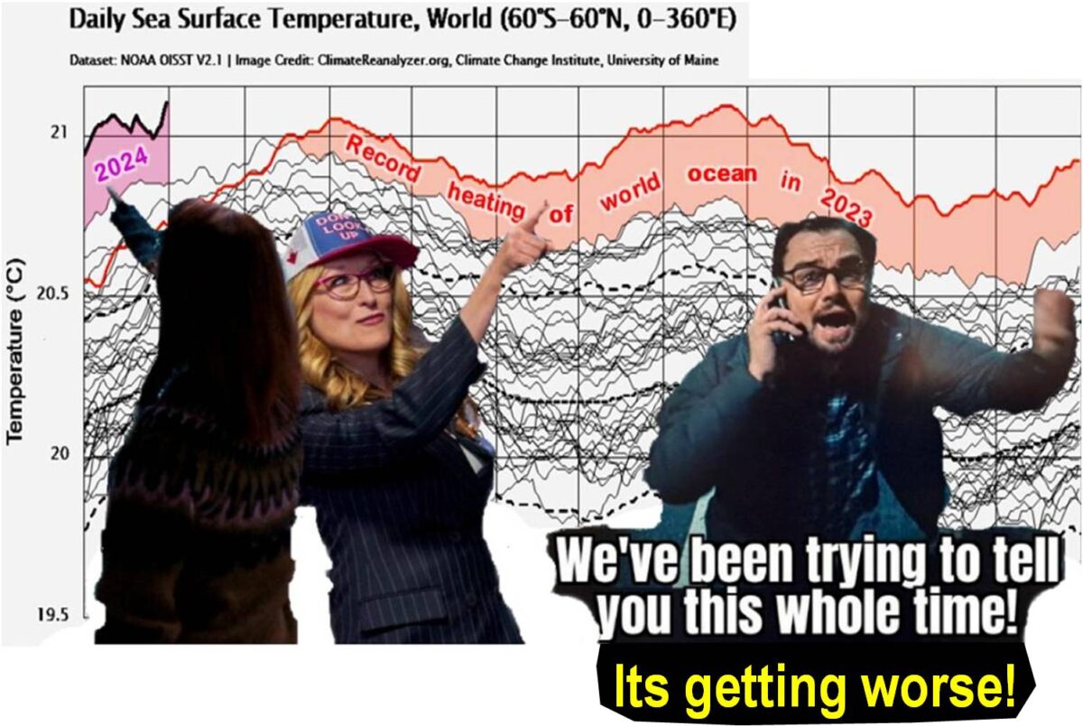

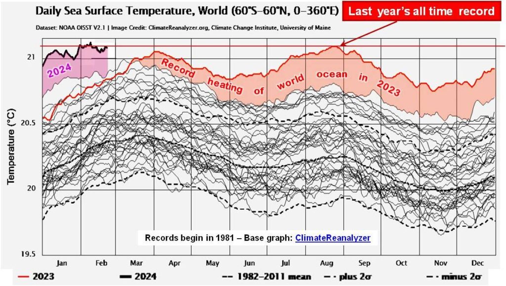

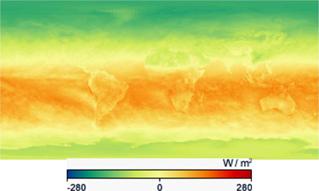
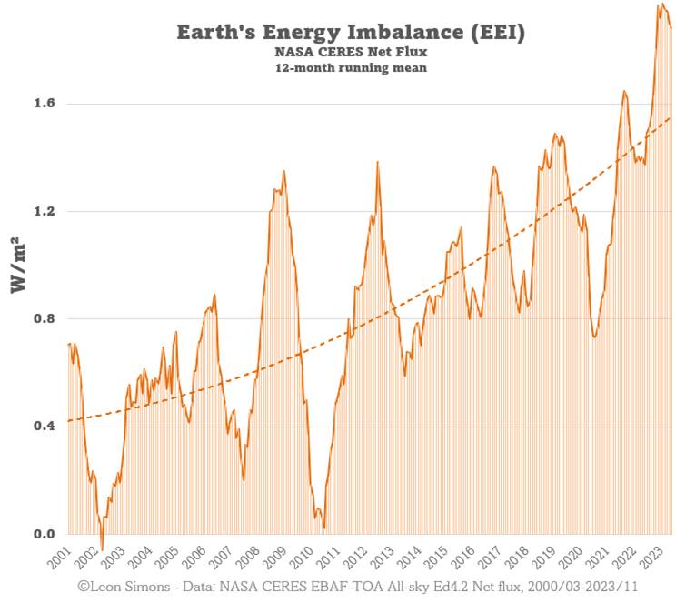
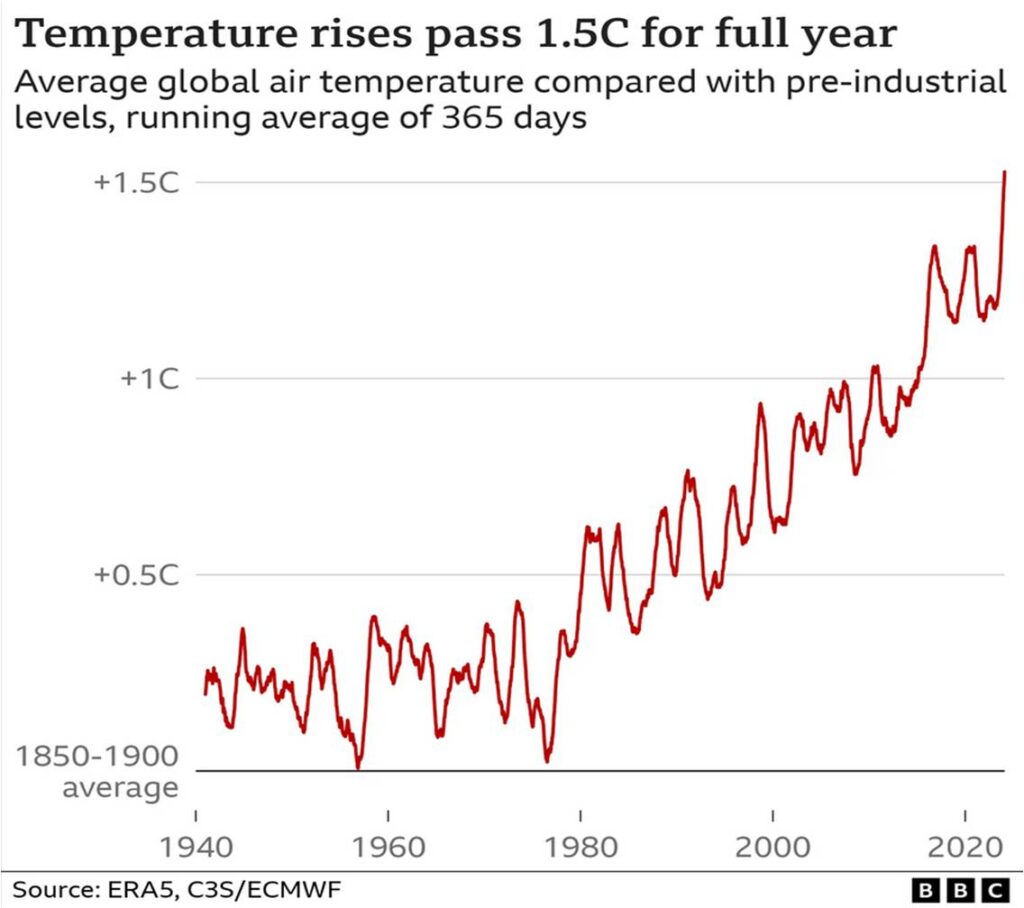
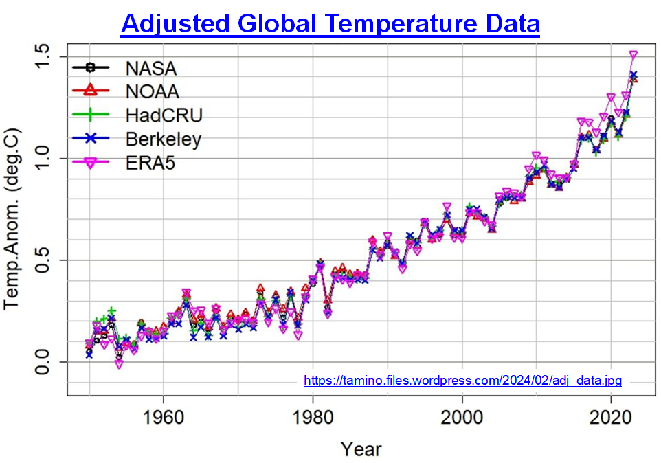
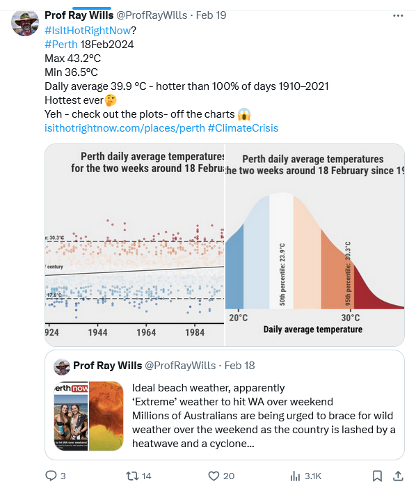
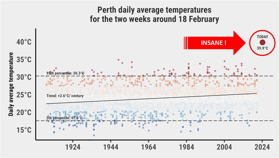
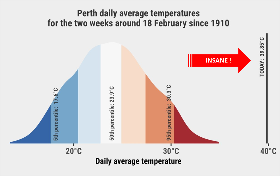
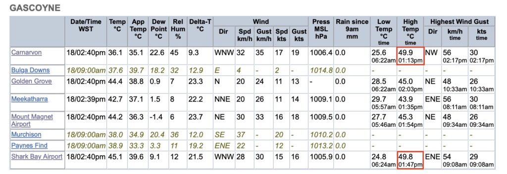
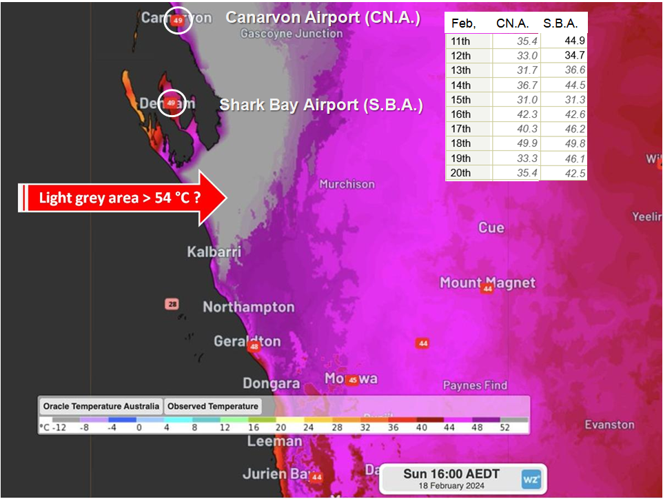
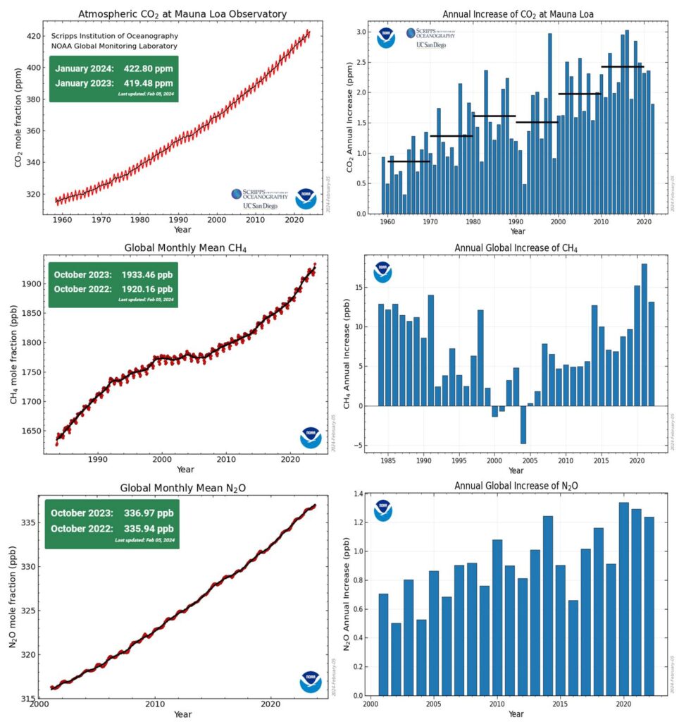
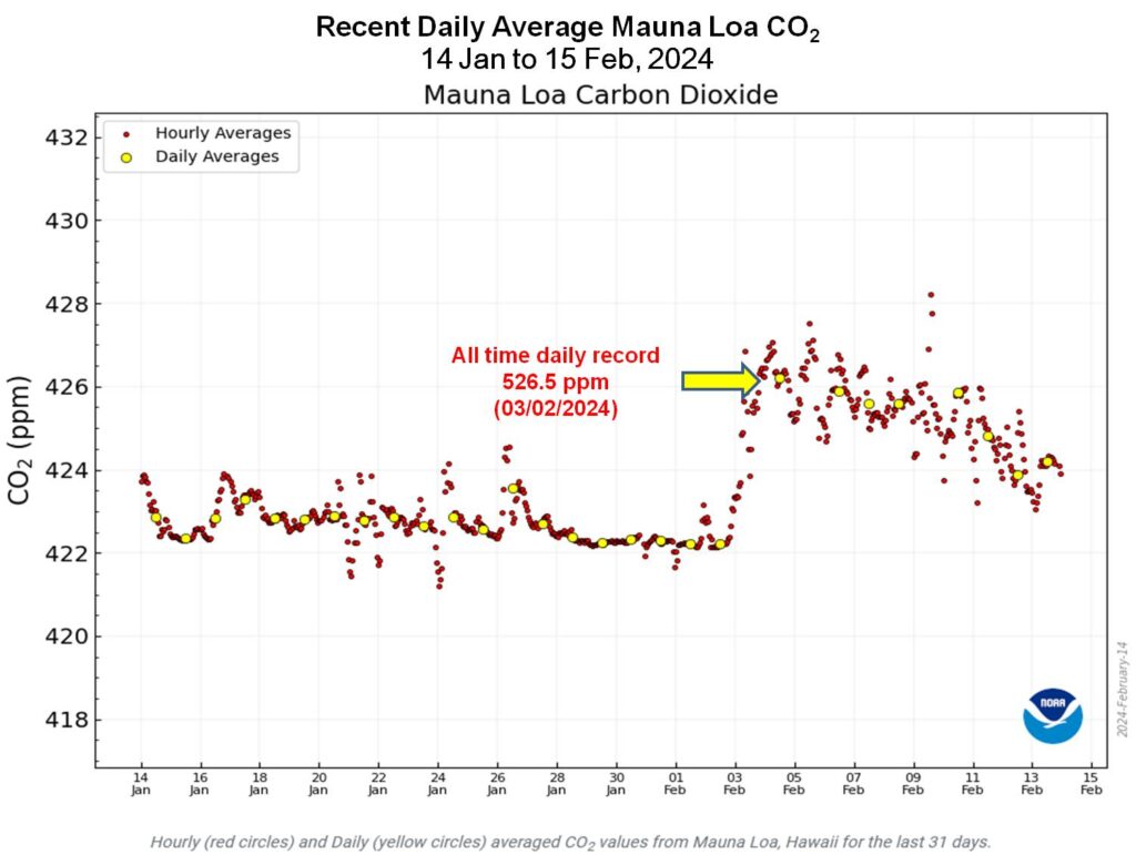
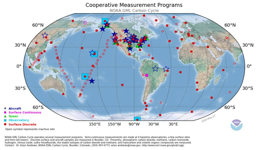
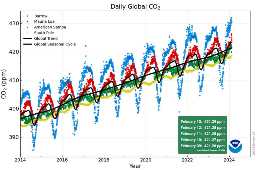
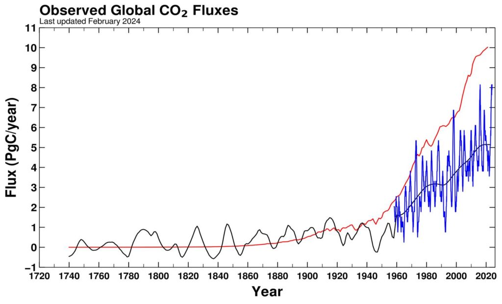

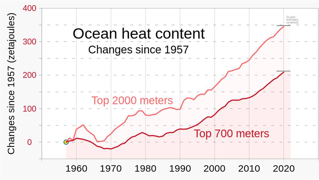
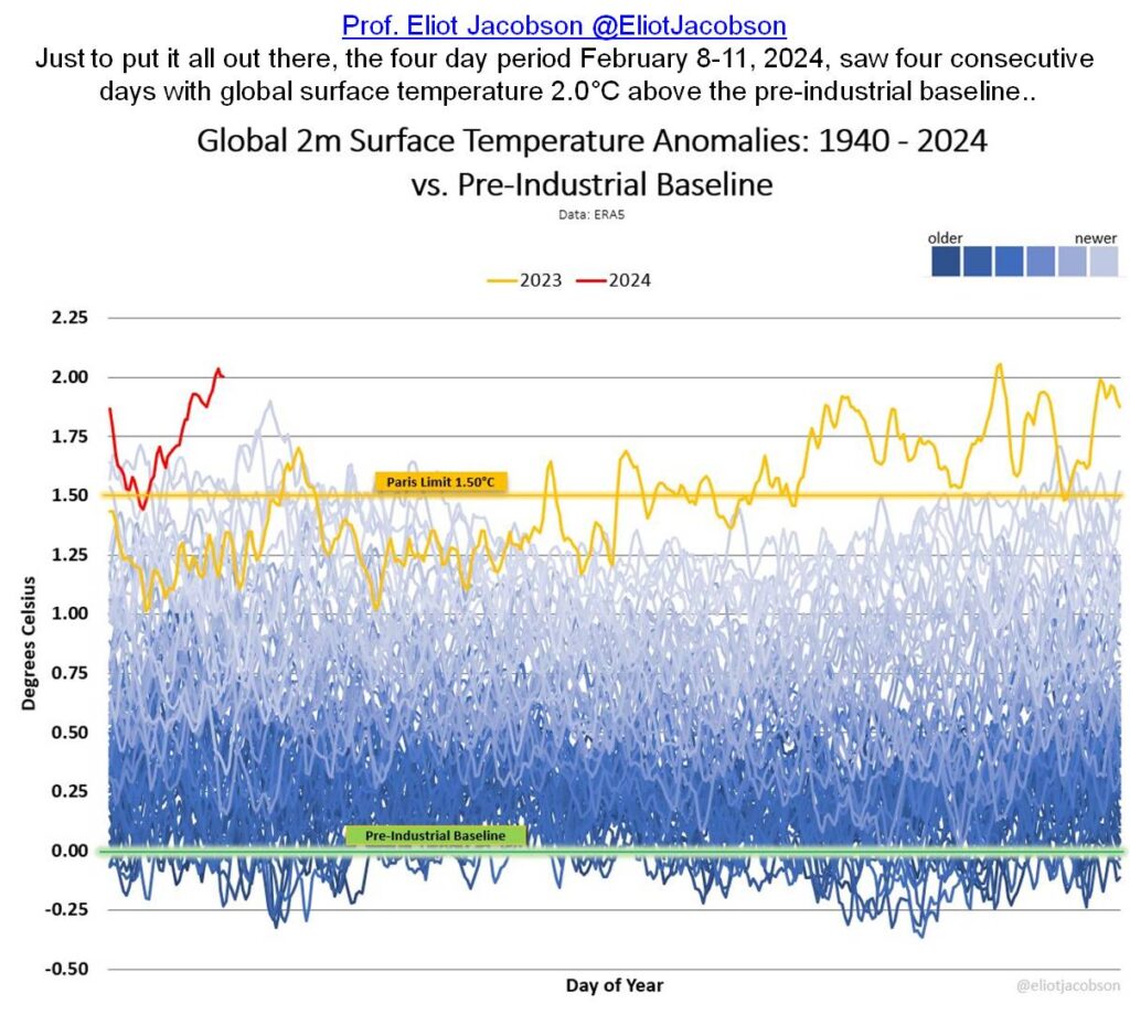
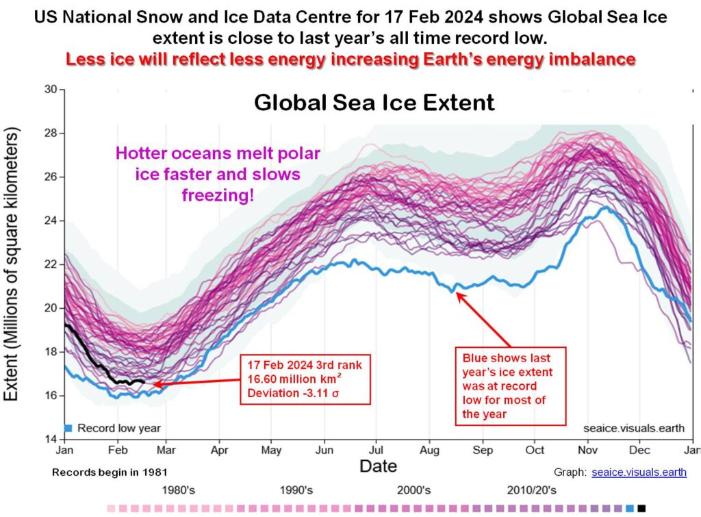
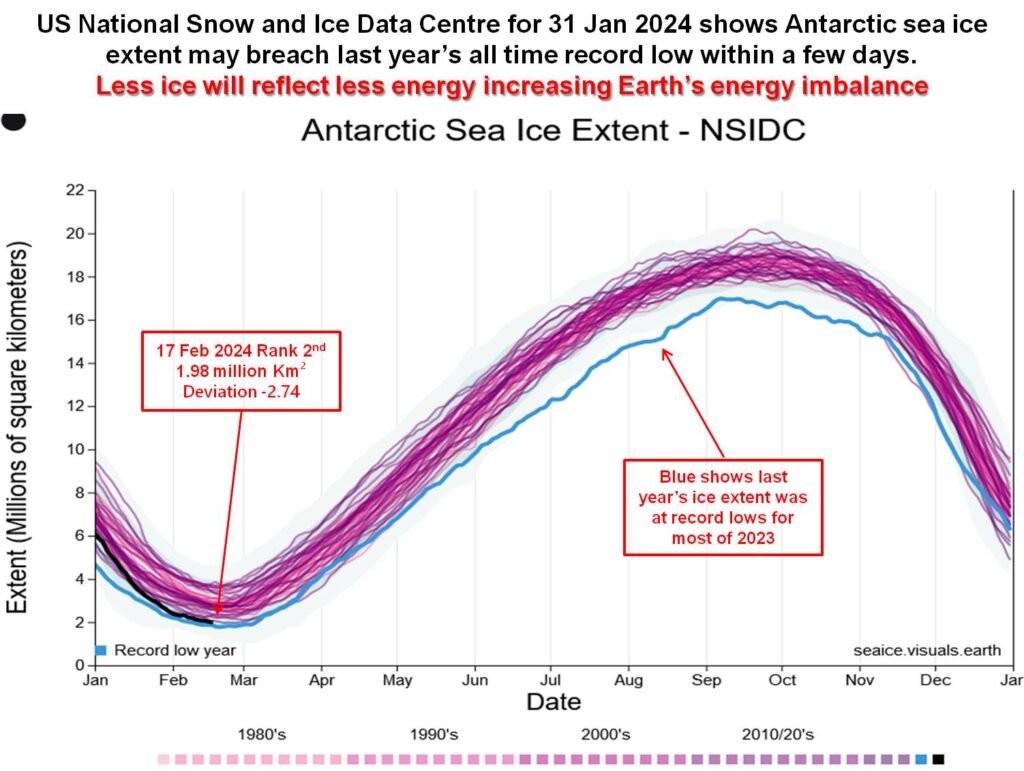
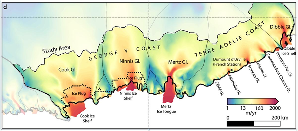
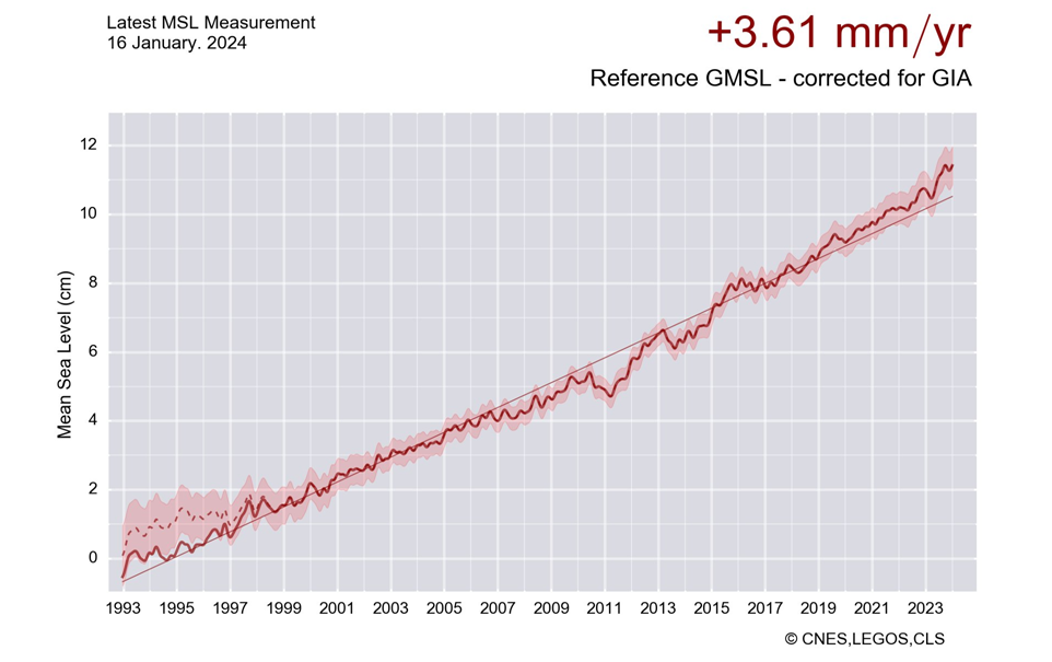
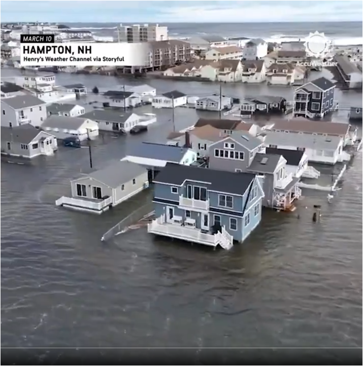
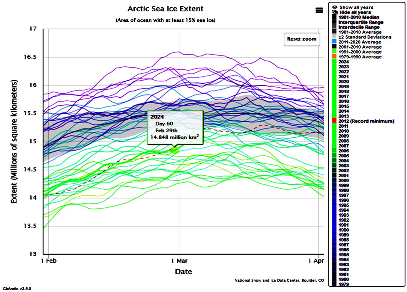
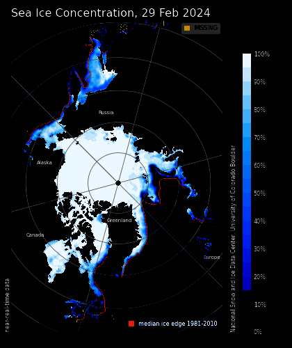
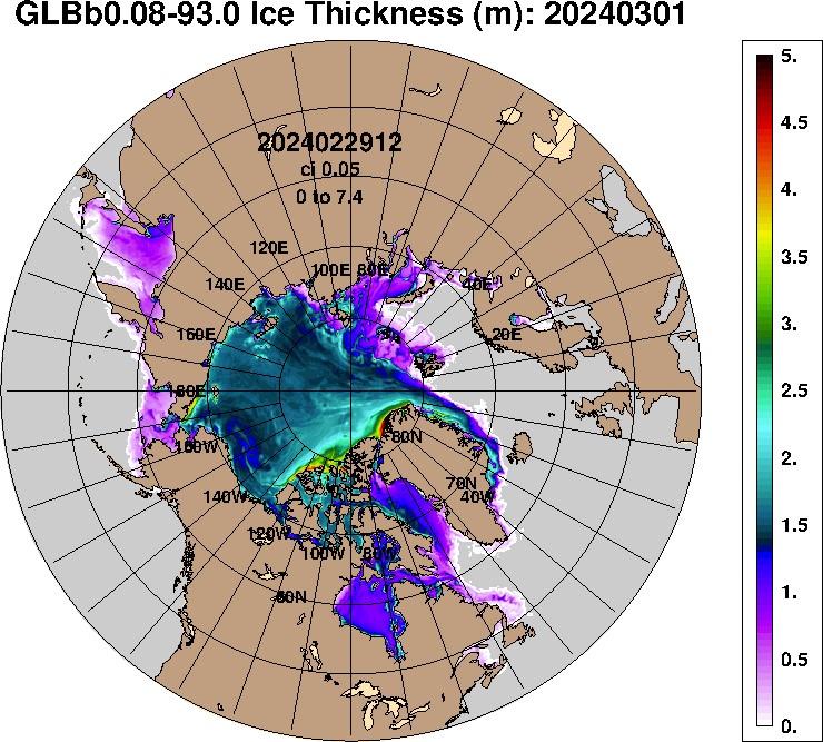
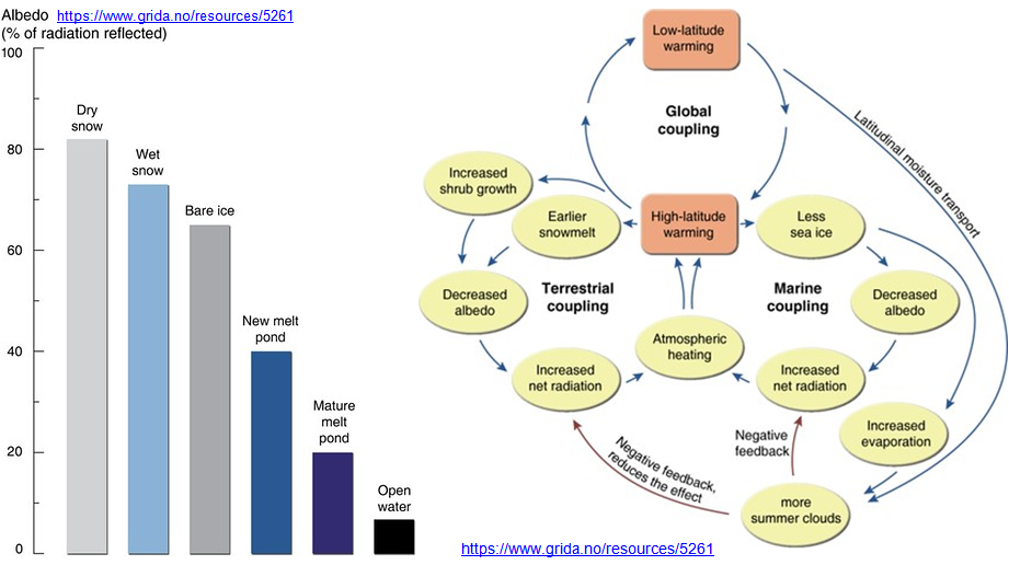
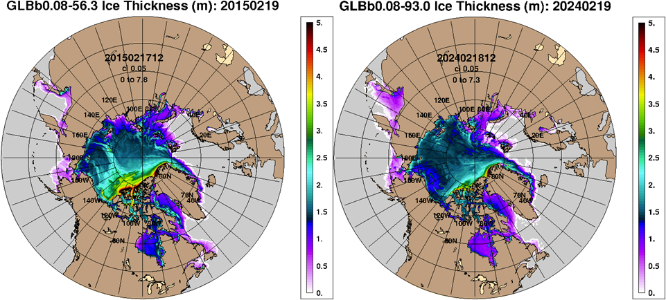
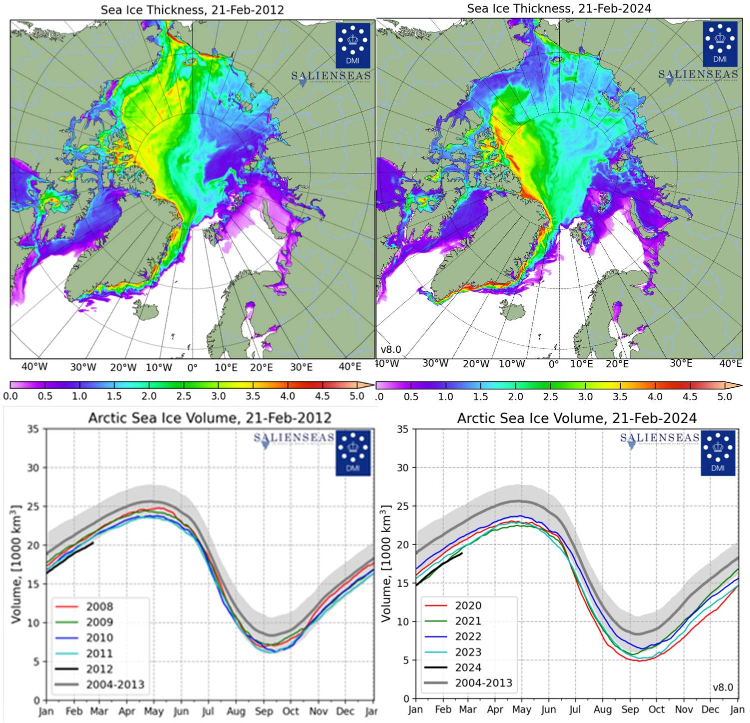
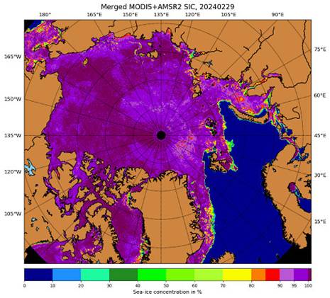
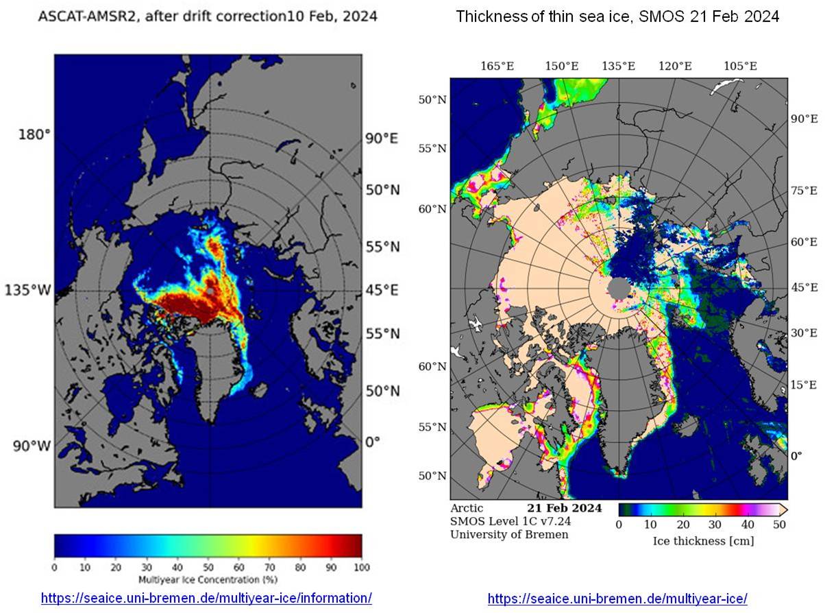
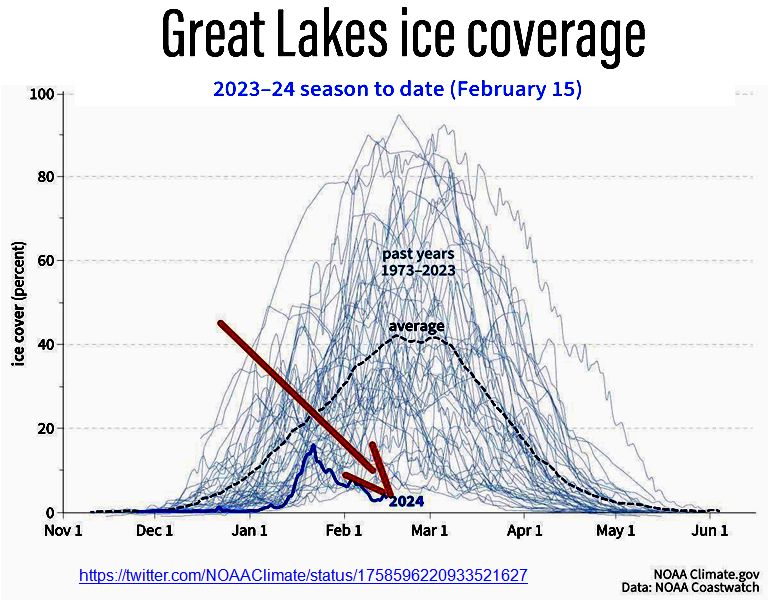
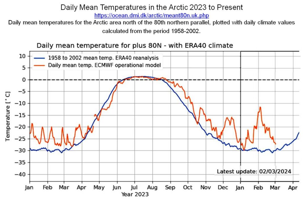
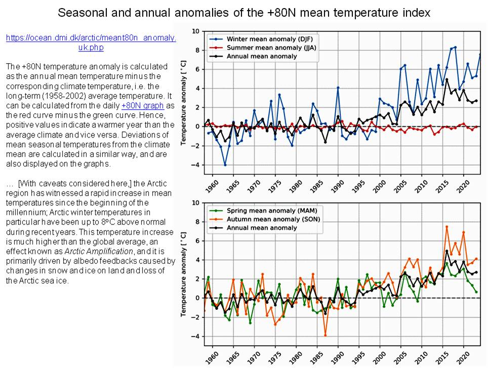

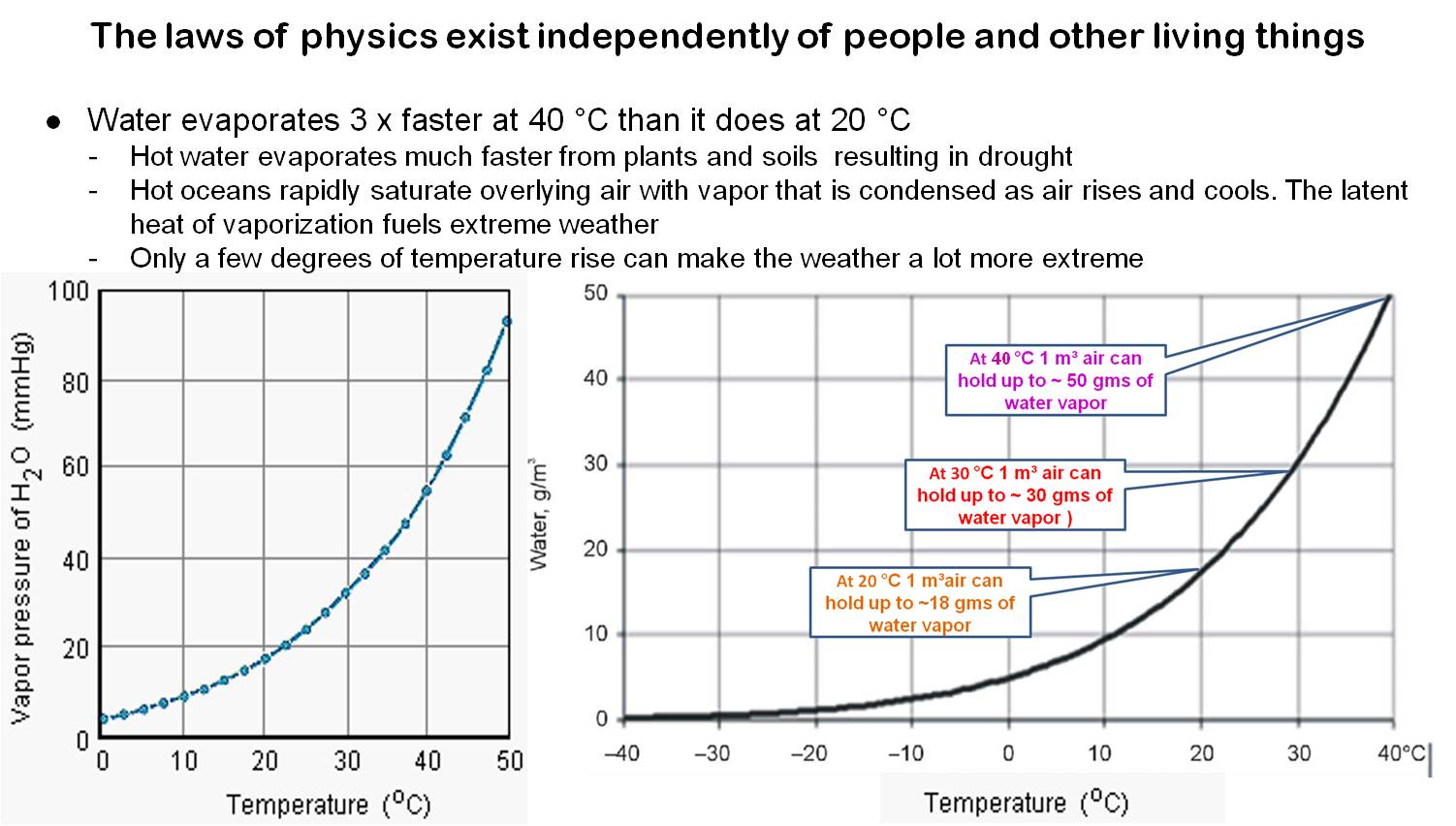
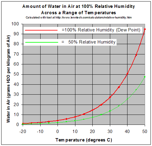
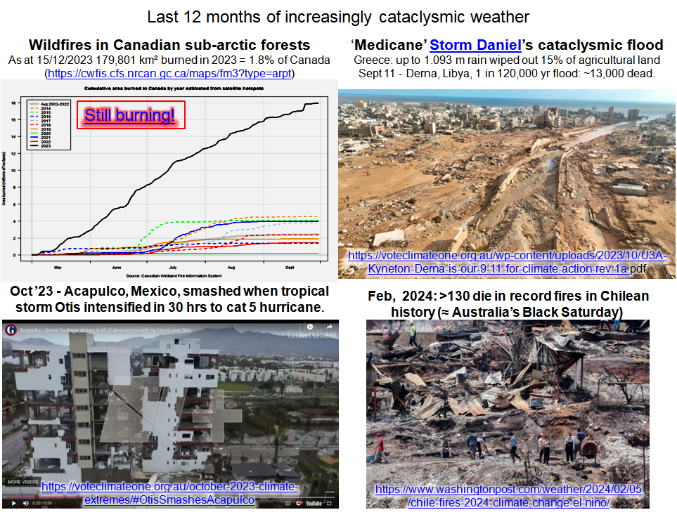
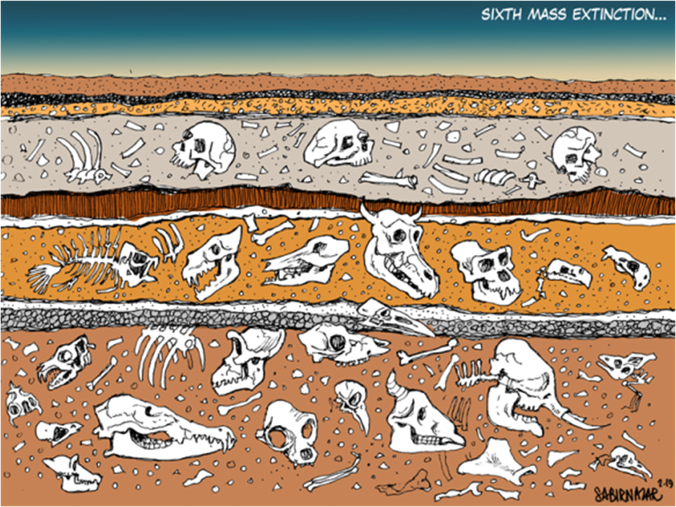
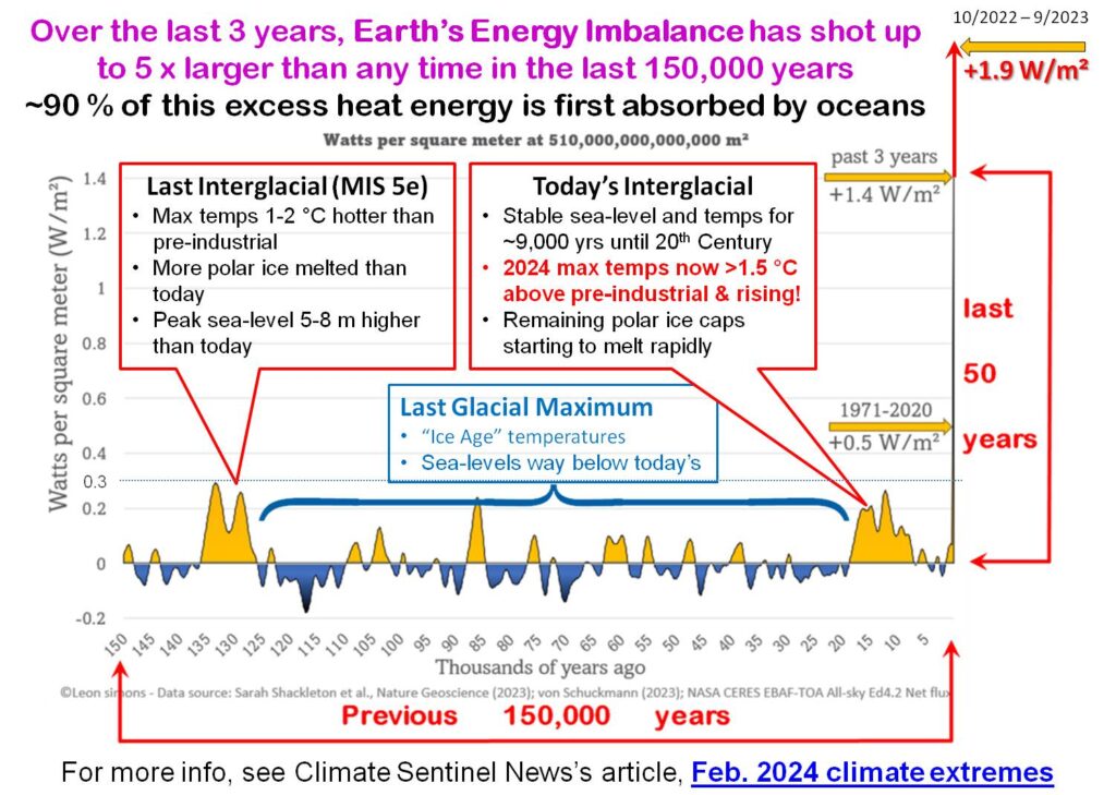
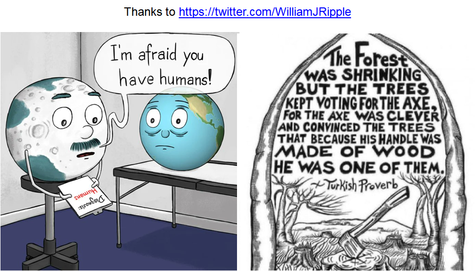
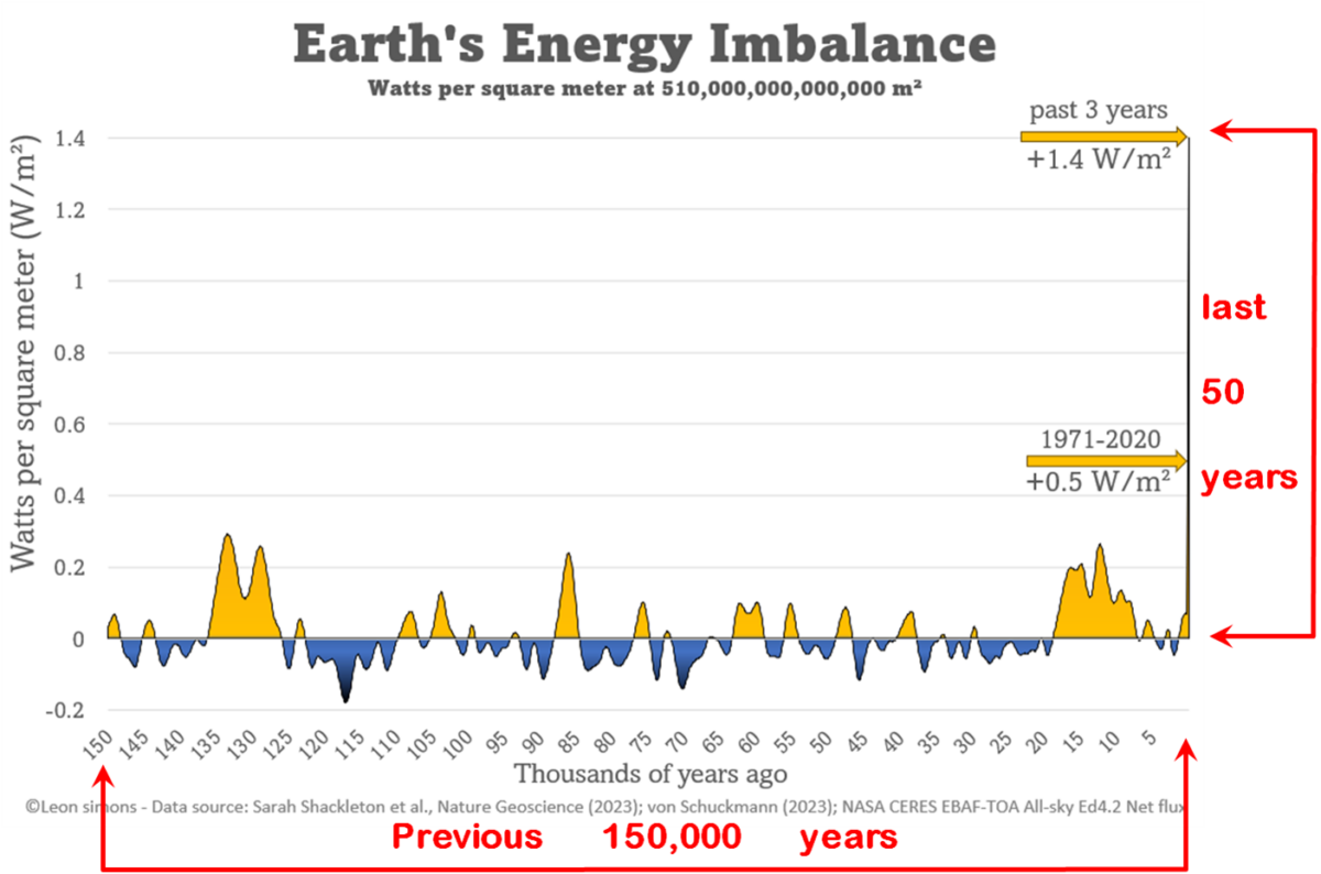
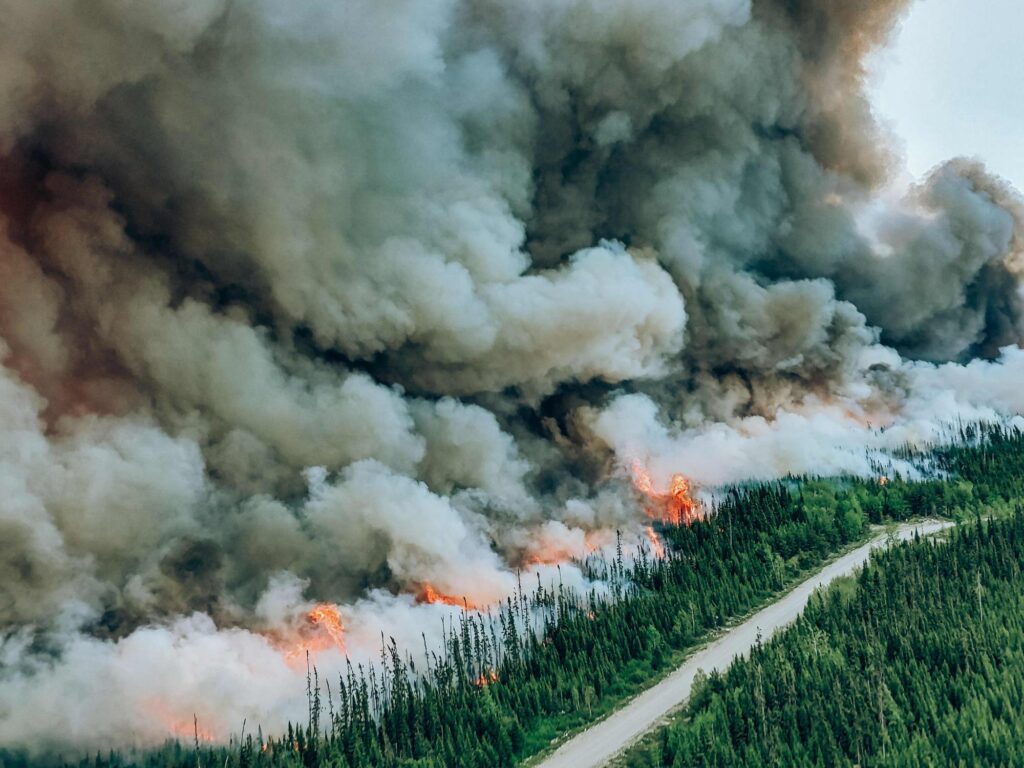
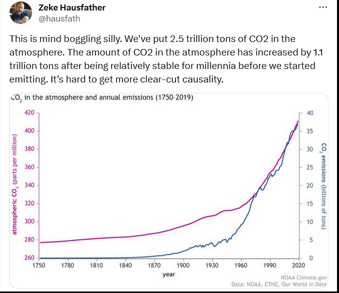
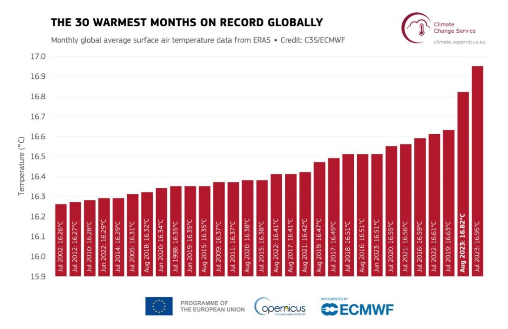
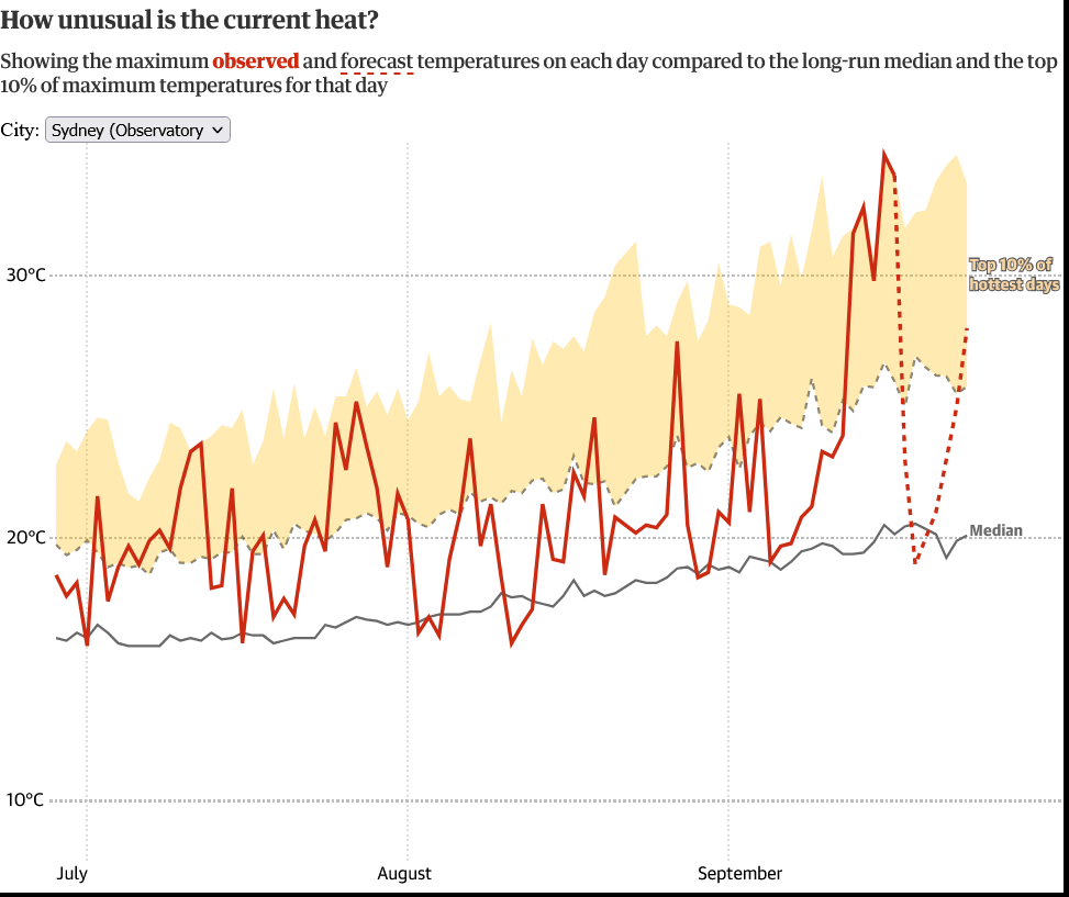
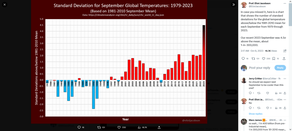
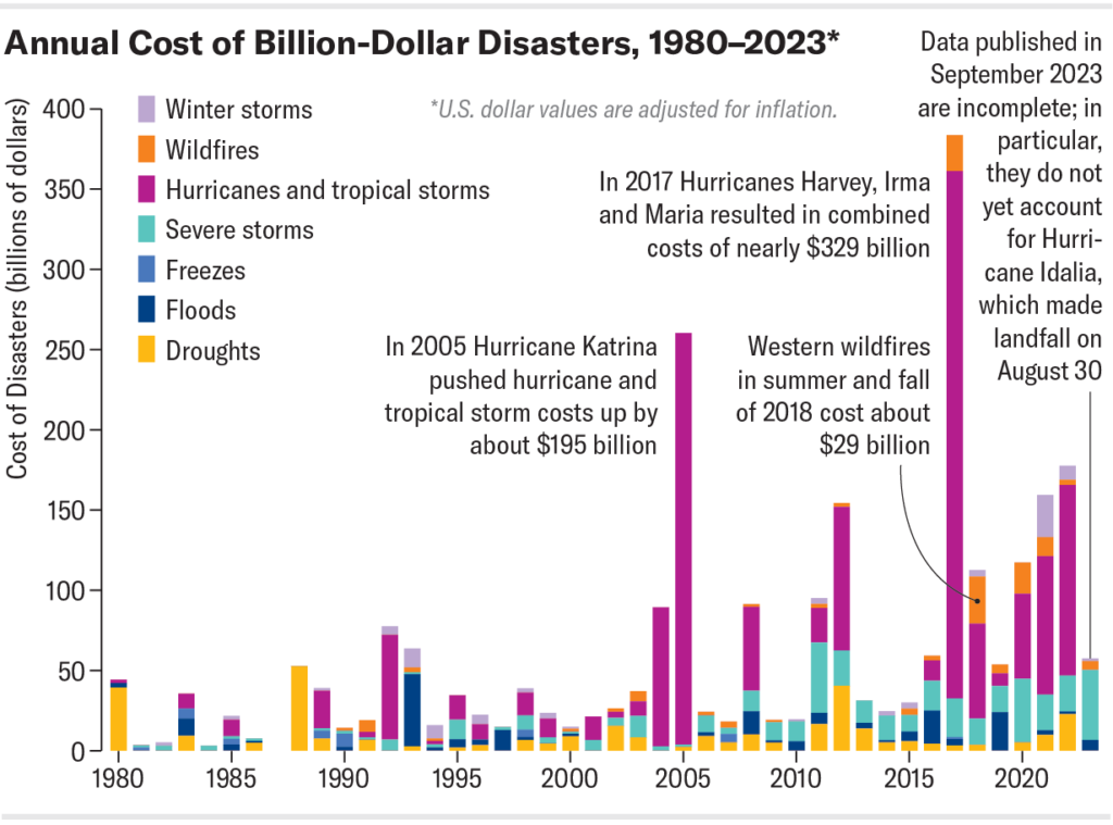

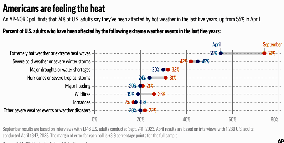
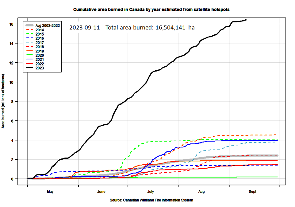
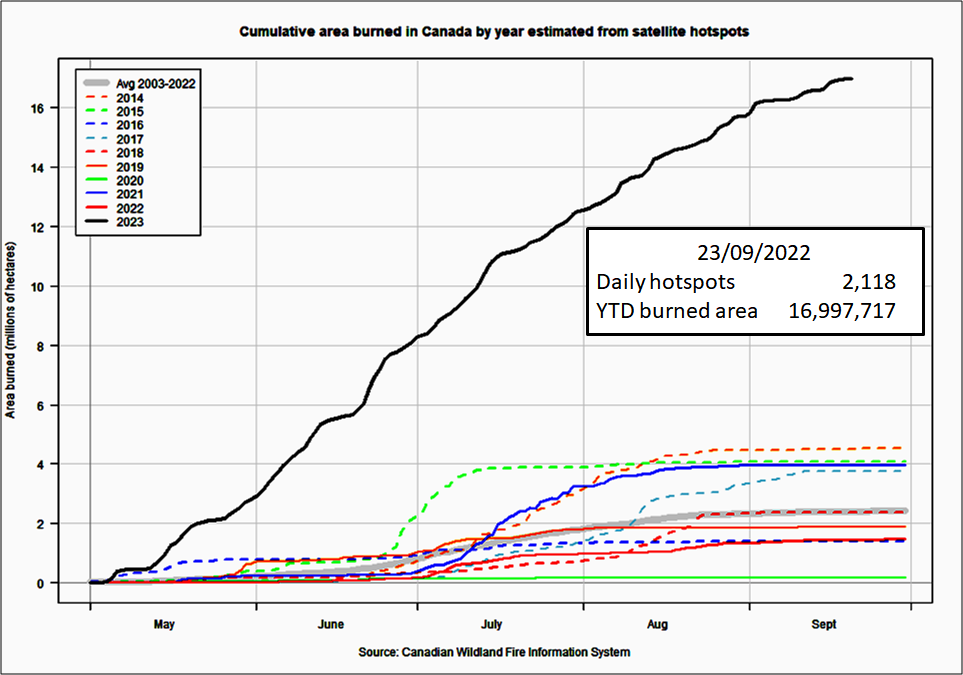
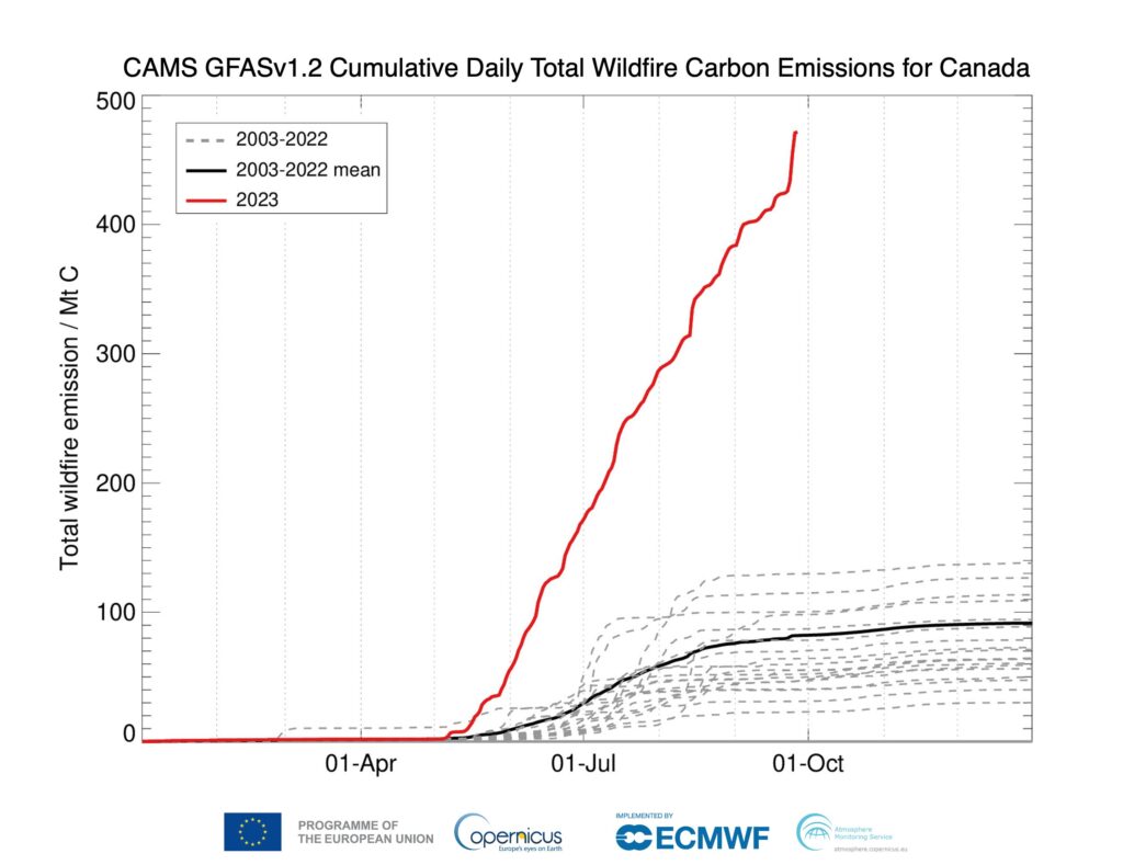
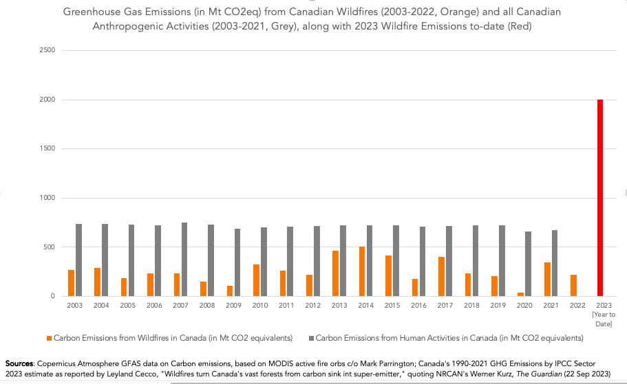
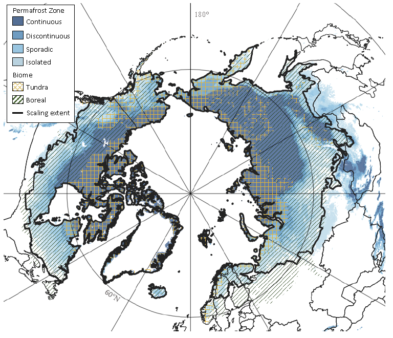
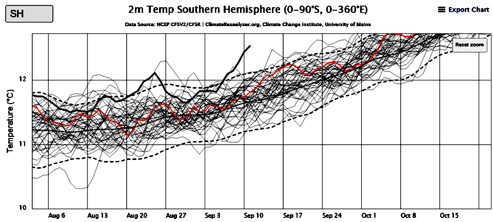
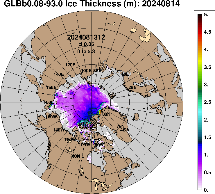
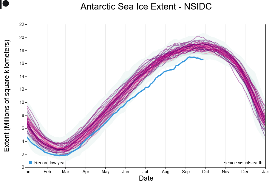
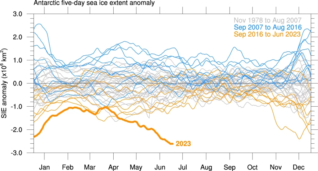
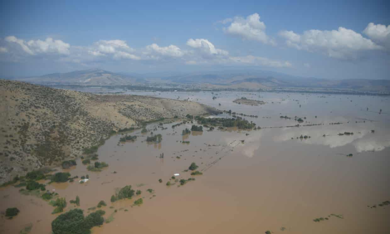
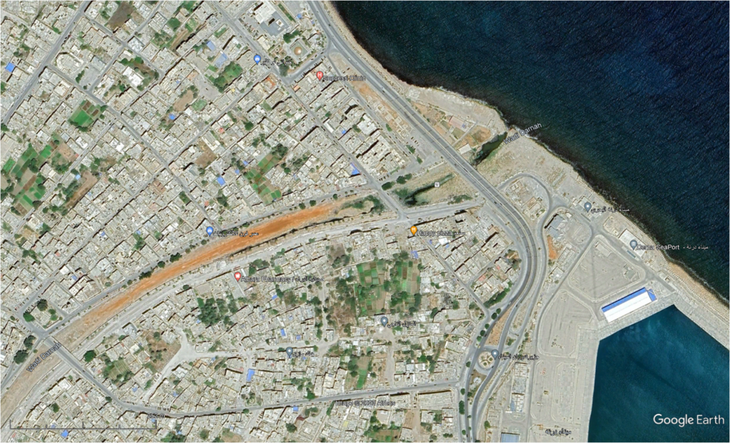
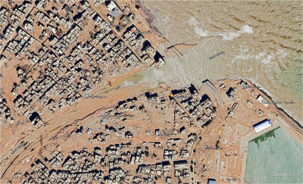
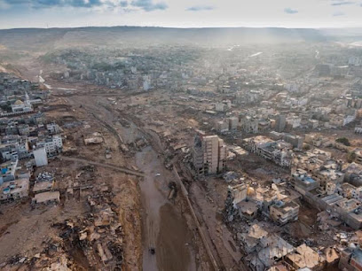
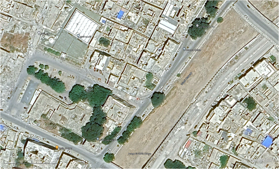
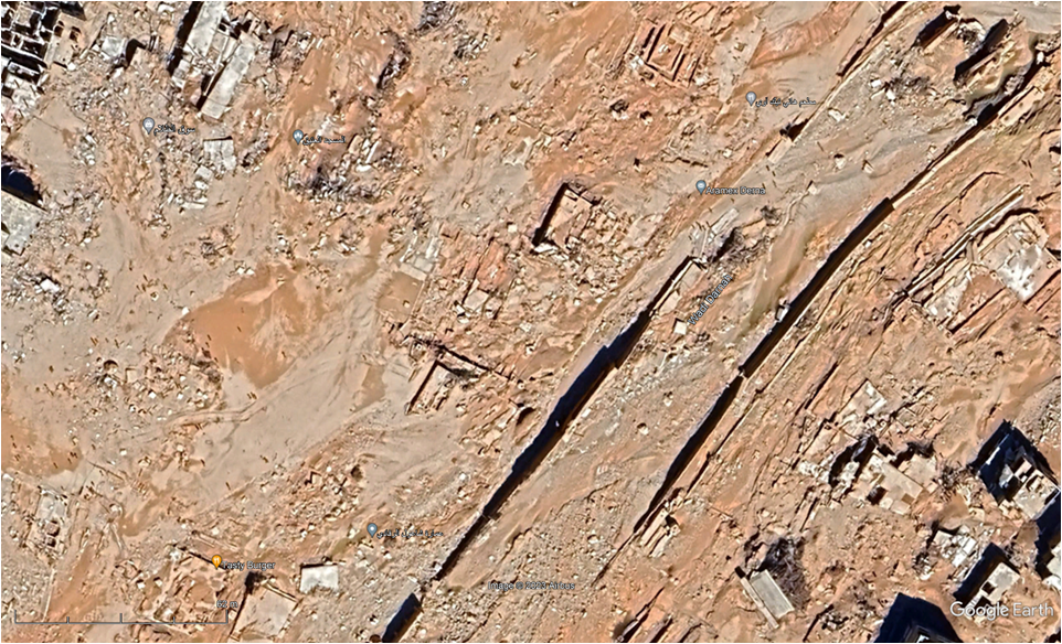
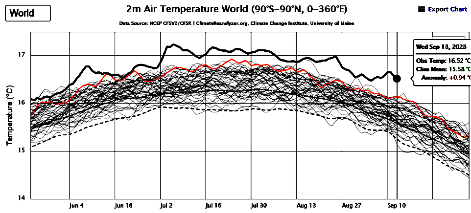
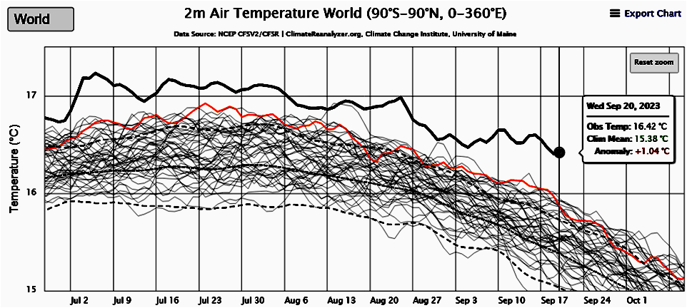
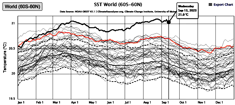
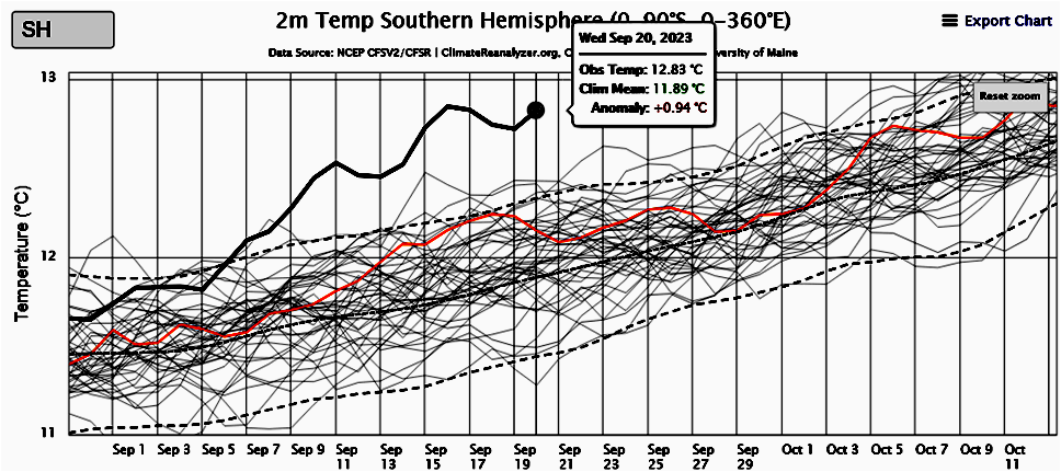
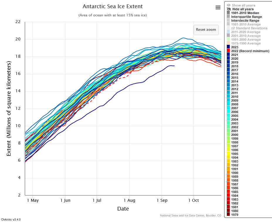
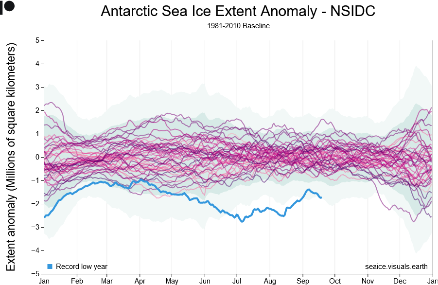
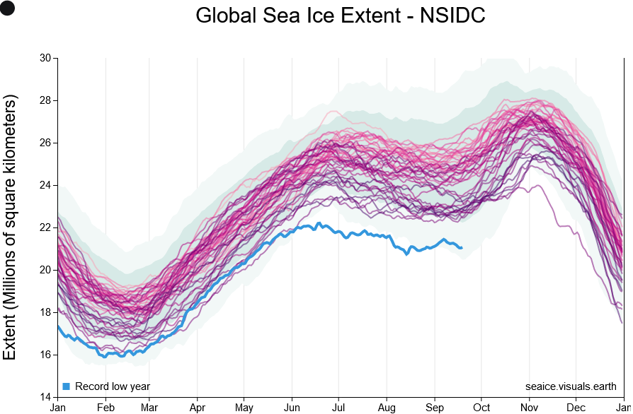
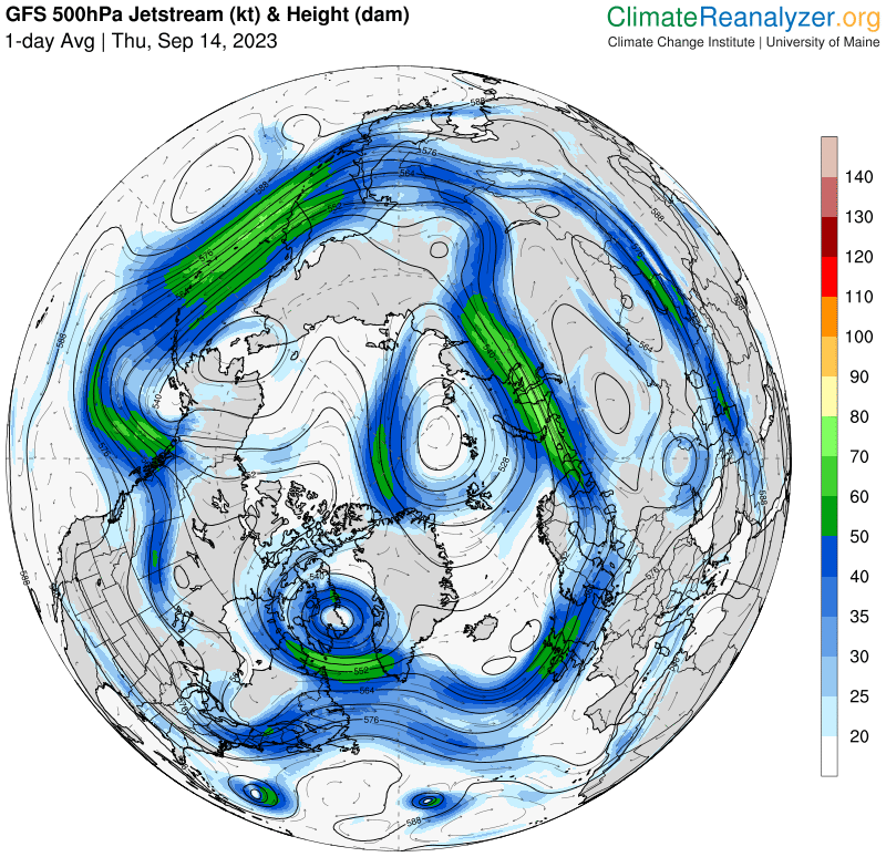
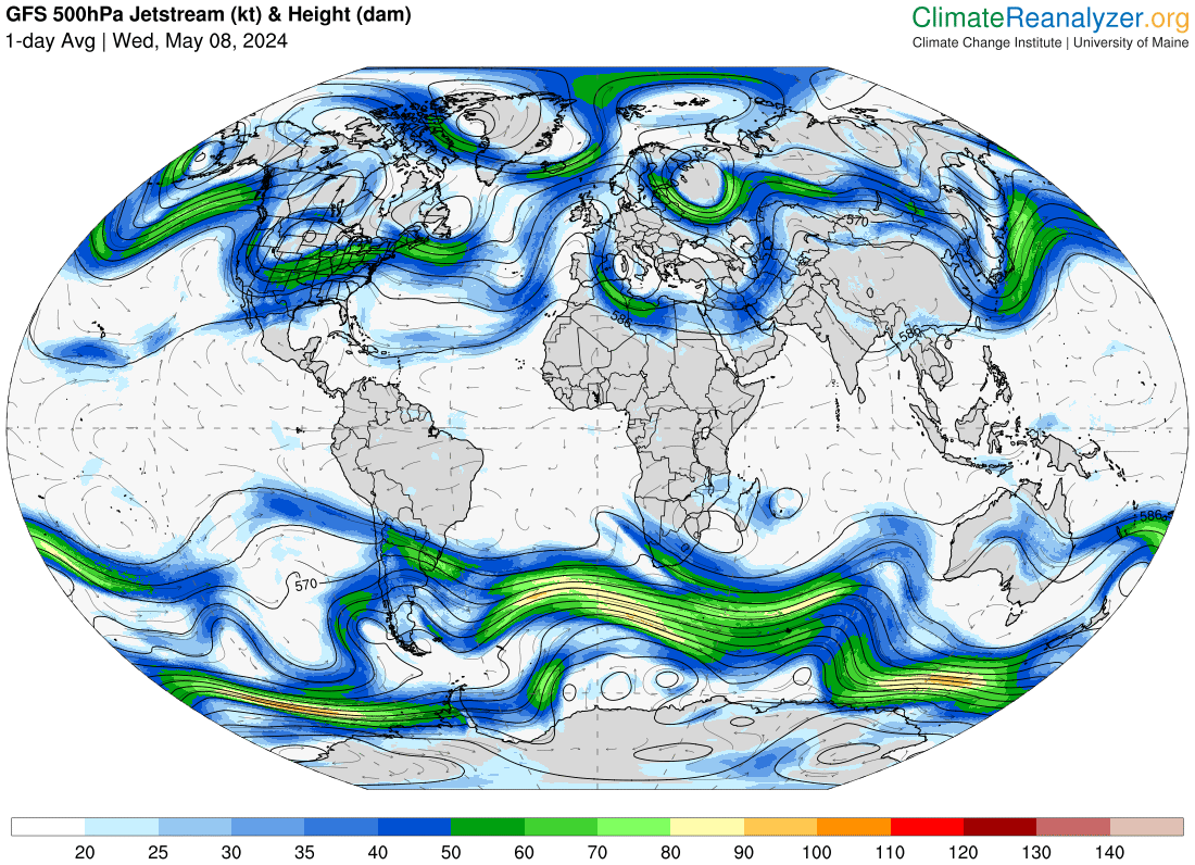
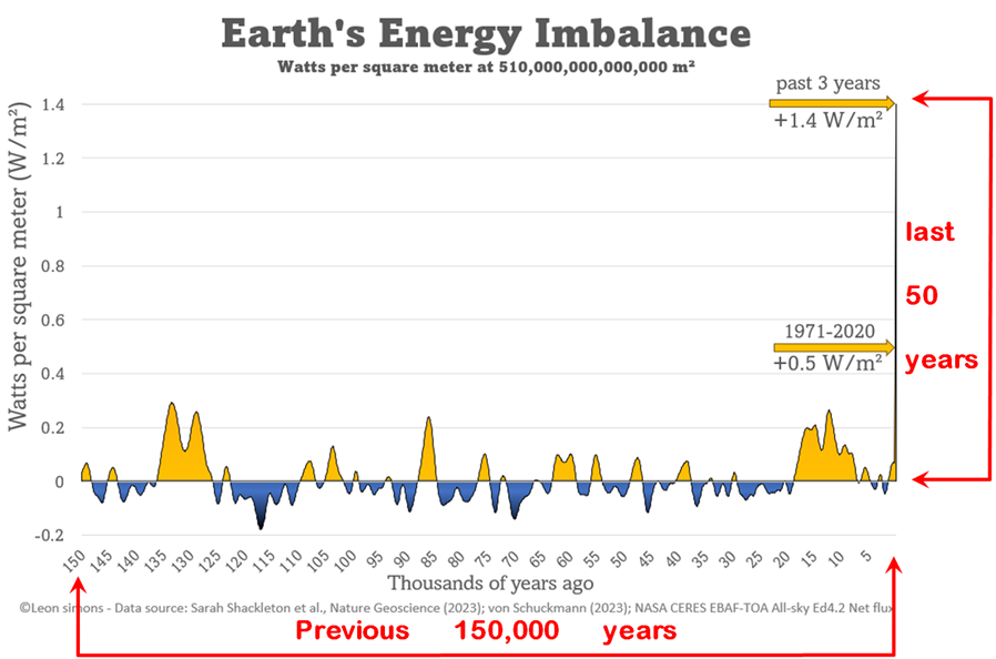
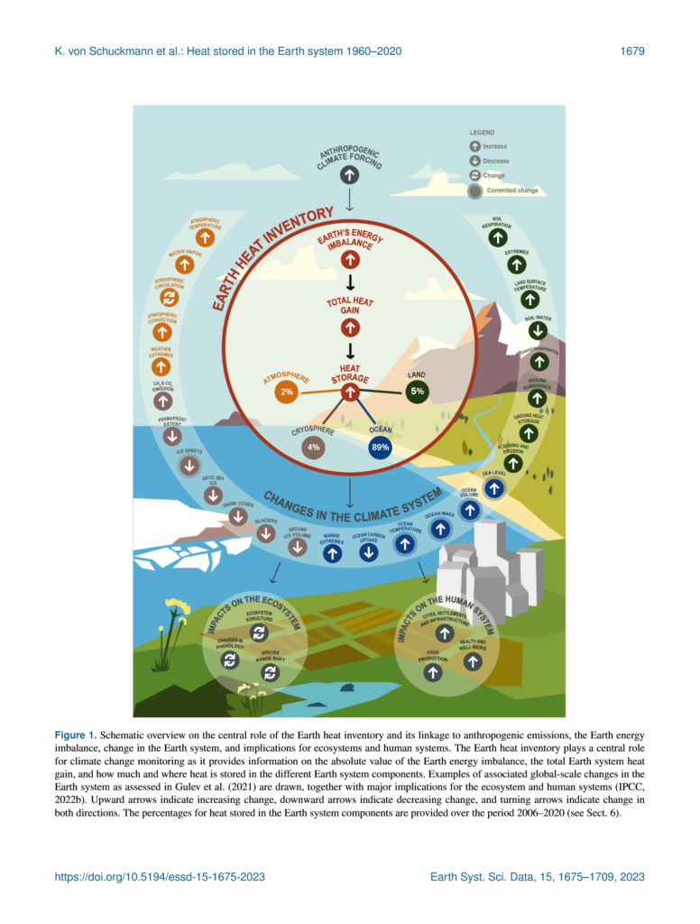
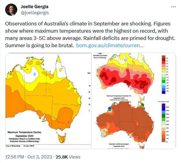
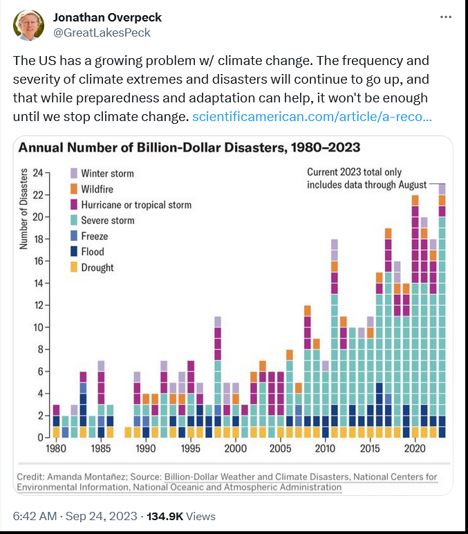


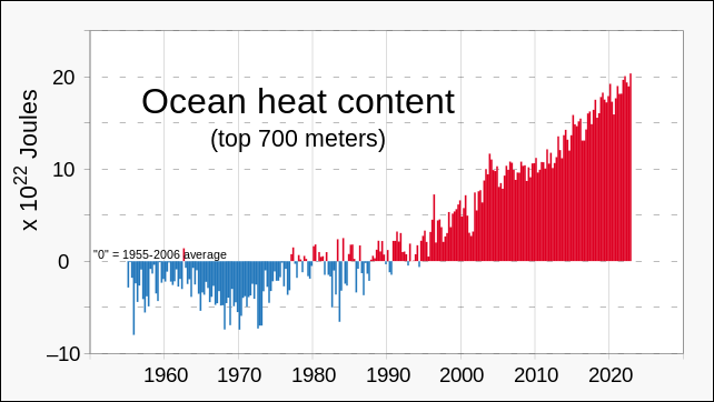
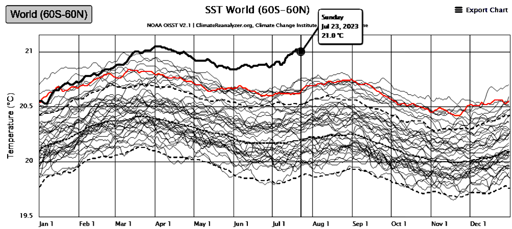


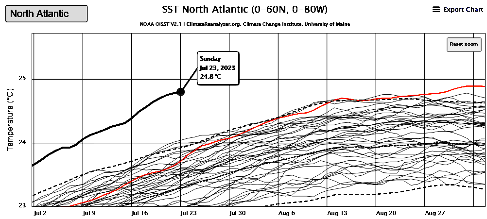

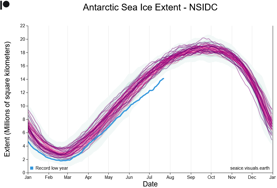
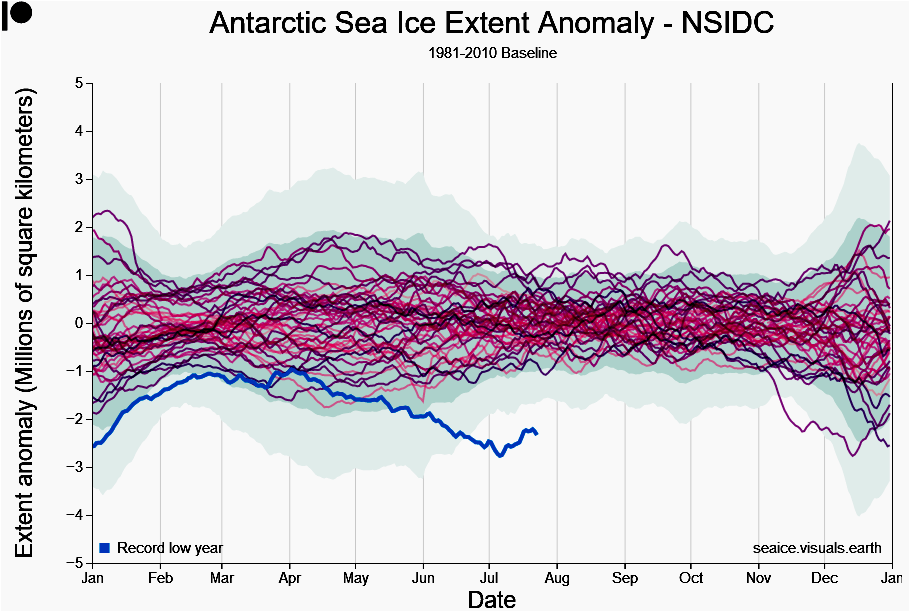
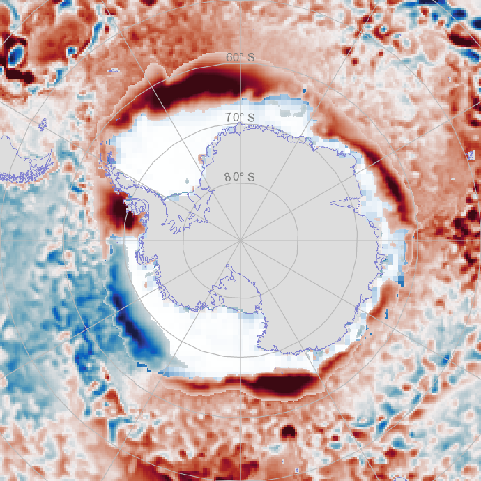

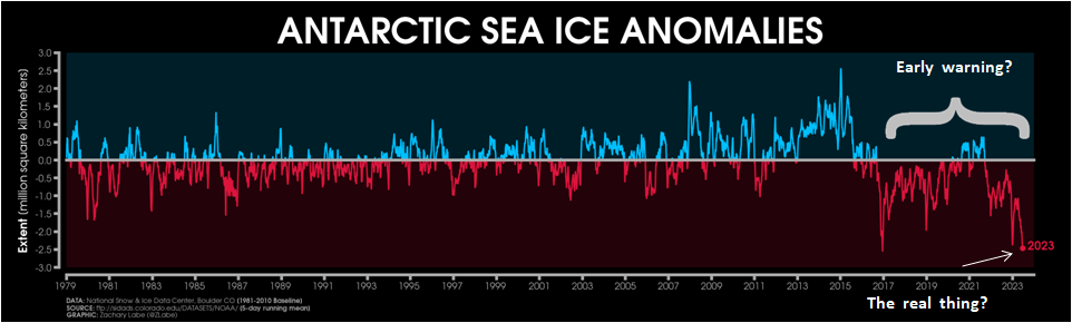

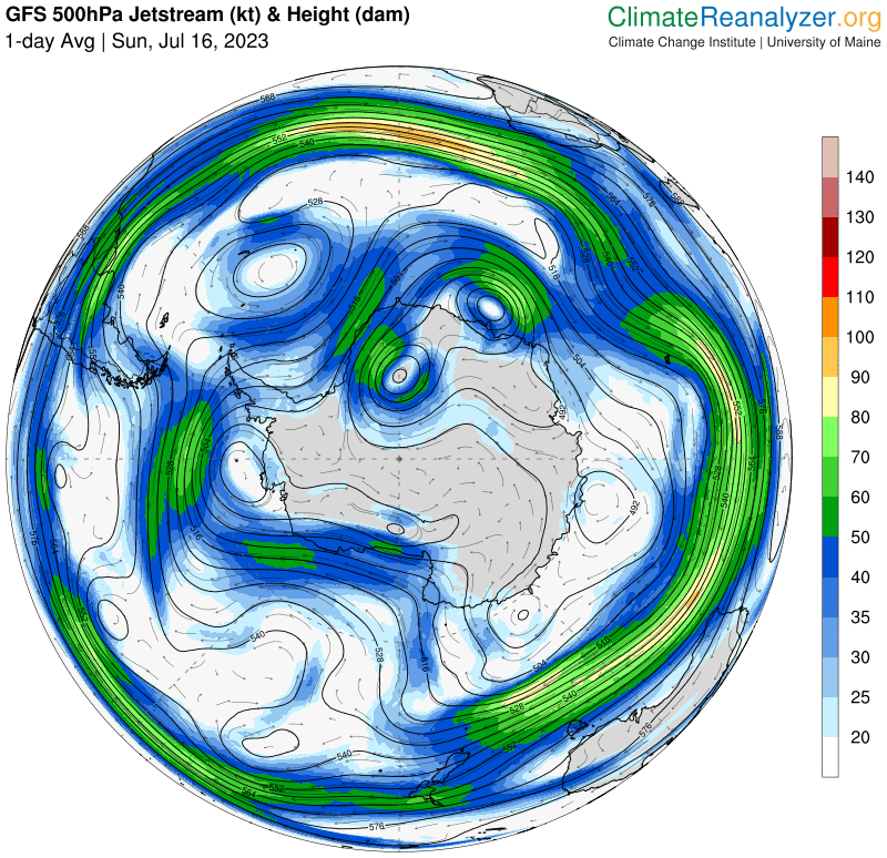
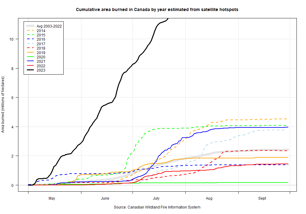
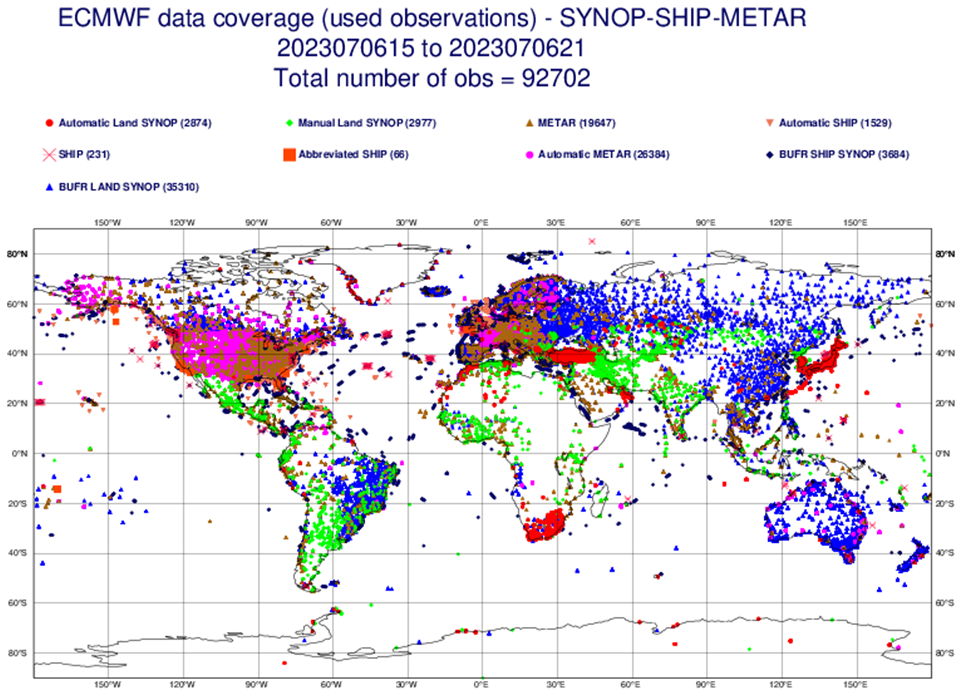
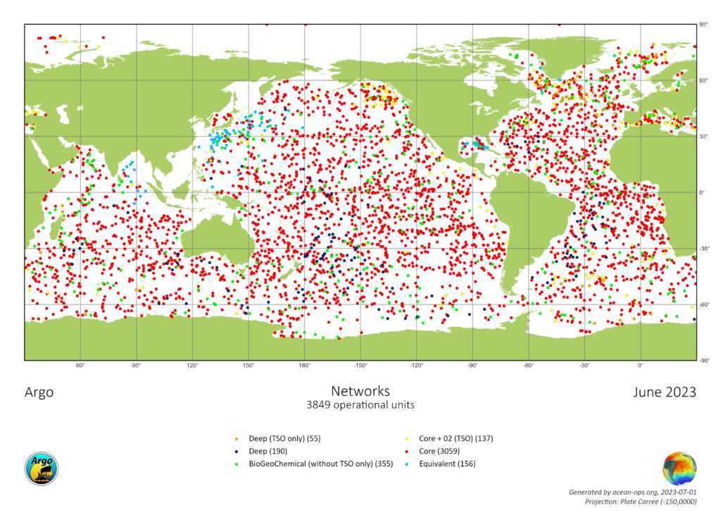

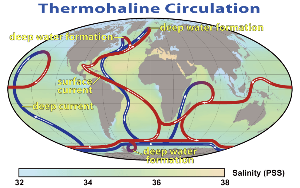
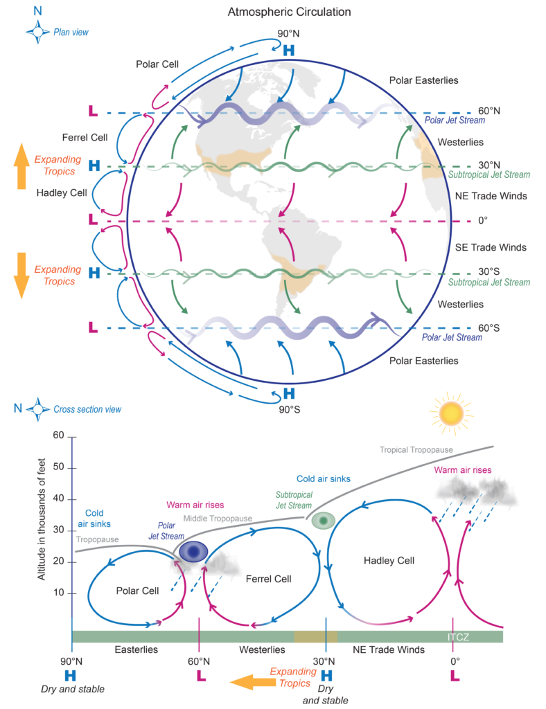
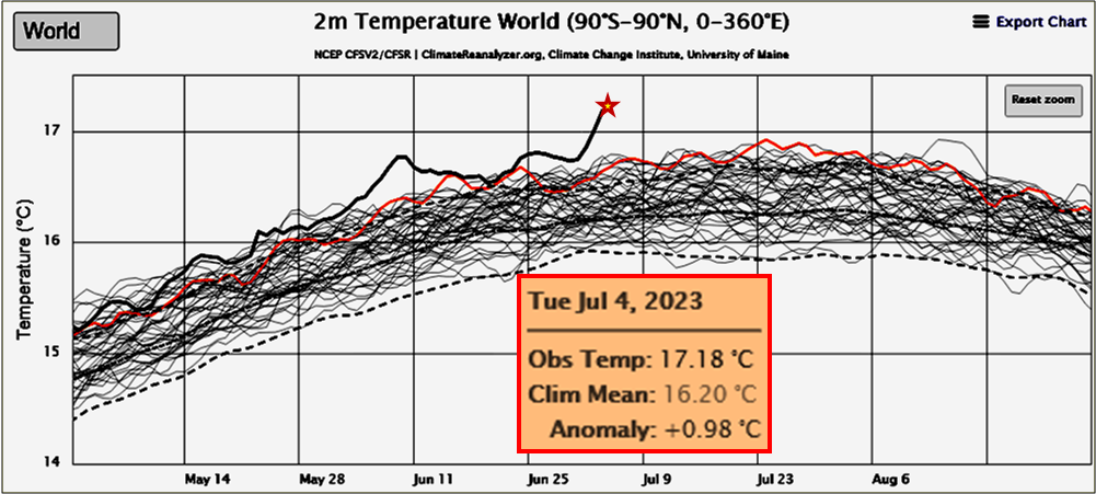
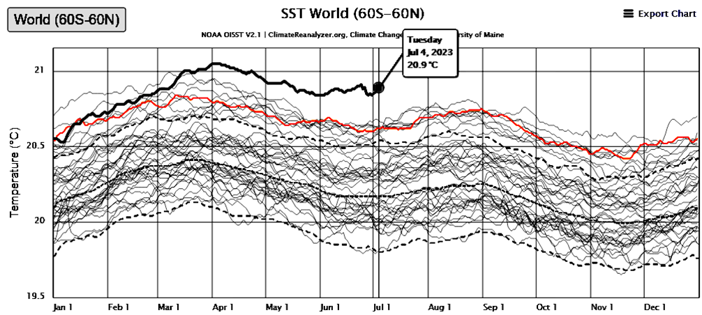
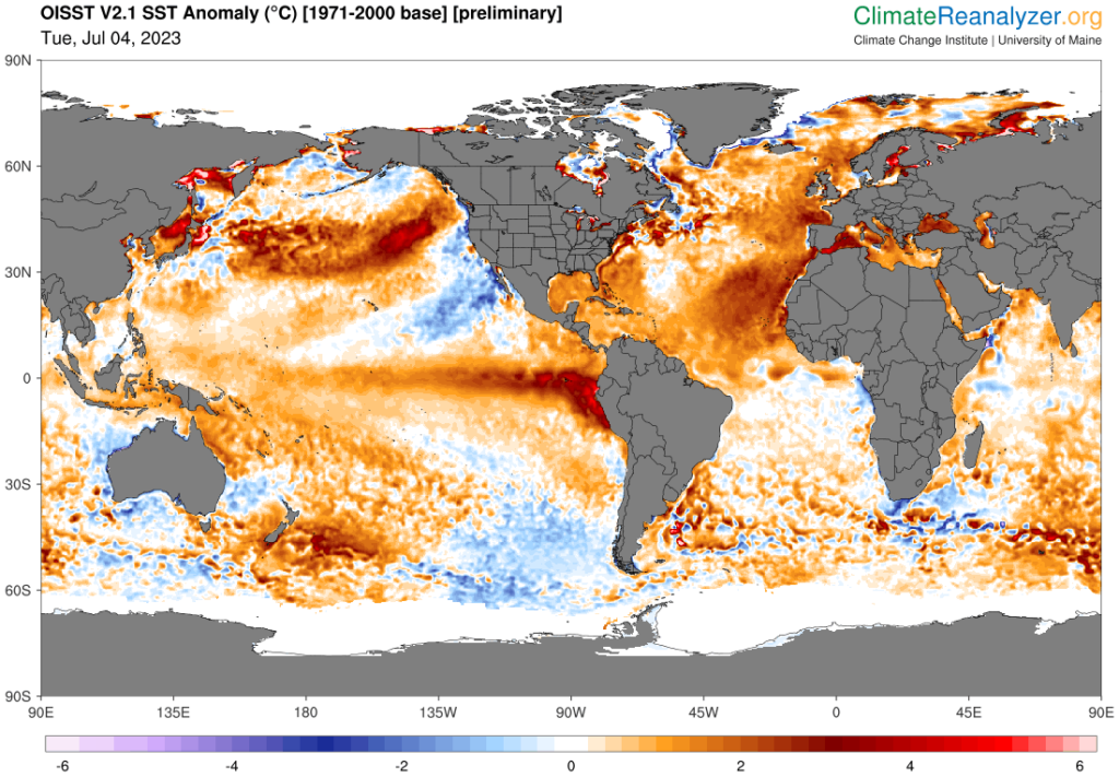
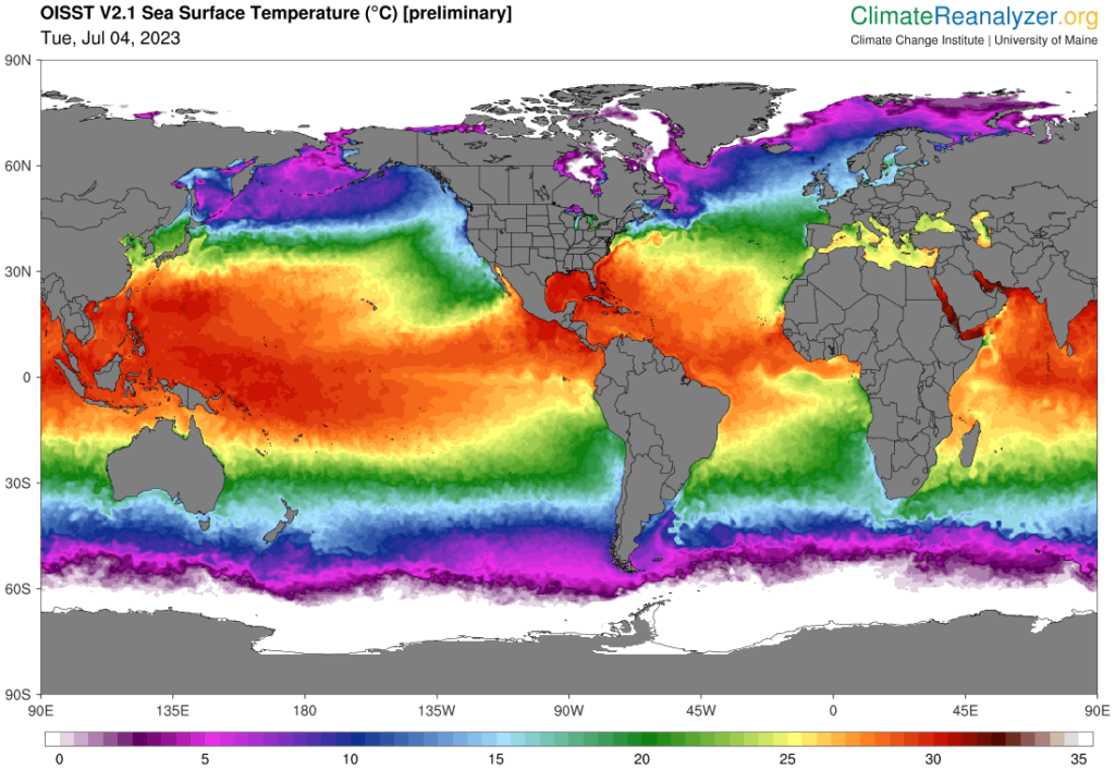

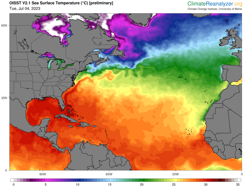
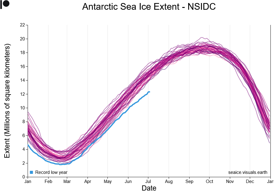
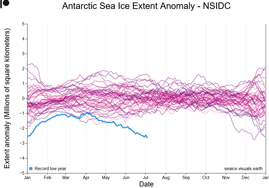
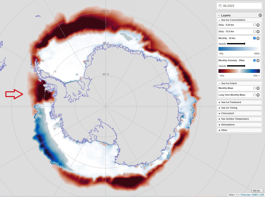
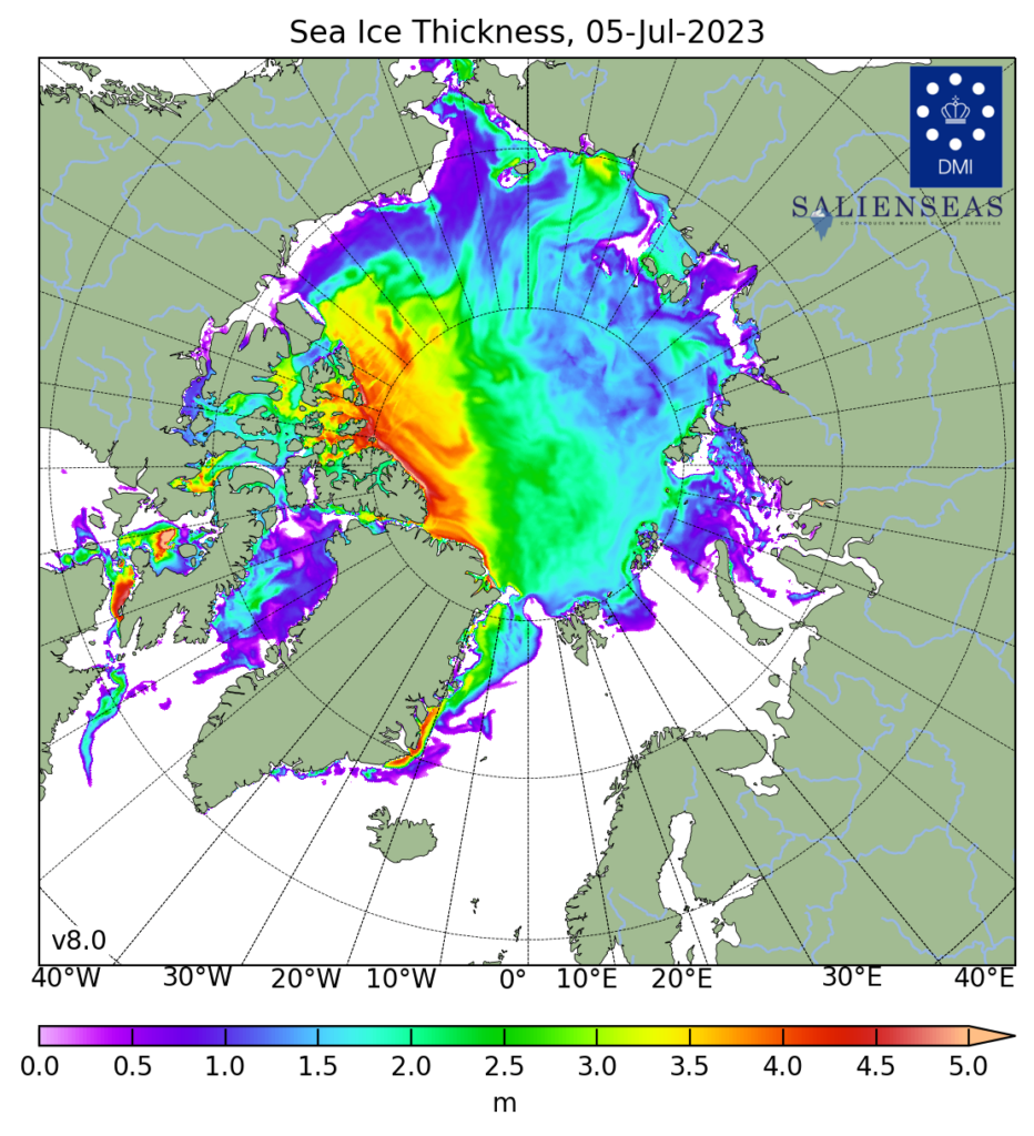
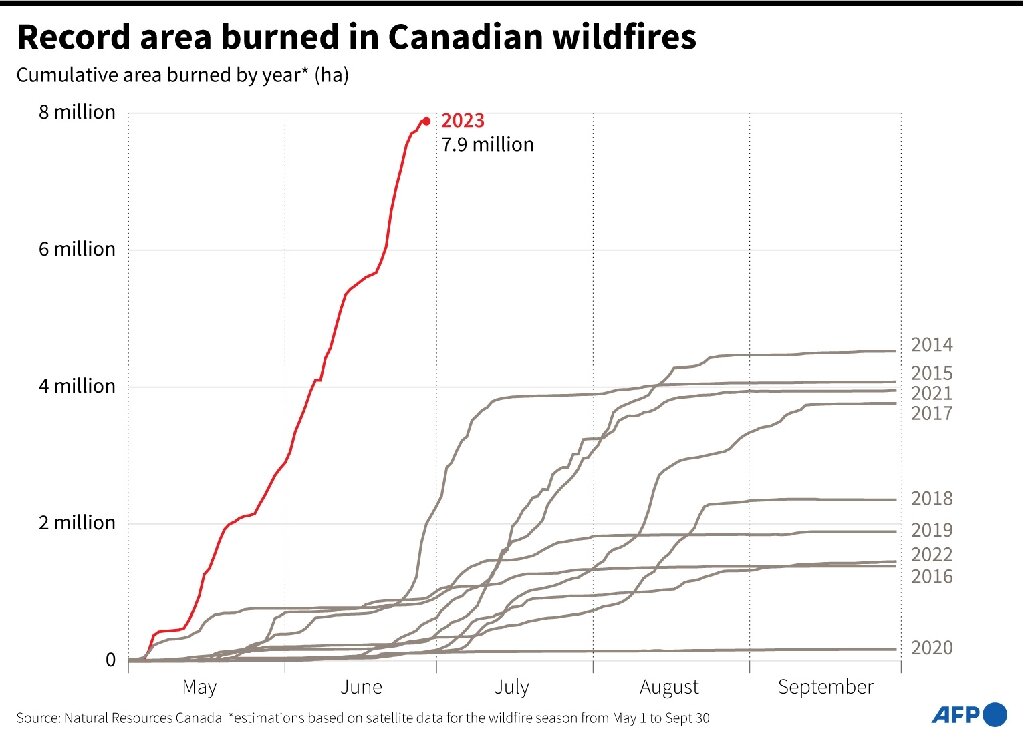
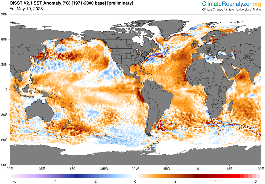
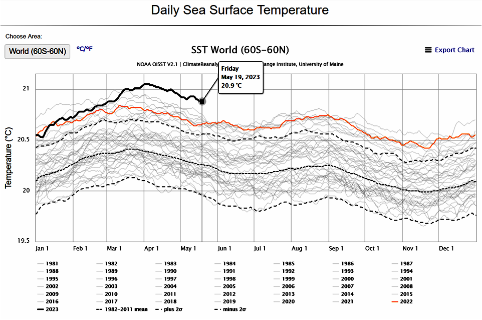
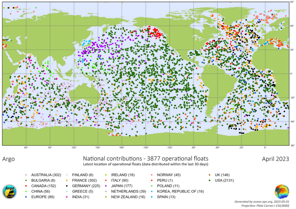
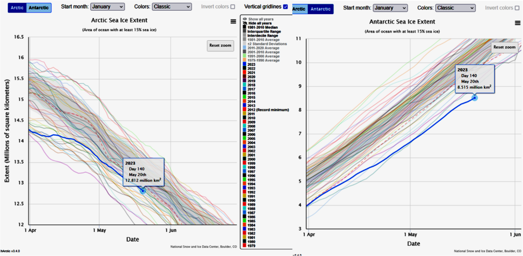
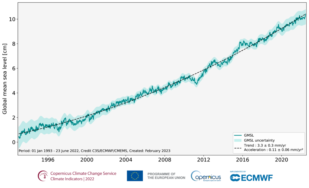
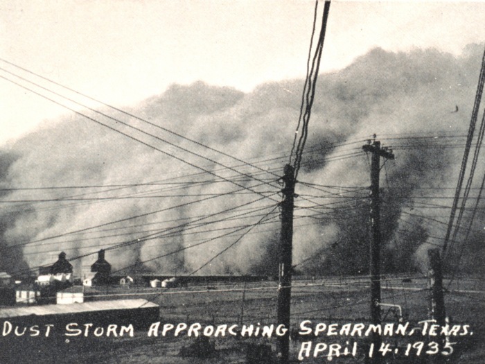
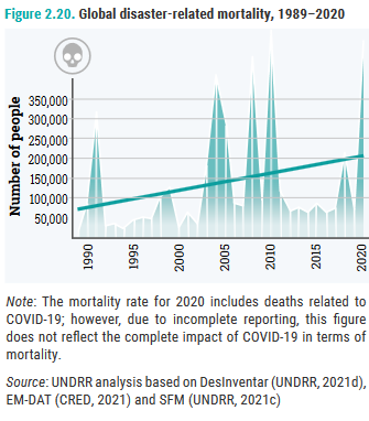


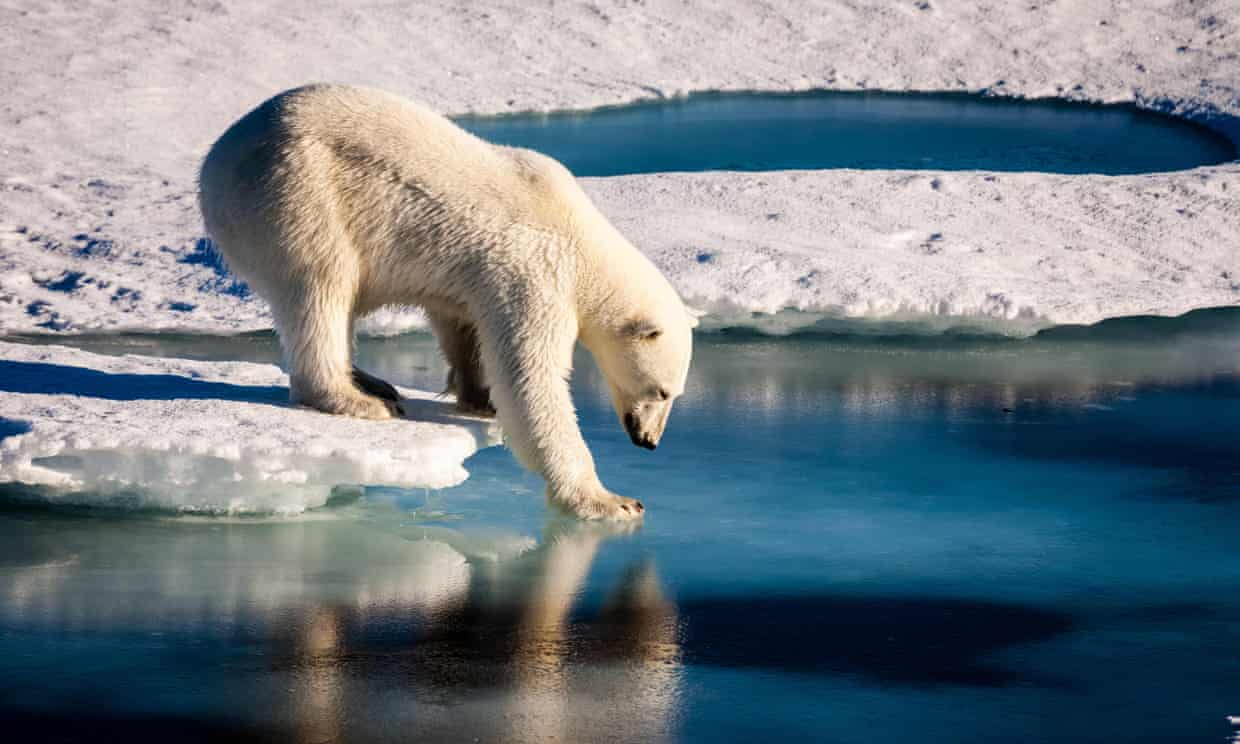
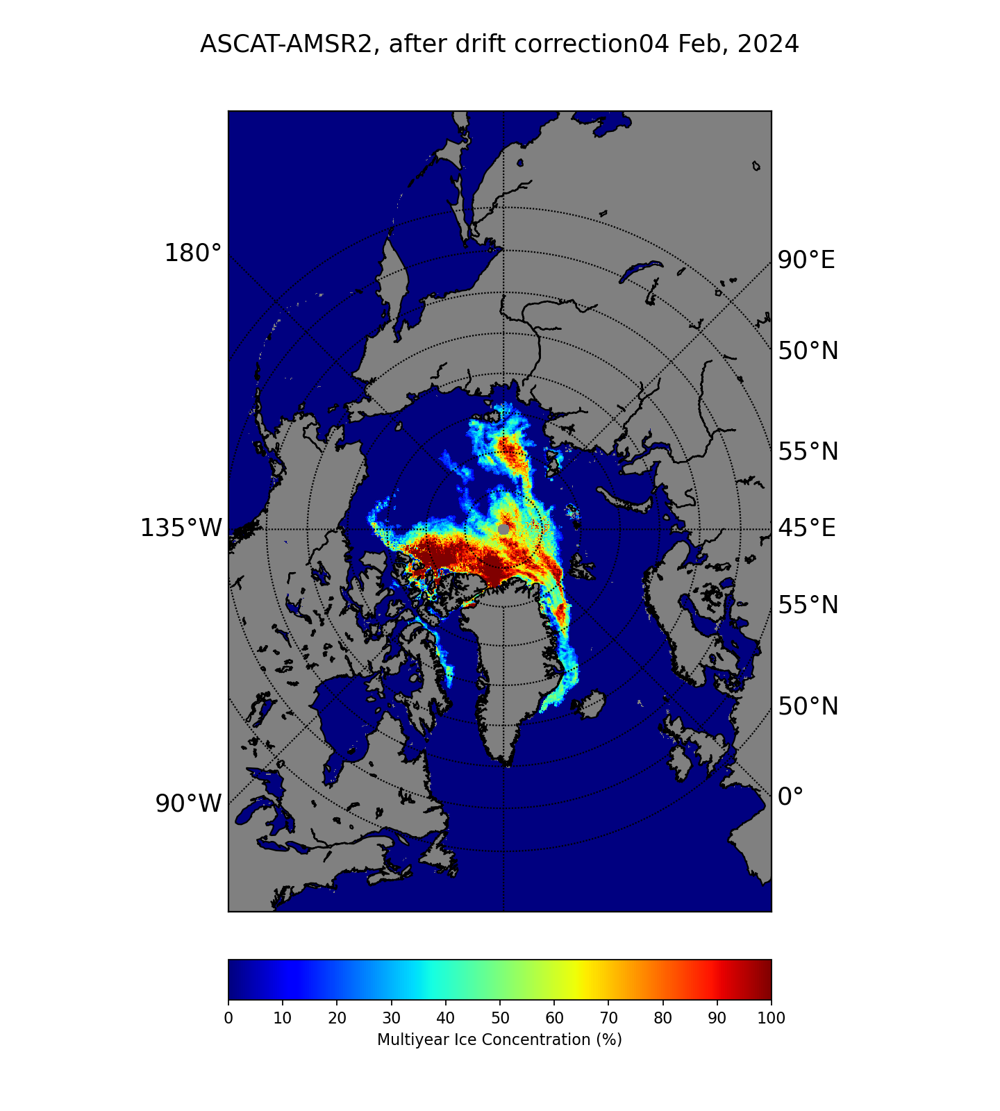