
Global Climate Change Now
25/07/2023 (for the last version see 8/07/2023)
What’s this article about, and why is the date important?
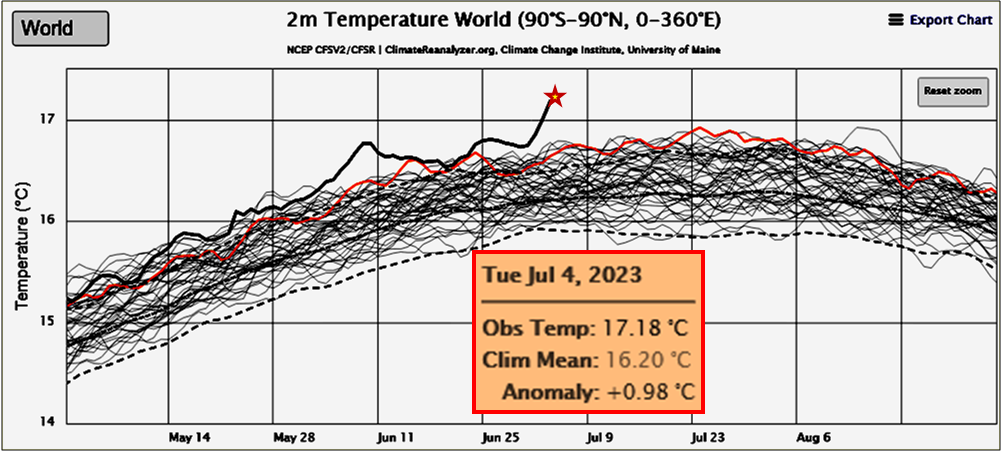
As I write this, the average climate for our WHOLE PLANET is changing so freaking fast we can see visibly measurable changes in the averages from one day to the next!
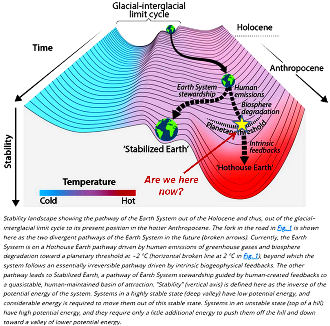
The sudden speed up of changes in several climate indicators at the same time suggests that we may be crossing a critical tipping point in the complex interactions of important temperature related feedbacks controlling the behavior of Earth’s Climate System, as shown in the Featured Image. The speed-up is highlighted by the fact that the average air temperature 2 meters above the surface of our planet is at an all time record (and especially in the satellite era beginning in 1979). These changes will affect the whole 8,000,000,000+ humans and alive today along with all other life on the planet. The charts and maps presented here graphically illustrate measurements of important climate variables up to the last 1 to 4 days.

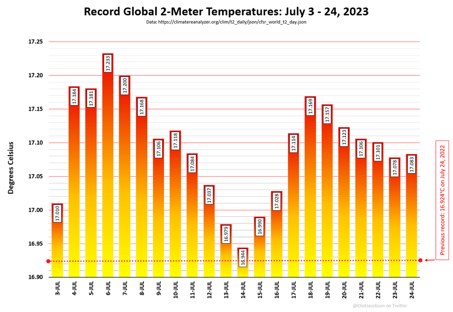
Again, every day since July 3 has been hotter than any maximum temperature recorded for any prior year back to 1979 when these records were compiled.
@EliotJacobson on Twitter shows this data a bit more legibly. The first record high was on 3 July, and daily average temperatures have remained in annual record high regions for a total of 12 ! continuous days through 14 July. The record is now 21 days!
Fig. 2. Progression of global temperatures higher than all time record temperatures back to 1979. ref. Eliot Jacobson.
The time gap between the instants of measurement depicted in the plots and charts and when they were printed are due to time delays between:
- automatically recording millions of readings from hundreds of thousands of networked physical sensors and more millions of readings from remote sensors on a plethora of artificial satellites whizzing around our revolving planet several times a day (“Intensity of observation”, below, illustrates just how comprehensive the sensor network is);
- accumulating and assembling the recorded data over the world-wide communications network;
- proofing, processing and tabulating the received data on the world’s largest supercomputers; reanalyzing and plotting the observations in the form of charts and graphs comprehensible to humans;
- publishing and publishing these outputs onto the public web, where they are accessible to anyone with a computer and the knowledge to find and understand the representations.
Based on the most recent measurements, the ongoing climate changes are accelerating in directions and speeds that will inevitably be lethal to the human and many other species within another century, more or less, if the changes are not stopped and reversed. These changes are a direct consequence of an unplanned experiment that humans began around 1½ centuries ago to burn geologically significant quantities of fossil carbon (e.g., coal, oil, ‘natural’ gas) into usable energy and greenhouse gases trapping an ever growing proportion of the total solar energy striking Planet Earth.
However, some of the combustion energy released by burning fossil carbon has also fueled an exponential growth of knowledge and technology able to produce the I am showing here. These plots provide the evidence our experiment is changing our global climate system to a state that will have existentially catastrophic consequences for Earth’s complex forms of life. This Hellish state is known as “Hothouse Earth“.
This fact that we now have the tools to actually see the evidence of our likely doom gives me some hope that our still exponentially improving technology may also provide us with the ability to stop further damage caused by our rogue experiment and repair enough of the damage already caused, to allow our species to continue evolving into the foreseeable future.
This raises the unavoidable and fraught question: Do we humans have the political will and capability to marshal and mobilize our technologies to engineer solutions that will allow us to avoid the abyss? This is the single most important issue facing the world today. If we don’t solve it, no other issue matters because — before long — no one will be left to worry about it.
Problematically, the world’s governments are dominated by puppets of the fossil fuel industry and related interests. They are doing as much as they can to PREVENT, DELAY, or MINIMIZE any actions that might hamper fossil fuel’s greed and short term interests for the world to burn yet more fuel. Hoping that we humans can solve this single, most important issue, VoteClimateOne is working to revolutionize our governments by replacing or changing parliamentary puppets to prioritize actions to solve the climate crisis first. Also, I am writing articles such as this to demonstrate and explain why this revolution is so urgent and necessary.
To demonstrate just how rapidly we are currently moving down the road to doom in what will be Earth’s Hothouse Hell, this article will be updated at least once a week until there is evidence of a downward trend to safer readings. We are certainly not seeing them yet!
Measuring progress towards existential catastrophe on Hothouse Earth
The world’s polar regions are critical. Ice and snow covering land and ocean reflects around 90% of the solar energy striking it. As temperature rises, more of the frozen water melts, allowing the exposed earth and water to absorb a much greater proportion of the solar energy during 24 hour-long polar polar daylight (open ocean absorbs ~94% of the energy striking it) , causing polar and global temperatures to rise in a potentially accelerating feedback cycle. In the animated graphic below, this process is clearly visible since the mid 1930s. This particular cycle won’t be broken until the ice is essentially all melted. By then there are several other feedbacks that will likely be in full swing.

Ocean measurements are critical
Because most humans live on continental land masses, immersed in the atmosphere, most climatologists are primarily concerned with what goes on in the atmosphere. However, because water covers some 70% of our planet’s surface and because of water’s physical properties, around 90% of the excess solar energy striking Earth is absorbed in the World Ocean. Heat is then transported around the planet in currents and is available to be released to drive climate. See below for explanations of how the major heat engines driving Earth’s Climate System interact and work.
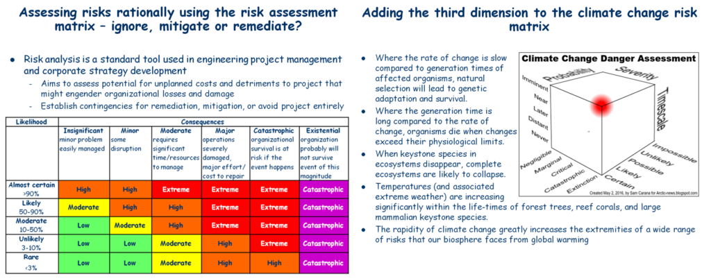
Because these climate ‘engines’ are complex dynamical systems with many interacting components, where the interactions are often non-linear and sometimes even chaotic (in a mathematical sense their behavior is inherently unpredictable to any statistically define degree. Positive feedbacks in such systems can be potentially destructive because they lead to exponentially growing changes that lead to system breakdown (because infinity is impossible in the real world). Mathematical modeling of the interactions of small sets of variables can provide an appreciation of how such breakdowns may occur. Systems engineering as practiced in large defence engineering projects is based around a MilStd known as Failure Modes Effects and Criticality Analysis (FMECA) to identify such kinds of failure modes in order to engineer system solutions mitigate or totally avoid circumstances where they might arise.
The charts and maps below show how some measures of the behavior of Global Climate System have been behaving over the last few months and days. I consider these to be critical because they are likely to be evolved in the kinds of positive feedbacks that can grow exponentially to cause systems failure or collapse.
A definition
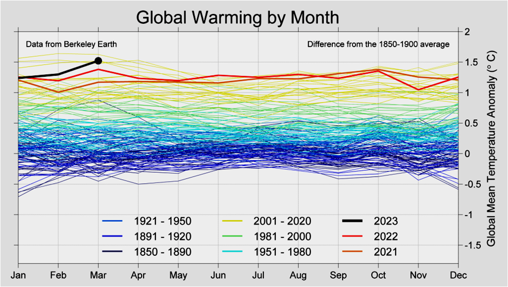
Many of the charts represent values of particular variables averaged over the surface of the whole Earth (or some specified region) at a specified point or interval of time. Most maps use colors to indicate the value of a specified variable at a specified point or averaged over an interval of time. In most such cases these measures are presented in the form of “anomalies”. An anomaly is the difference between the particular measurement and the long-term ‘baseline’ average for that measure on that day or interval of the year. For example, the graph immediately below uses a 30 year average (from 1971-2000) for its baseline average. Anomaly plots are particularly useful to highlight changes taking place over time.
Critical Variables
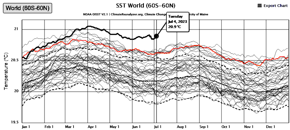
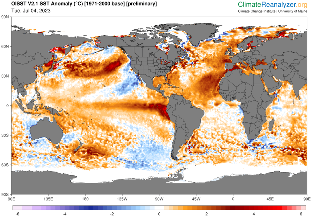
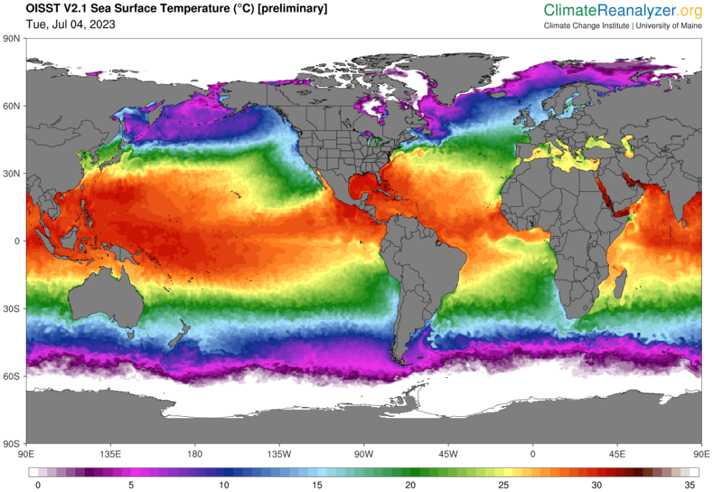
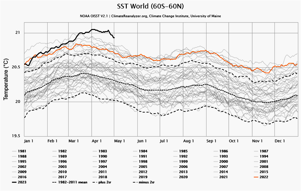
Global Sea-Surface Temperature
The global sea surface temperature anomaly broke into all-time record for the day of the year around 15 March, and by the end of March it was an all time record high since 1981, 0.1 °C above the previous record set on 6 March 2015. This value is so extreme, that along with other variables noted below it suggests that the average rate of global warming observed over the last few decades may be shifting into a new regime where the rate of ocean-surface warming is skyrocketing. As at 29 June it is still 0.2 °C above the previous record for that date – with an uptick after 4 days of downward trend).


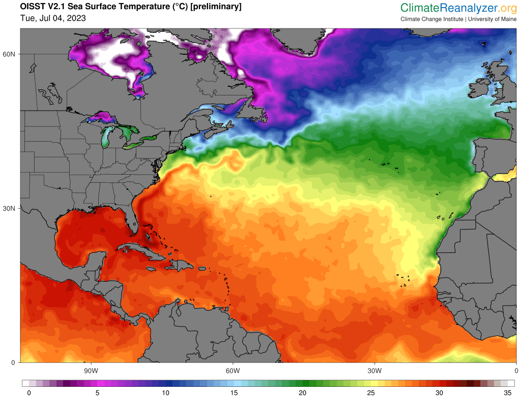
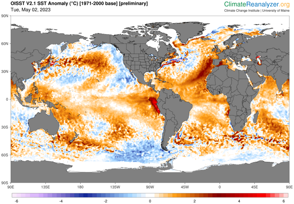
The North Atlantic’s fever is still has a fever is still growing on 13 July. Warmer than usual water flooding up around southern Greenland right up to the edge of the melting sea-ice, with what looks like cold fresh meltwater flowing out of Baffin Bay along the west side.
Note that the ocean surface temperature is 5 °C right up to the edge of the sea ice, with warmer water than that intruding nearly as far as the ice front in Baffin Bay. The cooler (purple shaded) water flowing down close to the Canadian shoreline has been pushed back into Baffin Bay (between Greenland and Canada. There is no sign in either of the SST maps of ‘cool spots’ which are thought to be the sources of the ‘salty cold water’ forming the deep water branches of the thermohaline circulation in the North Atlantic. In fact, the ocean in these areas seems to be 10-15 °C. Northern Hemisphere ice extents are low for the date but not yet near record lows, unlike the South!
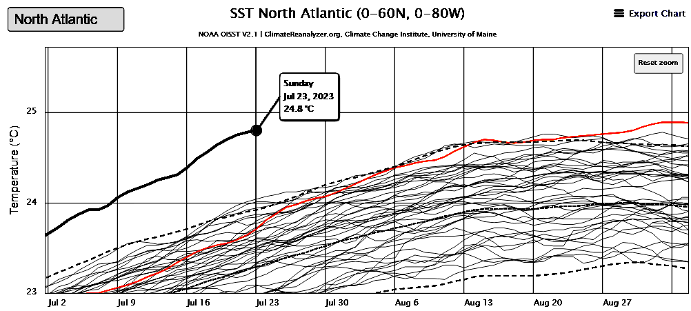
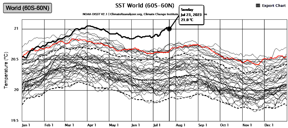
July 23, only 0.1 °C short of the previous all-time record, set more than a month later last year.

Global Sea Ice
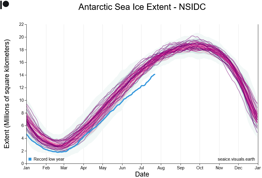
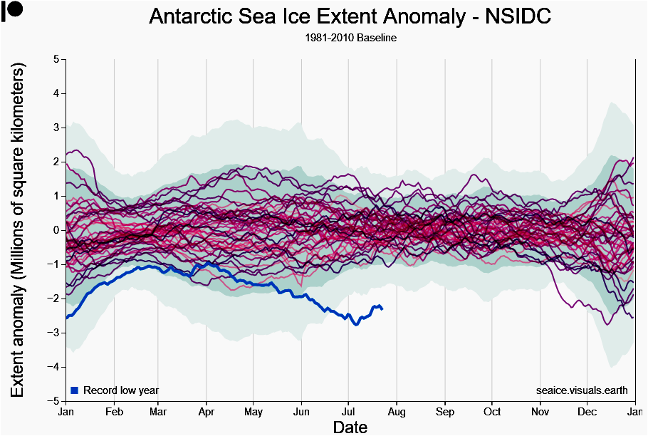
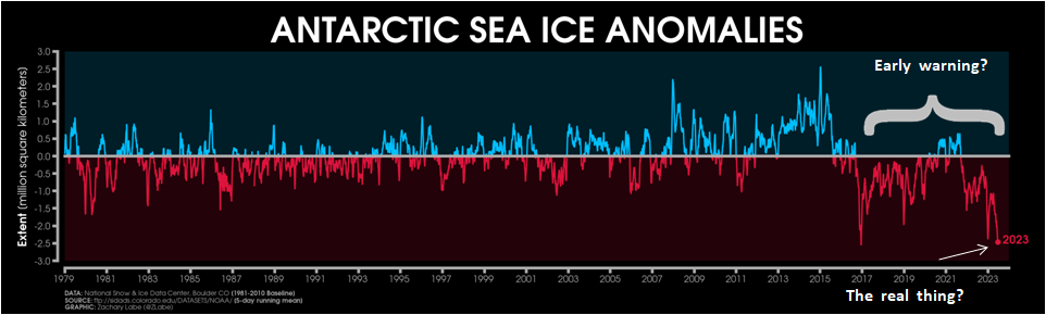
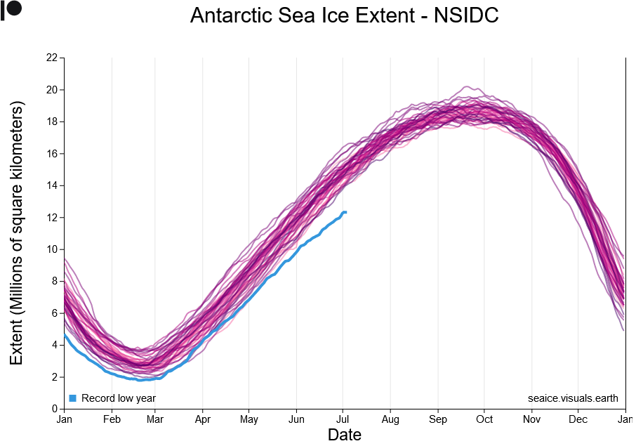
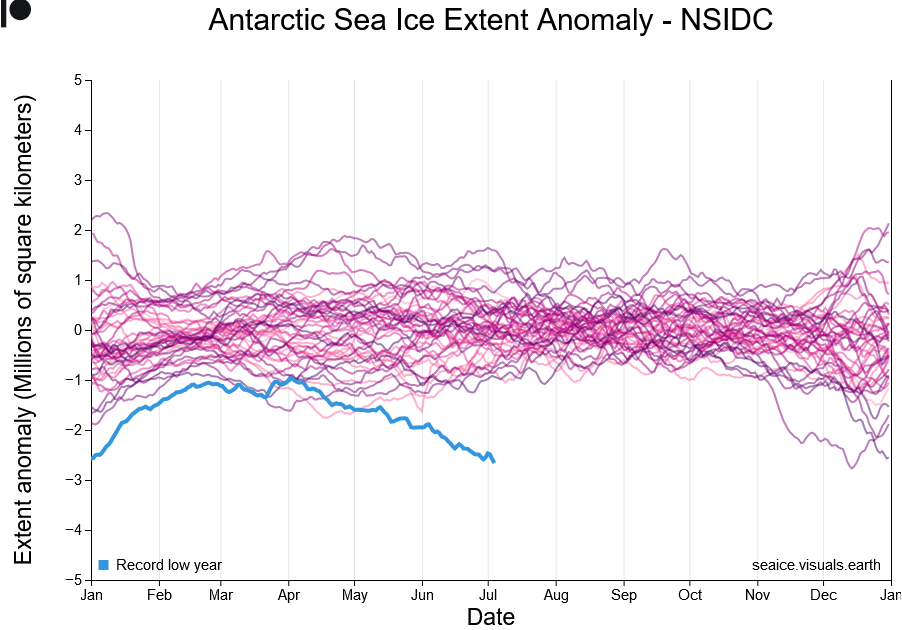
Antarctic Sea ice
Around the same time the global average sea-surface temperature began to skyrocket, the rate of sea-ice formation around Antarctica slowed — as would be expected if the surrounding ocean was becoming progressively warmer than has ever before been the case for this time of the year.
Sea ice extent anomaly is strongest in the Weddell and Bellingshausen Sea region. With the Indian Ocean region also showing what looks like the beginning of a strong deviation. The illustration is from the article from the Australian Antarctic Program Partnership that discusses the significance of the anomaly.
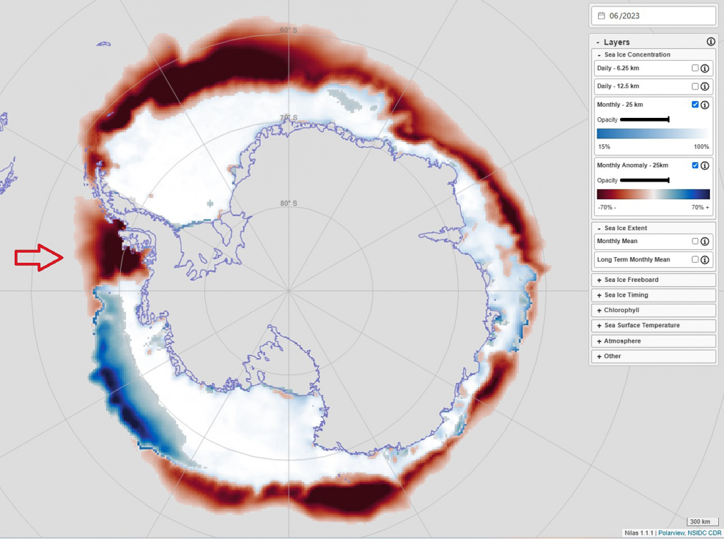
Fig. 8. Monthly anomalies in Antarctic sea-ice concentration and sea-surface temperatures for June 2023, showing more negative (i.e., reduced ice freezing) than positive anomalies. Note deep red is -70%, and lack of sea ice in Bellingshausen Sea (west of Antarctic Peninsula). Even though Antarctica is in mid-freeze season, Bellingshausen Sea is almost at summer sea-ice levels. (Source: interactive chart accessed at nilas.org). see also Polar View.
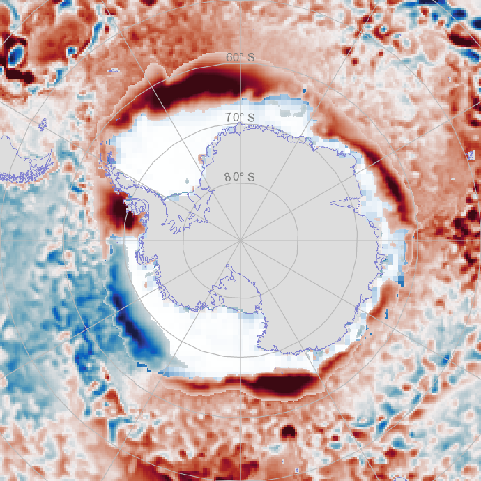
Sea ice extent anomaly is strongest in the Weddell Sea (area above the Antarctic Peninsula) and Bellingshausen Sea region (indicated by the arrow above). With the Indian Ocean region also showing what looks like the beginning of a strong deviation. See especially the article from the Australian Antarctic Program Partnership that discusses the significance of the anomaly.

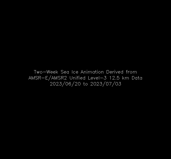
Fig. 9. Color-coded animation displaying the last 2 weeks of the daily sea ice concentrations. Sea ice concentration is the percent areal coverage of ice within the data element (grid cell) in the Southern Hemisphere. These images use data from the AMSR-E/AMSR2 Unified Level-3 12.5 km product. The different shades of gray over land indicate the land elevation with the lightest gray being the highest elevation.
This graphic from NASA Earth Science’s Current State of Sea Ice Cover shows the slow rate of ice formation around Antarctica. The almost complete absence of ice in the Bellingshausen Sea is remarkable. It is only now in the last few days that it is beginning to ice over. There is also significant open water within the extent of the sea ice.
See also:
- Australian Antarctic Program Partnership (AAPP). 16 June (2023) from World Meteorological Organisation (WMO), Polar scientists call for urgent action in view of rapid Arctic and Antarctic change
- Australian Antarctic Program Partnership (AAPP) . 23 June (2023), New study of Antarctic landfast ice charts dramatic crash referencing Fraser et al., 23 June (2023), Antarctic Landfast Sea Ice: A Review of Its Physics, Biogeochemistry and Ecology. Reviews of Geophysics, https://doi.org/10.1029/2022RG000770.
- Nature. (2017). Garabato et al. 9 Feb (2017). Vigorous lateral export of the meltwater outflow from beneath an Antarctic ice shelf. 10.1038/nature20825. Free PDF
- Nature 29 Mar (2023). Qian Li, et al.. Abyssal ocean overturning slowdown and warming driven by Antarctic meltwater. 10.1038/s41586-023-05762-w [paywalled!]
- Nature Climate Change, 2 June (2023). Zhou et al. Slowdown of Antarctic Bottom Water export driven by climatic wind and sea-ice changes. https://doi.org/10.1038/s41558-023-01695-4.
- X (Twitter) June 2023, Zack Labe’s Climate Viz of the Month.
Is all this part of an early warning that a tipping point is being approached…. Or is it the real thing?
Arctic Sea Ice
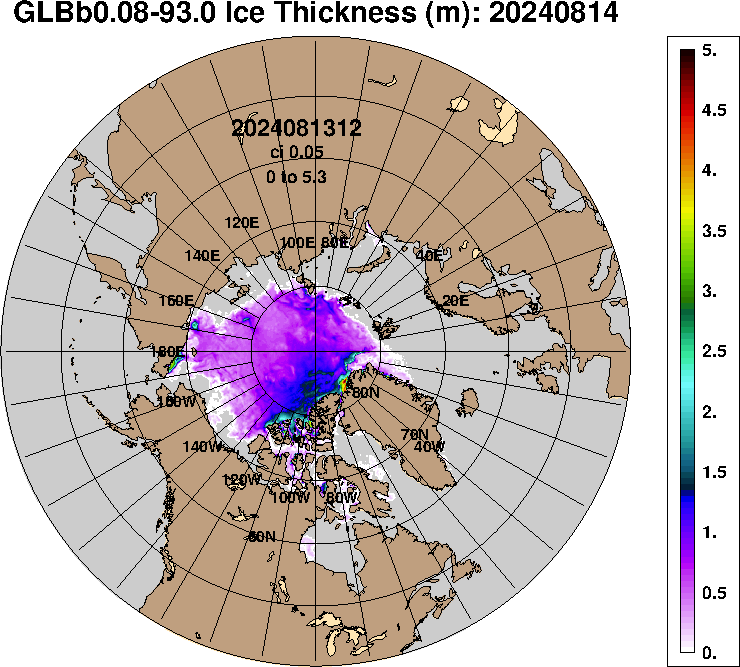
So far, melting of the Arctic sea ice has not been particularly exceptional. With regard to sea-ice at both poles, it is also important to consider thickness and volume. Ice that is only a meter or two thick is accumulated over winter when there is no solar heating (sun largely or completely below the horizon) is normally only a year old. Solid ice reflects most of the solar energy heating it. However, the thinner the ice is, the faster it can melt as it begins to heat under the summer sun and possibly even rain(!), to say nothing of warm currents from the tropics. Around the North Pole, all of the bluish and purple ice shown in the map here can disappear fairly quickly as summer continues to leave open ocean to absorb most of the solar energy striking it that will delay freezing in the following winter.
See also Danish Arctic Research Institution’s Polar Portal for current info on the northern polar region.
Arctic sea ice beginning to thin and break up as far as the North Pole. Shades of blue within the ice cap show regions where less than 100 percent of the quadrangle are covered by ice. (Either due to exposed ocean water or puddles of rain/melt-water on top of the ice). In either case this is bad news for reflectivity of the ice cap.

Atmosphere and land
Jet streams
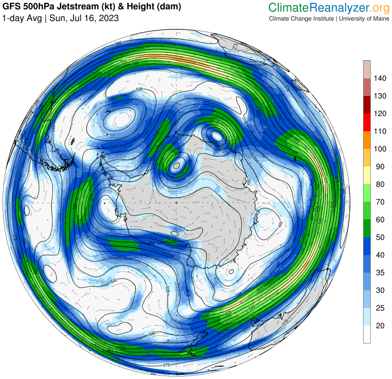
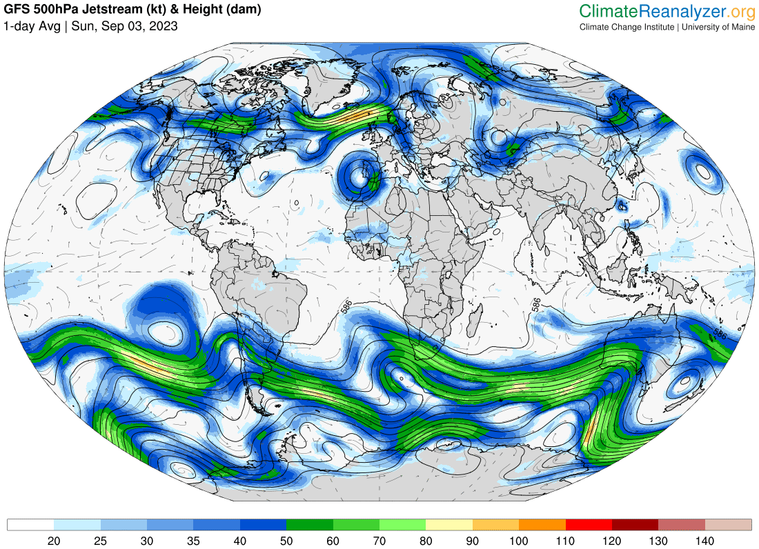
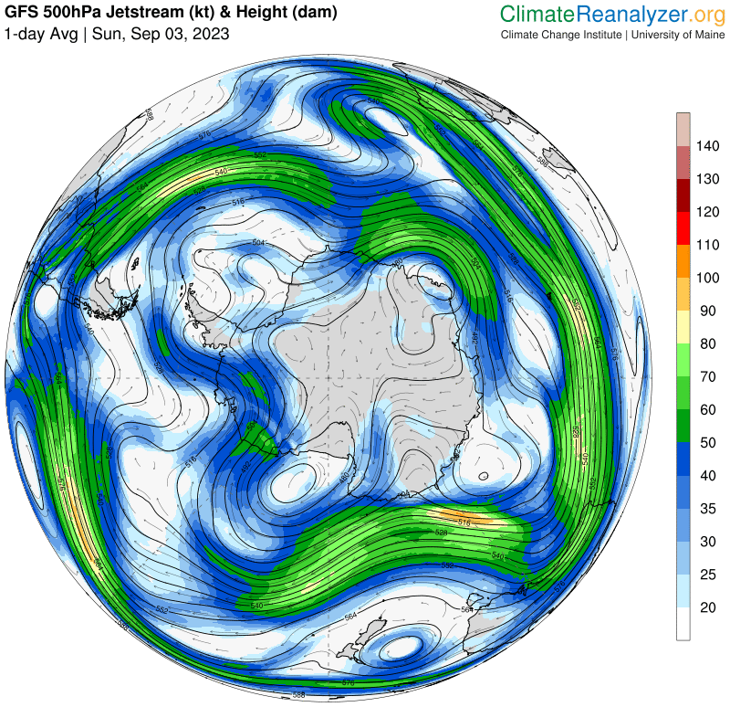
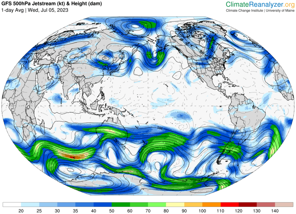
Jet streams are the atmospheric equivalents to major ocean currents that influence all of the other weather systems on the planet to keep them moving latitudinally around the planet. They are driven by temperature differences between the tropical and polar regions of the Earth and Coreolus effects as winds blow towards or away from the poles. Where the temperature differs strongly between poles and equator the jet streams are well organized with high winds. As temperature differences decrease so do the wind speeds, and the streams begin to slowly meander until they may become quite chaotic. Winds less than 60 kt are not considered to be jet streams. At present there has been very little change in the pattern that existed a week and a half ago (as shown in Fig 8b) there are virtually NO jet streams at all in the Northern Hemisphere, and the winds that do exist are completely chaotic — a highly unusual situation. This leaves major heat domes basically motionless, facilitating the buildup and maintenance of record high temperatures.
See: Nature Climate Change, Lenton (2011) Early warning of climate tipping points.
Continental effects
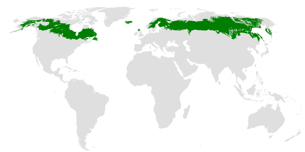
Fig. 14. The taiga biome is found throughout the high northern latitudes, between the tundra and the temperate forest, from about 50°N to 70°N, but with considerable regional variation. (Wikipedia).
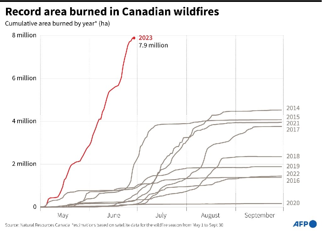
Some of the greatest impacts of the disrupted jet stream system are seen over the boreal/taiga forest zones of North America and Eurasia. Arctic tundra and much of the taiga is underlain by carbon rich peat and peaty permafrost soils that are thought to contain at least 2x more carbon than the current amount of carbon in our atmosphere. Depending on circumstances, significant amounts of that carbon can be released in the form of methane, that has more than 80x the greenhouse potential of CO2 over the first 20 years of emission (20x over 100 years). Aside from greenhouse gases emitted by the burning forests and soils, significant amounts of the black carbon ‘ash’ will settle on Arctic snow and ice – speeding their melting when exposed to sunlight. Collectively, at least over the first few years following wildfire, the burning will provide yet another powerful positive feedback to speed snow and ice melting. Over a longer term, re-vegetation will sequester some atmospheric CO2, but only if the forest is not burned again.
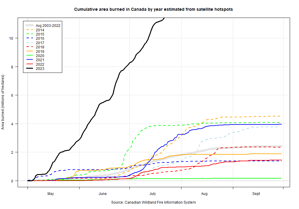
Fig. 15. By the end of June Canadian wildfires mainly in boreal forests have burned more area before the fire season is half over than in the previous record for a full year in 1989. Phys Org (30 June 2023). As at 24 July 11,582,531 ha have burned. The graph here, sourced from Natural Resources Canada gives the status as at 15 July. This is literally ‘off the chart’, and represents about 1.1% of Canada’s total land area.
Wildfires not only release the carbon contained in burned forests and tundra, but they can also burn the carbon rich peat soils. furthermore, burning off insulating vegetation and surface litter exposes permafrost to melting and release of CO2 and methane from frozen hydrates.
If the burning releases more greenhouse emissions than can readily be recaptured by re-vegetating forests. These emissions may more than replace any emissions humans cut — providing positive feedback to drive global temperatures still higher. This is one of several crucial tipping points associated with stopping the thermohaline circulation.
Intensity of observation
A hint to how little you can trust claims of reality denying trolls, puppets, and the like, is provided by the number monitoring points that physically monitor the atmosphere at those locations around the surface of the planet we live on used PER DAY.
Atmospheric monitoring
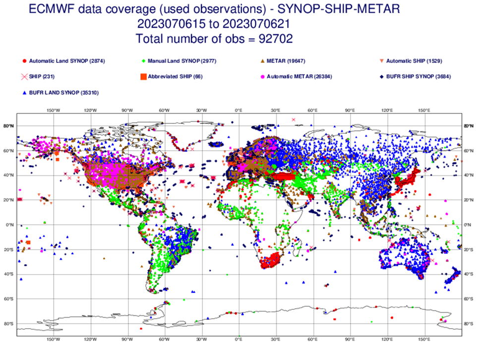
The European Centre for Medium-Range Weather Forecasts (ECMWF) for the charts plotted on 6 July 2023 as shown below are based on measurements from 92,702 locations. Note 1: this map does not NOT include ocean monitoring points. Note 2: The DATA COLLECTED EVERY DAY by this web of sensors is available to, used, and interpreted by several different national and institutional climate monitoring centers. In other words, the conclusions are cross checked between different centers many times over. The charts above depict scientific facts, not hunches and personal opinions. For more detail on how the accuracy of the observations is controlled see ECMWF’s Monitoring of the observing system.
Oceanographic monitoring
Argo
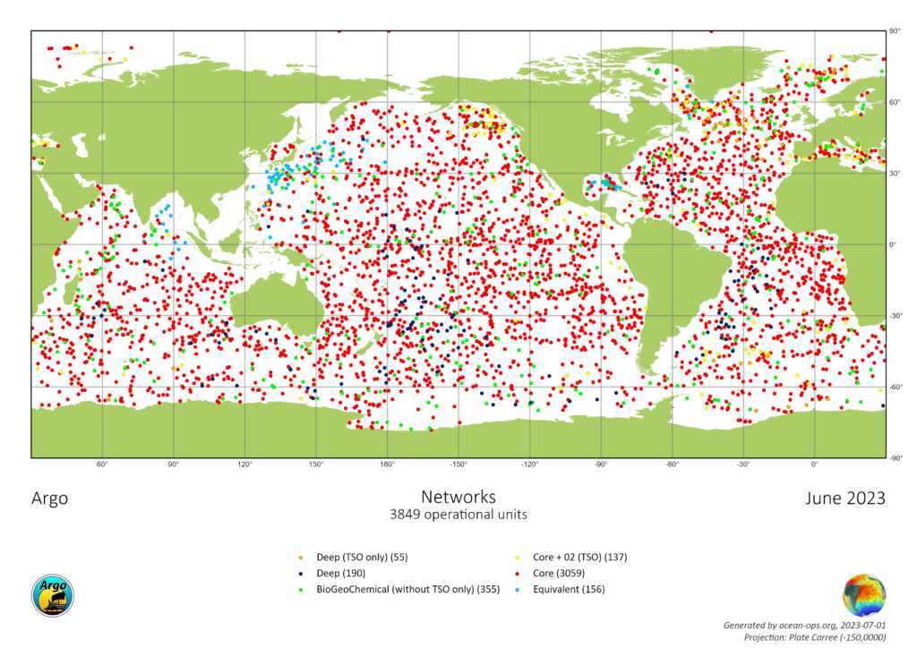
Argo floats profiles physical properties of the surrounding water, minimally ocean temperature, salinity, pressure (i.e., depth). Each float operates on a 10 day cycle, spending most of the cycle ‘resting’ at an intermediate depth. On the 10th day it sinks to a specified depth and begins recording inputs from its sensors as it floats up to the surface. The standard float sinks to a depth of 2 km (2,000 m) and records all the way up to the surface, where it then determines its GPS position to within a few meters and messages a passing relay satellite with its location and profile data before sinking to its resting depth waiting for the next profile position. As shown on the world map here, for June 2023, shows the locations of 3849 profiles received over the month. Of these ~1,400 recorded the profile from 2 km deep in the ocean to the surface. Some floats are designed to sink to the bottom and thus record a profile for the full depth of the ocean. A few include several additional sensors to levels for things like acidity, oxygen, nitrate, light level, and some more I don’t recognize. The Argo system is really quite amazing.
Some even have ice sensors allowing them to operate even in ice-covered waters by warning if they might be fatally damaged by striking ice overhead. For these, if they sense ice, they’ll record the profile in memory, and drop back and rest until the next cycle (which may again prevent surfacing). These interrupted cycles will keep repeating until the float can safely surface — in which case all of the aborted profiles will be messaged to the satellite relay along with the current one (better late than never!)
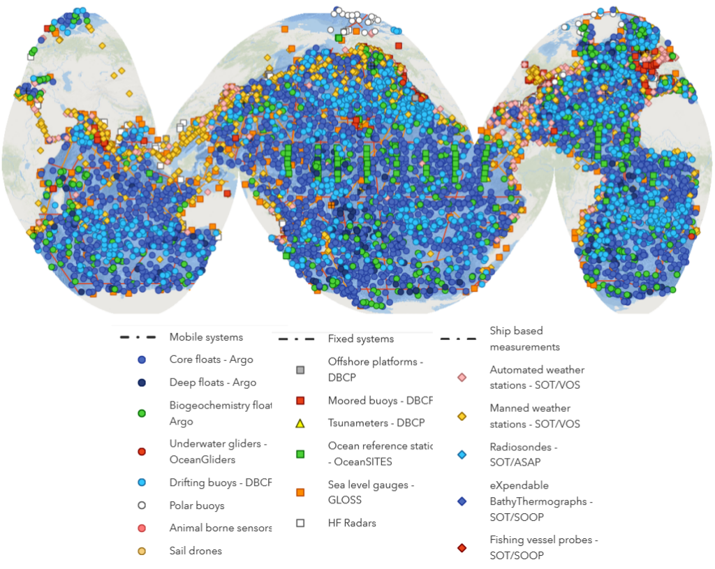
And then there is a plethora of other ocean sensor systems. The full gamut of them shown next. The various different types are named in the legend. Collectively, on 26 June 2023, the ocean sensing system measuring in-situ variables includes 7973 ‘platforms’ (including the different kinds of Argo Floats) and results from 104 ‘cruises’ of ships ranging from specialized oceanographic vessels to fishing boats. Some of these non-Argo systems also record partial or complete (i.e., to the bottom) profiles.
Almost all of the data collected from the range of sensors is freely accessible via the public World Wide Web.
Satellite remote sensing systems
As if the plethora of physical systems for directly measuring weather and climate is not enough. There is now a cloud of satellite-based remote sensing systems buzzing around our planet, making literally millions of observations every day of critical weather and climate variables. NASA EarthData’s What is remote sensing? gives a high level overview of some of the capabilities of these systems. You can be assured that the measurements made by the earth-based and space-based sensing systems are carefully cross calibrated to ensure the various systems are all working together towards a common view of the actual physical reality.
Major heat engine domains of the Earth System
Dynamic changes in the Universe through time are driven by spontaneous flows and transformations of energy from ‘sources’ at high potential to entropy and ‘sinks’ at lower potentials (e.g., water flowing down a hill). This flux can be used to drive other processes through a system of coupled interactions forming a thermodynamic system or heat engine. As governed by the universal physical Laws of Thermodynamics (especially the Second Law), as long as there is a potential difference between source and sink, the flux of energy between them will continue to spontaneously flow through the system/heat engine as long as long as the system’s net entropy production remains positive.
The ‘Earth System’ includes all the shell-like layered components of the planet from the edge of outer space to its center. The three main ones concerning us here from inside out are the geosphere, hydrosphere, and atmosphere. The biosphere formed in the interface between atmosphere and geosphere (on the planetary scale) is a microscopically thin turbulent layer of carbonaceous macromolecules and water combined with other elements and molecules exhibiting the properties of life. We humans form part of that biosphere.
The heat engines described here circulate masses of matter that transport heat energy from place to place within the Earth System.
Geosphere
The geosphere comprises Planet Earth’s, solid (‘rocky’) components. The geosphere’s heat engine is based on the geologically slow process of plate tectonics that drives continental drift.
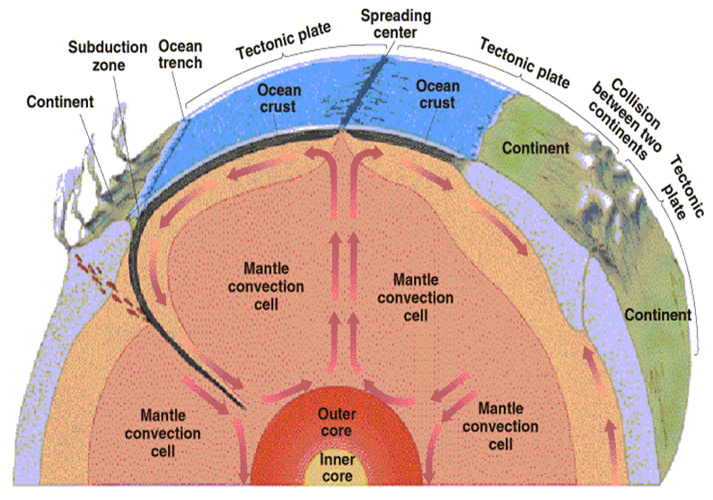
Fig. 22. Geological heat engine at work. Mantle convection may be the main driver behind plate tectonics. Image via University of Sydney.
The plate tectonics engine is driven by the slow radioactive decay of unstable isotopes of elements such as potassium, uranium and thorium remaining from the formation of Earth some 4.5 billion years ago.
Enough heat has and is being generated by this decay to melt the planet’s core and heat and expand the overlying mantle rocks enough to make them less dense and plastic enough for them to form convection cells like you see in a pan of nearly boiling water. Hotter and less dense rocks float up towards Earth’s harder crust and spread out (carrying surface crust and even lighter continental rocks, i.e., ‘plates’) to become cool enough for gravitational force to pull the solidified plates back towards the molten core in subduction zones that also form oceanic trenches.
Heat transported from radioactive decay is released into the hydrosphere and atmosphere from conduction through the crust + hot springs and geysers; by molten basalt lava coming to the surface in oceanic and terrestrial spreading (‘rift zones’); and volcanoes associated with localized ‘hot spots of rising magma or with the rift zones. Lavas associated with the latter type of volcanoes are formed of lighter, lower melting point rocks forming a scum on top of the denser crustal rocks of the drifting plates.
Hydrosphere

Earth’s hydrosphere is the thin film of water between the geosphere and atmosphere forming the salty Ocean covering around 70% of the planetary surface along with lakes and streams of generally nearly salt-free water serving as feeding tendrils draining water condensed from the land. The hydrosphere also includes a solid component of ice and a gaseous component of vapor. These components have very different properties compared to water and each other.
The liquid component of the hydrospheric heat engine absorbs solar energy in the form of heat warming volumes of water, in the form of latent heat of fusion (i.e., melting of ice) absorbing about 80 cal/gm of ice melted, and latent of vaporization (i.e., turning liquid water into an atmospheric gas) absorbing about 540 cal/gm of water vaporized (6.75 times as much energy as required to melt the gm of ice). The heat absorbed becomes ‘latent’ in that the energy transforms the state from liquid to solid or from liquid to gas without changing the measurable or feel-able (i.e., ‘sensible’) temperature of the mass. When the water vapor condenses or the water freezes, of course the latent energies are released in the form of sensible heat.
Basically, the hydrospheric heat engine is driven by the absorption of excess amounts solar radiation (the source) in equatorial, tropical, and subtropical regions of the planet that is mainly carried by ocean currents towards the polar and sub-polar regions where the an excess of heat energy released from water and freezing ice is carried away from the planet in the form of long-wave infrared radiation to the cold sink of outer space. Many different local, regional, and global ocean currents are involved in moving energy around the planetary sphere. Proportionately, a small amount of geothermal heat energy is absorbed from the geospheric heat engine by water, and larger amounts of heat are exchanged with the atmospheric heat engine(s) in a variety of ways.
Water has some very peculiar properties that play very important roles in the climate system and biospheric systems, especially around the freezing point. Most materials contract and become denser as they cool. This is also true for pure water, down to a temperature of 4 °C when it begins to expand and become less dense until it begins to freeze. Ice at 0°C is even lighter such that it easily floats. This is because water molecules are shaped like boomerangs with the oxygen atom at the apex and the two hydrogen atoms sticking out at angles. When they are warmer they jitter around in a relatively random way, such that warming makes the molecules jitter faster and further, while as they cool the jitter slows and they come closer such that a given number of molecules take up less space. As the jitter slows further at and below 4 °C, molecules tend to spread out some to form a quasi crystalline structure approaching that of ice where they are more or less locked into that structure, where the solid water is significantly lighter than the liquid. The presence of dissolved salts and minerals depresses the freezing temperature. As as ice freezes, crystallization of the water also tends to concentrate and expel dissolved minerals and gases in extra-cold plumes of particularly dense and very cold salty water (i.e., brine) — cold enough that tubes of ice may form from the less salty water around the brine.
Water is also a god solvent, able to carry substantial amounts of gases, (e.g., oxygen, CO2, methane – CH4), salts, carbonates, nitrates, sulfates, metal ions, etc). The ocean carries a lot of salt – enough to play an important role in the ocean circulation system. Oxygen and CO2 play essential roles in living systems, CO2 and carbonates play important roles in interactions between water, the Geosphere and the atmosphere. CO2 and methane in the atmosphere, along with water vapor, are the most important greenhouse gases, etc…..
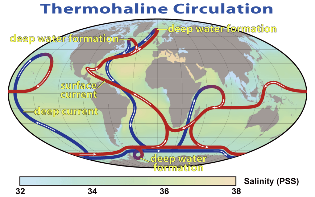
Fig. 23. A summary of the path of the thermohaline circulation. Blue paths represent deep-water currents, while red paths represent surface currents. This map shows the pattern of thermohaline circulation also known as “meridional overturning circulation”. This collection of currents is responsible for the large-scale exchange of water masses in the ocean, including providing oxygen to the deep ocean. The entire circulation pattern takes ~2000 year. Wikipedia
The principal current system driving ocean heat transport is known as the ‘thermohaline circulation‘. Basically, seawater is warmed in the equatorial, tropical and subtropical regions of the world. It also increases in density due to the evaporation of water vapor into the atmosphere. However, parcels of water are kept hot enough that thermal expansion more than compensates for the densification from becoming saltier. However, as currents carry the hot, salty surface water further towards the poles, the water begins to cool until the warm salty water carrying a full load of oxygen becomes dense enough around 4 °C to sink through layers of still warmish but less salty water, carrying a full load of oxygen down to the bottom of the ocean. The salt in this descending water is diluted by mixing with relatively fresh ice water from terrestrial runoffs, melting glacial and sea ice, etc sourced from zones even closer to the poles than where the dense salty water normally sinks.
The main source of power that drives the thermohaline circulation heat engine is the conversion gravitational potential energy in the sinking masses of water as they sink to the ocean floor this sinking helps to pull surface waters into the ‘sinkhole’. Further assists to the circulation are provided by prevailing atmospheric winds pushing surface waters away from continental shores, pulling up cold, deoxygenated, CO2 and mineral rich deep waters to the surface where they fertilize the blooms of micro-algae that add more oxygen and feed the whole food chains of larger organisms in the oceans.
Atmosphere
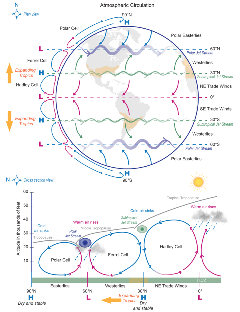
Fig. 24. (top) Plan and (bottom) cross-section schematic view representations of the general circulation of the atmosphere. Three main circulations exist between the equator and poles due to solar heating and Earth’s rotation: 1) Hadley cell – Low-latitude air moves toward the equator. Due to solar heating, air near the equator rises vertically and moves poleward in the upper atmosphere. 2) Ferrel cell – A midlatitude mean atmospheric circulation cell. In this cell, the air flows poleward and eastward near the surface and equatorward and westward at higher levels. 3) Polar cell – Air rises, diverges, and travels toward the poles. Once over the poles, the air sinks, forming the polar highs. At the surface, air diverges outward from the polar highs. Surface winds in the polar cell are easterly (polar easterlies). A high pressure band is located at about 30° N/S latitude, leading to dry/hot weather due to descending air motion (subtropical dry zones are indicated in orange in the schematic views). Expanding tropics (indicted by orange arrows) are associated with a poleward shift of the subtropical dry zones. A low pressure band is found at 50°–60° N/S, with rainy and stormy weather in relation to the polar jet stream bands of strong westerly wind in the upper levels of the atmosphere. From Wikipedia Hadley Cell.
The atmosphere includes the gaseous components of Earth’s global heat engine. The transport and transfer of heat energy and the Coriolis effect are the major drivers. The major sources of heat are direct conduction of sensible heat across the atmosphere : ocean/land interface, the conversion of latent heat into sensible heat through the evaporation and condensation of water vapor (mainly from the oceans), and direct solar heating (note: because the atmosphere is largely transparent to most radiation, most solar energy is not captured by the atmosphere itself.)
The diagram here shows how the transport of heat from the Earth’s surface to the top of the atmosphere where it radiates away as infrared to the heat sink of outer space organizes the wind systems into three major cycles. Note that the moisture laden warm air cools as it rises and releases a lot more energy as the water vapor condenses into rain or hail to keep the rising air warmer for longer.
Biosphere
The Biosphere (“Life”) – the totality of the living components of the planetary sphere, generally residing in the interface between the Atmophere and the Geosphere/Hydrosphere, where living things are characterized by their capacity to self-organize, self-regulate, and self-reproduce their properties of life through time.
The biosphere’s “Engine of Life” is predominantly driven by the complexly catalyzed formation of high energy chemical bonds from the capture of solar radiant or activation energy from redox reactions to combine oxygen and carbon to produce high energy carbohydrates (i.e., captured by chlorophyll in photosynthesis) used or ‘burned’ to fuel all kinds of metabolic activities and processes in living things. Living components of the Earth System have and depend for their continued survival and reproduction on their capacity to catalyze all kinds of energy transformations within and between the other Earth Systems. Over time the Engine of Life has profoundly affected the other planetary spheres. A tiny fraction of energy is captured in abyssal depths and deep in the earth through the process of chemosynthesis
Over evolutionary time the emergence and evolution Life has affected major global transformations involving many aspects of Earth’s other subsystems. Evolutionary processes are complexly dynamic and many of them include many potentially powerful positive feedbacks able to drive changes at exponential rates. All life can evolve genetically to live under a wide variety of environmental conditions over multi generational time scales due to natural selection at the genetic level.
A few species and humans in particular, can evolve culturally at intra-generational timescales to drive changes at exponentially explosive rates to the extent that WE are literally threatening all complex life on the planet with global mass extinction – quite possibly within two or three of our own generations!
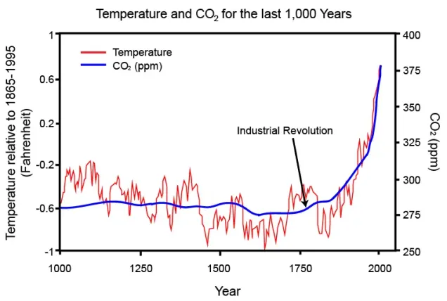
Interpersonal competition to gain ever more personal power from the burning of globally significant quantities of fossil carbon in less than a century that was accumulated in the geosphere over millions of years by life processes has destabilized Earth’s Climate System. TODAY, we seem to be in the midst of flipping the global climate system from the Glacial-Interglacial Cycle most life has adapted genetically to live under, to the Hothouse Earth regime that very few organisms will be able to survive in without hundreds or thousands of generations or more of genetic adaptation. SEE FEATURED IMAGE!


